Even though Archie Goodwin was an amazing writer (not to mention a legendary editor), I’m not as big a fan of his 1970s’ run on Detective Comics as others are. I gladly admit, though, that in terms of art, those are some pretty awesome comics.
One of my favorite bits was the fact that artists dropped the traditional Batman logo from the opening splash pages and started integrating it in clever ways, like Will Eisner used to do in The Spirit.
 Detective Comics #437
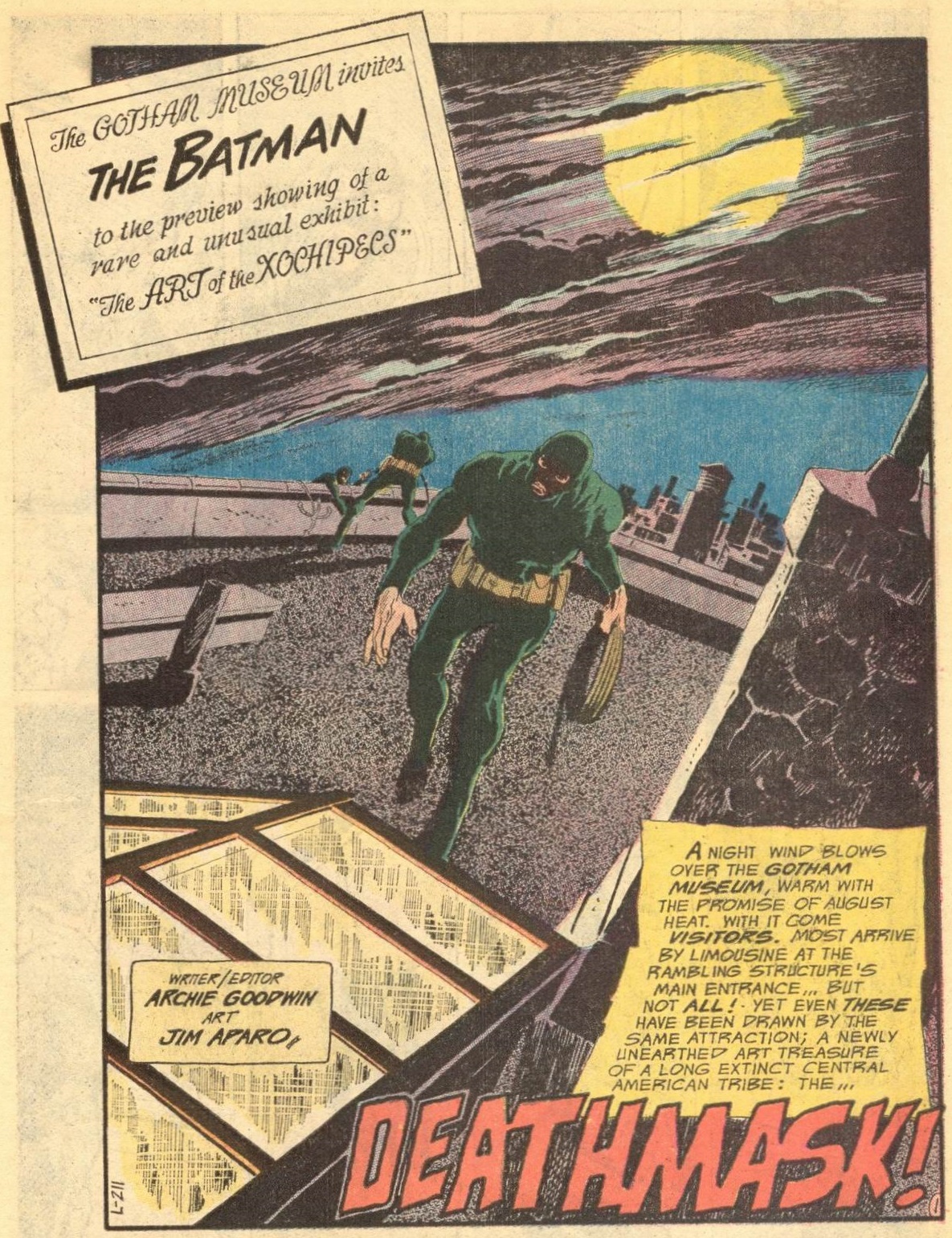
If there is one thing Jim Aparo excelled at, it was opening pages. The man knew how to draw an opening that pulled you right in, not least because those skewed perspectives and lettering just seemed like an invitation to let yourself slide.
In his first splash for Goodwin, Aparo worked in the words ‘The Batman’ as a name on an invitation, which is cute enough. However, I think his second go was more ingenious…
 Detective Comics #438
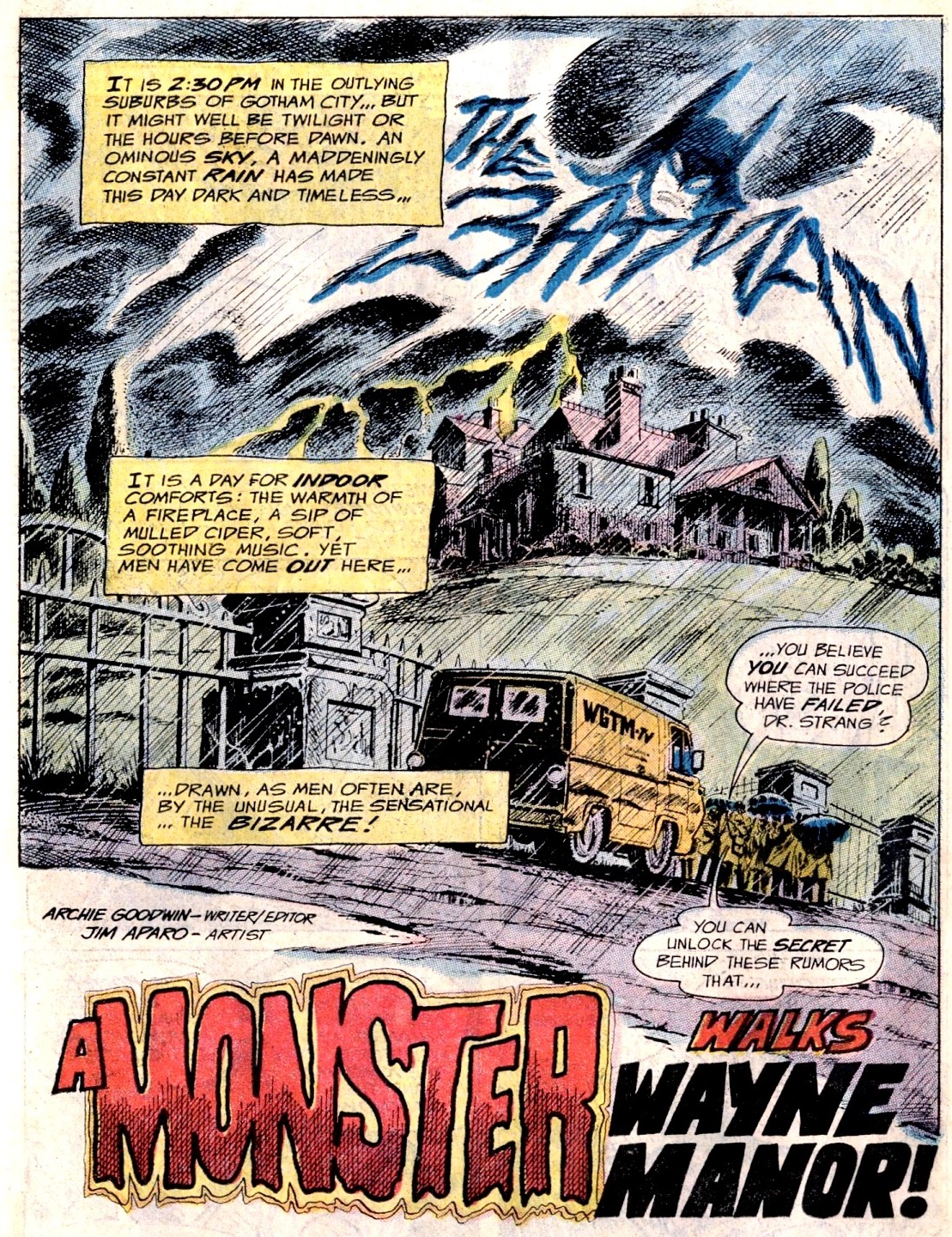
This time around, Jim Aparo screwed the full logo (including that creepy Batman head) into a thunder! What’s more, the resulting image actually matches the horror theme of comic.
After Aparo, the remaining artists continued to try out new things:
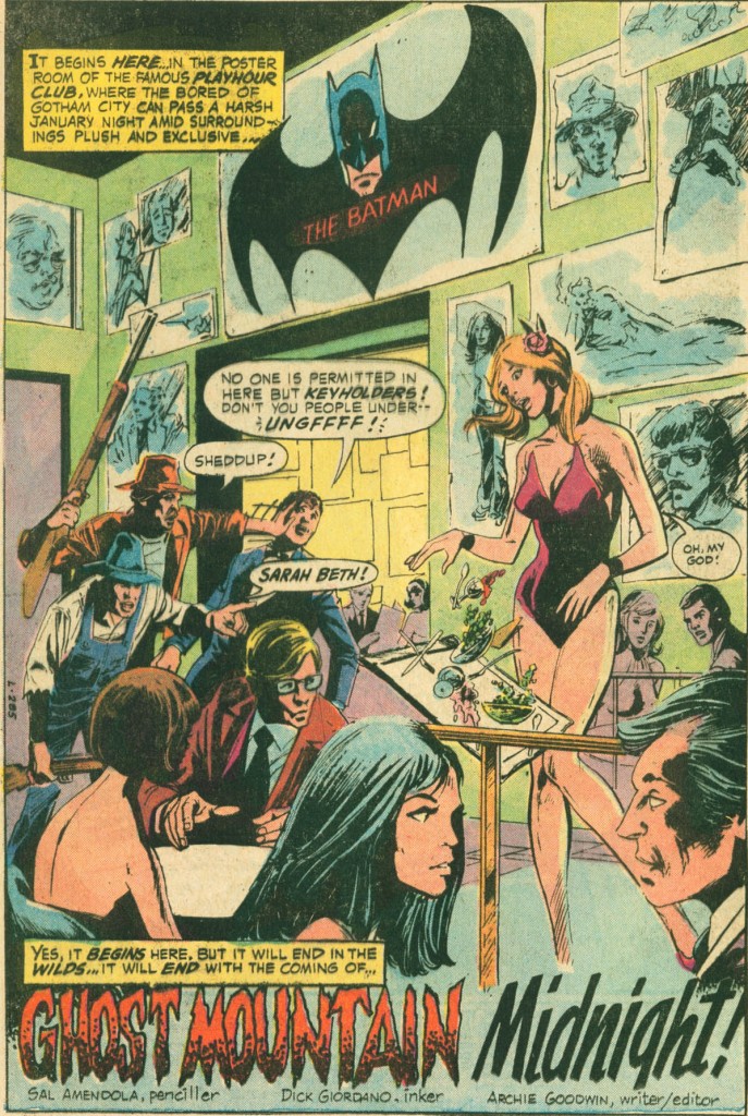 Detective Comics #440
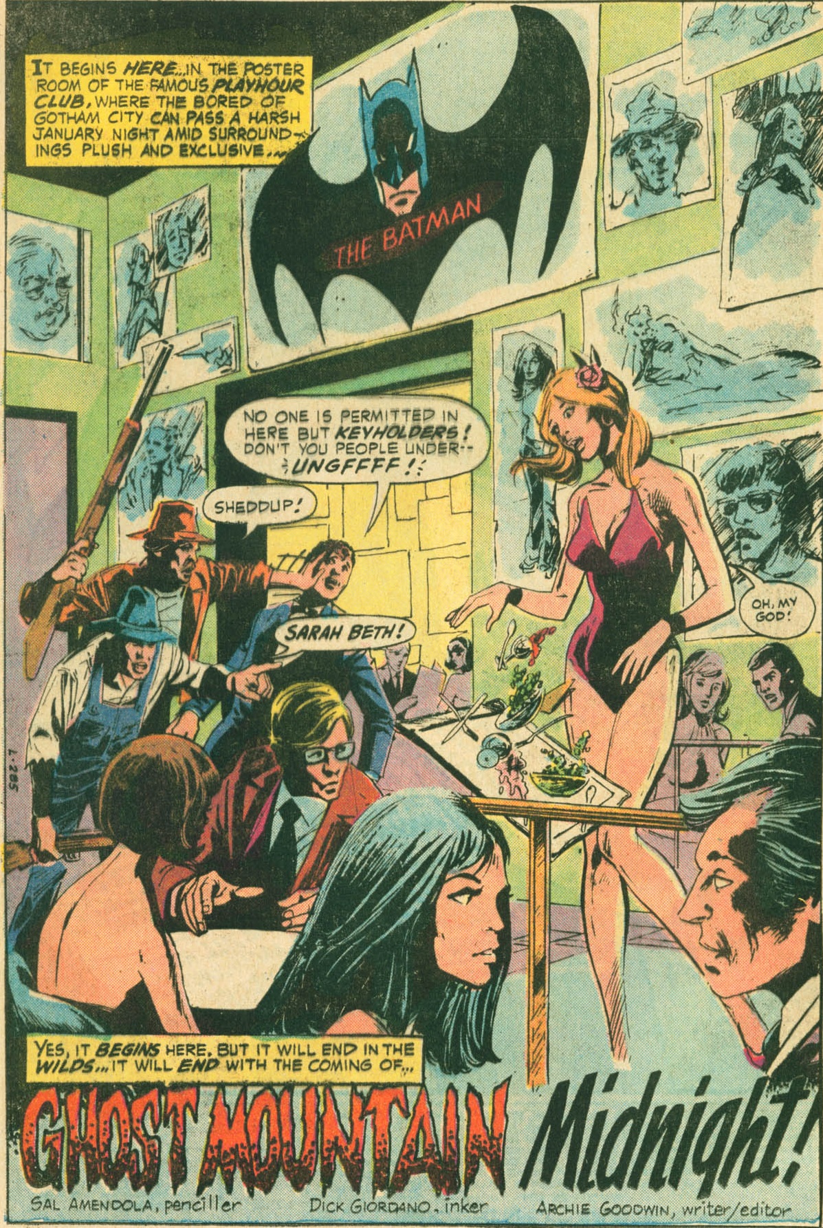
In the page above, Sal Amendola managed to fit in the full logo as well, now disguised as a painting. It is certainly not as powerful, but what the hell… I always enjoy these glimpses into Gotham City’s night life anyway!
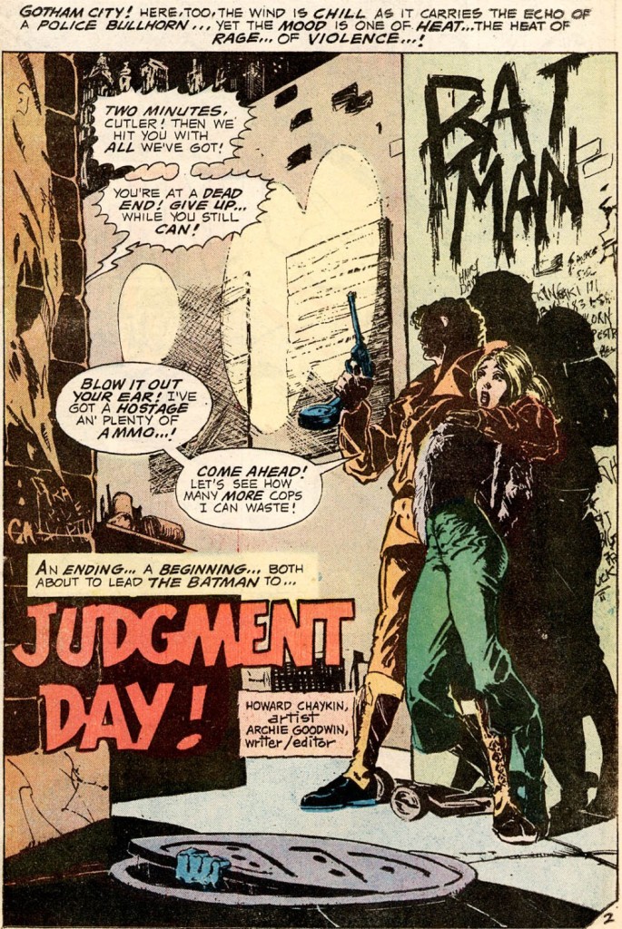 Detective Comics #441

Howard Chaykin’s art at the time wasn’t as experimental and maximalist as it would be in later DC projects (like his insane revamps of The Shadow and Blackhawk). Still, he packed a lot into this gritty page. Not only is there a ‘Batman’ graffiti on the wall, but you can see the Dark Knight beginning to crawl out of the sewer, so you know asses are going to be kicked.
Also, because Chaykin was already Chaykin, it totally says ‘big fat fuck’ on the lower part of the wall.
 Detective Comics #442
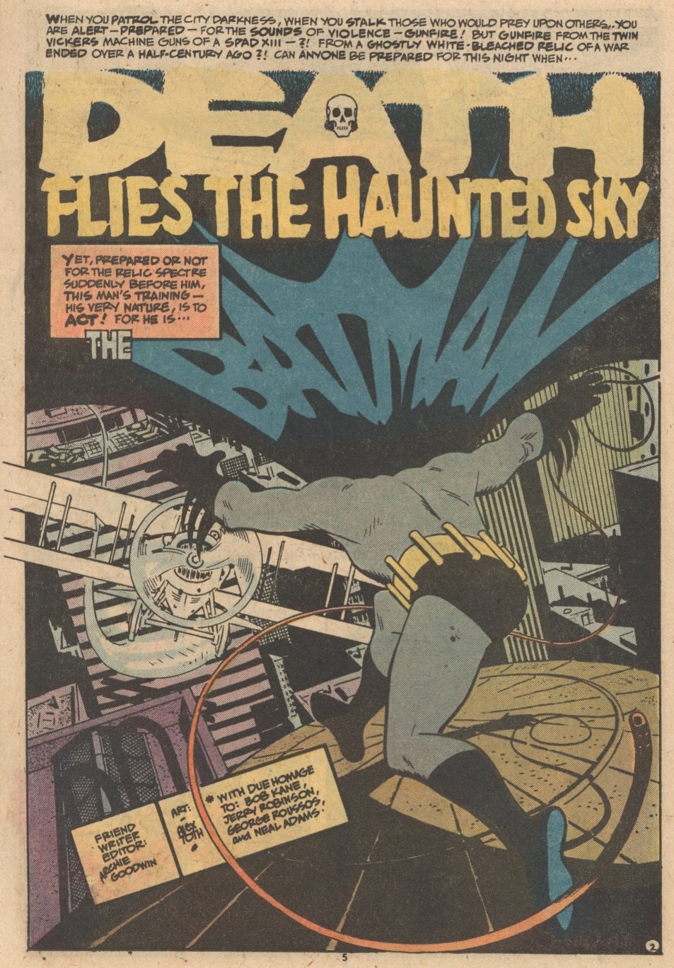
Which brings us to this beauty, by Alex Toth, done in his signature art deco-ish style. It’s a bit crammed, but what a sense of design… I would totally hang this as a poster on my wall.
Moreover, Archie Goodwin took his typical trick of using the narration to build up to the story’s title a little bit further this time. He now added a caption introducing the stylized Batman logo as well. And Toth just ran with it like the genius he was!
Damn it, there was some serious talent working on Batman comics in those days.
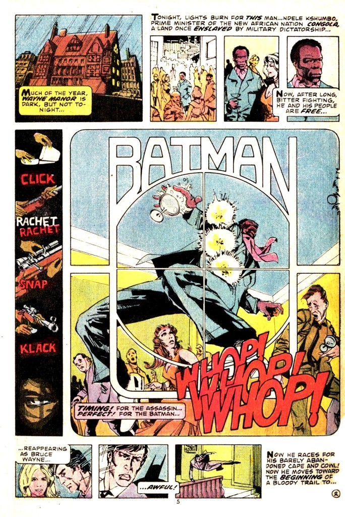 Detective Comics #443

See what I mean by serious talent?
First of all, a moment of silence for Ndele Kshumbo. It must have been bad enough being the Prime Minister of Congola (an imaginary country which I assume at the time was stuck between Mobutu’s ruthless dictatorship in Congo and an Angola still embroiled in its liberation struggle against the Portuguese), but he couldn’t even enjoy a drink in peace when he came to Gotham…
Anyway, Walt Simonson uses the word ‘Batman’ to frame the panel, or rather the sub-panel, from the point of view of the killer. The best part is that Simonson’s art is so dynamic that the word practically works as an additional sound effect – as far as I’m concerned, the last thing Ndele Kshumbo did before he died was shout for the Caped Crusader to avenge him.
And this is all before we actually get to the title & credits page, which is even more of a knockout!