In my world-changing countdown of Ed Hannigan’s Batman covers, I mentioned how much I love it when he put a spin on the series’ logo. Yet Hannigan, God’s gift to cover artists that he undoubtedly is, was hardly the only one to have fun with the iconic design.
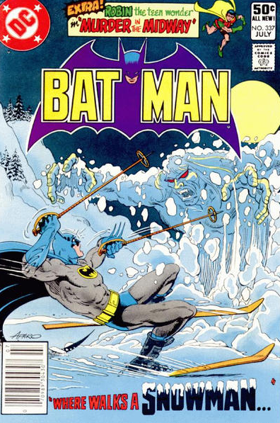
As far as pulling stunts with the cover logo goes, a personal favorite of mine is Batman #354, which actually came out shortly before Ed Hannigan’s legendary run. Before I show it, however, let me try to give you a sense of how innovative it was… Covers for the Batman series had a pretty consistent logo in the early 1980s, bat-shaped and with the Dark Knight’s head between ‘Bat’ and ‘Man.’ You can see it, for example, in this cover which features the Caped Crusader being rudely interrupted while trying to enjoy a ski ride:
While the logo sometimes shifted colors to match each cover’s mood, or was pushed to the background to let other elements shine, it retained a pretty coherent shape and place. This is why it was so cool to see penciller Keith Giffen, inker Dick Giordano, and colorist Anthony Tollin suddenly play with the format:
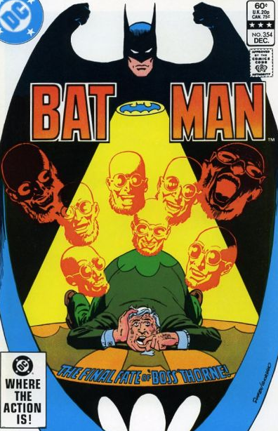
Man, this is such a great cover, particularly in the context of the regular ones that preceded it. Not only does it expand the logo to frame the whole image, it adds further detail to Batman’s face and hands, making it seem as if the Dark Knight himself is hovering over the scene (in fact, his shadow is even projected onto the floor).
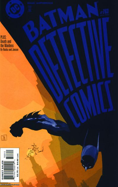
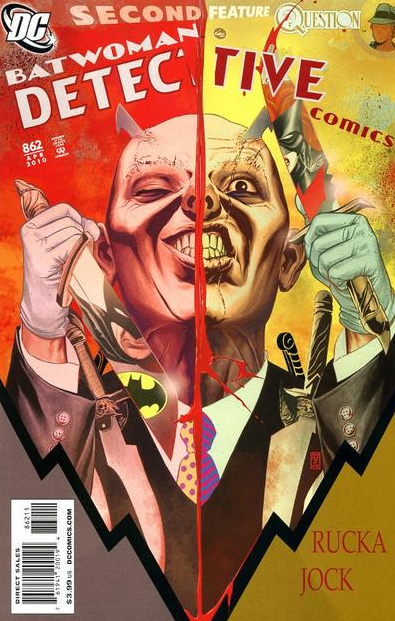
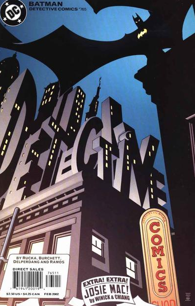
Since then, it has become less groundbreaking to screw with a series’ logo, although it’s still rare enough to jump at you from the stands. Take Detective Comics – I remember being so used to seeing its classic font and format…
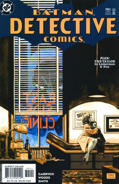
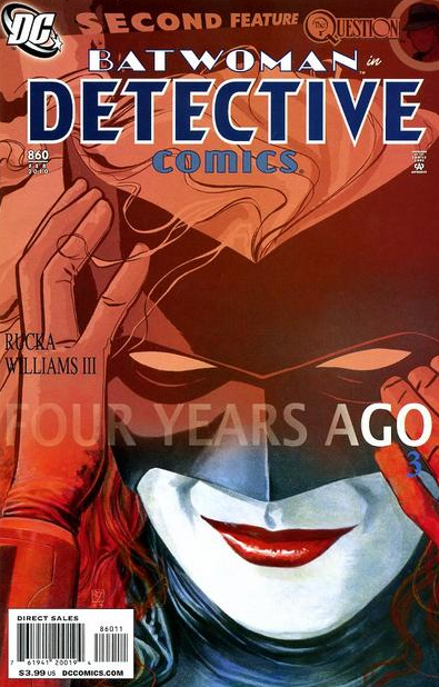
…that merely breaking the pattern was enough to make me giddy for these:
That said, as striking as it can be to simply distort the logo, the covers that really get me are those that integrate it into the layout in particularly clever ways…
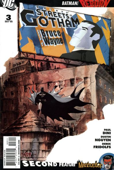
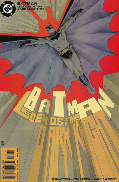
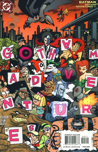
I’m clearly not alone on this. In fact, in 2001 DC challenged its artists to do just that, so across various comics we got covers where the series’ titles were turned into all sorts of objects. This, of course, was insanely awesome (even though DC editors were not ballsy enough to trust their artists, since the titles were also added in a boring font, in small print, to the top of the covers):
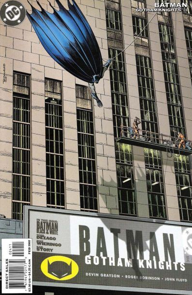
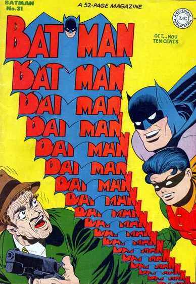
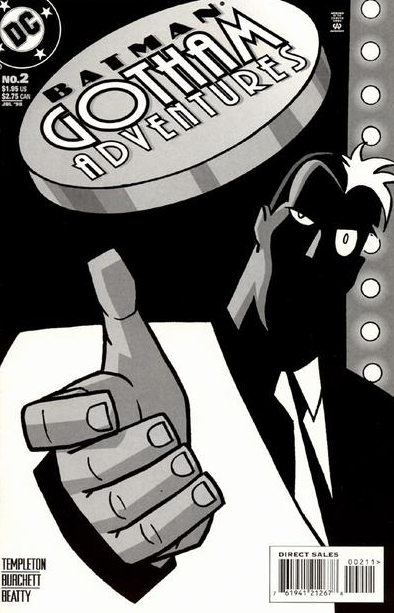
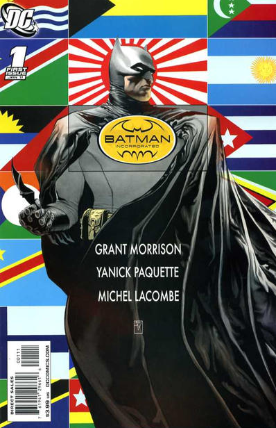
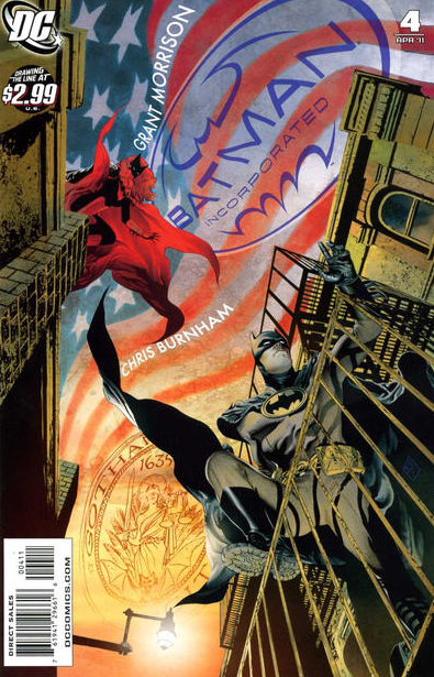
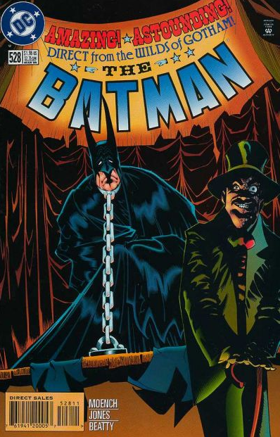
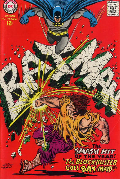
Another neat trick is when, instead of transforming the title logo into a different object, artists just treat it as a solid item in itself. This creates cover images with a twisted internal logic, as Batman interacts with the title of his own comic:
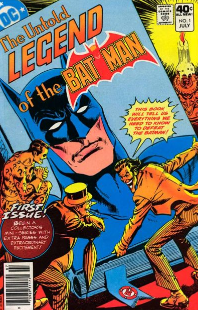
In this subgenre, I particularly like covers where the villains, not content with going after the Dark Knight, just go ahead and destroy his damn logo:
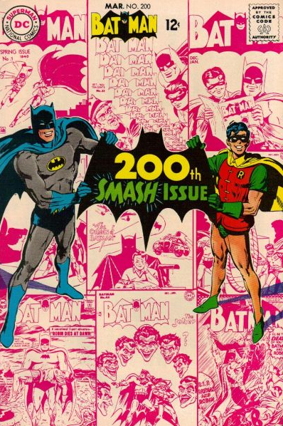
Ultimately, logos are just so much fun that Batman and Robin even got a portable one, to show off on special occasions:
NEXT: Batman turns into an ape.