As much as I enjoy psychedelic, surreal covers, sometimes a realistic image can be just as powerful in its own way. With this in mind, this week I present to you a selection (although not any kind of close analysis) of impressive covers of Batman comics that effectively summarize what their issue’s story is about without resorting to overblown visuals.
Each of these ten examples outlines a clear high concept through simple symbols depicted in a straightforward, figurative style:
BATMAN VS DEADSHOT
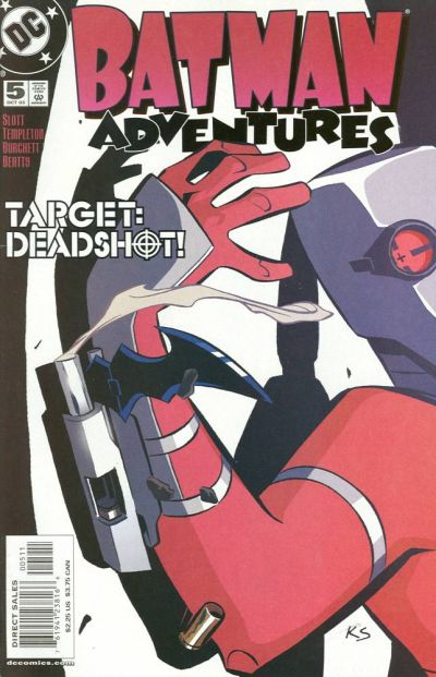 Batman Adventures (v2) #5
BATMAN VS SCARECROW
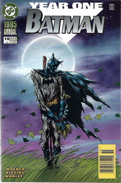 Batman Annual #19
BATMAN GOES TO JAIL
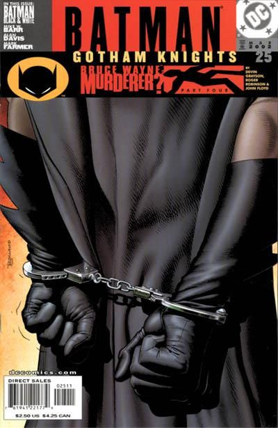 Gotham Knights #25
JLA GOES TO A DESTROYED GOTHAM CITY
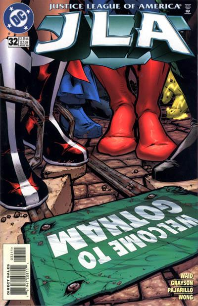 JLA #32
WHO WILL STEP INTO ROBIN’S SHOES?
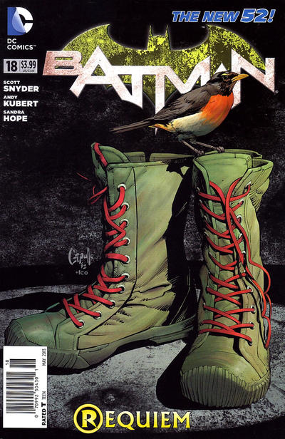 Batman #18
BATMAN’S WAR GAMES END UP IN DEATH
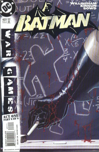 Batman #631
BATMAN & WONDER WOMAN ARE AN ITEM
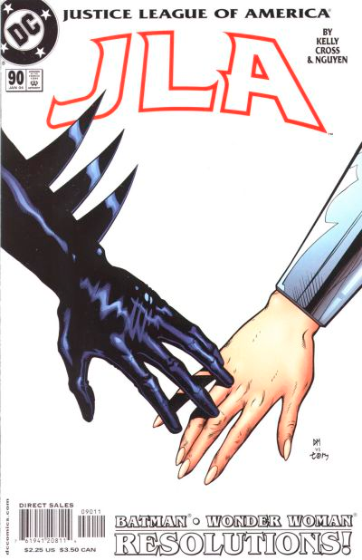 JLA #90
BATMAN VS WONDER WOMAN
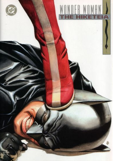 Wonder Woman: The Hiketeia
BATMAN VS GEARHEAD
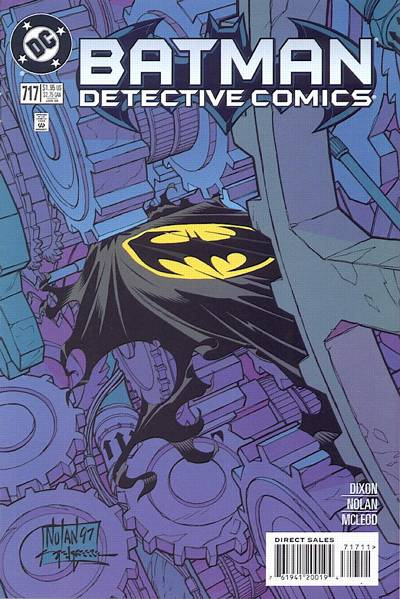 Detective Comics #717
BATMAN VS KEVIN SMITH
 Batman: The Widening Gyre #5
NEXT: Batman goes to court.