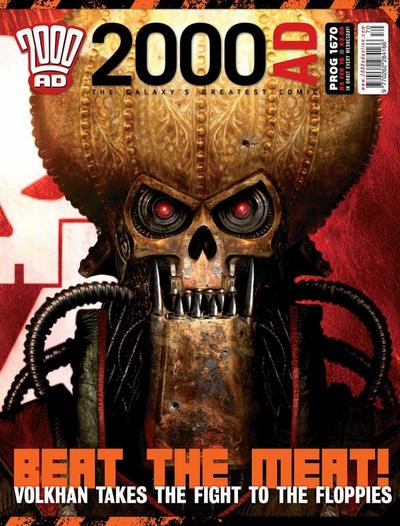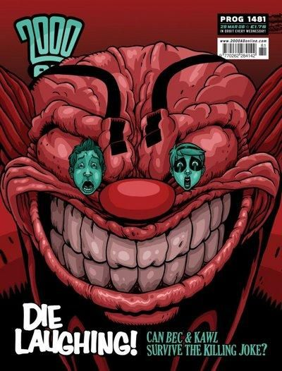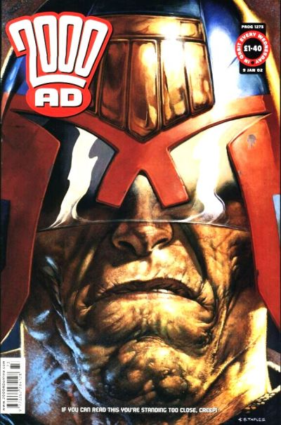
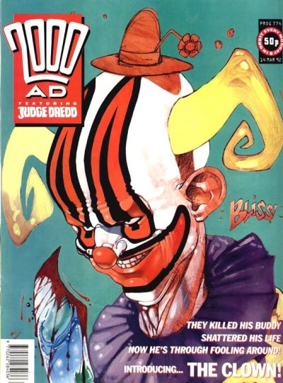
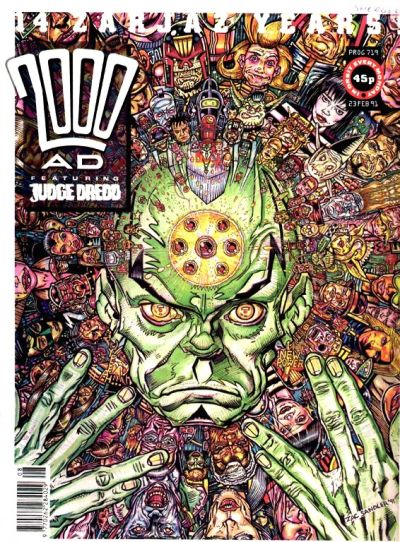
As mentioned before, I’m a huge fan of 2000 AD’s covers, especially of the way they spotlight the amazing character designs in those comics. With that in mind, this week I want to single out a specific subgenre of cover artwork, namely headshots that call attention to the facial features of the vast cast that has populated this anthology throughout the decades.
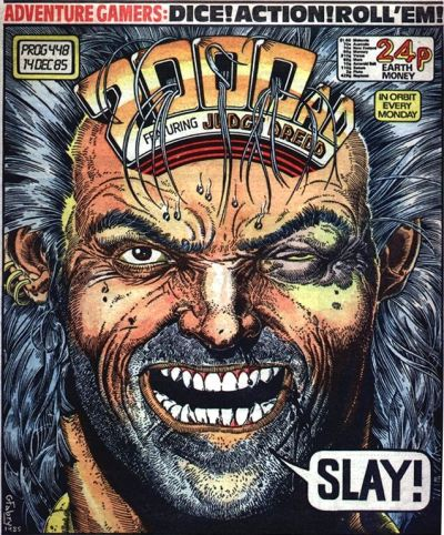
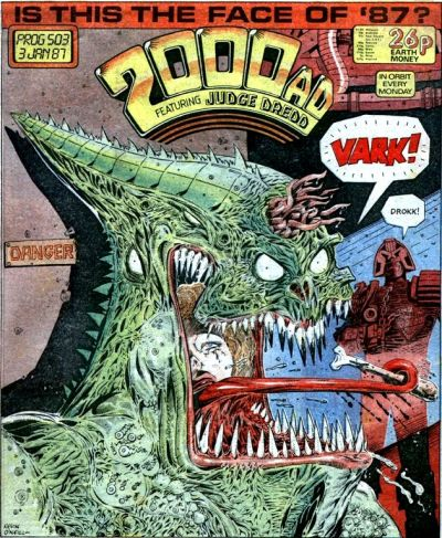
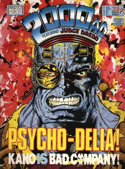
The features of the ‘cover models’ are often grotesque. This matches the magazine’s scornfully caustic outlook of the world as a vile, corrupt, and ultimately ridiculous place.
A key component of 2000 AD’s attitude is that it taps into a ferociously critical branch of science fiction, one that harkens at least as far back as the surreal Taylorist dystopias of Yevgeny Zamyatin’s We and Aldous Huxley’s Brave New World in the early 20th century, and which was kept alive by authors like Octavia E. Butler, with her gritty Parable book series in the ‘90s about a near-future civilizational collapse. Hell, social commentary has become such a standard staple of futuristic sci-fi that even a full-on spectacle shamelessly laden with product placement, such as Michael Bay’s The Island, can contain – seemingly without a trace of self-awareness – a populist indictment of corporate capitalism and celebrate the liberation of alienated workers.
The mix of angry defiance and commercial entertainment is plastered all over these covers…

Arguably the filmmaker that best captured the spirit of 2000 AD was Paul Verhoeven with his cyberpunk trilogy of RoboCop, Total Recall, and Starship Troopers. The latter movie, in particular, was infamously derided as a pure fascist fantasy, its ironic touches deemed insufficient to counterbalance the fact that the protagonists you’re most likely to root for represent an authoritarian civilization fighting an enemy that seems to come out of Nazi propaganda… Similar criticism has been geared towards 2000 AD’s most popular strip, Judge Dredd, but in both cases I’d say it’s too simplistic to merely consider them proto-fascist narratives; I see them more as works about the appeal of fascism (the same applies to Tom Strong, as compellingly argued by Geoff Klock in How to Read Superhero Comics and Why). You may not find fascism appealing, but the recognition that there is something alluring, cathartic, and libidinal about that ideology is not even a provocation anymore – if anything, it’s an invitation to try to understand the rise of the alt-right, from Trump to Bolsonaro.
I keep finding echoes of the visually experimental and politically explosive iconoclasm of 2000 AD – and of Verhoeven, I suppose – in comic books like Marcos Prior’s and David Rubín’s Grand Abyss Hotel, Christopher Sebela’s and Hayden Sherman’s Cold War, or Juan Doe’s Spectro, although they’re bound to be informed by many other sources of inspiration (in the former’s case, certainly Frank Miller and Paul Pope… weirdly combined with the Frankfurt School of Critical Theory).
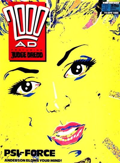

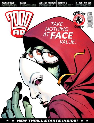
As critics and the magazine’s publisher itself keep remind us, often with a certain degree of self-mythologization, 2000 AD comes from a dark place (its seminal decade mostly coincided with Thatcherism), albeit not devoid of joy (in line with its counter-cultural sensibility). Over the years, creators have taken the chance to cut loose in terms of exaggeration and deformity, as highlighted by the close-ups in the covers. Artists with a remarkably widespread range of styles have had a go at this type of image, halfway between a mugshot and a classical portrait, showing off by detailing not only different faces, but also very different attitudes and expressions. In doing so, they have rendered a set of visceral personifications of society’s rapaciousness and monstrosity.