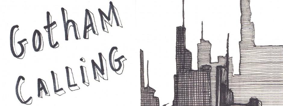

To say that Norm Breyfogle is my favorite Batman artist doesn’t do Breyfogle justice – along with Marshall Rogers’, his artwork is my platonic ideal of what a Batman comic looks like. It’s the first visual that comes to mind whenever I think of the Dark Knight and Gotham City (yes, before Neal Adams’ muscular naturalism or Bruce Timm’s angular style or even Jim Aparo’s increasing minimalism). Every time I write in this blog that a Batman comic looks stiff or ugly or realistic or whatever, you can assume that I always mean, implicitly, ‘compared to the comics drawn by Norm Breyfogle.’
With that in mind, this week I’ll try to break down exactly what makes Norm Breyfogle’s drawings so memorable. Part of the reason has to do with timing, of course, as Breyfogle regularly drew the Caped Crusader between 1987 and 1995, which is one of my favorite eras of the franchise in terms of stories, so it’s not surprising his images left such a strong impression on me (he also worked on a few Batman-related special projects until 2014, when he suffered a debilitating stroke). Yet a lot of it, I’d argue, has to do specifically with Breyfogle’s own artistry…
 Detective Comics #579
It’s not hard to see why DC first decided to assign the 26-year-old Norm Breyfogle the gig of illustrating one of their core books, Detective Comics. At the time, Breyfogle was drawing and lettering Steven Grant’s Whisper, a cocktail of ninjas, yakuza crime lords, and shadowy government conspiracies, mostly set in the gritty streets of New York (i.e. the most ‘80s comic of the eighties, just as Miracle Mile is the most ‘80s movie of the eighties), so it wasn’t a big jump to Gotham City. After all, Batman has traditionally benefitted from the fact that the superhero genre lends itself quite well to crosspollination with street-level crime fiction (a fact that Netflix went on to further prove through their excellent live-action series Daredevil and Luke Cage) and Breyfogle seemed right at home in this intersection.
Besides instilling Gotham with suitably seedy aesthetics, Norm Breyfogle could pull off blistering action scenes like few in the business, his pencils – which he gracefully inked himself – oozing a particular sort of fluidity… In fact, two sorts of fluidity. First of all, his characters (especially the Dynamic Duo, as you can see above) displayed incredibly fluid movements, their fights an acrobatic choreography not unlike a violent type of ballet. One of my issues with Batman’s live-action adaptations is precisely how static the Caped Crusader tends to look on the screen, in contrast to the elegance and vitality of Breyfogle’s version, who never misses an opportunity to engage in circus-worthy pirouettes:
 Batman #462
Yet the fluidity doesn’t apply just to the cast’s sweeping sense of movement, but also to the whole reading experience. Whether you’re following Batman’s moves or perhaps peeking into somebody else’s conversation, your eyes just flow through every page, flying to the end of each issue. Norm Breyfogle’s sharp, mostly diagonal lines expertly direct the readers’ pace and gaze, often in a speedy zigzag motion, making his comics feel like a dizzying shot of adrenaline. I know they’re still, but the images appear to slide in every direction, even sometimes advancing towards us as if trying to rub their intensity in our faces.
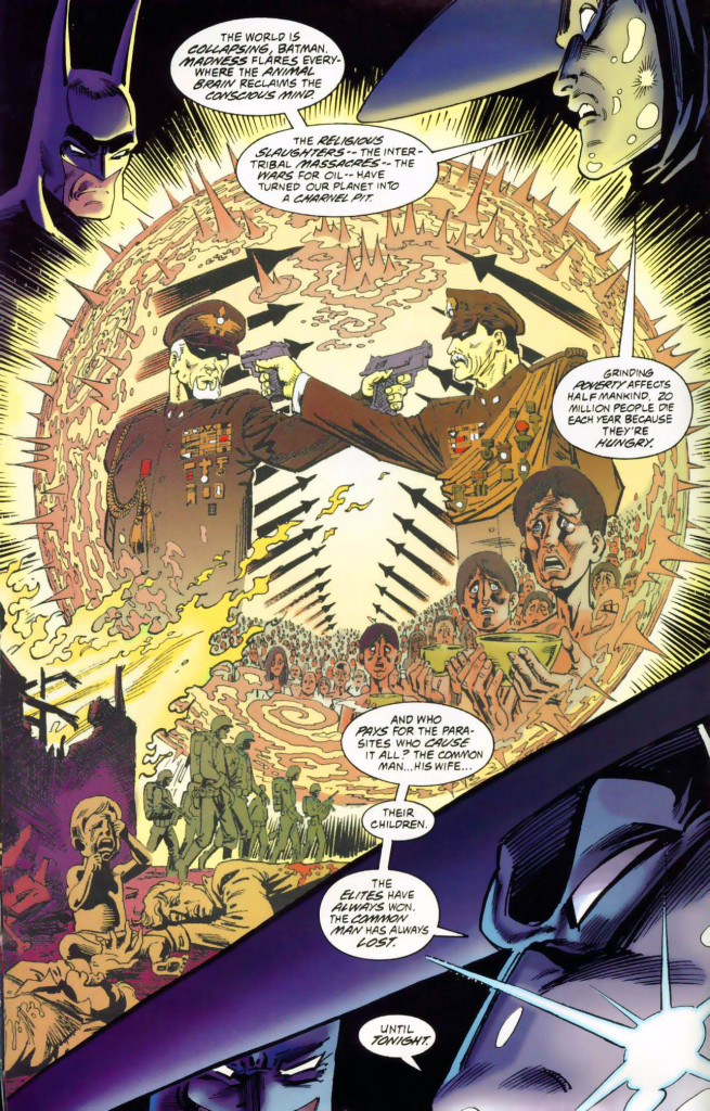
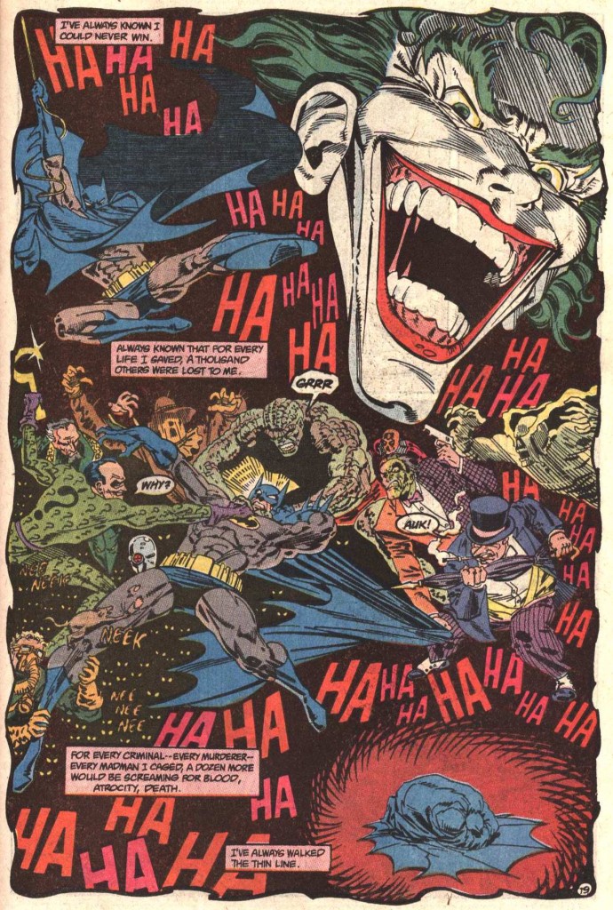
The ensuing dynamism – along with Breyfogle’s emotion-heavy facial expressions – made for a happy match with Alan Grant’s scripts, which were full of over-the-top action and sensationalist set pieces…
 Shadow of the Bat #5
Indeed, Norm Breyfogle’s early collaborations with Alan Grant (no relation to Steven) – first in their Detective Comics run and then in Batman and Shadow of the Bat – had a punk-ish mix of grittiness and lunacy akin to that of a lot of cult cinema from this era, like Russel Mulcahy’s Highlander, Dan O’Bannon’s Return of the Living Dead, and Alex Cox’s Repo Man (I could easily imagine Breyfogle & Grant adapting any of these to comics!). Their Gotham was a nocturnal carnival of graffiti-sprayed derelict buildings bursting with delinquent youth gangs and homeless people, no doubt enwrapped in the stench of littered garbage and the sweat of desperate junkies. Hell, you can practically hear Bad Religion’s ‘In the Night’ blasting on the soundtrack (or Cameron Howe’s playlists from Halt and Catch Fire, for that matter).
Breyfogle was such a master of layouts that he even dared experiment with exuberant gimmicks, like in this page where the Dark Knight lends his shape to the panel borders:
 Batman #458
Norm Breyfogle’s stupendous flair for composition was seen in his covers as well. I particularly like the ones in which Breyfogle spotlighted the issues’ villains while treating the Caped Crusader as this eerie looming presence (thus capturing the rogues’ inner perspective), conveyed through shadows and silhouettes:


Probably a good way to understand the level of dedication and consideration Norm Breyfogle put into his Batman work, effectively channeling his outstanding talent into a commercial assignment for a lowbrow corner of popular culture, can be found in a passionate letter he wrote to The Comics Journal, in 1988, defending Steven Grant against Gary Groth’s narrow definition of what – and whom – should be considered artistic: ‘Are [Frank] Miller and [Alan] Moore “artists” only because they push present limits? No. Their work is meaningful or beautiful as well. One can be meaningful or beautiful within almost any limits, in fact, all Art and all life exists within limits. (It’s always amused and frustrated me how the world of “modern” fine art fails to understand this fully.) The impressionists’ work is forever beautiful, in my mind forever Art, but they were originally considered iconoclasts and are now old hat! Surely this alone doesn’t make a present-day impressionist a non-artist! If one is overtly concerned with the present definition of “Art” one cannot create.’ He concluded that ‘all Art depends on both sophistication and naivite.’
The belief that artistic value could find a place even in a formulaic franchise shines through in the way Breyfogle approached each cover or page as a single piece, to the point where it’s hard to detach one panel or detail from the rest (believe me, I’ve tried, for this blog, and his images put up a bigger fight than those of most other Batman artists when it comes to singling out specific bits). As a result, it is a joy to study many of his pages, appreciating how he carefully crafted them as a fluid whole.
This is especially true of Norm Breyfogle’s painted art on the superb graphic novel Birth of the Demon (which remains the best version of Ra’s al Ghul’s origin story), but you can still see it in some of his later work…
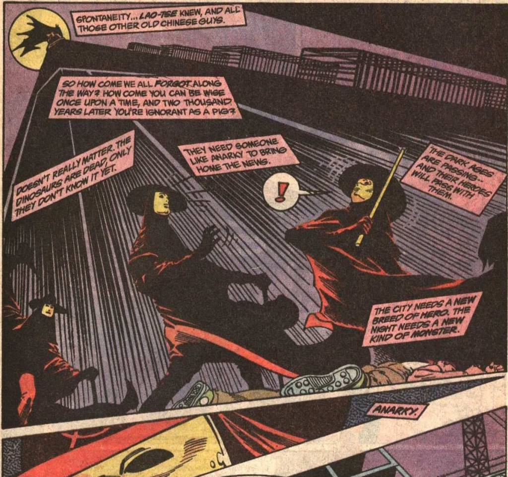
 Anarky #3

(Yes, the digital coloring doesn’t suit Breyfogle’s smooth pencils so neatly…)
The page above is from a series starring the Gotham City vigilante Anarky, which Norm Breyfogle co-created with Alan Grant back in 1989. That character has one of Breyfogle’s most remarkable designs – his look has traces of the protagonist from Alan Moore’s and David Lloyd’s brilliant V for Vendetta (thus visually translating that comic’s obvious inspiration for the creation of the whole Anarky concept), yet you could tell from the start that there was something peculiar about the way he moved…
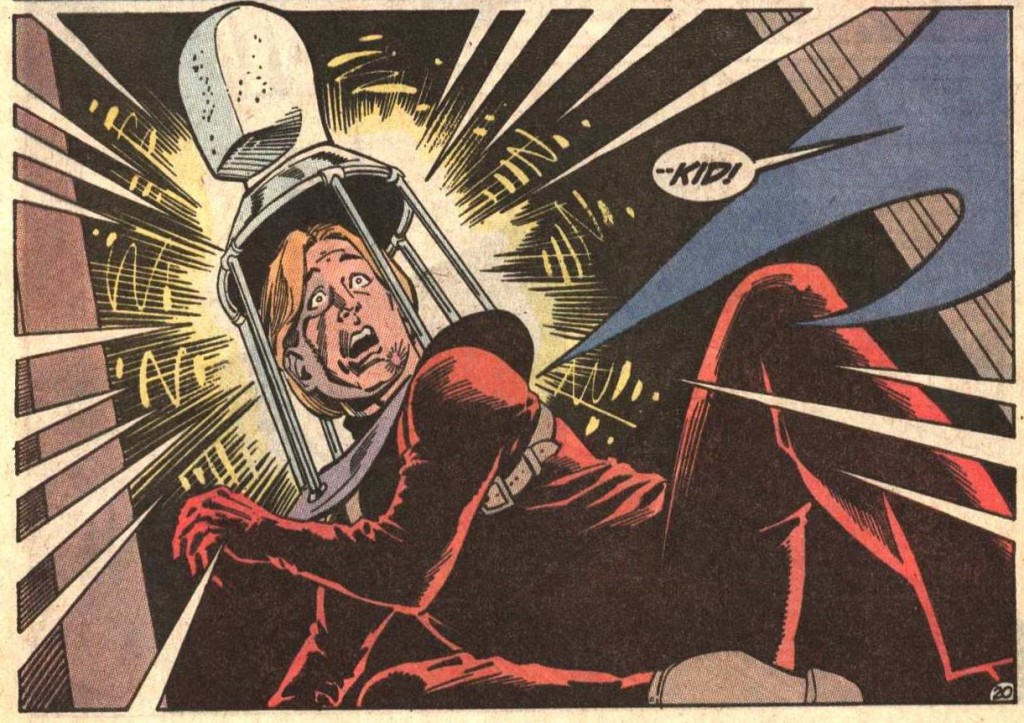
 Detective Comics #609

And, sure enough, it was soon revealed that the costume disguised the vigilante’s identity beyond hiding his face. It was actually an elaborate contraption that misled witnesses – and the initial readers – about the character’s whole physiognomy, thus creating a clever red herring before the revelation at the end of Anarky’s introductory arc, which made the unmasking much more impactful:
 Detective Comics #609

Besides Anarky, Norm Breyfogle designed several other recurring villains, such as the Ratcatcher, the Corrosive Man, Mortimer Kadaver, Victor Zsasz, and Amygdala. My favorite ones actually made their debut quite early on, namely the Ventriloquist and his puppet, Scarface, both of which stood out as soon as they showed up… although, to be fair, puppets are inherently creepy as a rule anyway (that said, as far as comic puppets go, nothing beats The Vault of Horror’s short story ‘Strung Along’).
On top of all of these original designs, Breyfogle also got to put his spin on pre-existing characters, often making them more elongated, flexible, and expressive than usual – including the Dark Knight himself, who looked much more emotionally versatile in these comics. Here is Breyfogle having a go at many of the classic members of Batman’s Rogues’ Gallery:
 Detective Comics #606

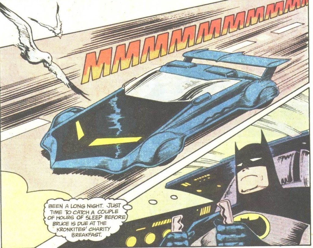
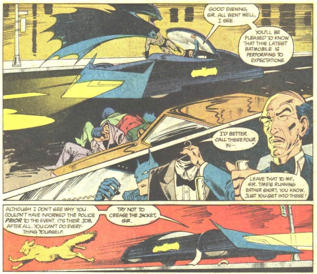
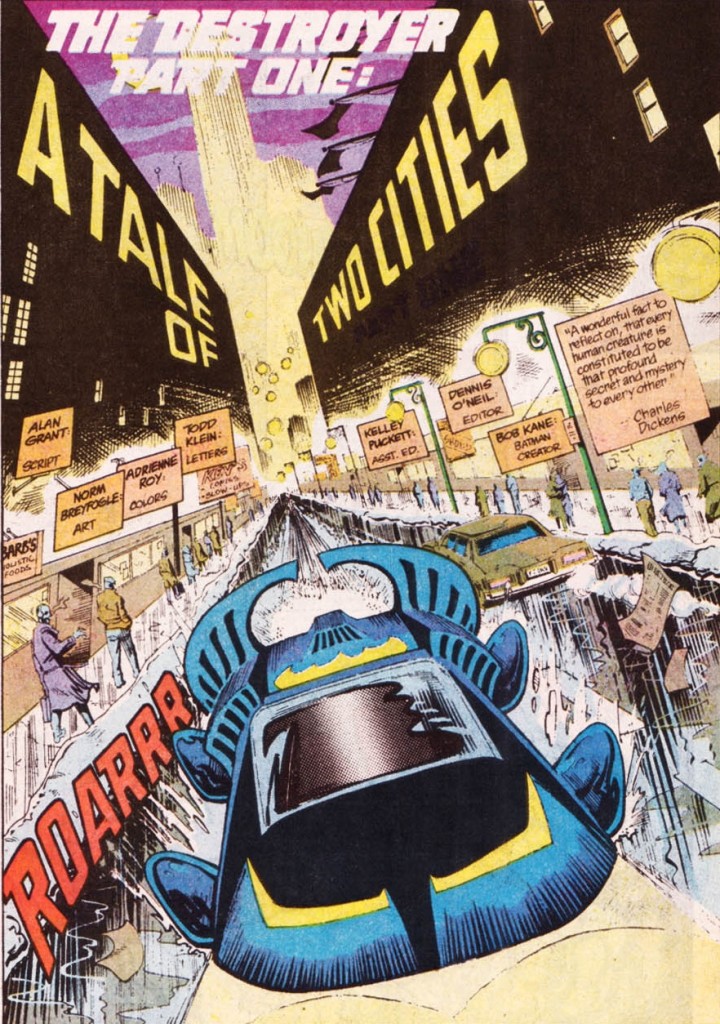
Finally – and speaking of redesigning old concepts – I have to mention Norm Breyfogle’s idiosyncratic approach to the Batmobile, which he kept reinventing every few issues.
He started out with a variation of the Lincoln Futura from the 1966 TV show, which had a brief revival in the mid-1980s….
 Detective Comics #584
(Here is Klaus Janson’s version, in case you want to compare.)
…and he soon went on to introduce a number of new versions, each of them more futuristic-looking than the last:
 Detective Comics #589

 Detective Comics #591

 Detective Comics #601
The apparent reasoning behind this was that, at the end of the day, Bruce Wayne was a rich guy who was into gadgets, so he was bound to have a large car collection. Plus, he probably crashed the Batmobile all the time, what with all those death-defying chases…
Cars can be an efficient way to convey their owner’s characterization and Norm Breyfogle’s slick, ever-changing Batmobiles did just that in a fun and relatively subtle way. Perhaps he was inspired by Jack Kirby, who also tended to use strange machinery to reveal aspects of the cast in his work, although the King of Comics was less subtle about it. For instance, you can tell the guy below is up to no good just because even his car looks so damn evil!
 2001: A Space Odyssey #9
Ultimately, the string of vehicles demonstrated Batman’s – and Breyfogle’s – restlessness and perfectionism, constantly searching for new aerodynamic forms to suit the larger purpose of making crime-fighting looking freaking cool.
 Batman #474

Great post. He’s my all time fav artist. Love your writing.
Great stuff. I’ve only discovered Breyfogle in recent years and I wish his Batman years were reprinted more often. With DC being DC, it might take decades to have all of his work available for us. That’s a shame, because for me, he’s up there with Jack Kirby and Jim Lee as one of the comic artists that truly stand out with a unique and groundbreaking styles.
Maybe we’ll get more of his work with the new DC Finest line (there’s already at least one issue penciled by him expected in those) – though it seems that the chance this line presents, in the case of Batman, will mostly be used to reprint The Killing Joke and Year One for the gazillionth time.