This week we’re back to spotlighting comic book covers in Gotham Calling.
I’m quite fascinated by the work of Joe Simon on the covers of Dick Tracy back in the early 1950s, when monthly issues collected Chester Gould’s iconic daily newspaper strips about a tough, square-jawed police inspector’s crusade against organized crime.
Because I first encountered Dick Tracy as a kid-friendly cartoon show and, later, as a surreal comedy film (where Al Pacino played his funniest gangster outside of Donnie Brasco, if not Scarface), for a long time I associated it with a relatively light, whimsical take on the crime genre, somewhere between Will Eisner’s The Spirit and Golden Age Batman comics. This means that, when I finally came across the original Dick Tracy stories, I was shocked and amused by how unabashedly sadistic they turned out to be.
I now realize that cruelty was as much a trademark of the series as the gadgets, the silly names, and the goofy-looking villains (Pearshape, Flaptop, Pruneface…). This spirit was certainly kept in 2018, when Dick Tracy was rebooted in the IDW mini-series Dead or Alive. Although superficially set in the present, that series emulated the original’s idiosyncratic brand of pulp, courtesy of a team of wonderful creators whose work had always seemed heavily inspired by Chester Gould’s comics in the first place (Rich Tommaso along with Lee, Michael, and Laura Allred).
In turn, while Michael Avon Oeming’s Dick Tracy: Forever began by returning the characters to their initial historical setting, for the most part that series substantially toned down the nastiness. Oeming’s artwork – colored by Taki Soma – looked absolutely lovely and the storytelling was pretty ambitious (gradually moving from a pastiche of Sunday strips into cyberpunk metafiction), but the result nevertheless felt somewhat sanitized and defanged in comparison to pre-Code comics…
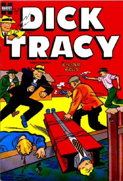
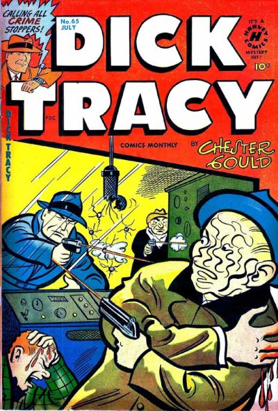
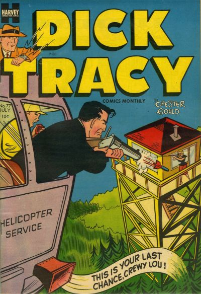
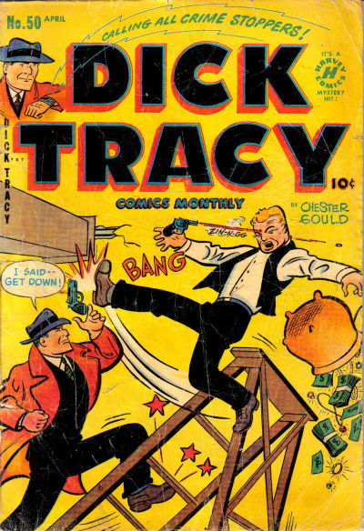
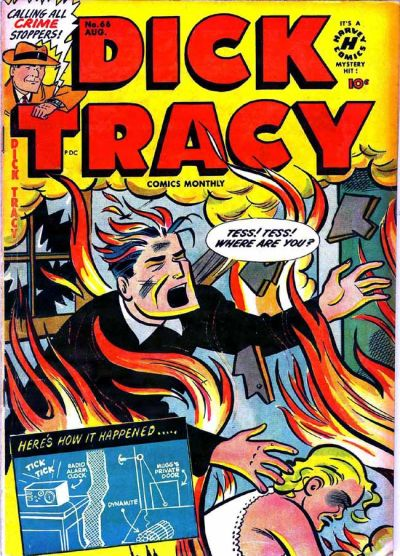
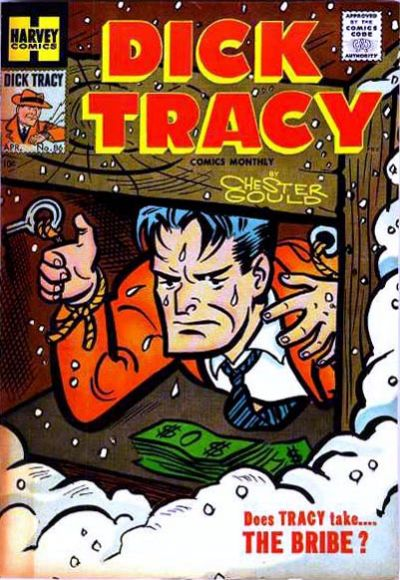
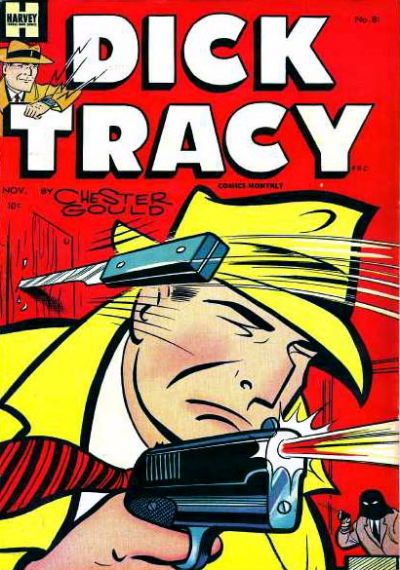
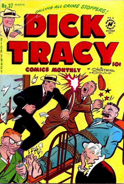
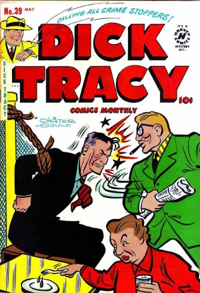
As you can see above and below, the old comics pushed the contrast between colorful, naïve aesthetics and a committedly hardboiled tone to outrageous extremes. They’re full of blood, death, and torture, but there is also a cartoony edge to them, both in the caricatural character designs and in the overblown situations they depict.
Moreover, if there is one thing Joe Simon knew how to do was how to put together a striking layout (after all, he co-designed, with Jack Kirby, the mythical cover of Captain America Comics #1!). His covers for Dick Tracy are incredible pieces of storytelling, framing dynamic compositions with interlocked actions at multiple levels (usually playing with the foreground and background) so as to conjure up an elaborate scene – hell, almost an entire story – from a single image.
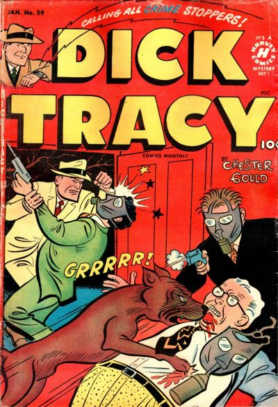
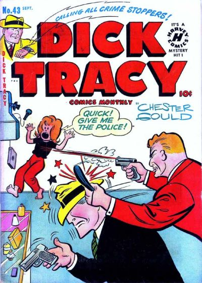
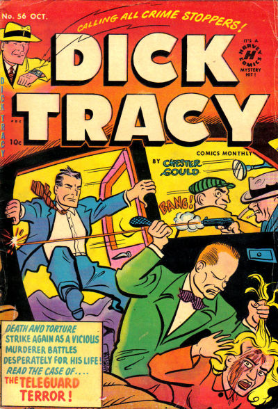
Whether showing the titular protagonist getting viciously attacked or featuring him mercilessly inflicting pain on outlaws, the covers drawn by Joe Simon (ghosting for Gould) aren’t mocking film noir or distorting old Dick Tracy comics – they ARE old Dick Tracy comics (even if the strip had been around for over twenty years by the time these specific collections came out). They’re also not spoofing police brutality or the panic over racketeering, since the series seems very clearly on the side of authority. In fact, Simon’s covers do perfect justice to the stories inside. And yet, retroactively, they came off as misleadingly iconoclastic in my eyes – their violence not only perversely thrilling, but comically grotesque.
Here are a few more bombastic examples that made me feel this way: