An imposing reminder that comics can be awesome:
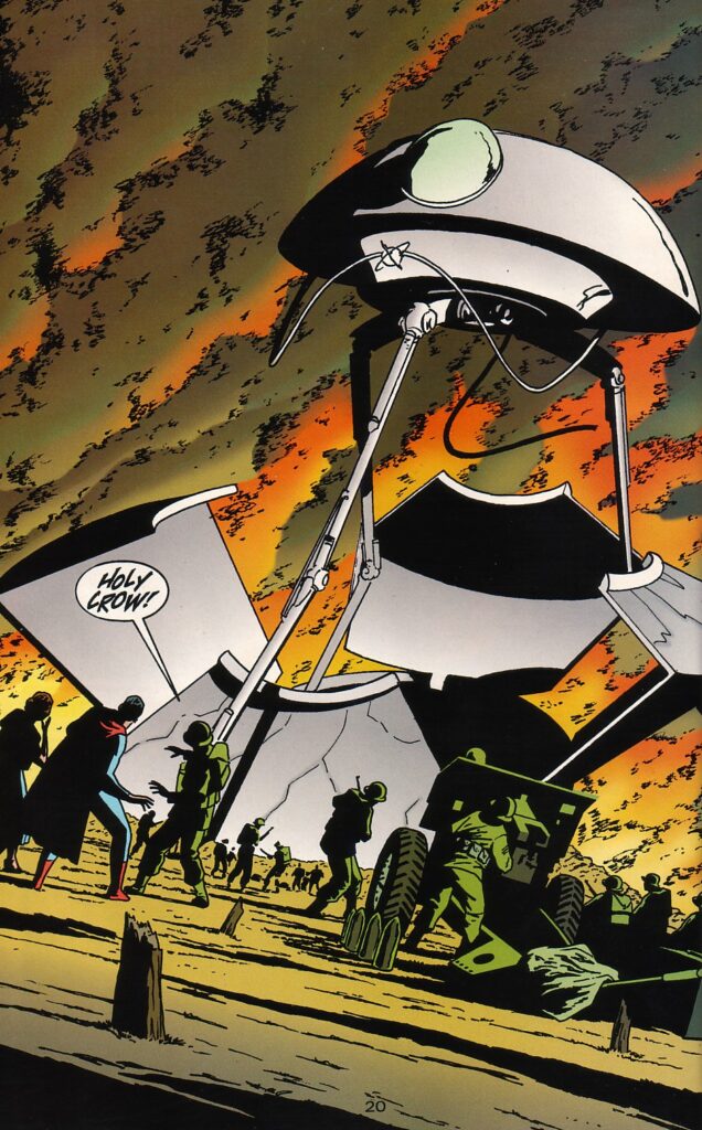
Superman: War of the Worlds
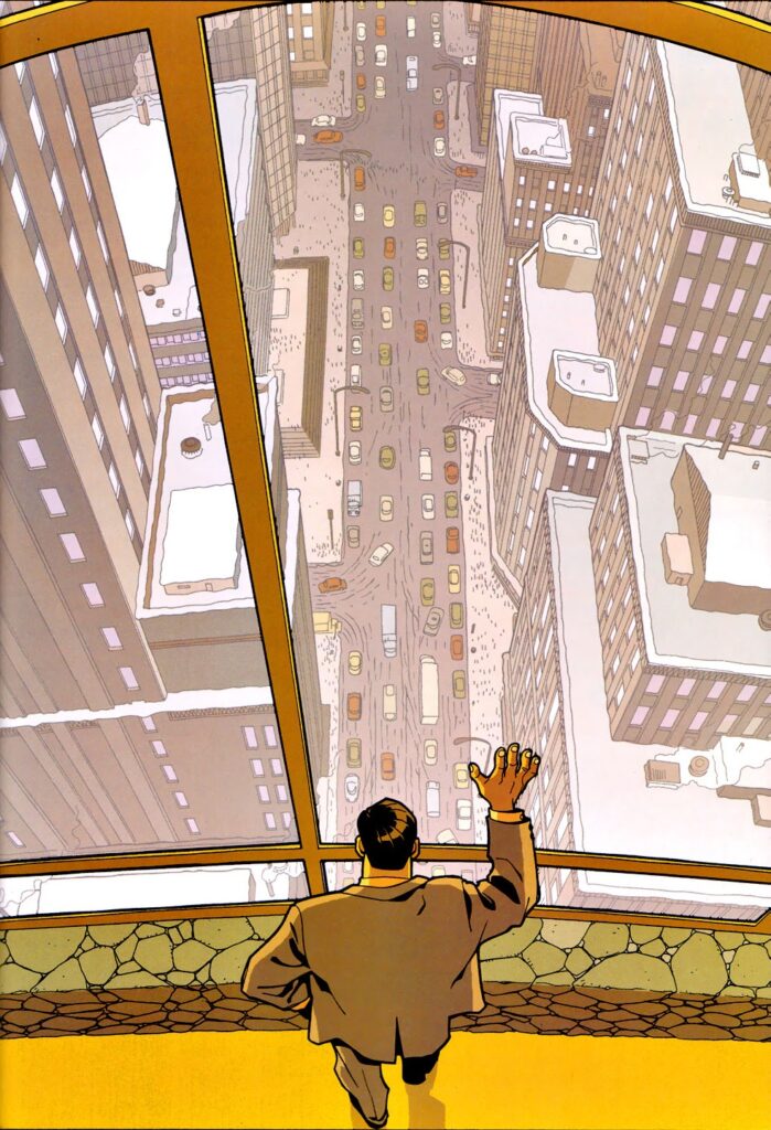
Batman: Tenses #1
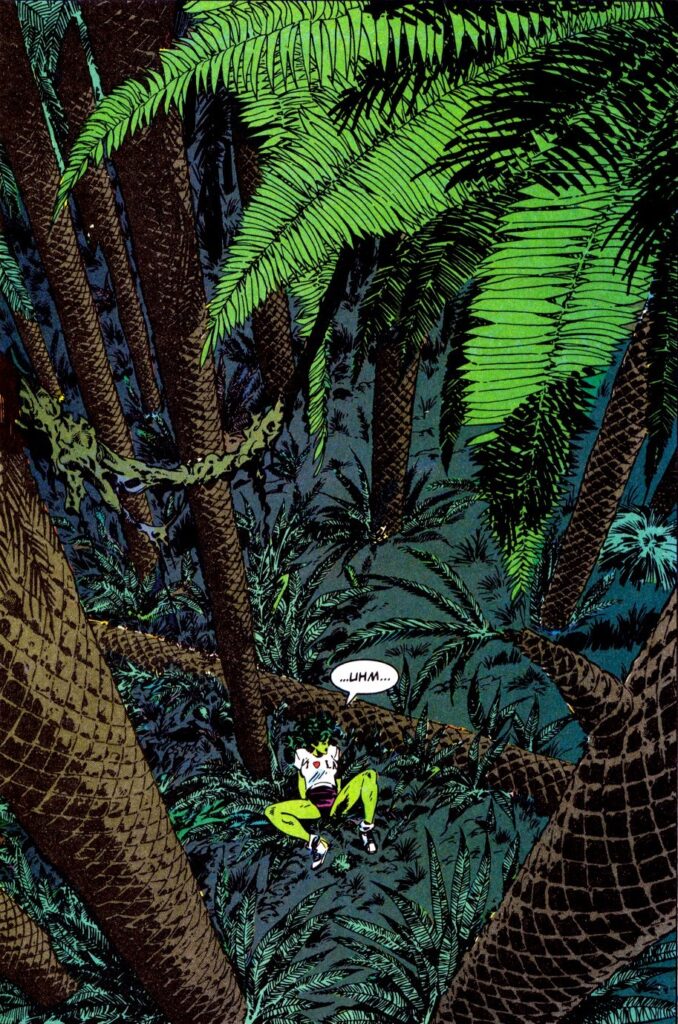
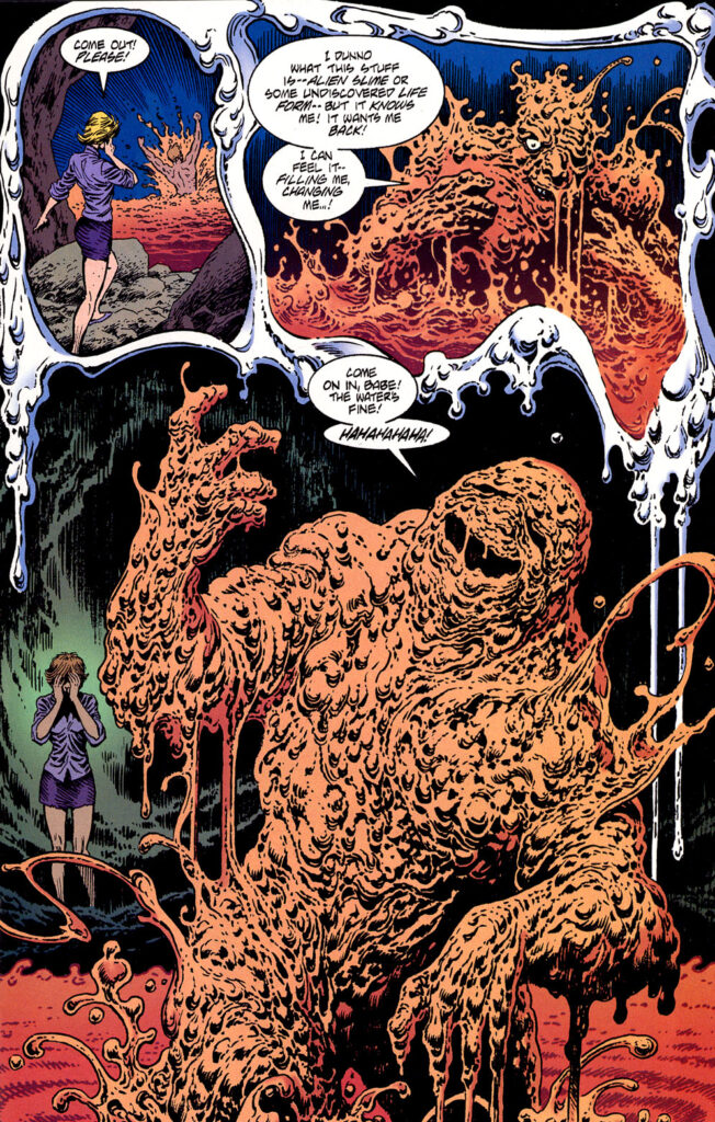
The Sensational She-Hulk #5
An imposing reminder that comics can be awesome:
Superman: War of the Worlds
Batman: Tenses #1
The Sensational She-Hulk #5
One of the things I enjoy doing at Gotham Calling is to quickly zoom in on specific skills and quirks of the many awesome artists of Batman comics, from Don Newton and Tim Levins to Graham Nolan and Frank Robbins. Today, I want to spotlight one of my favorite traits of Enrique ‘Quique’ Alcatena, namely his flair for adorning panel borders with flourishes that bring out each story’s core motifs…
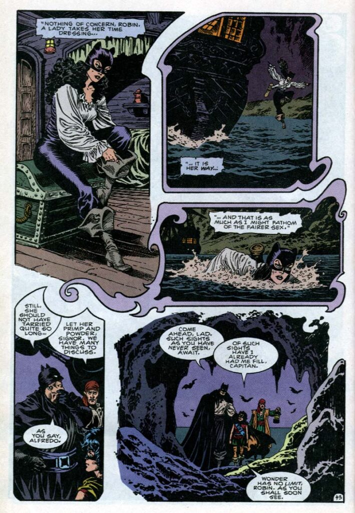
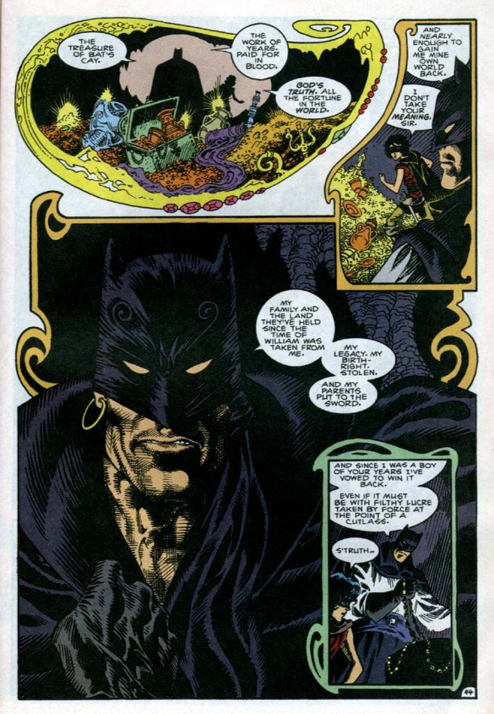
Detective Comics Annual #7
A self-taught Argentinian artist, Quique Alcatena entered British comics in the late 1970s and eventually made his way to DC, where his first Batman work was this 1994 swashbuckling period piece set in an alternate reality where the Dark Knight is an English pirate called Leatherwing who targets Iberian galleons in the Caribbean.
Ah, pirates… It’s not too much of a stretch to see a family tree growing from these violent outlaw figures operating by their own code (at least as depicted in popular culture) to Zorro and, by extension, to the Caped Crusader strand of virile, if campy, vigilantes. Now, as far as pirate comics go, this one isn’t as nastily funny as Isle of 100,000 Graves or Portrait of a Drunk, but Chuck Dixon’s script is nevertheless highly amusing, what with its quaint turns of phrase, rhymed narration, and the way it reimagines the Batman mythos (including a cathartic reversal of A Death in the Family). Alcatena’s deadpan – yet baroque – artwork helps sell the humor, redesigning the cast’s extravagant garments with a straight face while placing them in a lavishly illustrated adventure.
The ornate panel borders, beside serving a practical function in the pages’ layout (for instance, clearly separating the scene with an ersatz-Catwoman fleeing the ship from the one about Leatherwing, Robin, and Alfredo in this version of the Batcave – the Bat Cay), contribute to the whimsical faux-historical spirit. The arabesques above may resemble the jewelry one might find in Leatherwing’s treasure, but they’re clearly also meant to evoke the illuminated manuscripts of old… Or, better yet – and perhaps deliberately – they rather evoke the pastiche of such illuminations you could find in the sort of pulp magazines Dixon probably read for inspiration, so that the access to the 18th century is openly mediated by the fiction of a much more recent past, thus adding yet another layer of history – and intertextuality – to this Elseworlds tale.
(Dixon and Alcatena later reunited for a fun sequel entirely made of verses and splash pages, ‘The Bride of Leatherwing,’ published in Batman Chronicles #11.)
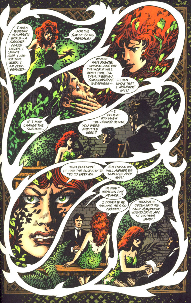
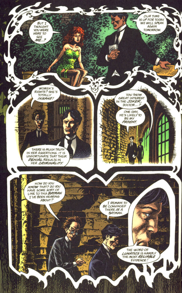
The Batman of Arkham
2000’s The Batman of Arkham one-shot is another Elseworlds tale, and another period piece, but instead of a pulpy romantic adventure, we now get a gothic horror psychodrama set in 1900 where a version of Bruce Wayne is a Freudian doctor in a post-Bedlam Arkham Asylum.
Tonally, it’s a very different comic. It was penned by Alan Grant, one of the most interesting and prolific Batman writers, who had an instinct for injecting even the most lowbrow material with his passionate political and philosophical concerns, often resulting in provocative and/or weird projects. Grant occasionally used the freedom and storytelling potential of Elseworld narratives not just to rearrange the Dark Knight’s tropes and aesthetics, but also to problematize the franchise’s values through recontextualization. In The Batman of Arkham, he challenges the series’ standard problematic depiction of mental illness as evil, unimprovable, and contained only through violence and incarceration… Here, such a worldview is linked to outdated, century-old ideas attributed to a villain (Jonathan Crane) and actively fought against by a hero who argues that ‘Men are made evil.’ (Plus, as you can see in the scan above, when it comes to women, the very notion of ‘evil’ is externally imposed in order to preserve reactionary social norms.)
Quique Alcatena pushed his quirky panel borders to a new degree. Besides enhancing specific atmospheres (dizzying in the first page above, which suits Poison Ivy’s hypnotic seduction moves; generally stiff and oppressive in the scene at the bottom of the second page, just like Crane’s conversation with Wayne), they appear to project characters’ states of mind, which makes thematic sense in such a psychological story.
Thus, the borders around Poison Ivy look like climbing vines, not least because they are superimposed over some kind of wooden garden fence that frames the whole page. This ties both into the fact that the character typically identifies with nature (reinforced by the leaves coming out of her hair, although that may have been an additional choice by colorist Noelle Giddings) and into how twisty and entangled Ivy is feeling at the moment, restrained as she is for the crime of seeking liberation. Likewise, the borders of the very final panels, around Bruce Wayne and Jonathan Crane, shift from a rational angularity to a sinister melted shape, a distortion that suggests the characters are heading in a darker direction (in the case of Crane, this is complemented by the unnaturalistic Scarecrow-ish shadow).
Grant and Alcatena formed quite a team. In fact, they had already partnered up a few years before, in Legends of the Dark Knight #89-90, where they had reimagined the origin of Clayface…
Legends of the Dark Knight #90
This image really stuck with me over the years. ‘Clay’ is both a horror story and a story about horror, as early-career Batman is still learning to cope with fear and supernatural threats… and here Quique Alcatena – ever a master of the medium – nails it perfectly, not just through Clayface’s horrifyingly grotesque design, but also through the eerie way the magical shape-shifting matter appears to contaminate the page’s whole layout. It is the stuff of nightmares: the squiggly panel borders stretching and dripping towards the bottom of the page somehow seem alive, fluid, unstable, and even gory.
While storywise ‘Clay’ is a loose remake of 1961’s Detective Comics #298, the artwork alone makes this a whole other beast. Alcatena’s skill in rendering both a monster *and* a monstrous mood sell the key impression that this is a scary – and deeply fantastical – world… one in desperate need of a certain masked hero.
A gloriously excessive reminder that comics can be awesome!
Superman’s Pal, Jimmy Olsen #138
Grimjack #23
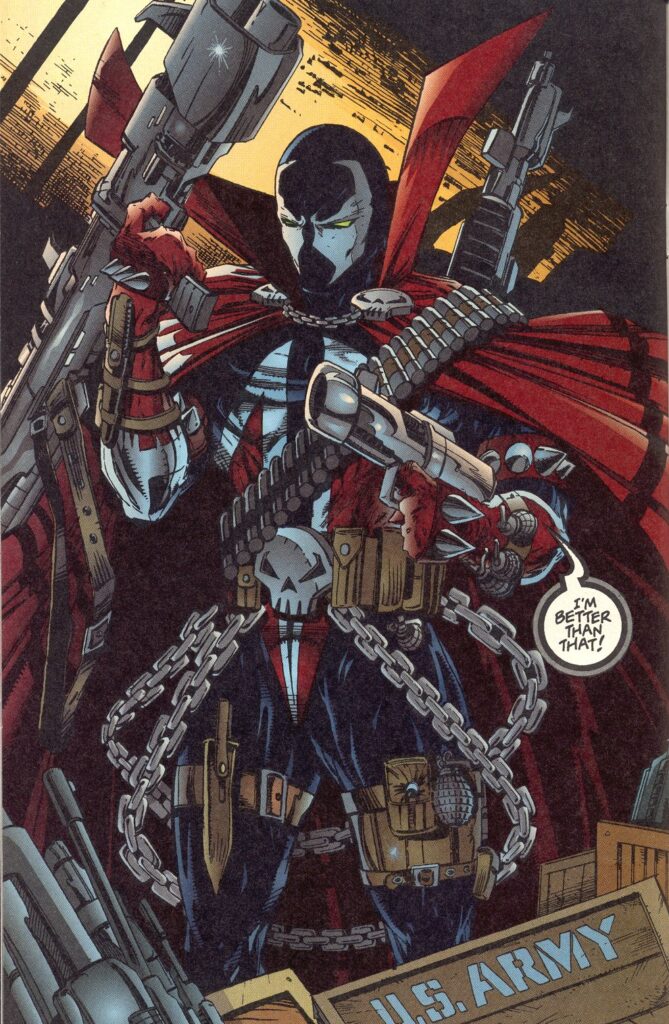
Spawn #6
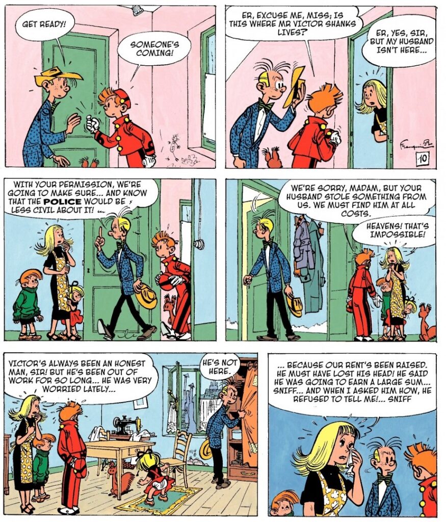
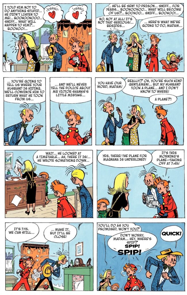
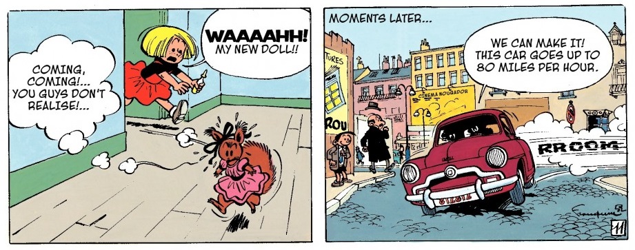
Since I did a couple of posts about The Adventures of Tintin a while back, I guess it was a matter of time before I got around to writing about Spirou & Fantasio, the other major classic series of Belgian bandes dessinées about madcap globetrotting adventure.
In particular, I want to focus on the first decade or so after World War II, when the series was both written and drawn by one of the greatest geniuses in the history of cartooning, André Franquin.
Despite its long-lasting popularity in continental Europe, most albums of Spirou & Fantasio have yet to be translated to English (although Cinebook and Europe Comics, slowly but surely, have finally been doing a praiseworthy job at fixing this). Indeed, the series never reached the same level of critical acclaim – and scholarly discussion – of The Adventures of Tinitin… not even close!
One reason for this may be, precisely, the inescapable comparison with Tintin. After all, although Spirou has different hair, a different attire (he is often dressed like a bellhop, strangely), and a different adorable pet (Spip the squirrel, instead of Snowy the dog), he has pretty much the same personality as Tintin: a young, curious, friendly, (initially) asexual hero with smarts and a kind heart. Spirou’s hotheaded-but-well-meaning sidekick, Fantasio, is a version of Captain Haddock, albeit less politically incorrect and not a sailor… in fact, he’s a reporter, like Tintin. The comparison can go on: they often hang out at a palace with an old inventor who at one point builds a model submarine!
Above all, they get involved in a very similar type of all-ages Boys’ Own thrillers…
The Wrong Head
This parallel became more superficial as the series developed its own identity and mythology – and it didn’t appear to bother readers in the first place (I remember accepting the derivative features as a serviceable springboard for fun rip-roaring yarns when I was a child… Hell, the fact that the whole thing at first seemed Tintin-like was a bonus, as I was looking for more of the same anyway!). Still, when it comes to the medium’s intelligentsia and academia, I’m not sure Spirou & Fantasio ever fully cast aside the negative connotation of being a less sophisticated copycat of a critical darling.
All of it written and drawn (or closely supervised) by Hergé, The Adventures of Tintin feels shaped by an auteur’s artistic vision and evolving personal concerns – i.e. the type of stuff scholars and critics love to scrutinize and evaluate – while Spirou & Fantasio, in turn, comes across like much more of an industrial franchise: the character of Spirou was originally created by cartoonist Rob-Vel, in 1938, for the leading strip of the magazine Le Journal de Spirou; it became property of the publisher Dupuis during WWII; Jijé introduced the co-lead Fantasio (who also went on to be a key character in Franquin’s hilarious strips about Gaston Lagaffe, known in English as Gomer Goof); and the series has been passed around from one creative team to the next throughout the ages, to the point that new albums – and spin-offs – by different writers and artists keep coming out almost every year, with flexible internal continuity (for example, some are set in the present and others in the distant past, although the characters usually have the same age).
I realize I could be describing Batman or loads of other IPs from American comics but for a long time this made Spirou & Fantasio relatively exceptional in the European scene… and probably made it earn less respect and less close attention than the finite opus that is Tintin.
I’m sure it didn’t help that the series was more prominently comedic, as well. Don’t get me wrong, Tintin is certainly humorous…
The Castafiore Emerald
However, the tone of Spirou & Fantasio has always been much more playful (with a couple of exceptions), including outright surreal and metafictional gags. André Franquin no doubt played a major role in popularizing this aspect when he took over the series, in 1946: if Hergé’s ligne claire was sometimes used to render physical comedy in an anchored, quasi-realistic, and comparatively stiffer world (as seen above), Franquin’s Spirou pushed the slapstick further while drawing everyone – and everything – as elastically cartoony, within relative boundaries.
At one point, Franquin even came up with a gas that diegetically made solid metal soft and malleable:
The Dictator and the Mushroom
There is a case to be made that Franquin’s Spirou and Fantasio is not just a more whimsical version of The Adventures of Tintin, but ultimately a kind of good-natured parody of Hergé’s work. Like Tintin in The Broken Year, the two heroes travel to a fictional country constantly embroiled in revolution – in this case, Palombia – in Spirou et les héritiers [‘Spirou and the Heirs’, one of several albums bafflingly untranslated to English, all the more so because it introduces many recurring elements and cast members]. When Spiro and Fantasio get there, however, they find something much more frantic: every important building they look at immediately explodes and the streets are littered with chaotic gunfights and tanks. If Hergé caricatured Latin American politics, Franquin seems to be spoofing that very caricature!
Even when he plays the material straighter, in the sequel, The Dictator and the Mushroom, Franquin seems less interested in satirizing imperialism than Hergé did in The Broken Ear or, later, Tintin and the Picaros. It is a pacifist tale (Spirou and Fantasio try to sabotage Palombia’s military arsenal before its latest leader invades a neighboring country) but the story doesn’t seem informed by specific geopolitics, only by a general impression that this part of the world is full of warmongering regimes (yes, the Cold War only fully blasted into Latin America with the coup in Guatemala of 1954, a year after this album came out, but almost two decades before Hergé had already linked the region’s violence to neo-colonial interests…).
If there is a political angle here, it’s the liberating joy of laughing at buffoonish authoritarianism:
The Dictator and the Mushroom
Seen from this prism, Franquin’s run appears less like a poor imitation of The Adventures of Tintin than like a talented cartoonist taking a familiar blueprint (like Hergé had done with the works of Jules Verne and Alfred Hitchcock) and filtering it through his own idiosyncratic sensibilities. In other words, it can be read as an auteur piece on the same level of Tintin, not least because Franquin’s output was itself incredibly groundbreaking and influential.
While Franquin’s plotting was thinner and probably improvisational (at least early on), he was quick to introduce a bunch of concepts and visuals that have remained a lasting staple of Spirou & Fantasio (and which have themselves been imitated by other series), from Fantasio’s despicable cousin Zantafio to the competitive reporter Cellophine (Seccoutine in the original), not to mention the exotic animal Marsupilami (a prodigy of design and frequent deus ex machina) or the village of Champignac-en-Cambrousse, with its pompous mayor (so proud of the village’s first – and apparently useless – traffic light) and its eccentric count/grandfatherly master of mad science.
Notably, Franquin’s distinct drawing style displayed a flair for imaginative and amazingly fluid designs, which he often applied to gizmos (including some very cool vehicles!) and to action set pieces. Again, compare Hergé’s and Franquin’s depictions of North African architecture – while the former carefully traced reference photos and came up with credible backgrounds…
The Crab with the Golden Claws
…the latter filled the pages with deliberately skewed lines, less concerned with realism than with projecting the dizzying sensation of a foreign look at the seemingly labyrinthine kasbahs:
The Rhinoceros’ Horn
Is it a colonial gaze? You bet. And wait until you see his take on sub-Saharan tribalism in the same album… or the one in Le gorille a bonne mine [‘Gorilla’s in Good Shape’], for that matter. Like Will Eisner – and, yes, Hergé – Franquin, although a gifted artist and in many ways social conscious, was unfortunately not above the shameful ethnic stereotypes so in vogue at the time.
Then again, 1951’s Il y a un sorcier à Champignac [‘There is a Sorcerer in Champignac’] anticipates the subplot about racism against the Roma from the 1963 Tintin album The Castafiore Emerald. Indeed, like I mentioned about both Tintin and Lucky Luke (by Franquin’s close friend, Morris), racist imagery and humor do not preclude a compassionate undercurrent in these comics. For all of their forays into unbridled mayhem and grotesque caricature, the early stories of Spirou & Fantasio were informed by a remarkable empathy with people as well as animals.
Decades later, Franquin would indulge in glorious misanthropy through the brilliant cartoon series Idées Noires (published in English as Franquin’s Last Laugh and Die Laughing):
Franquin’s Last Laugh
Yet Franquin actually started his career doing upbeat, lighthearted comics where the stakes were frequently somewhat low, suggesting a world of big children where even the villains seemed more mischievous than downright evil…
In his Spirou & Fantasio, most criminals were just trying to make a buck in a difficult situation, which was presented as understandable and ultimately forgivable:
The Marsupilami Thieves
I love how, in the pages above, Franquin enriches what could’ve been a schmaltzy exposition scene through the Spip subplot, told wordlessly almost until the end at the lower level of the panels… Indeed, his artwork is chockful of nifty details. Notice, in the final panel, an ad for the very magazine that readers are reading, proof that self-reflexive Easter Eggs have a very long tradition in pop culture (as early as 1928, Fritz Lang’s Spies featured, in the background, a poster advertising his previous film, Metropolis). The sheer aesthetic pleasure and the captivating flow of movement make these comics worth tracking down even if you can’t find them in your native language.
You can sense the joy in each drawing, particularly in the many extended scenes with the Marsupilami goofing around. This sort of stuff is clearly where Franquin’s heart truly was. Sure, he could pull off pulpy thrills, as proved in albums such as Le repaire de la murène [‘The Moray’s Hideout’], with its pre-Thunderball underwater action, and Les pirates du silence [‘Pirates of Silence,’ written by Maurice Rosy], where Spirou and Fantasio stumble into an ambitious heist on a secretive Jet Set city…
However, the more he established himself, the more Franquin turned out to be much less concerned with genre than with visual invention. Most of The Marsupilamis’ Nest – one of his strangest (yet amusing) albums – consists of a pictured documentary about the fictional animal’s eating and mating habits. Vacances sans histoires [‘Uneventful Holidays’] – which should be read right after The Marsupilamis’ Nest – is a loose short story where Franquin gets to indulge in the 1950s’ growing love affair with cars (it was a key feature of French society, as analysed in Kristin Ross’ fascinating book Fast Cars, Clean Bodies, and I don’t suppose car culture was all that different in the neighboring Belgium).
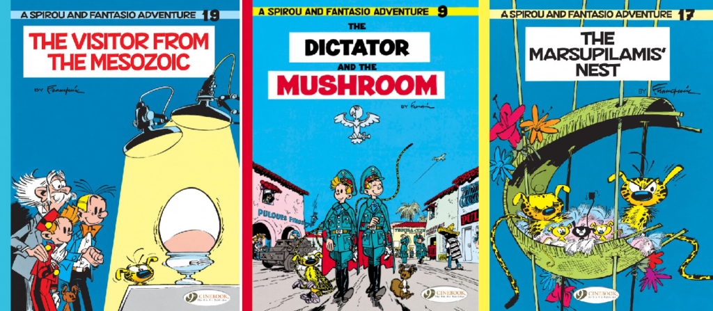
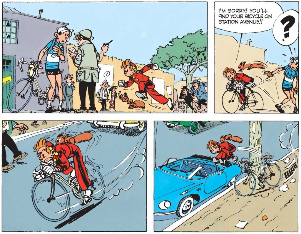
This tendency eventually reached an apex in the wonderful The Visitor from the Mesozoic, where Franquin unleashed a damn dinosaur in Champignac:
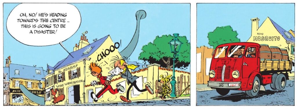
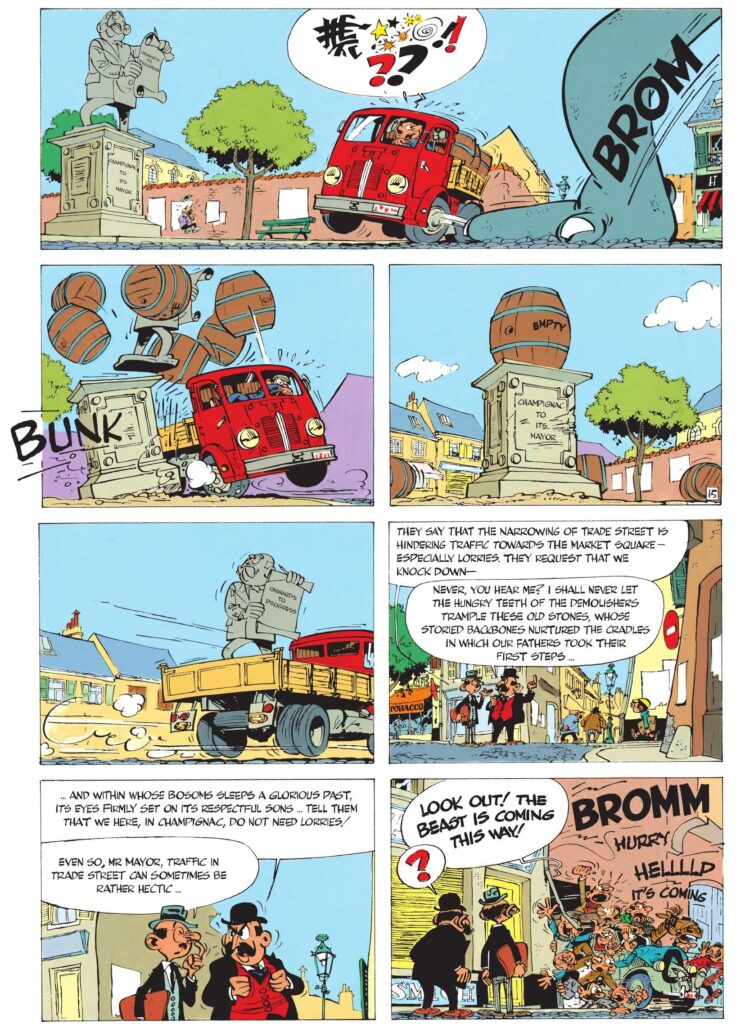
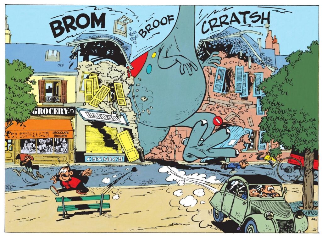
The Visitor from the Mesozoic
What makes The Visitor from the Mesozoic so special – and so quintessentially Franquin-esque – isn’t just that it forsakes Spirou & Fantasio’s (and Tinitin’s, for that matter) usual brand of intrigue in the name of escalating chaos, shamelessly replacing narrative with a barrage of funny moments…
The thing is that, as you can see above, Franquin uses this Godzilla-like framing to trample over all sorts of authority symbols and figures. It’s almost as if the dinosaur represents Franquin’s own caustic id finally unchained and relentlessly smashing every institution that takes itself seriously.
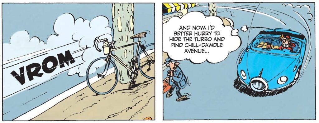
The Visitor from the Mesozoic
Certainly Hergé never did anything remotely similar to The Visitor from the Mesozoic.
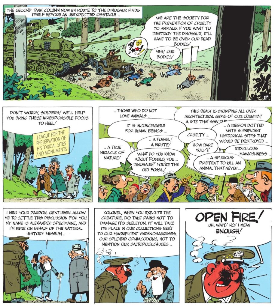
There is a delightful sense of freedom and iconoclasm to the whole thing. And, for a series that so far had mostly stayed away from an explicit engagement with politics, the book contains this priceless slice of cruel irony (where Spirou, appropriately, plays the straight man):
The Visitor from the Mesozoic
A hyperbolic reminder that comics can be awesome!
Black Science #28
Since this year’s weekly reminders that comics can be awesome have been focusing on splash pages, double spreads, and short sequences of interior artwork, it’s been a while since I’ve highlighted covers, which are actually one of my favorite features of the whole medium, requiring artists to convey in a single image the exact tone readers should expect to find inside each issue.
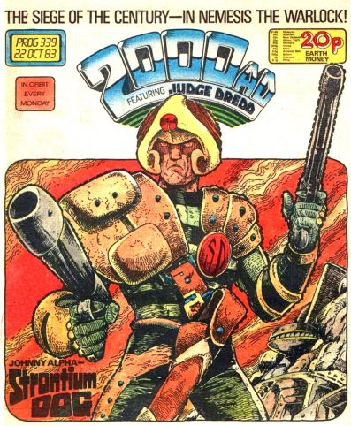
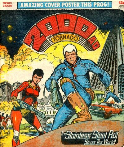
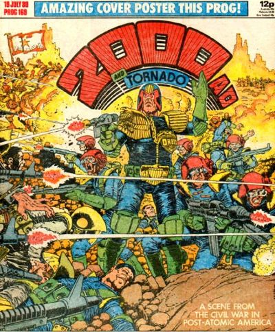
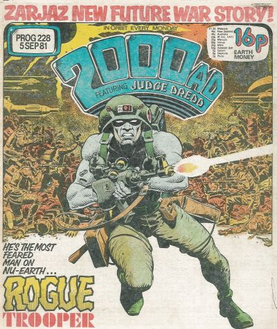
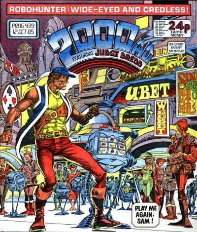
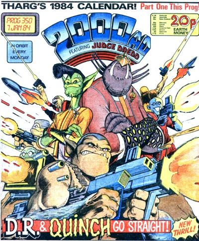
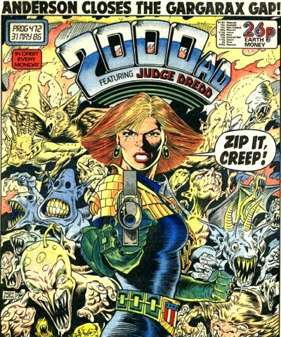
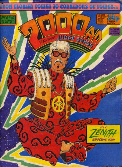
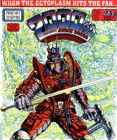
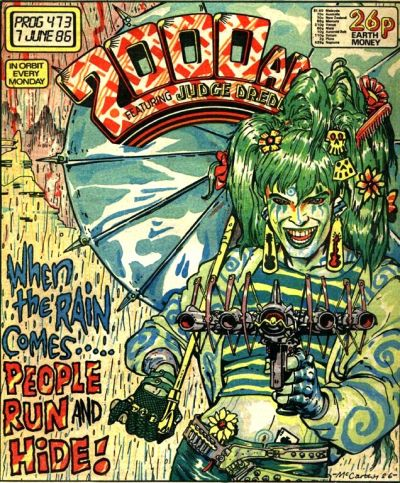
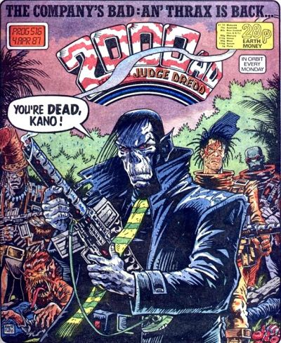
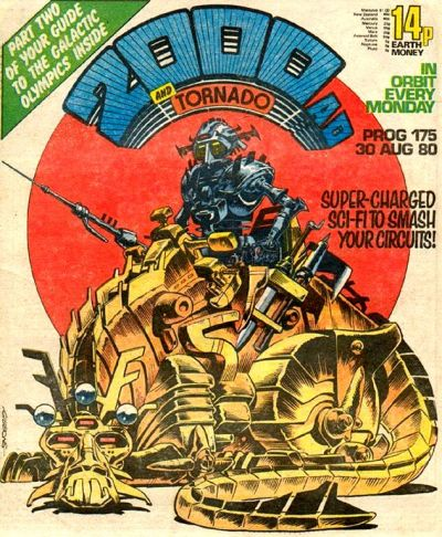
Some of the greatest examples come from the British anthology 2000 AD, which has a very strong tradition of covers spotlighting its incredible character designs as well as a general sense of damned coolness (including, more often than not, hilariously huge guns). Here is a selection of a dozen classics from the series’ first decade or so:
A Batman reminder that comics can be awesome:
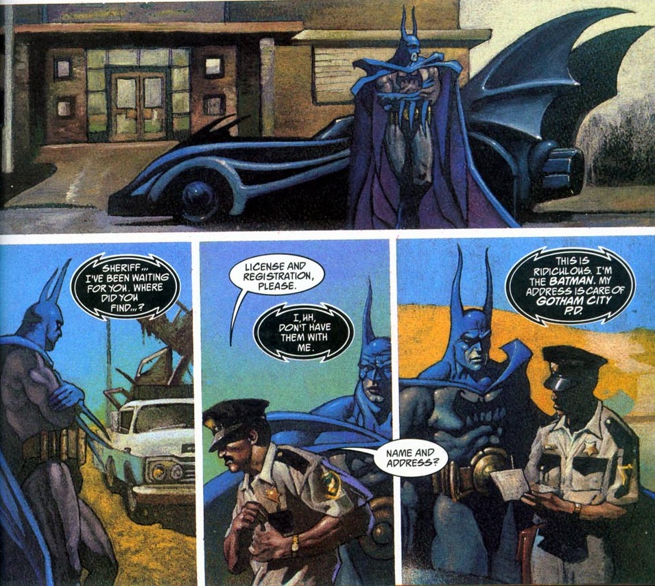
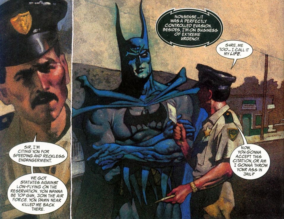
Manbat #2
When I use the word ‘comics,’ it can mean different things. I can be talking about the medium itself, that is to say sequences of visibly still images that tell a story or develop an idea, including such remarkable literary works as Will Volley’s The Opportunity, Nate Powell’s Any Empire, or Gabriel Bá’s and Fábio Moon’s Daytripper, not to mention non-fiction books like Liv Strömquist’s Fruit of Knowledge. Or I can be referring to a specific kind of reading experience centered on gonzo weirdness and bodacious drawings in the service of a narrative committed to excite and entertain.
The latter can range from unimaginative dreck to transcendental masterpieces, but on a good day they’re at least enjoyable genre pieces that unrepentantly embrace schlocky elements in clever and/or amusing ways. Here are a few scattered thoughts on five comic books that feel just like, well, COMICS.
ADVENTUREMAN
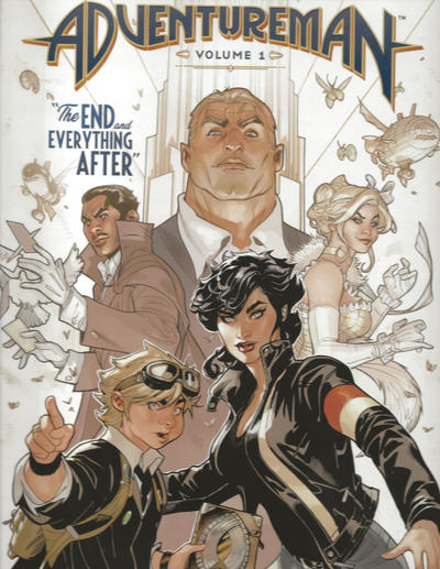
Adventureman introduces an over-the-top version of Doc Savage and his team, then an even more over-the-top assortment of supervillains (led by Baron Bizarre), and then, after a bombastic fight between the two groups, we start to follow Claire Connell, a bored hearing-impaired single mother who works at a bookstore and believes she’s the least interesting member of her family… That is, until she starts investigating the fate of the supposedly fictitious Adventureman and gets wrapped up in an out-of-this-world romp full of art deco boobytraps and mind-bending spells! The result is both an ode to pulp heroes and an ode to New York (or, better yet, not to the actual pulps or to the city itself, but to their striking resonance over time).
Much of this has been done before, but Adventureman ultimately won me over due to Matt Fraction’s ability to come up with countless whimsical concepts (the Apocalypsydra? the Automaterror? the Oblivionists?), charming characters, and engrossingly elliptical storytelling, as well as – and above all – due to Terry and Rachel Dodson’s luscious artwork (he draws and colors, she inks). The depth of their layouts and all the slick, retro designs are nicely complemented by Clayton Cowles’ typically chameleonic lettering, ramping up the whole bouncy feel of the series. In particular, the way the protagonist increasingly irradiates wonder and enthusiasm is really something to behold…
CHARLATAN BALL
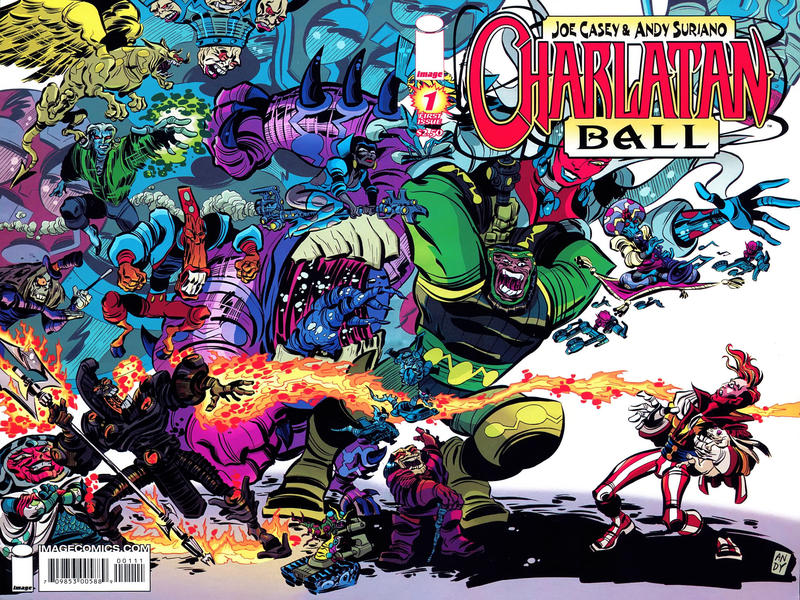
Joe Casey made much of his career trying to recapture the peculiar flavor of Jack Kirby’s manic surrealism, albeit with more of a hip, postmodern slant. One of the projects that took this approach particularly far was the 2008 mini-series Charlatan Ball, about a low-rent illusionist who gets transported into an outlandish fantasy world where he’s expected to enter – along with his mutated rabbit – a deadly competition against mega-powerful sorcerers.
Because the story was meant to continue in later installments that haven’t materialized (yet?), the book ends on a somewhat unresolved note, but it doesn’t really matter, as ultimately the purpose of the paper-thin plot is merely to secure a loose structure among the chaotic slugfests. In other words, while Casey comes up with a quirky cast (including a monster called Hellion Keller, the Blind Destructor – get it?), amusing narrative captions, and more than a dash of metafiction (even name-dropping Rogan Gosh), the true star of the comic is the artwork of co-creator Andy Suriano, who nails Kirbyesque designs and action scenes while somehow making them even cartoonier. Suriano’s inking, which is so expressive that it seems almost calligraphic, works particularly well with Marc Letzmann’s explosive colors and Rus Wooton’s spirited lettering.
FVZA: FEDERAL VAMPIRE AND ZOMBIE AGENCY
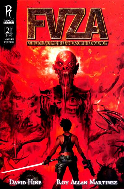
So, not only are zombies and vampires real, but they were treated as viral diseases until the mid-1970s, when a specialized federal agency apparently managed to eradicate them in the United States… until now! The detailed alternate history that makes up the bulk of FVZA’s backstory was actually developed in a site created by Richard S. Dargan, so this 2009 mini-series is technically an adaptation (or a spin-off?) of a website, which is a rare path. What the reliable David Hine brings to the table is both solid characterization and some suitably gnarly imagery, not to mention a then-topical concern with bio-terrorism (which now reads as a topical concern with epidemiological threats).
Kinsun Loh and Jerry Choo paint the comic in Radical’s house style, i.e. an ultrarealistic digital coloring process that’s not for all tastes (it usually isn’t for mine), but which doesn’t clash with the naturalistic figures drawn by Roy Allan Martinez and Wayne Nichols. Honestly, I would’ve preferred more fluid-looking artwork rather than something that could pass for a photonovel… Still, even if the images feel too static, at least the book lives up to its promise by delivering quite a fair share of creepy and gory horror set pieces.
THE NINJETTES
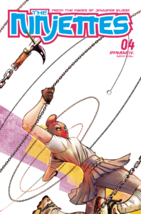
The latest reboot of The Ninjettes completely overhauled the original premise (which was little more than ‘team of killers dressed in kogal schoolgirl uniforms’ to begin with) by having a secret government program take away teenagers predicted to be on the verge of committing school massacres and then pit them against each other in the middle of nowhere. A spin on the likes of Battle Royale and The Hunger Games (not to mention Lord of the Flies), this is as tasteless and immoral a black comedy as it sounds, with a dozen girls bickering – ironically resorting to ‘woke’ lingo – and bloodily slaughtering each other while wearing fetishistic uniforms (even if Joseph Cooper’s and Dearbhla Kelly’s art and colors help restrain the sexualization of teens inherent to The Ninjettes’ committedly trashy vibe). If this were a movie, there’d a dozen indignant op ed pieces about it, but comics get away with this sort of stuff all the time… And Fred Van Lente is one of those writers who can actually pull off a fine balance between, on the one hand, the exuberance of brazen exploitation and, on the other, smart character work and a knowing approach to these tropes, somehow mocking and indulging in them at the same time.
The Ninjettes started off as a throwaway gag in Garth Ennis’ original Jennifer Blood series and, like everything else in that godawful run, was eventually elevated to undeserved brilliance during Al Ewing’s subsequent stint on the property. After years adrift, the franchise only recently recovered from Ewing’s departure, as Van Lente has given it a sudden injection of off-the-charts energy. That said, to appreciate his new take on the Ninjettes you don’t have to know anything about their predecessors or about any of the comics starring Jennifer Blood. You just have to set aside any sense of shame and embrace all the hyper-violent, outrageous grindhouse vibe.
ORGANISMS FROM AN ANCIENT COSMOS
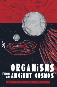
Having masterfully reworked pulpy genres in films like the horror western Bone Tomahawk and the bad cop/heist thriller Dragged Across Concrete, in his second graphic novel S. Craig Zahler applies his signature brand of vicious storytelling to an alien invasion saga. You may think you know how these stories go, but don’t be so sure… While the tone is more tongue-in-cheek than usual, Zahler’s plotting feels much more ambitious, as he keeps broadening the book’s scope and stakes, letting the narrative organically expand into new and surprising directions (including a lengthy detour into prison drama).
Not only does the naïve-looking black & white artwork intensify the deadpan humor, but the ensuing visual style is also somewhat reminiscent of 1950s’ B-movies and Al Feldstein comics. If that era’s science fiction channeled Cold War fears of invasion, radiation, and nuclear apocalypse, however, 2022’s Organisms from an Ancient Cosmos updates the tropes’ allegorical potential to reflect current anxieties around terrorism, the covid pandemic, and the tense, suspicious, competitive relationship between the US and China. Nasty fun.
A war-torn reminder that comics can be awesome.
Battlefields #6
Along with Eurocomics and old TV shows, I also like to use Gotham Calling to highlight cool spy novels. Here are a couple of British contributions to the genre that should please any self-respecting afficionados:
BERLIN GAME
(Len Deighton, 1983)
“’How long have we been sitting here?’ I said. I picked up the field glasses and studied the bored young American soldier in his glass-sided box.
‘Nearly a quarter of a century,’ said Werner Volkmann. His arms were resting on the steering wheel and his head was slumped on them. ‘That GI wasn’t even born when we first sat here waiting for the dogs to bark.’
Barking dogs, in their compound behind the remains of the Hotel Adlon, were usually the first sign of something happening on the other side. The dogs sensed any unusual happenings long before the handlers came to get them. That’s why we kept the window open; that’s why we were frozen nearly to death.
‘That American soldier wasn’t born, the spy thriller he’s reading wasn’t written, and we both thought the Wall would be demolished within a few days. We were stupid kids but it was better then, wasn’t it, Bernie?’
‘It’s always better when you’re young, Werner,’ I said.”
As you can guess by this opening at Checkpoint Charlie, Berlin Game is a Cold War classic. First published in the early ‘80s – when the Berlin Wall was still up – and told from the point of view of Bernard Samson, a middle-aged, somewhat jaded (yet committedly anticommunist) MI6 agent who keeps travelling between the UK, West, and East Germany, the circuitous plot revolves around two of the genre’s quintessential tropes: the perils of escaping from the GDR and an investigation into a possible Soviet mole in the British Secret Intelligence Service.
Yes, all this had been done before – including by Len Deighton himself, in the 1960s – but Berlin Game nails the formula to a tee, delivering plenty of authentic-sounding descriptions of spycraft and of life in divided Germany. The book may even appear to start off slowly, with a few detours into the protagonist’s upper-class milieu (unlike the unnamed hero of Deighton’s early novels, Bernard Samson married into wealth), yet once you get to the mystery at the core of the story, you’ll realize there were clues (and red herrings!) in each of those earlier scenes. Indeed, Berlin Game reads pretty much like a Raymond Chandler detective yarn, as Samson moves from one conversation to the next while we try to discern vital information among the sardonic dialogue (‘Werner’s too lazy to be a double agent – too lazy to be a single agent, from what I saw of him.’).
Like Chandler, Deighton buys a lot of good will with his compelling characterization of a shady underground (the British spy networks in Germany appear to be built almost entirely out of petty criminals), not to mention his ability to evoke places and atmosphere (which, I admit, resonate particularly well with me because of my own passion for Berlin):
“The Russians got the State Opera, the Royal Palace, the government buildings and some of the worst slums; the Western Powers got the Zoo, the parks, the department stores, the nightclubs and the villas of the rich in Grunewald. And spiked through both sectors, like a skewer through a shish kebab, there is the East-West Axis.
The Bendlerblock, from where the High Command sent the German Army to conquer Europe, has now been renamed. Nothing here is what it seems, and that appeals to me.”
To be fair, the division of Berlin and the GDR’s border control, although a real-life human drama, provided just the perfect raw material to fuel gripping thrills. In cinema, this had been a source of exploitation for years, going at least as far back as Carol Reed’s noirish The Man Between (made back when there was still relatively loose circulation in the city). Yet the escape narrative is only a small section of the overall book, which for the most part is quite light on action. The main appeal lies elsewhere: sexist and sarcastic, Bernard Samson has such a captivating voice – and Deighton does such an expert job of worldbuilding, bringing a memorable cast to life – that it’s no wonder Berlin Game ended up inaugurating a whole series, spawning eight sequels and a prequel.
Plus, in line with the interpretation that, under the façade of diplomatic crises and aggressive international relations, much of spy fiction – at least since Len Deighton and John le Carré joined the game –is actually about the world of mid-level work, a key portion of Berlin Game consists of discussions about office hierarchies, promotions, demotions, retirements, and loyalty to the company. It’s to Deighton’s credit that none of this ever feels boring, not least because of his sharp prose – like when he paints a whole picture of one of Samson’s superiors, Bret Rensselaer, in just a couple of paragraphs:
“Needless to say, Rensselaer had never served as a field agent. His only service experience was a couple of years in the US Navy in the days when his father was still hoping he’d take over the family-owned bank.
Bret had spent his life in swivel chairs, arguing with dictating machines and smiling for committees. His muscles had come from lifting barbells and jogging around the lawn of his Thames-side mansion. And one look at him would suggest that it was a good way to get to them, for Bret had grown old gracefully. His face was tanned in that very even way that comes from sun reflected off the Pulverschnee that only falls on very expensive ski resorts. His fair hair was changing almost imperceptibly to white. And the eye-glasses that he now required for reading were styled like those that California highway patrolmen hang in their pocket flap while writing you a ticket.”
DEAD LIONS
(Mick Herron, 2013)
“A fuse had blown in Swindon, so the south-west network ground to a halt. In Paddington the monitors wiped departure times, flagging everything ‘Delayed’, and stalled trains clogged the platforms; on the concourse luckless travellers clustered round suitcases, while seasoned commuters repaired to the pub, or rang home with cast-iron alibis before hooking up with their lovers back in the city. And thirty-six minutes outside London, a Worcester-bound HST crawled to a halt on a bare stretch of track with a view of the Thames. Lights from houseboats pooled on the river’s surface, illuminating a pair of canoes which whipped out of sight even as Dickie Bow registered them: two frail crafts built for speed, furrowing the water on a chilly March evening.
All about, passengers were muttering, checking watches, making calls. Pulling himself into character, Dickie Bow made an exasperated tch! But he wore no watch, and had no calls to make. He didn’t know where he was headed, and didn’t have a ticket.
Three seats away the hood fiddled with his briefcase.”
The second novel in the Slough House series, about an office/purgatory where MI5 sends its most disgraced agents to perform menial tasks (someone has to compile all those briefings the main spies get, after all), lives up to the promise of the incredible first installment. It shares the same initial structure, starting off with a taut, suspenseful sequence and then moving on to a tour of the Slough House building (this time, amusingly, from the point of view of a cat), thus making the book accessible for readers who are new to the series… Yet I would still recommend picking up Slow Horses first, if you can, because so much of the pleasure of Dead Lions derives from reencountering the surviving characters from last time and seeing how some of them have evolved in the intervening months – and how some remain grudgingly stuck in the same place.
Also back is Mick Herron’s grey version of London, which I find so utterly recognizable – a city of depressing bedsits, of buses diverted due to roadworks, of omnipresent electronic posters rotating day and night (‘drawing an absent public’s attention to unbeatable mortgage deals’), of foxes and rats rummaging through the bins of an empty-looking Chinese restaurant… alongside massive phallic skyscrapers and anti-capitalist demonstrations. While the general plot and situations will be pretty familiar for genre fans everywhere, the book is peppered with details that should especially resonate with anyone who was living in the UK in the early 2010s (worried about the possible power dynamics of forging an alliance with his boss, a character fears he might ‘end up being Nick Clegged’).
In particular, it’s fun to revisit Jackson Lamb, the unforgettable head of Slough House, whose abusive behavior – like his farts – may or may not be part of a winning psychological strategy to get his way… Regardless, we know there is at least a degree of sincerity to his curmudgeon attitude because Herron makes us private to his abrasive inner thoughts:
“Where Jackson Lamb was was Oxford, and he had a brand new theory, one to float in front of the suits at Regent’s Park. Lamb’s new theory was this: that instead of sending tadpole spooks on expensive torture-resistance courses at hideaways on the Welsh borders, they should pack them off to Oxford railway station to observe the staff in action. Because whatever training these guys underwent, it left every last one of them highly skilled in the art of not releasing information.”
Besides characterization, Mick Herron once again excels at plotting and prose. By plotting, I don’t mean just the story itself (although it is a satisfyingly relentless circuit of misdirection), but the way he keeps jumping from one short scene to the next, piling up twists and cliffhangers while making sure that every cast member adds at least one key piece of the larger puzzle being put together in front of our eyes.
As for the prose, Herron’s style isn’t particularly fanciful, but it has wit to spare, along with a nasty edge (‘The building opposite used to be a pub, and maybe hoped to be a pub again one day, but for the time being was making do with being an eyesore.’). He often delves into the minds of the cast and shuffles in their pettiest private thoughts, which is consistent with the overall leitmotif of contrasting high espionage with the mundane perspective of the average frustrated worker.
“If he’d been asked to draw a picture of what he’d expected from private security work, Carl Fenton would have drawn it big. There’d have been manual combat training; utility belts, Kevlar vests, Tasers. And driving, too: rubber-shredding take-offs and sharp cornering. He’d have had one of those earpieces with a hands-free mic attached, a necessity in the adrenalin-rich world of the security consultant, where you never knew what the next second might bring. That was what Carl Fenton had had in mind. Danger. Excitement. A grim reliance on his own physical competence.
Instead, he had a uniform that was too small, because the last guy in the job had been a midget, plus a rubber torch with a fading battery. And instead of riding shotgun in an armored limo, he had a nightly trudge up and down half a dozen corridors, calling in every hour on the hour; less to reassure management that the facility was still standing than to prove he was awake and earning his pay. Which was so slightly above minimum wage that if you split the difference, you’d have change from a quid. A job was a job, his mom never left off saying, but flush with the wisdom of nineteen years on the planet, Carl Fenton had found the flaw in this argument: sometimes a job was a pain in the arse.”