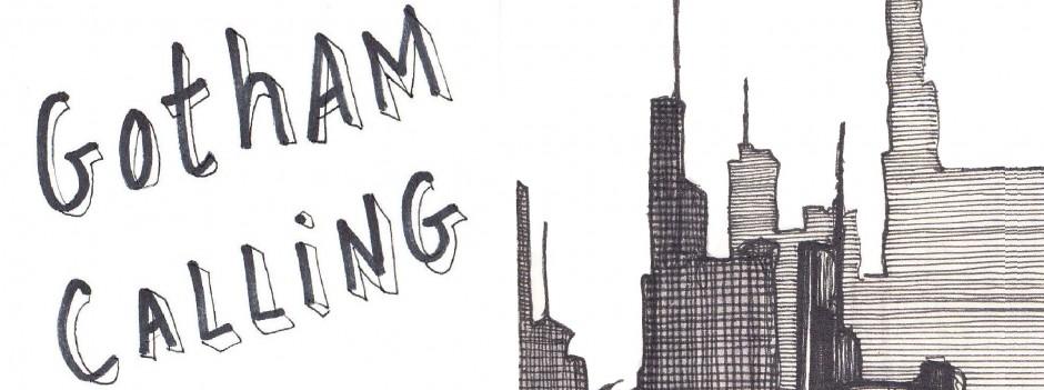
Gotham Calling started out as a blog specifically about Batman comics and, every once in a while, I enjoy going back to its origins. So, here is a post about three amazing title splash pages from the 1970s – an era when title splashes became particularly creative – by one of the most underrated artists in the history of the Dark Knight…
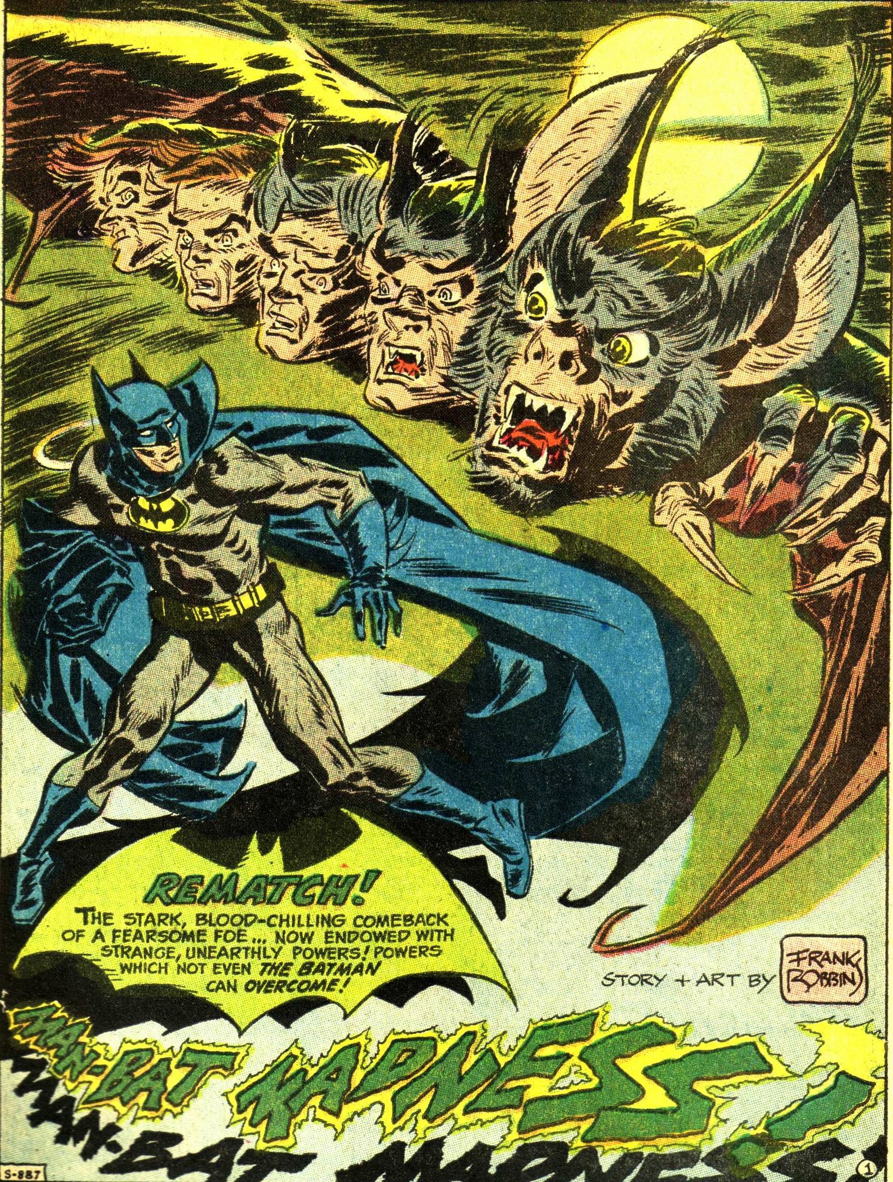 Detective Comics #416
Although he had a following as a writer, Frank Robbins was an impressively controversial – perhaps downright unpopular – artist of Batman comics. Fans at the time seemed reticent to break away from the semi-naturalistic house style established by Neal Adams and perfected to nuts’n’bolts efficiency by Jim Aparo. By contrast, Robbins’ quirky pencils and inks were unabashedly prone to expressionistic distortion.
In the page above, from 1971, Robbins drew a surrealistic composition that presents us with the various horrifying stages of Kirk Langstrom’s transformation into Man-Bat, thus immediately laying out the story’s premise and genre, so that readers can begin adjusting their expectations. Moreover, by framing those evolutionary stages between a couple of batwings, the splash also creates two additional effects: it both encroaches the Dark Knight (thus heightening the impending threat) and, because Batman too is framed within a wing-like cape, it suggests a kind of imperfect parallel between the two characters (thus anticipating the theme that one is the dark mirror version of the other). Each of these elements deserves consideration.
The transformation from human to monster is a classic horror visual trope that would reach one of its apexes a decade later, with the iconic sequence from An American Werewolf in London. Indeed, although Kirk Langstrom’s alter ego isn’t lupine, werewolf fiction is the most obvious model for this tale… Sure, the thing about werewolves is that their mythology hasn’t exactly coalesced into a ‘model’ with firm rules, at least compared to other fantastical creatures (like zombies and vampires), which means that we’ve gotten a number of awesome werewolf stories that actually feel original and radically different from each other (books like Guy Endore’s historical saga The Werewolf of Paris and Terry Pratchett’s fantasy adventure The Fifth Elephant, film hybrids ranging from Wolf’s corporate satire to Good Manners’ social/family drama, not to mention the cult classic The Howling). Regardless, the imagery on display here leaves little doubt about its inspiration, as the full moon in the background, partly engulfed by gothic clouds, suggests a lunar cause for Langstrom’s transformation.
The fact that the transformation is depicted through disjointed flying heads suitably makes the whole thing feel even more like a nightmare. The finalized Man-Bat, with his open mouth and stretched claw, is disproportionally enormous and seems about to attack, nailing him as the aggressive villain of the piece. Bellow, the Caped Crusader looks surprised and vulnerable. Add to this the fact that we tend to read from top to bottom and the whole narrative thrust is quickly set up even before our eyes reach the text at the bottom of the page.
The game of likeness and contrasts was a recurring motif in the early Man-Bat comics (this was the fourth one, by the way… the previous issues had also been written by Robbins, but drawn by Neal Adams). Here, the tip of the shadow of Batman’s cape has the same shape as the tip of Man-Bat’s wing, reinforcing the notion that the two characters somewhat reflect each other. Duality is also projected by the freaky letters in the title, which cast a shadow themselves, somehow.
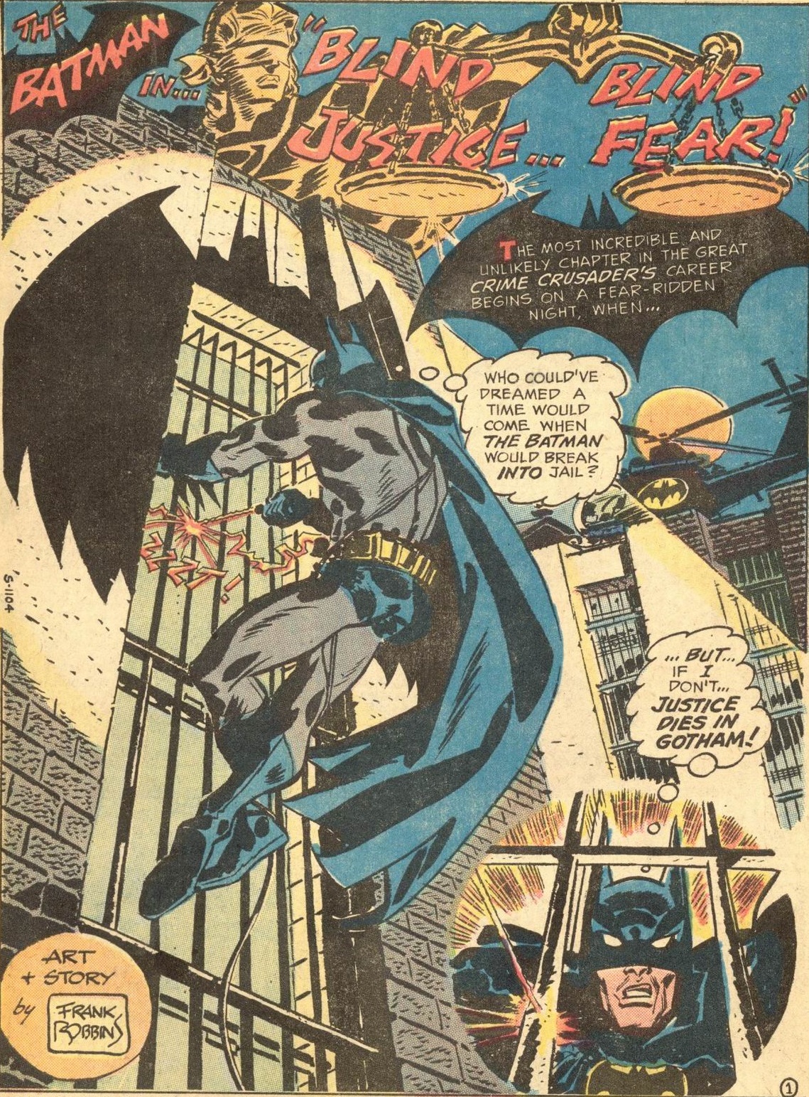 Detective Comics #421
This staggering page prepares us for a whole other genre, namely an action-packed crime thriller, kicking things off in medias res with the Dark Knight doing a dangerous stunt while, intriguingly, trying to break into a prison with the help of a laser. This was a type of story Frank Robbins clearly enjoyed writing and drawing – and his stylized, angular approach to noir strongly anticipated the aesthetics later popularized by Bruce Timm, making Robbins an artist ahead of his time (if such a thing is possible).
Besides the disorienting perspective and the neat placement of the title on the scales of justice, the page is also noteworthy for the profusion of Bat-symbols. I count five: two non-diegetic ones (framing the series’ title and the omniscient narration caption), the silhouette around the prison window (is it the Bat-Signal or just a regular searchlight projecting Batman’s own shadow?), and the logos that the Caped Crusader – or the Crime Crusader, as the narration calls him – uses to brand his costume and helicopter. The result is a bit chaotic, but I think it helps provide an overwhelming sensation that there are many focal points deserving of attention and, by extension, many things taking place at once – if this was a film, the soundtrack would be blasting and the camera wouldn’t stop moving!
Such relentless momentum is especially important when it comes to throwing the Dark Knight into straight-up crime fiction (i.e. into stories without colorful rogues), like in this case. Rather than bending backwards to explain what Batman brings to the table that the regular cops couldn’t do, a tried-and-true trick is to inject so much dazzling adrenaline into the proceedings that your brain hardly ever stops to ask questions.
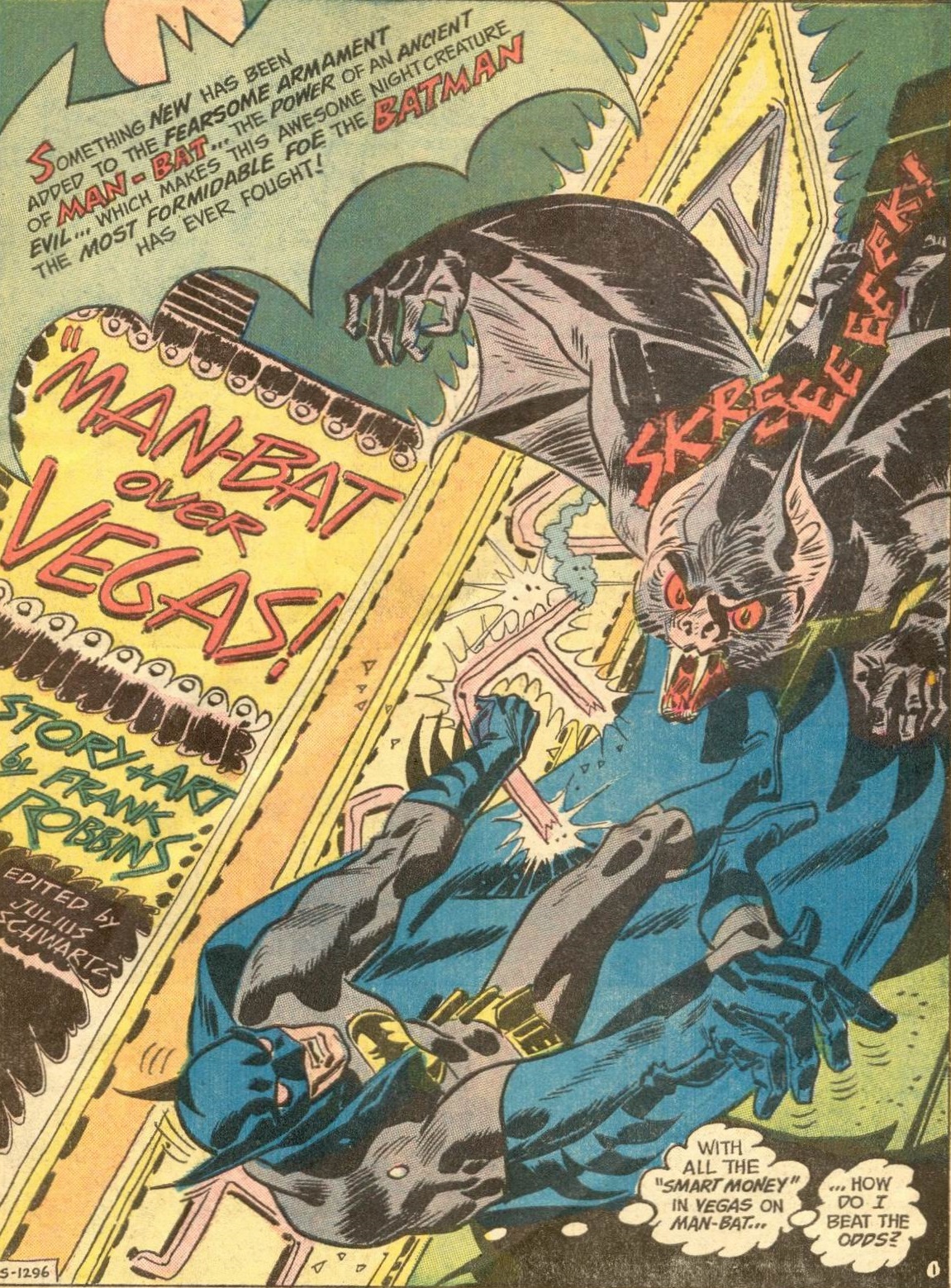 Detective Comics #429
Another Man-Bat classic!
Cover-dated November 1972, this issue shows Frank Robbins even more willing to play with word design. Besides giving Man-Bat a sinuous scream, he adds to the long list of Eisner-influenced Batman comics by integrating the title and credits into the picture’s ‘reality,’ as if they’re just another set of neons in Las Vegas.
Meanwhile, the layout vertically – or, at least, diagonally – pulls you into the comic, instilling a sense of urgency from the get-go even if you disregard the typically hyperbolic text blurb (as usual in a bat-shaped caption). And if on one corner of the page we find the moon that we’ve come to associate with Man-Bat (a reminder of the character’s horror roots), by the time our eyes reach the opposite end we are already firmly back in whimsical Batman territory, because the Bronze Age Caped Crusader, even when apparently falling to his death by pavement-or-feral-evisceration, is still thinking through puns!
In the shadow of O’Neil & Adams, Robbins now seems overlooked as one of the writers who returned “The” Batman to his dark-night roots. I love his art on the strip. It is both cartoony and impressionistic; fifty years on, I’m not sure any other artist has pulled that combination off with similar verve.