15 superhero horror covers

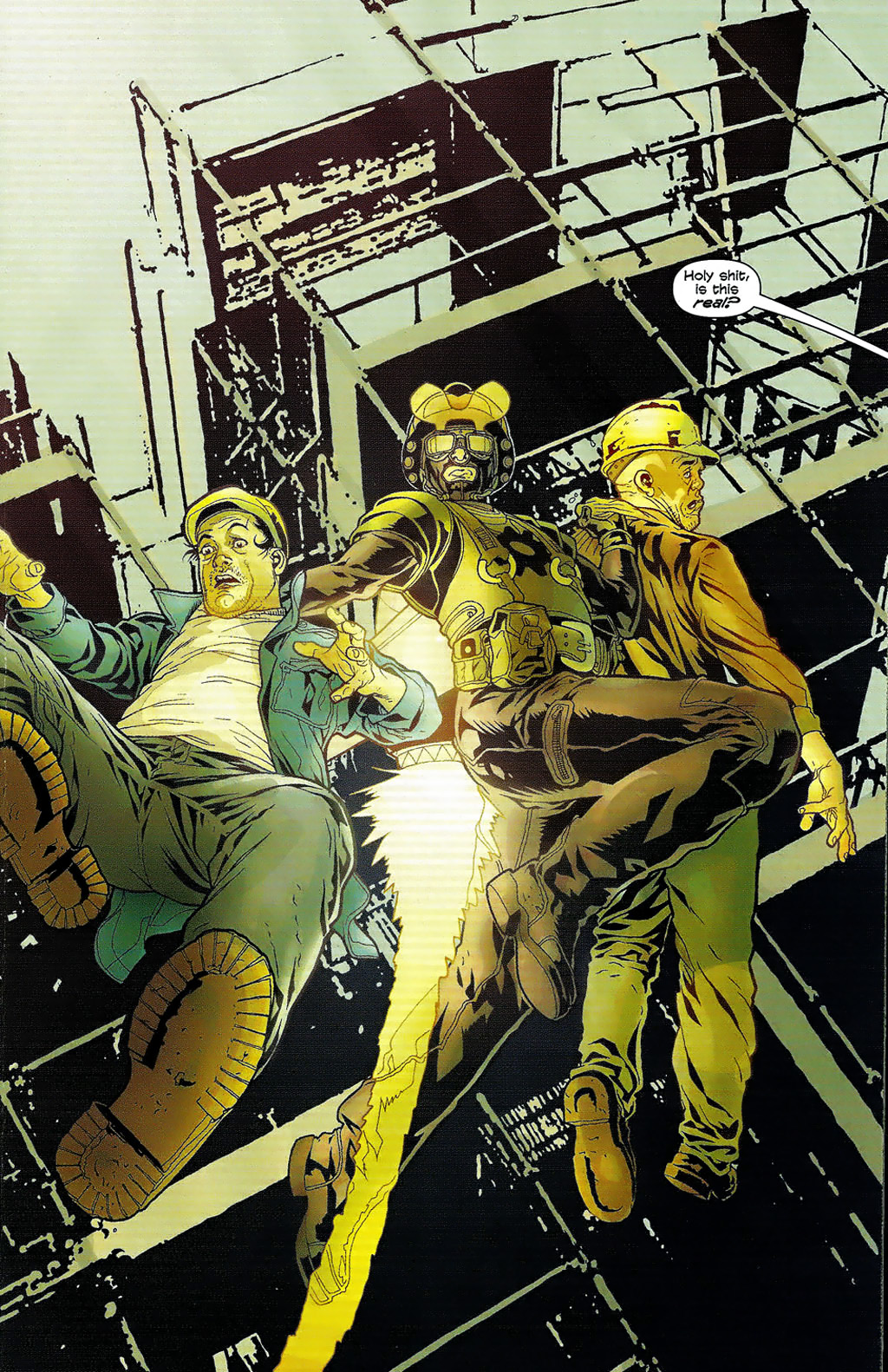
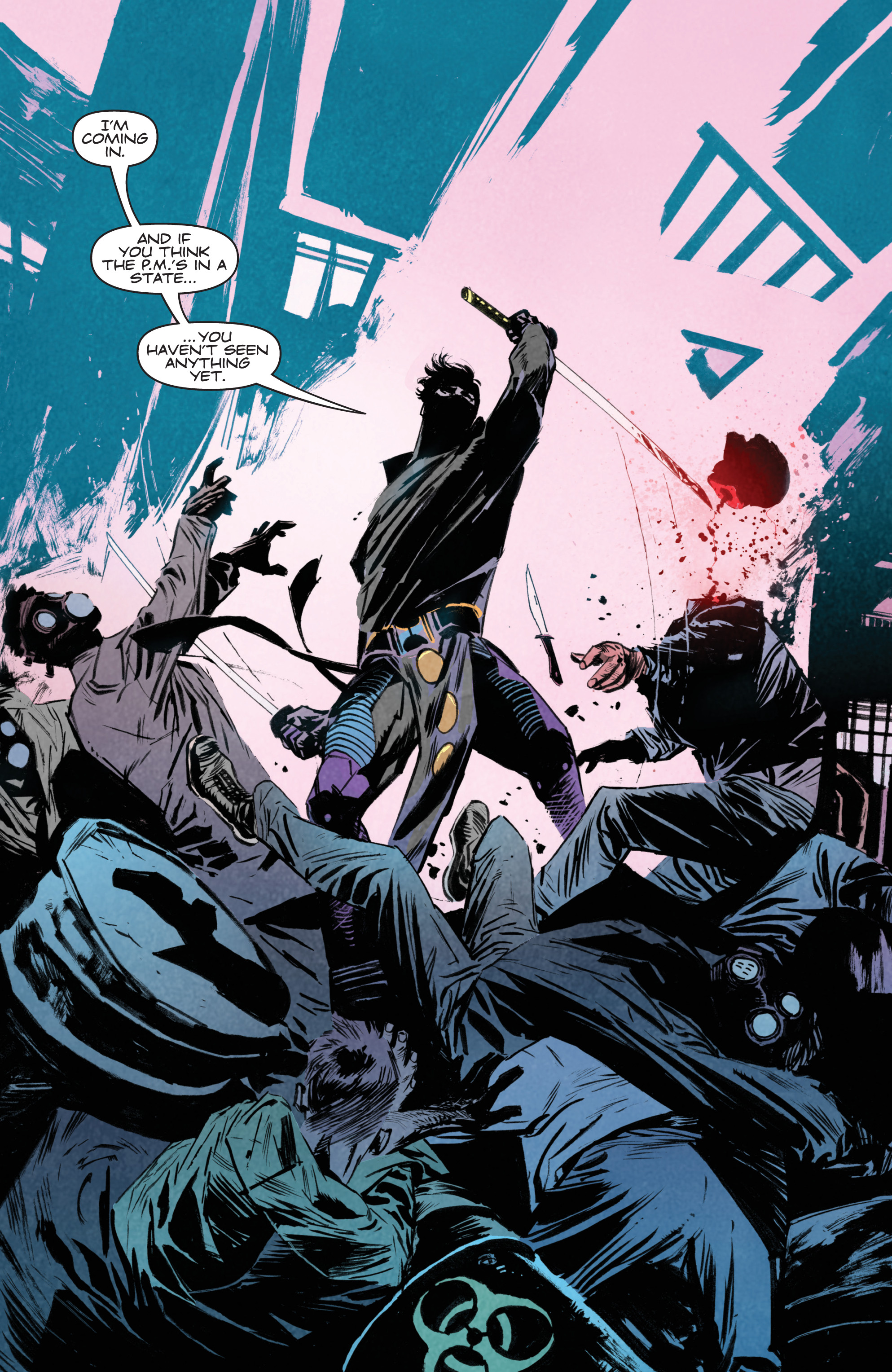
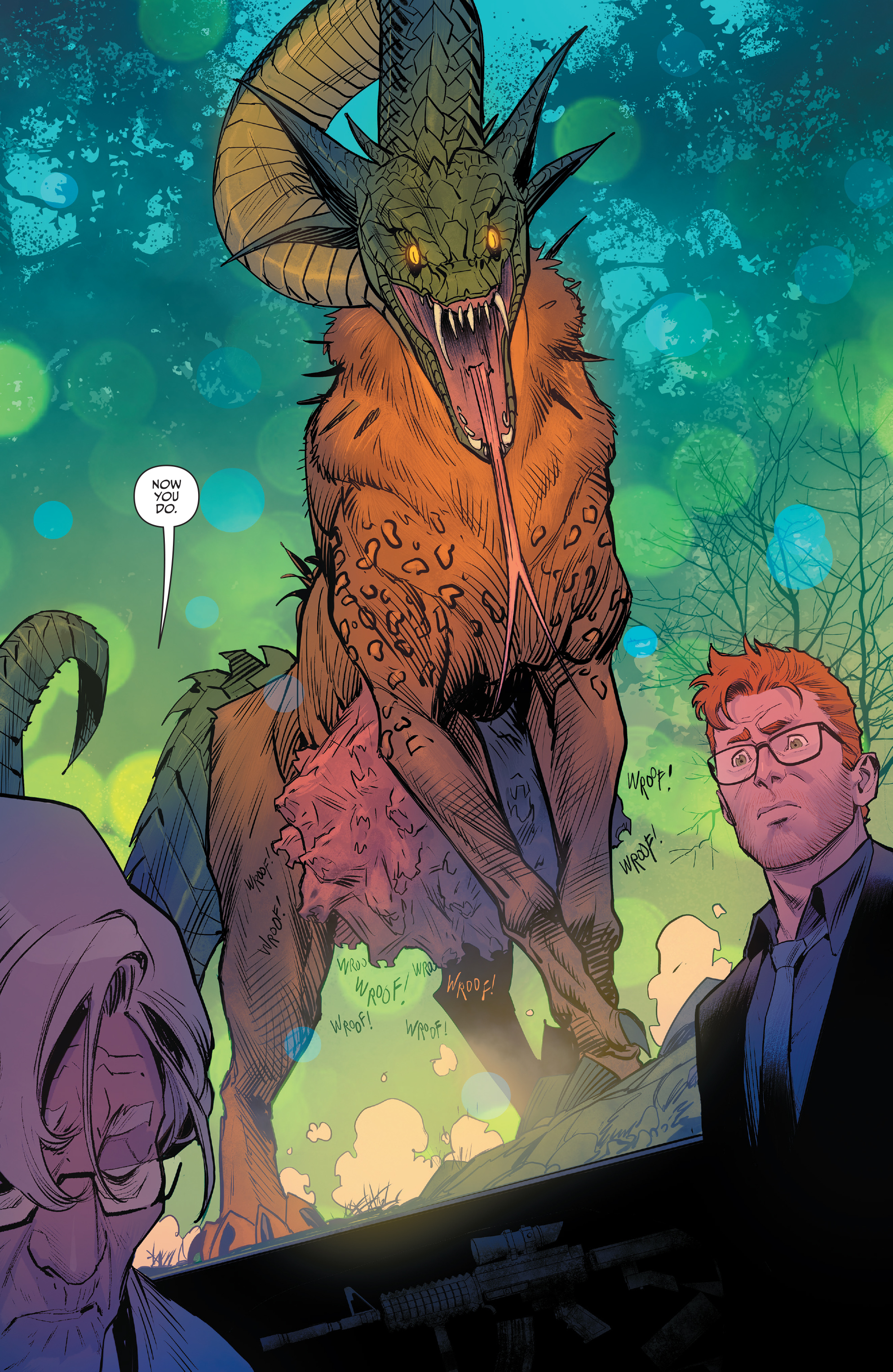
Just because the weekly COMICS CAN BE AWESOME section has moved back to focusing on splash pages, it doesn’t mean Gotham Calling won’t continue to spotlight cool covers every once in a while…

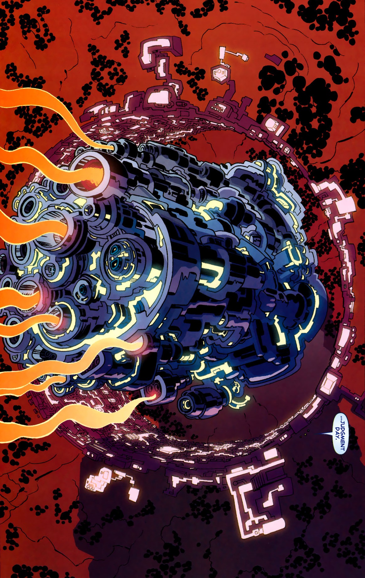
Here is a selection of fifteen eerie comic book covers that effectively inject superhero narratives with horror imagery, a common hybrid in comics as well as in film (with last year’s ill-fated The New Mutants being the latest addition to the subgenre):

jeff jonesbill sienkiewicztodd mcfarlanebill sienkiewiczBrian Bollandtony harrisjohn totlebensupermanjohn byrnesupergirlpaul smithfrank milleralex rossM.D. Brightrick veitch

Posted in ART OF HORROR COMICS | Tagged , , , , , , , , , , , , , , , , , , , , , , , , , , , , , , , , , , , , , , , | Leave a comment

COMICS CAN BE AWESOME (22 February 2021)

Yep, one more reminder that comics can be awesome…

brian k. vaughanEx Machina #17
ninjakNinja-K #11
dan moraOnce & Future #1
Posted in GLIMPSES INTO AWESOMENESS | Tagged , , , , , , , , , , , , , , , | Leave a comment

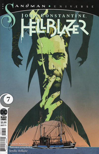
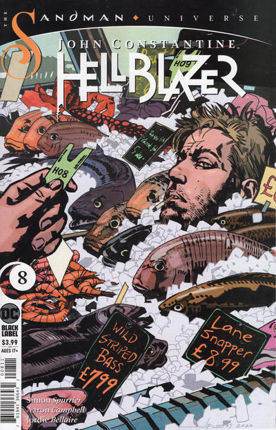
Anatomy of John Constantine Hellblazer #7-8

Throughout 2020, two comic book series consistently had a blast translating Brexit-era chauvinism into supernatural horror. One of them was Kieron Gillen’s, Dan Mora’s, and Tamra Bonvillain’s Once & Future, in which the British past – even the imaginary version upon which nationalism is built – came across as gruesome and violent and certainly not something that anyone in their right mind should wish to reclaim (if there is any hope for the future, the series seems to suggest, it lies with people forging their identity out much more than what they inherited). The other one was Simon Spurrier’s run on John Constantine Hellblazer, the latest string of occult/satirical tales about the long-lasting cynical working class mage from Liverpool, whose two-parter ‘Britannia Rule the Waves’ (issues #7-8) is, if nothing else, the most brilliant horror story I’ve ever read about EU fishing quotas.

john paul leon          john constantine

The latter series nailed Hellblazer’s trademark blend of dark fantasy and social commentary, mixing streets gangs with black magic, setting a ghost story around the NHS, and spinning a hilarious yarn around Prince Andrew’s scandalous links to Jeffrey Epstein. John Paul Leon’s covers and Aaron Campbell’s art, colored by Jordie Bellaire, were absolutely jaw-dropping (although I didn’t love the angular look of the fill-ins, by Matías Bergara). As usual, Spurrier’s ear for dialogue lent the text an almost musical quality, with a particular cadence based on accents and slang (‘There’s the troubled brow of a bloke wi’ his fair share of pissed-off exes, heh!’). He also displayed a pretty good grip on the titular anti-hero’s voice, solidly building on the characterization developed throughout the years (from John Constantine’s off-color humor to his bisexuality). On a more personal note, the fact that the first arc was set in Peckham Rye brought back fond memories, as I lived there ten years ago (and it was a much cooler place than what its crime-ridden reputation suggests).

Si Spurrier belongs to a crop of talented British comic book writers who have taken the industry by storm in the 21st century, along with the likes of Kieron Gillen and Al Ewing (not to mention Paul Cornell, who had been around for longer but only really stormed into Marvel in the 2000s). Jumping from the pages of 2000 AD, these creators have imbued American comics with a veritable burst of energy and intelligence. They also share an underlying concern with British cosmopolitanism, their comics often reacting – explicitly or implicitly – against the rise of open racism in the UK. Indeed, the connecting arc of Spurrier’s Hellblazer revolves around Constantine’s investigation into various monstrous creatures conjured by national pride… which brings us to ‘Britannia Rule the Waves,’ where an Essex fisherman (who is also a fishmonger, for narrative convenience) has a lurid affair with a mermaid that helps him fight off French fishing boats in order safeguard his trade.

aaron campbell

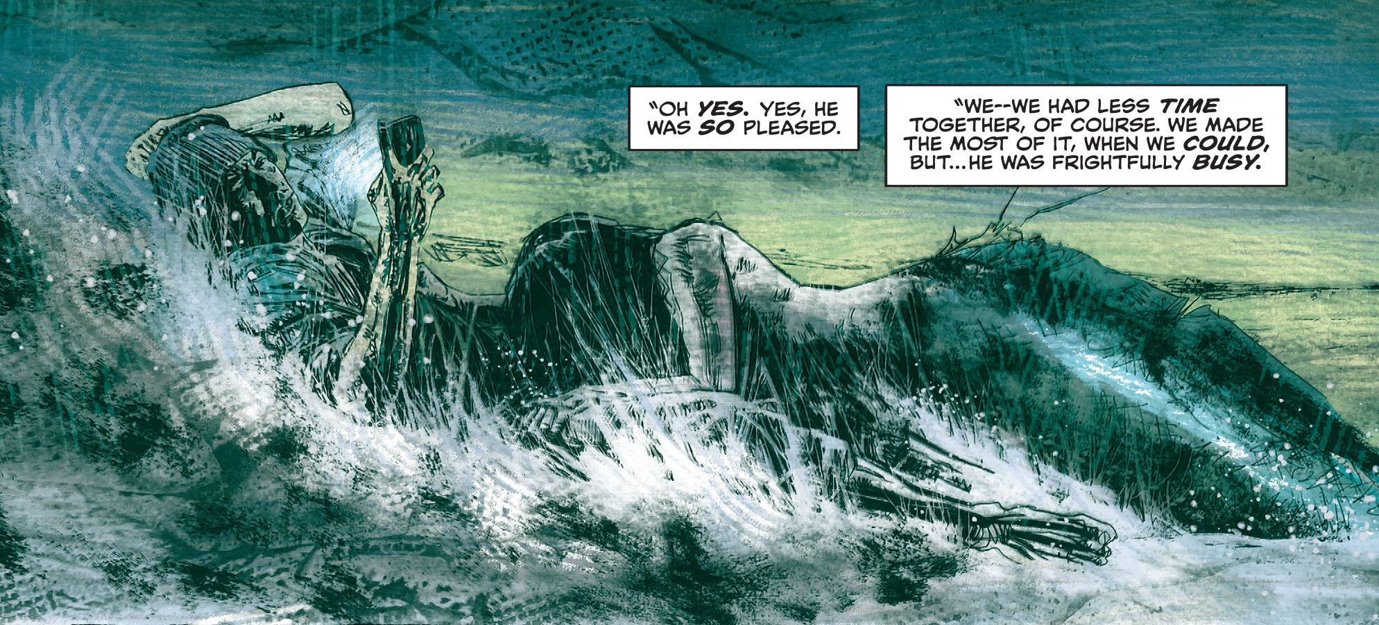
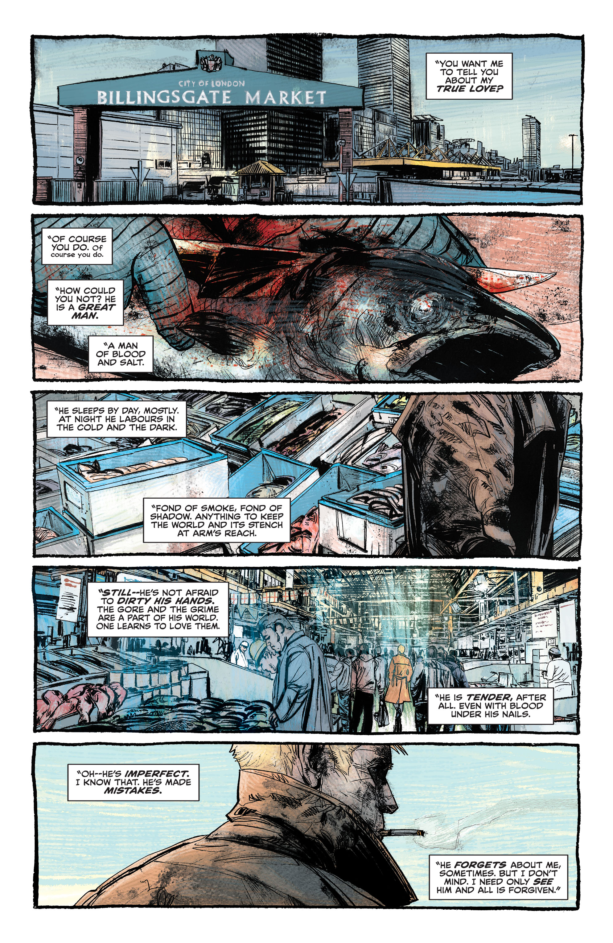
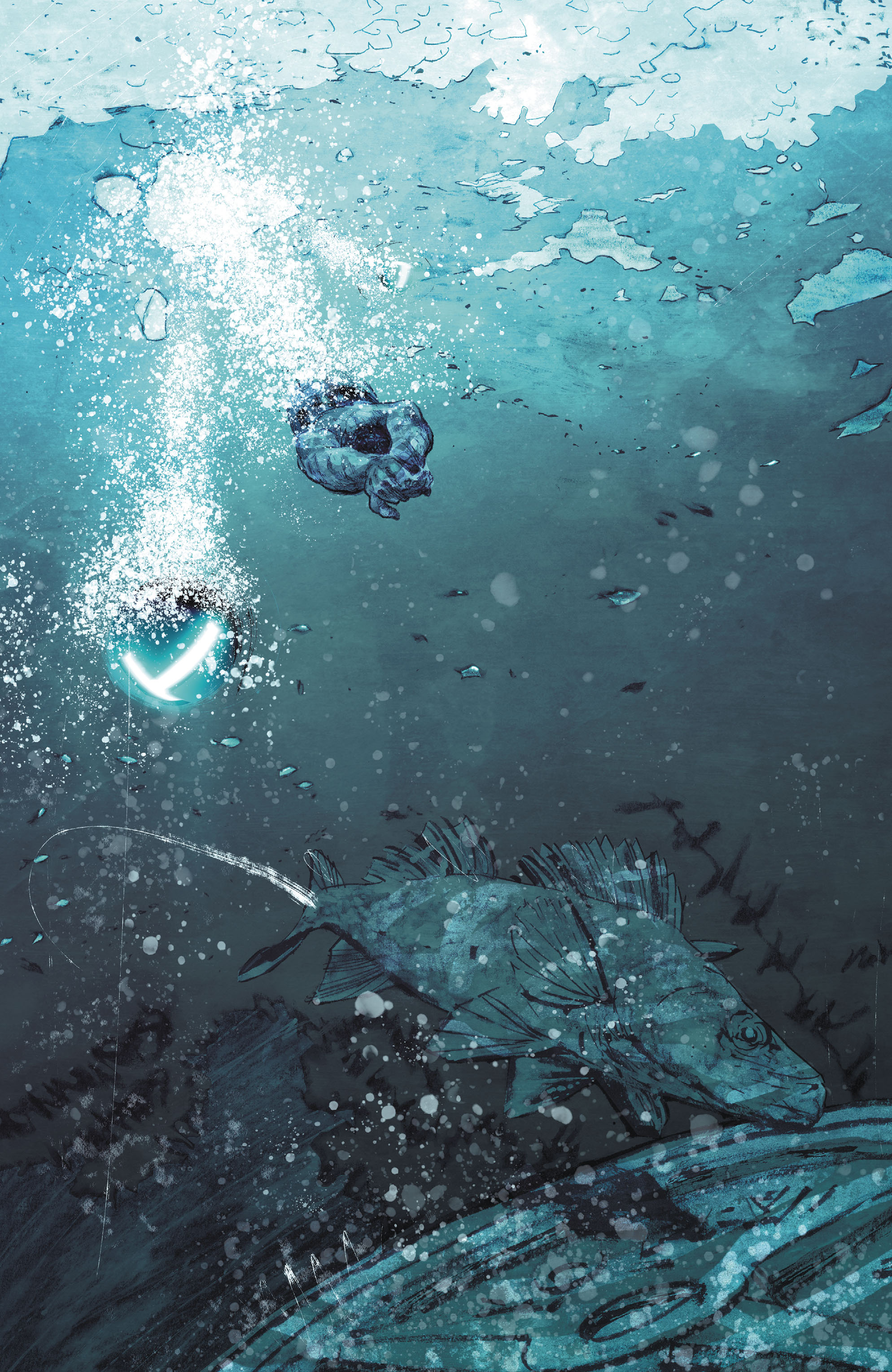
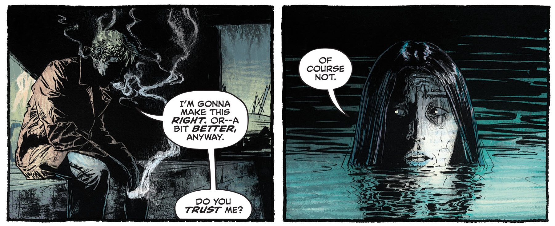
As you can tell from the image above, the artwork is stunning… Aaron Campbell’s light yet dirty draftsmanship and, particularly, Jordie Bellaire’s enveloping colors establish the required combination of realism and nightmarish eeriness. The smell of fish and maritime winds practically oozes from the pages. The goriest panels are typically covered with an aggressive red (which provides a symbolic link to the ‘salmon run’ comparison Constantine brings up in the final stretch), although the most shocking moment is actually rendered through a blue-tinged splash, creating a suitably nauseating visual. In the Hellblazer canon, the result sometimes verges on the realism of a Leonardo Manco or a Tim Bradstreet, but it also feels unique – the art is likely to stand out in one’s memory, like that in other remarkable issues of the series (such as those by the recently departed Richard Corben). Letterer Aditya Bidikar contributes to the unsettling tone as well, as the words become visibly hesitant and uneasy at key points in the comic, often changing size or intensity to convey the odd whispered aside (usually ‘Fuckwitt’).

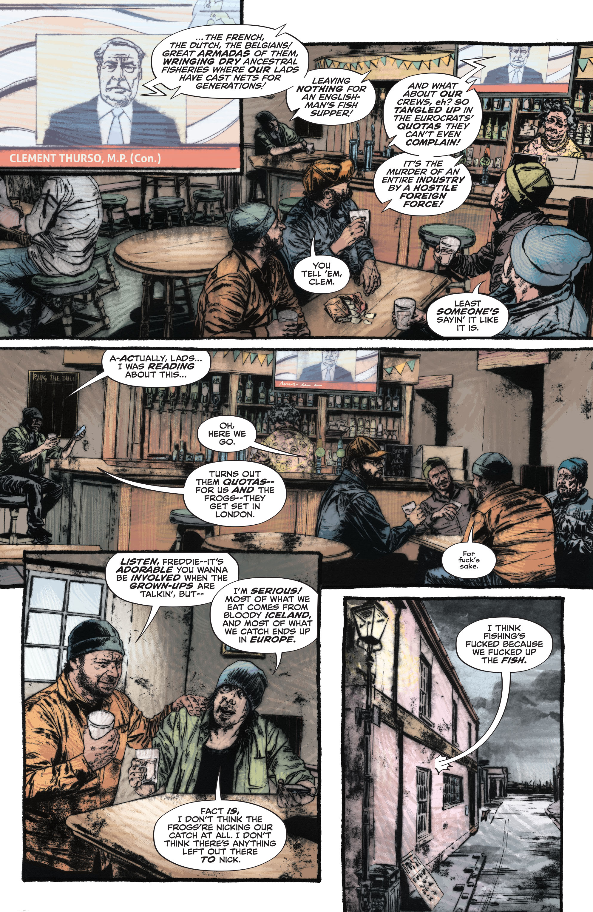
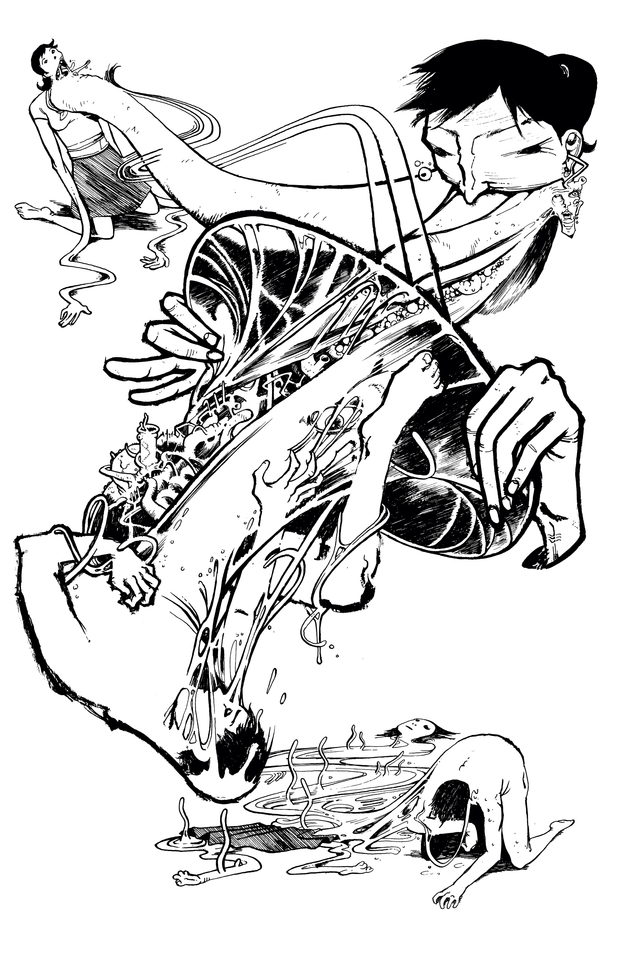
Like I mentioned above, Hellblazer has always committedly fit into a tradition of socially conscious horror that stretches from cult classics like Wolfen to the wave of post-Get Out attempts to capture the paranoia-inducing conditions of African-American existence (whether it’s Lovecraft Country‘s all-out fantasy or Blindspotting‘s low-key, thriller-like tension). Thematically, the background of ‘Britannia Rule the Waves’ (whose title is an obvious reference to the patriotic song ‘Rule, Britannia!’) is the resentment in the UK over other nations’ access to British territorial waters, enabled by the European Union (which was a major sticking point in the Brexit negotiations taking place at the time these comics came out). In other words, like the real-world debate about fishing rights, the story is about much more than the regulation of access to fish, touching upon the twin nerve of nationalism and xenophobia – plus the overlapping issue of environmental devastation – as succinctly illustrated in this scene:

si spurrier

Let’s get the spoilers out of the way. The first twist in the story is that the mermaid is deeply in love with Freddie, the fisherman who conjured her (using a spell provided by a mysterious old man). Their relationship, besides being highly sexual, turns out to be extremely abusive as well, as he’s basically just using her to get fish and respect from his manly peers (while getting off with other women on the side). The second big twist is that the mermaid gets pregnant and Freddie, lovely chap that he is, pushes her away – he only takes her back once he realizes she has amazing self-healing powers, which means that he can keep chopping off her tail and selling it as monkfish. Feel free to read in this a sick parable about Britain ruthlessly and recklessly exploiting its resources while blaming foreigners when things turn bad.

This is one of those comics in which John Constantine remains mostly passive, serving as a bastard version of the Phantom Stranger: part witness to the horror, part dispenser of EC-style ironic justice. Just like Brian Azzarello once had John unleash a Jewish golem against neo-Nazis, Si Spurrier has him push Freddie into the waters where the fisherman gets devoured by fish – more precisely, by his own children! (As for the creepy old man who provided the spell, although you don’t really need to know this to appreciate the tale, his actions tie into the series’ overarching saga, so this two-parter helps set up his plan, revealed in later issues.)

I guess you can see in the story echoes of a certain kind of post-referendum discourse against working class voters who chose to leave the EU (the British equivalent of Hilary Clinton’s ‘basket of deplorables’), with the fishing community coming across as somewhat despicable. Yet there is also a degree of empathy with the plight of these men, acknowledging their economic despair and (misdirected) fear. I especially like the passage in which Constantine describes how, every day at 4am, Freddie waits for the market to open while ‘sucking smokes like a brat with a milkshake.’ Ultimately, the fishermen are just trying to get by, responding to pressures of demand by ‘all them chefs and foodies watchin’ the haul of fuglyfish get smaller and smaller…’

In short, ‘Britannia Rule the Waves’ powerfully draws horror from a combination of surreal imagery and real social issues (right-wing populism, economic hardship, ecological crisis, toxic masculinity…), treading the line between politically informed dark comedy and chilling, emotional drama. This balancing act, coupled with the acerbic, non-linear storytelling, makes this Hellblazer at its finest: the comic is a worthy successor to vintage tales such as ‘When Johnny Comes Marching Home,’ ‘Early Warning/How I Learned to Love the Bomb,’ ‘Hold Me,’ ‘Fear and Loathing,’ ‘Setting Sun,’ and ‘Scab,’ among many others. (And yes, the second story in the ‘Setting Sun’ issue, in which John recalls his previous lovers, has now become a bit of an awkward read, given the recent revelations about Warren Ellis’ manipulative promiscuity…)

Like those classics, this one is also beautifully written, with the prose interweaving the various layers at play. Check out how the very first page, below, has a lyrical description of the (not usually romanticized) figure of a fishmonger that also doubles as a metaphorical allusion to John Constantine himself:

simon spurrier

The reason I didn’t include the paperback collecting the first half of Spurrier’s 12-part run, Marks of Woe, in my list of top 2020 books is because this trade opens with a couple of issues (The Sandman Universe Presents: Hellblazer and Books of Magic #14) that are all about continuity-fixing, tying up loose ends from three decades ago and joining the dots between various bits from the long history of both Hellblazer and Books of Magic (going back to the original Neil Gaiman mini-series). I wanted to keep the recommendations relatively accessible and those opening chapters seemed impenetrable for anyone without a Vertigo degree – in fact, for anyone without a DC PhD, since they even featured references to Doomsday Clock, the infamous crossover between Watchmen and the latest reboots of the DCU (‘The New 52’ and ‘DC Rebirth’). Most readers could perhaps get the gist of things, but they wouldn’t have much reason to care… Seriously, Hellblazer is up there with Batman as my favorite comic book franchise and even I couldn’t bring myself to care all that much.

While I’m onboard for having John Constantine occasionally pop up in other DC titles, I don’t think his own series has much to gain from being treated as a superhero-like, exposition-heavy kaleidoscope of a thousand different publications you have to check in order to properly follow the main story. A special one-shot could certainly be the place for it, but the problem is that the rest of Si Spurrier’s run was intrinsically related to a plot point from these issues (in which Constantine once again sold his soul for a return to health), so they contaminated much of what followed, clever as it was. Fortunately, you don’t really need all that background to enjoy ‘Britannia Rule the Waves’ (which should be collected next month, in the book The Best Version of You).

In any case, like I mentioned above, there was still quite a lot to like in Si Spurrier’s John Constantine Hellblazer. In fact, it’s a damn shame this series has been canceled (even if it was allowed to wrap up its main plot in a double-sized final issue). The age of Brexit and Covid-19 is ripe for exploitation by what has often been one of the most twisted and viciously entertaining comics in the field…

si spurrier

Posted in FANTASTIC ADVENTURES | Tagged , , , , , , , , , , | Leave a comment

COMICS CAN BE AWESOME (15 February 2021)

A trippy reminder that comics can be awesome:

michel fiffePanorama
GrimJackGrimJack #28
spy islandSpy Island #3
Posted in GLIMPSES INTO AWESOMENESS | Tagged , , , , , , , , , , , , | Leave a comment

Yet another long post about Batman’s humorous villains

Gotham Calling’s 400th post!

This is the kind of benchmark I usually celebrate by spotlighting oddball members of Batman’s rogues gallery who don’t get enough love. While the Dark Knight has some of the most popular rogues out there, Gotham’s very tendency to keep spitting out new demented criminals is a big part of the franchise’s mystique – and one of its main sources of humor. It means that you can even pull off homages to this world without riffing on specific characters, since readers can recognize the *type* of villains that could show up in Batman tales (for example, Big Bang Comics (v2) #11 does a wonderful job of evoking this feel). Moreover, those throwaway foes, with their damaged psychology underneath silly, referential identities, tend to come off as particularly pathetic underdogs, so a part of me cannot help but root for them as they punch way above their weight by going up against the Caped Crusader.

For instance, take the Pied Piper of Peril, who uses pipes to commit crimes:
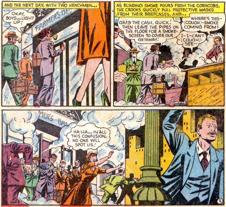
The Pied Piper of PerilDetective Comics #143

The Pied Piper made his first – and, I believe, only – appearance in Detective Comics #143 (cover-dated January 1949), by the fruitful creative team of writer Bill Finger, penciller Jim Mooney (ghosting for Bob Kane), and inker Charles Paris. What raises the character above a mere thief with a visually interesting technique is the committed embrace of his gimmick’s semantic potential. In other words, what makes him truly eccentric isn’t that he robs a bank with weaponized corncob pipes, as shown above, but that he uses all sorts of pipes – from exhaust pipes to bagpipes – to commit different crimes related to the victims’ names…

It’s the kind of comic where, if you take a step back, you can just picture Finger jolting down every idea he could come up with related to one specific object (or one word with multiple uses) and then building the whole script around it. Every standard Batman trope (from Gotham City’s gaudy architecture to the puns in the Dynamic Duo’s dialogue) is then adjusted according to a single motif – in this instance, pipes. So, for example, here is the obligatory deathtrap:
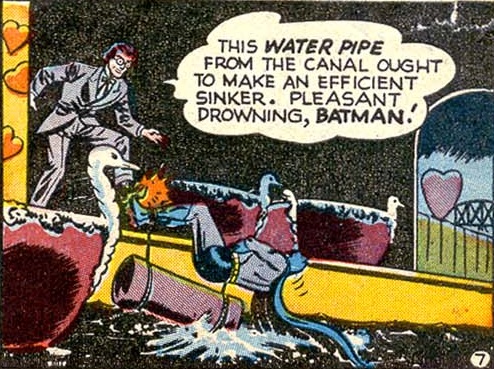
Bill FingerDetective Comics #143

This storytelling strategy can produce pretty entertaining comics, which often come out as either quite cohesive or hilariously forced. The ensuing villains tend to run out of steam pretty quickly, though, since they amount to little more than a superficial word-association exercise that has already been fully explored.

That said, from an in-story perspective, because they only show up once, characters like the Pied Piper of Peril come across like criminal hobbyists having fun rather than like full-blown psychopaths, which is a nice change of pace in the daily exploits of the Dark Knight. Hell, they end up seeming relatively harmless, to the point where you can almost see Batman actually letting them get away, just out of respect for the fact that they clearly put a lot of effort into the whole thing… Regardless, the fact that these kooky crooks don’t reappear can serve as a helpful counterpoint to the troubling implications in the genre’s intrinsic discourse about recidivism (admirably spoofed in Wonder Twins #2).

A similar case of working an entire story out of a single concept could also be found in the previous year, in ‘The Human Key!’ (Detective Comics #132, February 1948), by the same creative team:
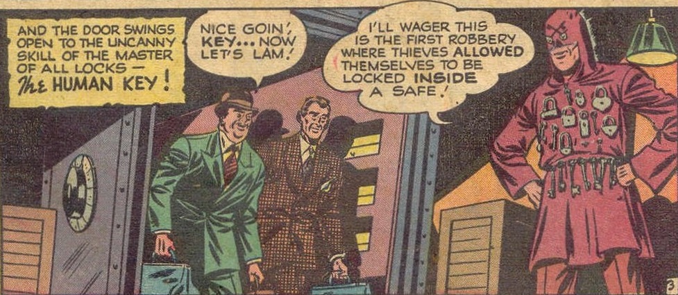
Human KeyDetective Comics #132

(I absolutely love the impractical costume!)

In this quintessential Batman tale, the Dynamic Duo faces a criminal version of Harry Houdini in the form of a master locksmith who can break into any safe (and, presumably, out of every prison, although, given the story’s resolution, it makes sense that we never saw further crime sprees by the Human Key).

In a typical approach to characterization, the villain’s obsession harkens back to his childhood, giving a sense of inescapable destiny to his personality, even if – for once – the Human Key’s origin does not involve any serious trauma, but merely the passionate use of a personal skill…
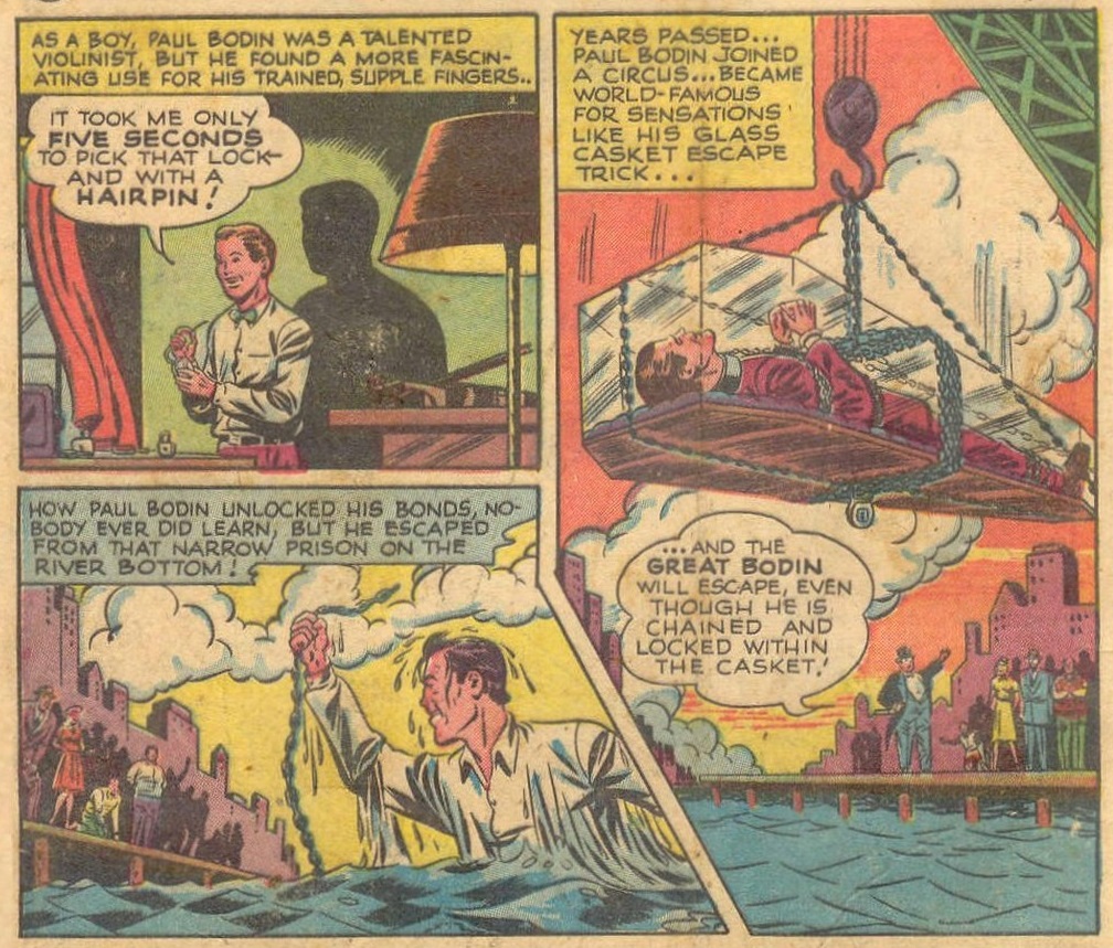
Jim MooneyDetective Comics #132

Once again, Bill Finger stretches the meaning of the villain’s theme through whimsical games of polysemy. While the Human Key’s name and major M.O. clearly refer to his expertise in unlocking physical locks, that doesn’t prevent this brilliant safecracker from providing outrageously convoluted clues that draw on other uses of the term ‘key’ – in particular, he tips off the Dynamic Duo about his next job by whistling in a specific musical key!

Likewise, we get another deathtrap linked to the foe’s chosen motif. The result is an epitome of one of my favorite type of scenes, with the Caped Crusader using his intelligence, imagination, and scientific knowledge to figure out an escape:
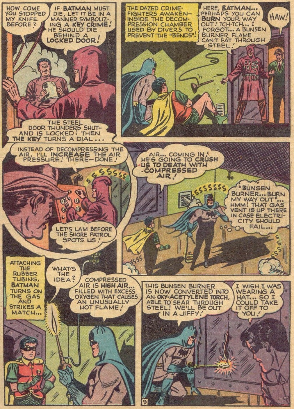
The Human KeyDetective Comics #132

Just one more example from the Golden Age: ‘Tiger Shark!’ (Detective Comics #147, May 1949), where the titular villain is a subaquatic thief equipped with marine gadgets and knowledge. This tale (by an unknown writer) doesn’t seem to have sprung up from wordplay, but rather from the alluring notion of pitting the Dark Knight against a modern-day pirate with a fancy submarine and scuba-diving henchmen.

Gotham being Gotham, the crook has to have a preposterous costume… This time around the design is by Dick Sprang (also inked by Charles Paris). In a delightfully odd choice, either Sprang or whoever colored the original comic chose to base the villain’s look, not on an actual tiger shark, but on a literal extrapolation from part of his name: the costume has black stripes over an orange pattern, like the fur of a (non-shark) tiger:
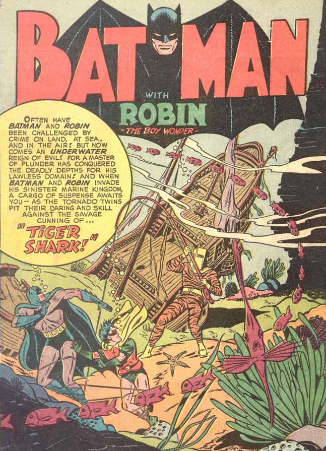
Tiger SharkDetective Comics #147

(It’s also a neatly designed splash page… I particularly enjoy the fish in the bottom right corner, who seems to be staring at the readers, mirroring their surprised look.)

The outfit may feel especially weird if you consider that, unlike tigers, killer sharks have become a huge part of pop culture, although, in its defense, this comic came out almost thirty years before Jaws. Plus, the truth is that such a cool design can take you a long way… ‘Tiger Shark!’ is fine, but as a story it’s less amusing than either ‘The Human Key!’ or ‘The Pied Piper of Peril!’ Nevertheless, Tiger Shark became comparatively more iconic than those other villains, earning a few memorable cameos in the 2008 cartoon show Batman: The Brave and the Bold.

Speaking of the 21st century trend of bringing back goofy creations from the Caped Crusader’s earlier decades: the criminal illusionist Zelda the Great moved in the opposite direction from Tiger Shark, starting off on the small screen and eventually finding her way to the printed page. She made her debut in the 1966 Batman TV series, on the episodes ‘Zelda the Great’ and ‘A Death Worse Than Fate’ (a two-parter saga, as per the show’s formula). Despite the usual mix of spectacular art direction and offbeat comedy (which you can also find in the series’ awesome trading cards), those episodes weren’t necessarily among the first season’s highest points, even if they later earned their place in history by featuring the opening line of White Zombie’s ‘Cosmic Monsters Inc.

Zelda’s initial gimmick was pretty specific: she robbed one hundred thousand dollars from a bank every year, on April 1st. It turned out that even though she was a world-famous escape artist, Zelda secretly bought her act’s traps and escape solutions from the self-proclaimed Albanian genius Eivol Ekdol, for $100,000 apiece. When Batman planted a fake news item in the Gotham City Times claiming the money from her latest robbery was counterfeit, though, she happily switched tactics, kidnapping Dick Grayson’s aunt Harriet and suspending her in a straitjacket over a pool of flaming oil while waiting for the $100,000 ransom…
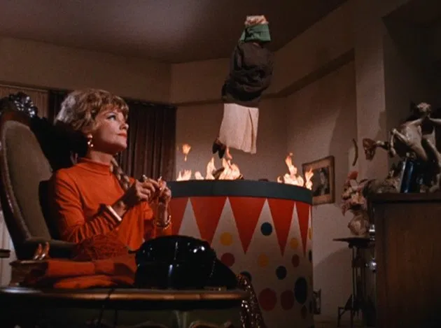
Batman TV‘Zelda the Great’

In ‘A Death Worse Than Fate,’ we found out that not even Eivol Ekdol knew how to escape from his latest trap, so he and Zelda lured the Caped Crusader into it in the hopes that Batman’s inevitable escape would show them how the trap could be used on the stage… As motivations for crime go, this one was pretty bonkers, but also perfectly in tune with the show’s campy attitude. That attitude, by the way, reached a new height during a priceless sequence in which Commissioner Gordon, speaking to Zelda on a live television broadcast, explained to her the money from the original robbery wasn’t counterfeit after all while holding a one-sentence statement from the editor of the Gotham City Times – ‘Look, it’s signed and notarized!’ (By the way, did I mention that in this reality Bruce Wayne was the director of the First National Bank of Gotham City?)

Apart from the kidnapping subplot, the episodes’ overall story was actually based on ‘Batman’s Inescapable Doom-Trap!’ (Detective Comics #346, December 1965), by John Broome, Sheldon Moldoff, and Joe Giella.
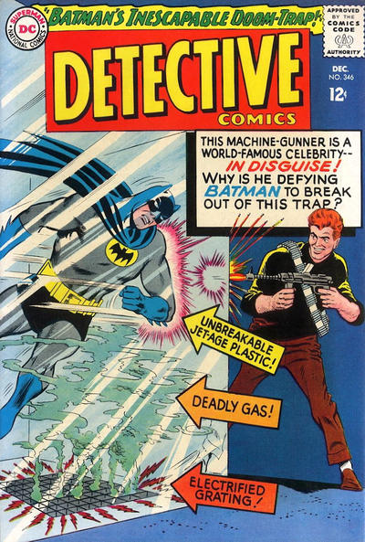
batman

Zelda the Great, then, was a gender-swapped version of that comic’s escape-artist-turned-thief, Carnado, but she came off as much cleverer, seeing through the Dynamic Duo’s early ruse (she even broke the fourth wall to brag about it to the audience) and nonchalantly outsmarting them in the first part of the story. Moreover, you get the feeling that it wasn’t just a moral compass that led her to spare Batman’s life in the climactic ambush, especially as the previous episode had already established the Dark Knight’s powerful sex appeal (in the comic, Batman didn’t need any aid: he figured out where the shooters were by paying attention to the way Carnado’s eyes moved). It helped that guest star Anne Baxter imbued her performance with so much charisma and ill-disguised titillation – in my head-canon, she’s playing the same character as in All About Eve, whose career has taken a zany turn since we last saw her because entertainment is such a ruthless business (the point of that movie, after all).

While the ridiculously named Carnado was never heard of again, Zelda the Great reappeared in 2014, on the pages of Batman ’66, a comic book spin-off of the sixties’ show (created almost fifty years later, because that’s nostalgia for you). In ‘Zelda’s Great Escape’ – written by Jeff Parker, illustrated by Craig Rousseau, and colored by Tony Aviña – we see this villain has turned the previous story’s premise into a whole modus operandi, repeatedly trapping the Dynamic Duo in order to copy their escapes in her stage act…
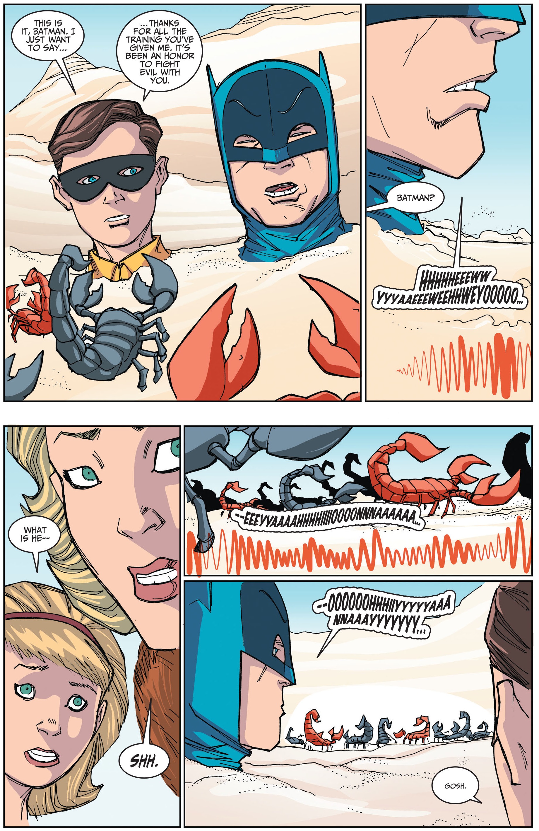
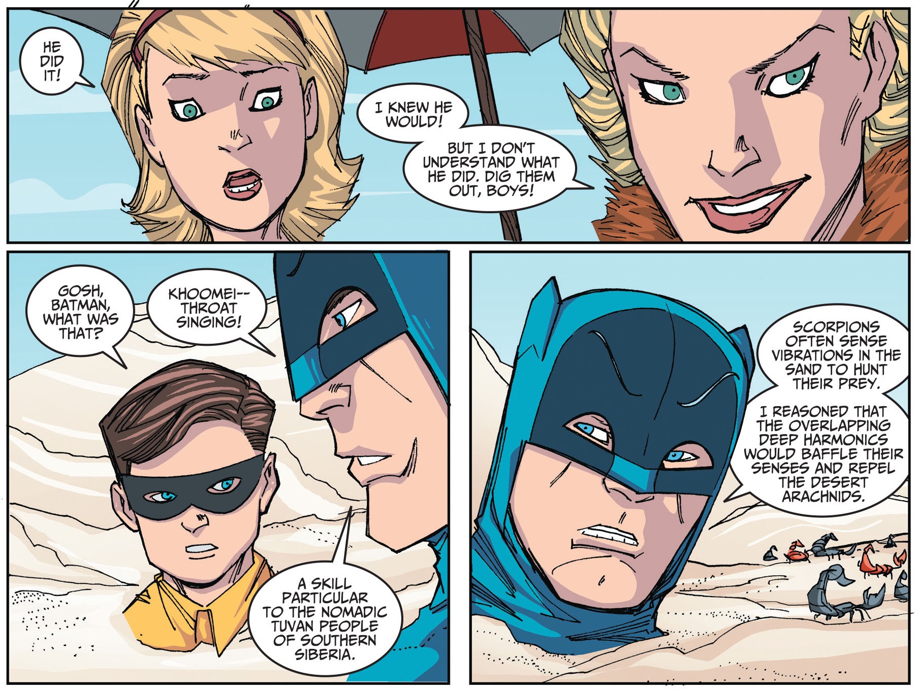
Zelda the GreatbatmanBatman ’66 #9

While the main joke is Zelda’s explicit obsession with showmanship (as opposed to its implicit status in the performative crimes and showy deathtraps of Batman’s usual rogues), what elevates this tale is Jeff Parker’s decision to actually give Zelda the Great a philosophical justification for her willingness to go to such extremes in the quest for fame and glory… And because Dick Grayson’s date, Haley, seems persuaded by Zelda’s warped worldview, the villain actually ends up striking quite a blow against the Teen Wonder, without even realizing it!
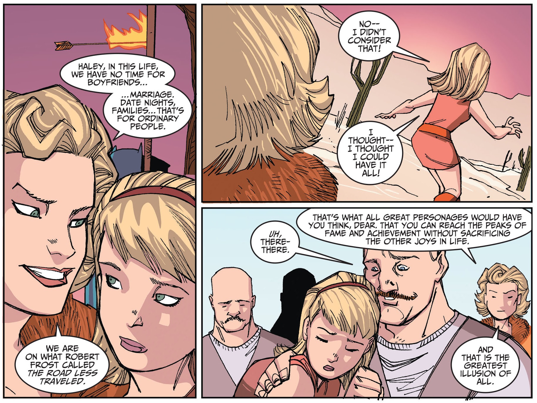
ZeldaBatman ’66 #9

Don’t get me wrong: I love scary villains. In fact, I think Batman has generally gained a lot from drawing on horror imagery, whether it’s David Lapham riffing on Invasion of the Body Snatchers in his ‘City of Crime’ saga, Kelley Jones filling every single one of his pages with a parade of grotesqueries, or Christopher Nolan shooting the docks’ scene in Batman Begins from the crooks’ terrified point of view, as if it was a slasher movie. However, there’s more than enough room in my Gotham for the sort of colorful, flamboyant escapades that you get with characters like Zelda the Great.

For instance, another rarely seen villain I really like – and who also straddled the line between spectacle and delinquency – was a guy called Kim, who made his debut in ‘The Art of the Steal’ (Gotham Adventures #49, June 2002). That issue was part of the underrated – because bafflingly uncollected – run by Scott Peterson, Tim Levins, Terry Beatty, and Lee Loughridge, who in the early 2000s put out a phenomenal string of one-and-done stories featuring fun mysteries, boisterous action scenes, slick visual storytelling, and some of best takes on the Caped Crusader and his world. Although Gotham Adventures was mostly focused on standard gangsters or on familiar rogues, this creative team came up with a new villain, one who approached crime, not as a means, but as an end in itself – more specifically, Kim understood crime as a possible art form!
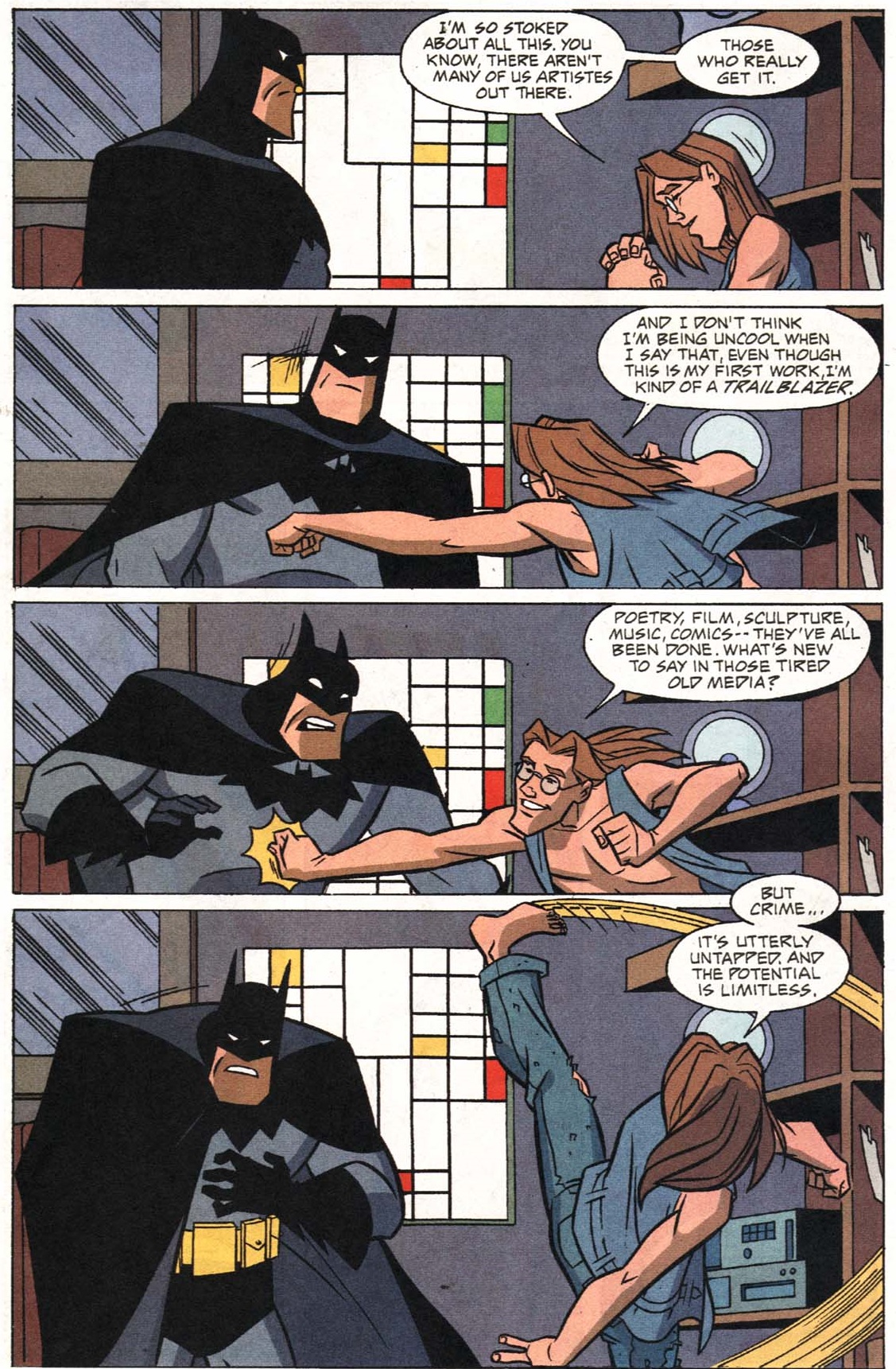
gotham adventuresGotham Adventures #49

It was a particularly conceptual understanding of art, which owed more to cerebral criticism and academia than to the notion of the passionate creator expressing his emotions through his works. The fact that Kim essentially approached crime as an intellectual exercise can be seen in his refusal to don an extravagant name or outfit, like most Batman foes – instead, suitably, Kim just looks (and sounds) like a smug, pretentious art student who trades on postmodern referentiality and ironic distance.

The absence of a memorable visual signifier may explain why the character was never picked up by other writers, even if he did return in a couple of very nifty issues of Gotham Adventures: ‘Identity Theft’ (#56) and ‘The Real Deal’ (#57). Sure, Kim was ultimately just a more exaggerated version of other criminals with an obvious artistic inclination (from the Joker to Calendar Man…), but I think there is gold to be mined in the premise of a highbrow villain who – like some artists – is so committed to his schtick that his schemes become virtually indecipherable to anyone other than himself.
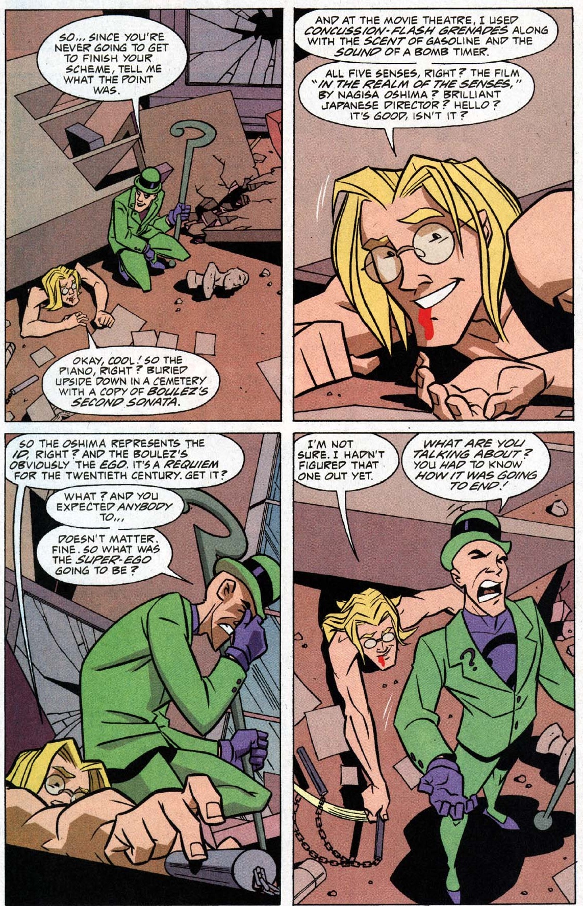
Gotham Adventures #56Gotham Adventures #56

Ironically, the lamer a villain comes to be regarded, the less likely it becomes for s/he to fade into obscurity… After all, infamous creations like Crazy Quilt and Polka-Dot Man ended up evolving into the recurrent butt of jokes about Batman’s rogues’ gallery. This tendency reached a particularly meta dimension in the case of the Condiment King, a condiment-themed thief that was created as a deliberate parody of those sorts of villains and eventually became one of their most notable representatives.

Like Zelda the Great, Condiment King made his debut on television, but his origin was even more tongue-in-cheek. In the Batman: The Animated Series episode ‘Make ‘Em Laugh’ – written by Paul Dini and Randy Rogel (and first aired in 1994) – the Joker used mind control to turn the judges of a comedy competition into absurd costumed criminals, including the Condiment King (other victims became the Pack Rat, who only stole trash, and Mighty Mop, an evil sitcom housewife). Thus, even within the story, CK was supposed to be a joke, or at least the twisted product of a comedian’s delusional mind and the Joker’s slapstick sense of humor, awful condiment puns and all (‘I knew you’d ketchup to me sooner or later. How I relished this meeting.’).

Hell, just look at the guy:
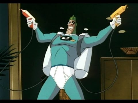
make 'em laugh‘Make ‘Em Laugh’

Chuck Dixon later introduced the character into the comics’ continuity, without the brainwashing backstory, as just another Gotham madman, complete with an appropriate civilian name (Mitchell Mayo) and a hilariously offhand explanation for his disorder (‘I guess he took one too many special orders.’). Curiously, in Birds of Prey #37 (January 2002), Barbara Gordon reminisces about something special that happened between her and Dick Grayson the first time they – as the original Batgirl and Robin – fought Mitchell Mayo. The following year, in Batgirl: Year One, Dixon revealed this to have been the first kiss between Babs and Dick, thus retroactively inscribing the Condiment King at the heart of the history of this major romance! (Yep, reading Dixon’s comics back-to-back can be as rewarding as binging the Marvel movies in order…)

Even better than Dixon’s worldbuilding, though, was the chance to see the amazing art team of penciller Marcos Martin and inker Alvaro Lopez amusingly redesign the Condiment King’s look… Here is their take (colored by Javier Rodriguez) on what a more amateurish version of this villain might have looked like when he first got started, including a clear mustard and ketchup motif:
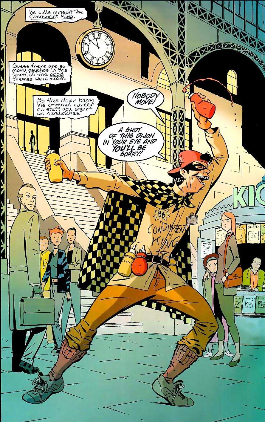
chuck dixonBatgirl: Year One #8

And here is a more stylish, upgraded, Jokerized version, who showed up in the aftermath of the crossover Joker: Last Laugh:
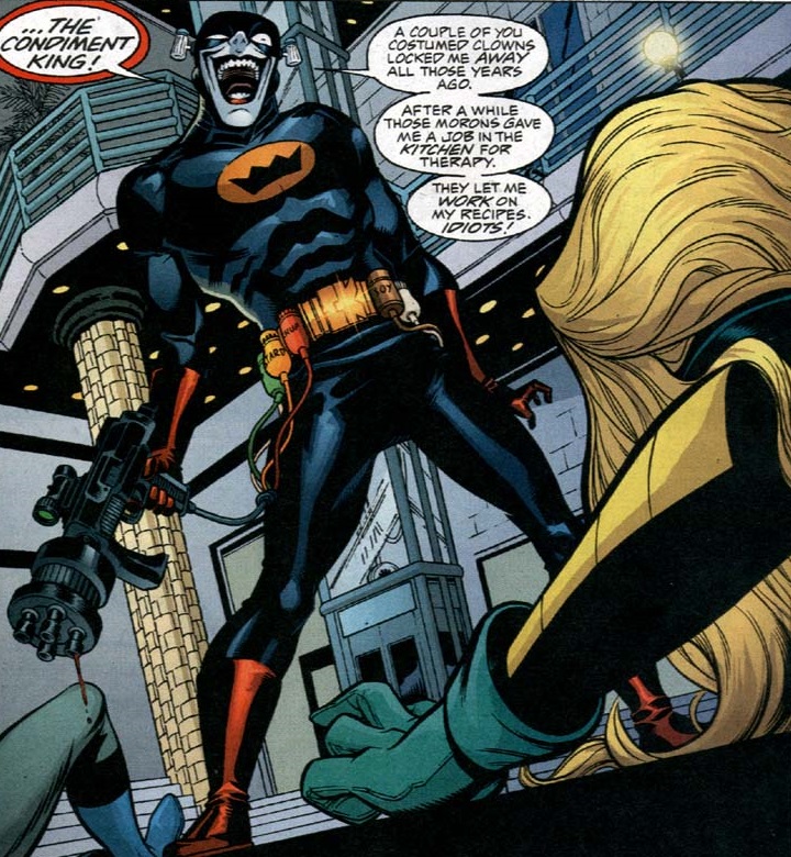
condiment kingBirds of Prey #37

(Yep, it’s a condiment-based variation of Batman’s suit!)

Although the Condiment King wasn’t taken seriously from the start, leave it to Chuck Dixon to come up with a way of having your spicy cake and eating it too – i.e. of preserving the character’s inherent ludicrousness yet simultaneously turning him into a dangerous threat. In the comic book version, while the Condiment King was locked up in Arkham Asylum, Poision Ivy taught him all about natural spices and how to weaponize them. Once he broke out, he totally built a mustard gas bomb!

Dixon brought him back one last time, in Robin #171, but it was little more than a cameo… In turn, Lilah Sturges (then writing as Matthew Sturges) gave the Condiment King a more prominent – and ultimately fatal – role in her violent comedy about Z-list villains, Final Crisis Aftermath: Run. Sturges ran with the notion that this was basically a Batman ’66 villain displaced in time, so she filled his dialogue with non-stop gloriously cheesy puns:
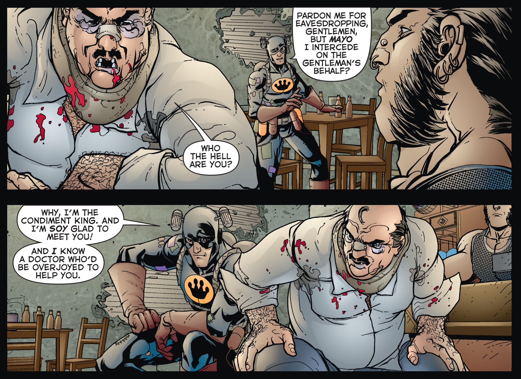
lilah sturgesFinal Crisis Aftermath: Run #2

Between reboots, parallel continuities, and the Caped Crusader’s constant multimedia expansion, the Condiment King has continued to pop up as a reliable running gag. He looked quite at home in The LEGO Batman Movie, a metafictional satire that threw a caricature of the Christian Bale/Ben Affleck Dark Knight into a heightened version of Adam West’s world (the film deliberately mimicked the joyful energy of a child playing with toys from disparate branches of the franchise… and, ultimately, with disparate franchises). Back in comics, the Condiment King appeared in Lil Gotham and Harley Quinn, but his presence goes beyond humor titles: notably, Tom King has featured a bunch of cameos by Mayo in his Batman run.

This character’s longevity speaks to the fact that, regardless of the grim façade, one of the core genres operating in Batman narratives has always been an outlandish kind of darkly funny surrealism (typically diluted in crime, horror, and superhero elements). This isn’t just something that comes to the surface when you have comedy writers work on the property, like when Kevin Smith went for it by including in his Cacophony mini-series a genital mutilation joke about Victor Zsasz that built on the logical extension of this serial killer’s bizarre gimmick (if he honors each murder by scarring himself, then sooner or later he has to run out of unscarred skin…). The best creators have embraced this side of the material, whether it’s Grant Morrison opening his epic run with the Joker engaged in a farcically over-the-top slice of mayhem (‘I finally killed Batman! In front of a bunch of vulnerable, disabled KIDS!!!!’) or Paul Dini having Harley Quinn investigate a case about missing dogs, only to then realize her own hyenas had been eating them in the first place (back in Gotham City Sirens #11).

The magic of a solid Batman tale is to pull off this madcap comedy angle while also delivering a thrilling adventure. It may sound like a strange balancing act, but you can find similar blends in a number of other pop cultural phenomena – it’s not such a big leap from the gonzo comics of 1970s’ The Brave and the Bold to the best James Bond films coming out at the time (Diamonds Are Forever, Live and Let Die, The Spy Who Loved Me) or even some of the following decade’s Arnold Schwarzenegger vehicles.

On a more direct level, like I said in the beginning, I have a certain fondness for Gotham City’s small-time criminal losers and I’d like to see them thrive, somewhere. Who knows, perhaps they can find a place in The League of Annoyance…
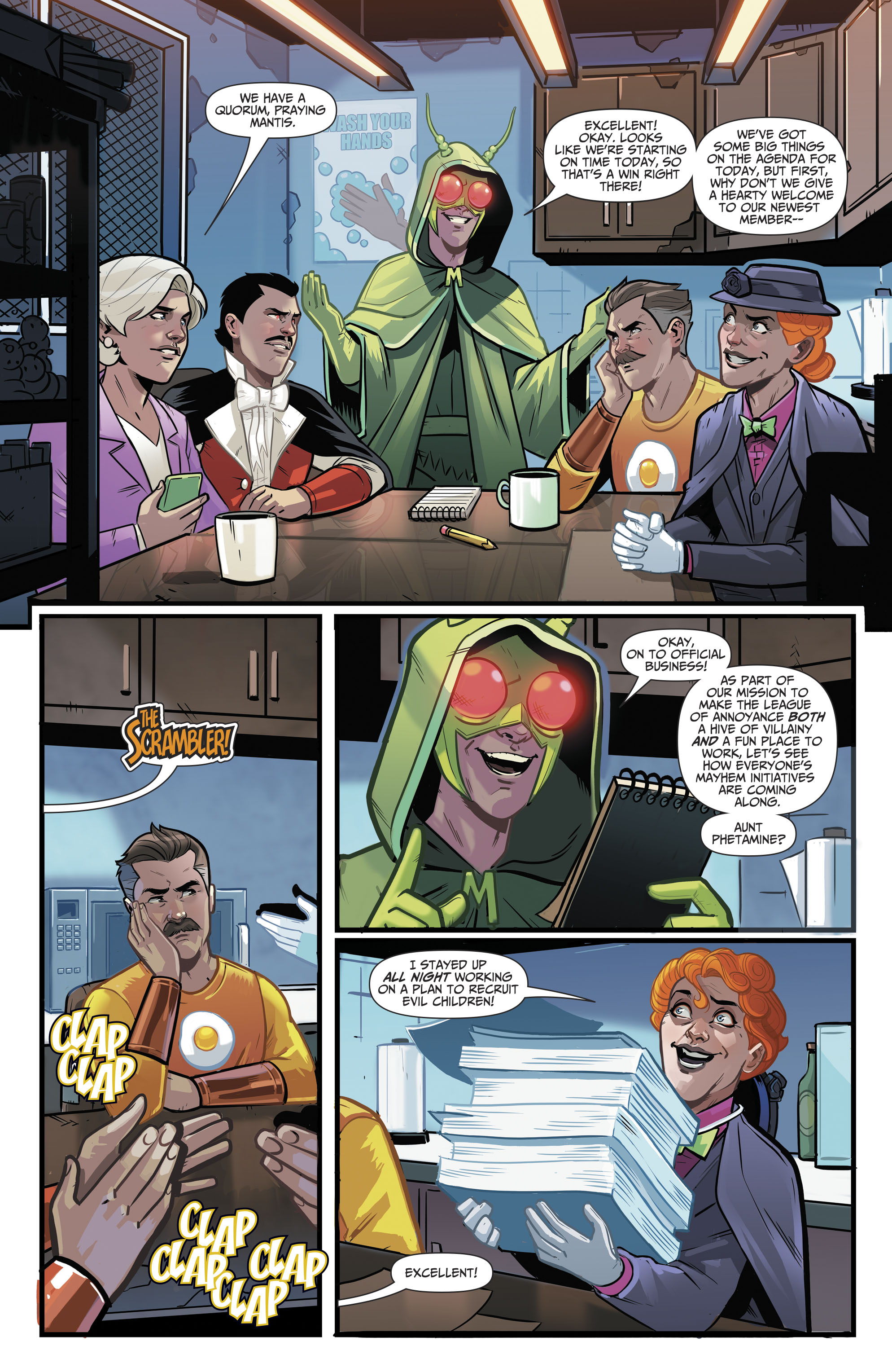
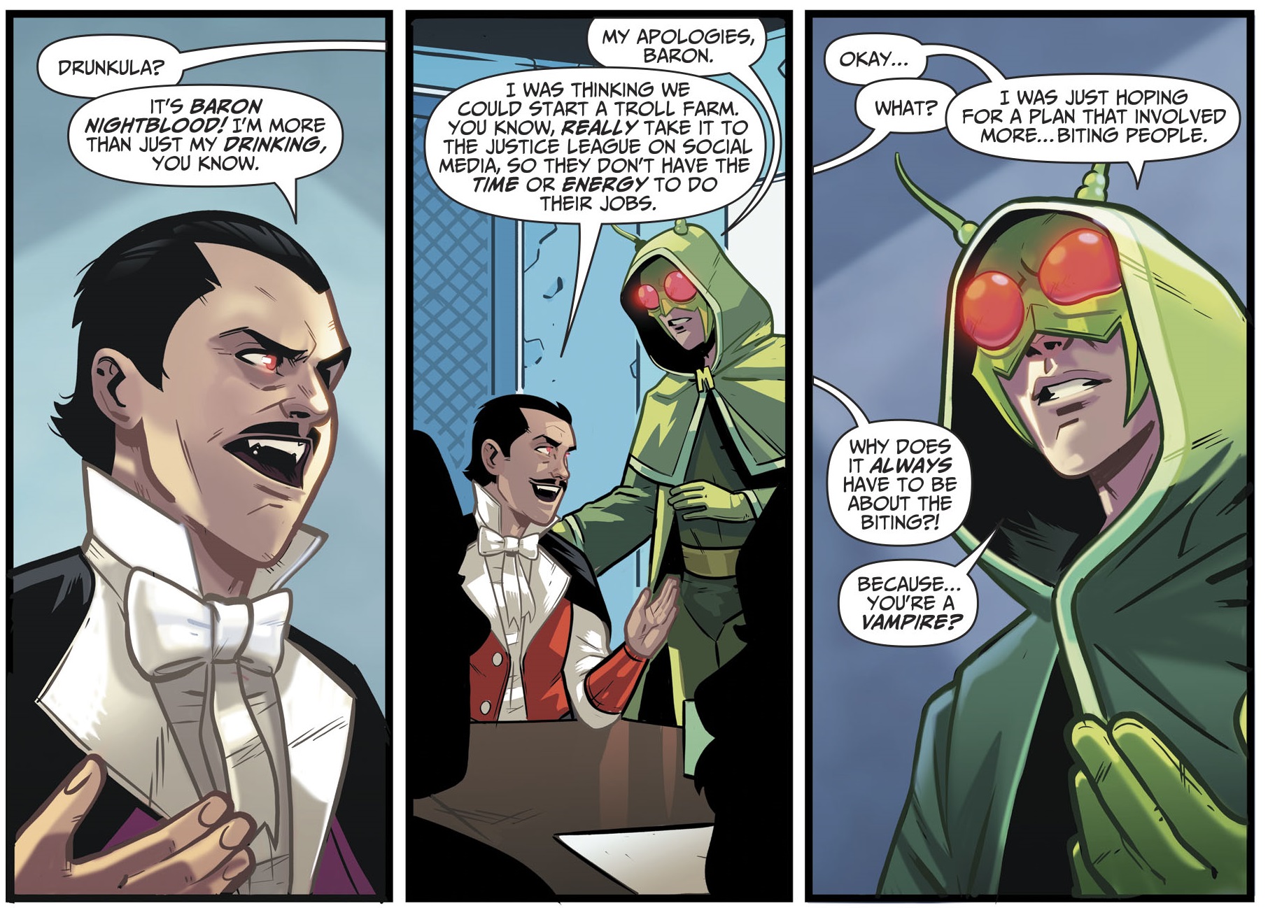
mark russelmark russellWonder Twins #2
Posted in GOTHAM CITIZENS | Tagged , , , , , , , , , , , , , , , , , , , , , , , , , , , , , | Leave a comment

COMICS CAN BE AWESOME (8 February 2021)

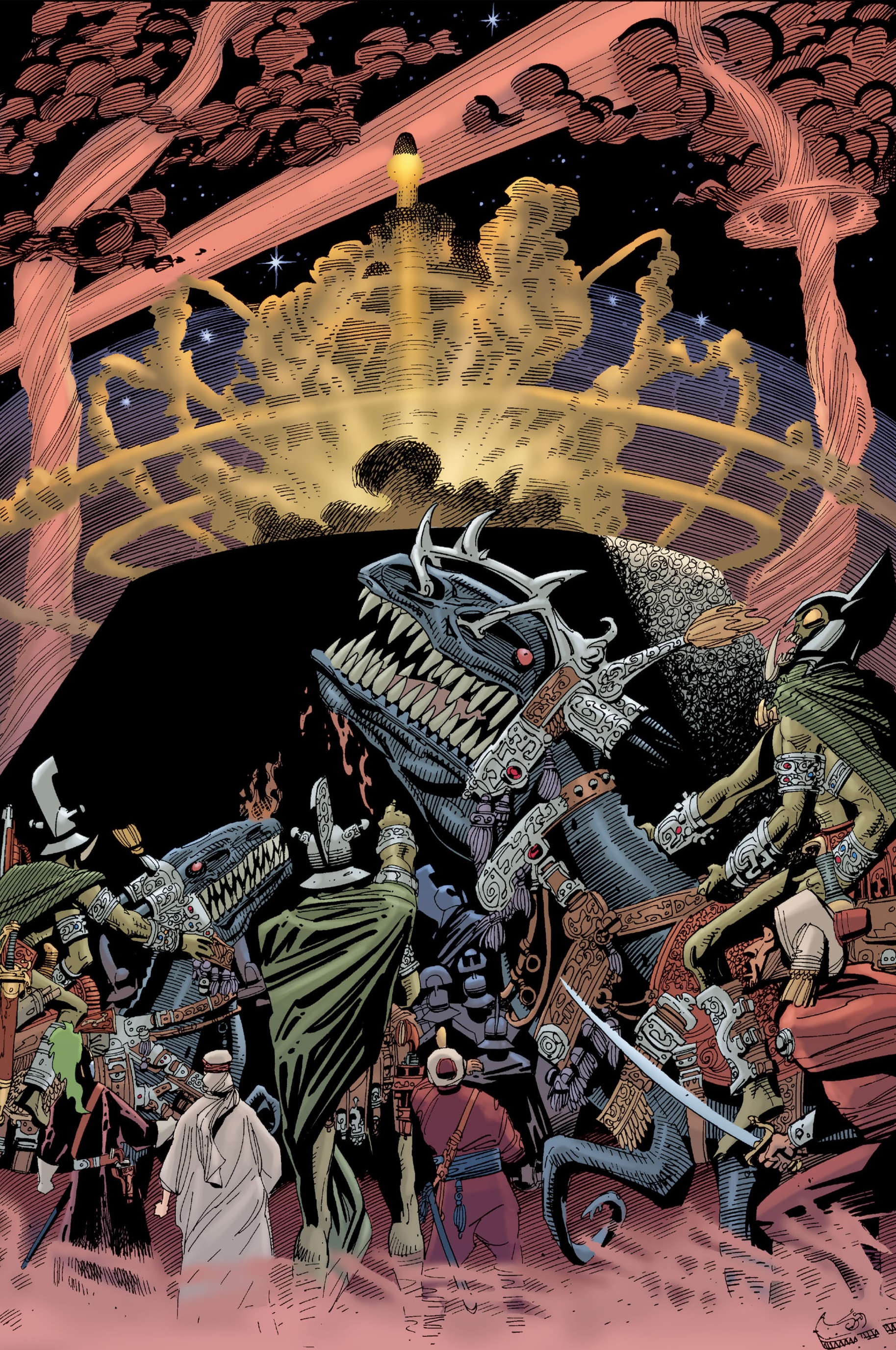
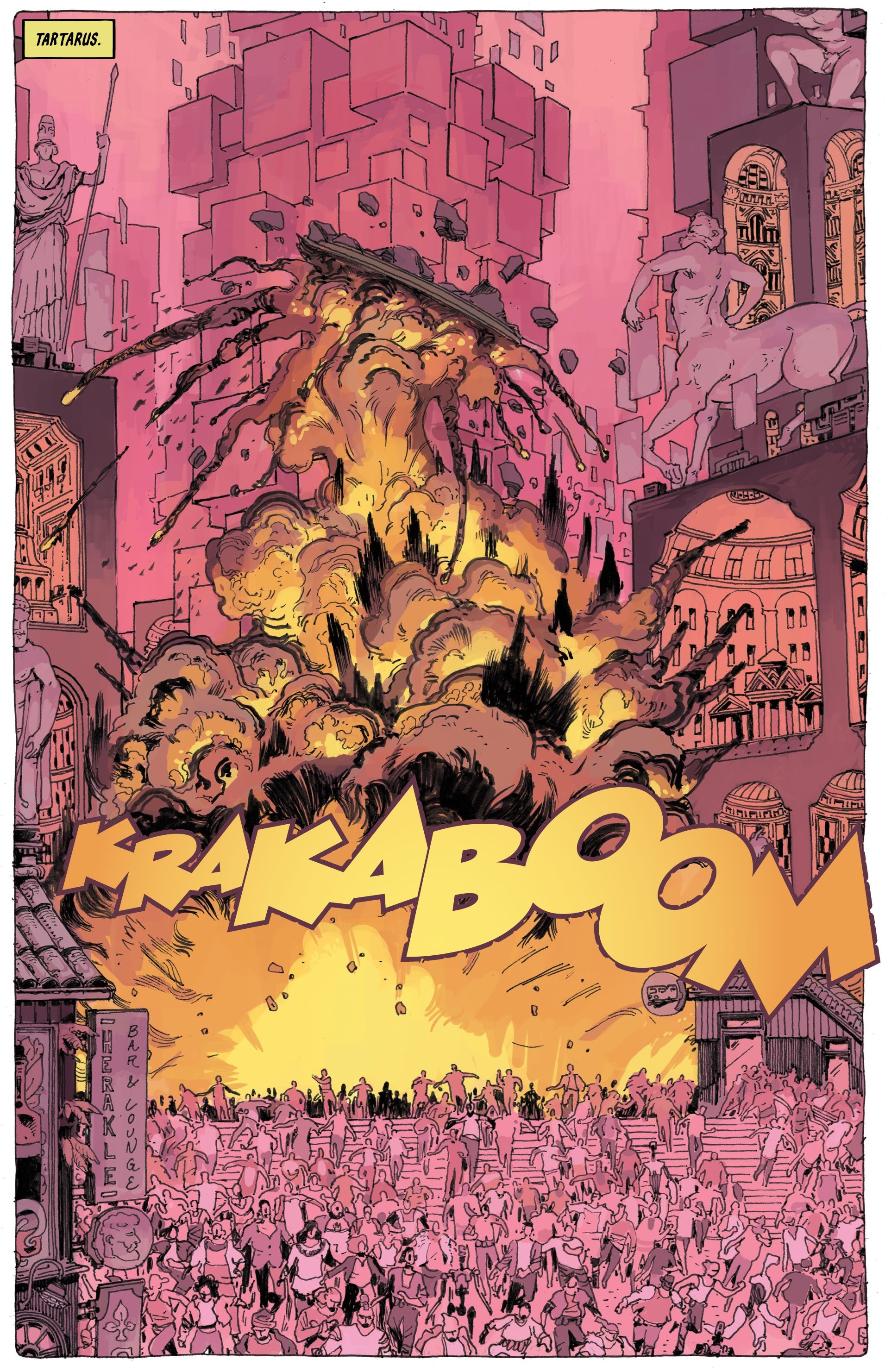
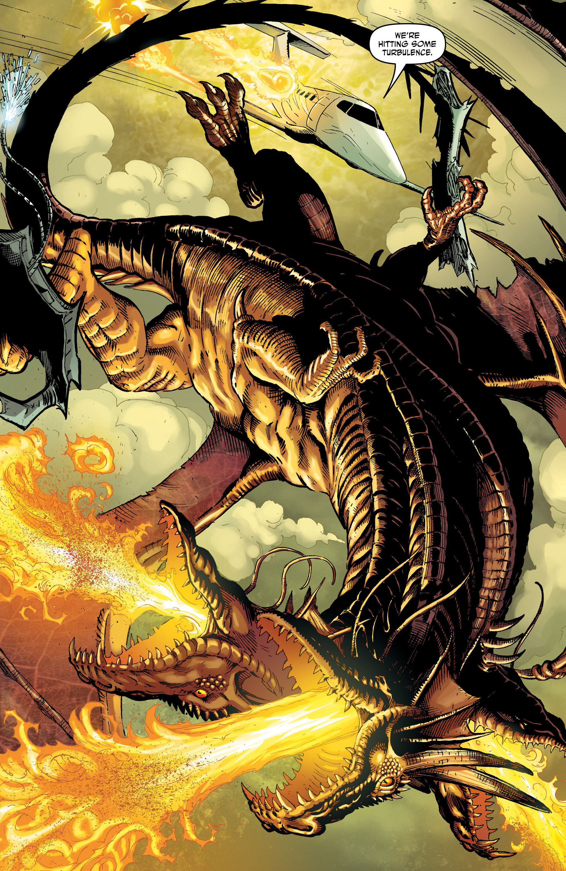
Your explosive reminder that comics can be awesome:

kevin o'neillThe League of Extraordinary Gentlemen (v2) #1
TartarusTartarus #1
Di AmorimGod Is Dead #3
Posted in GLIMPSES INTO AWESOMENESS | Tagged , , , , , , , , , | Leave a comment

2020’s books of the year – part 5

If you read last weeks posts, you know what’s going on. Here are Gotham Calling’s top four books of 2020:


4. WHO KILLED JIMMY OLSEN?

superman's pal jimmy olsen

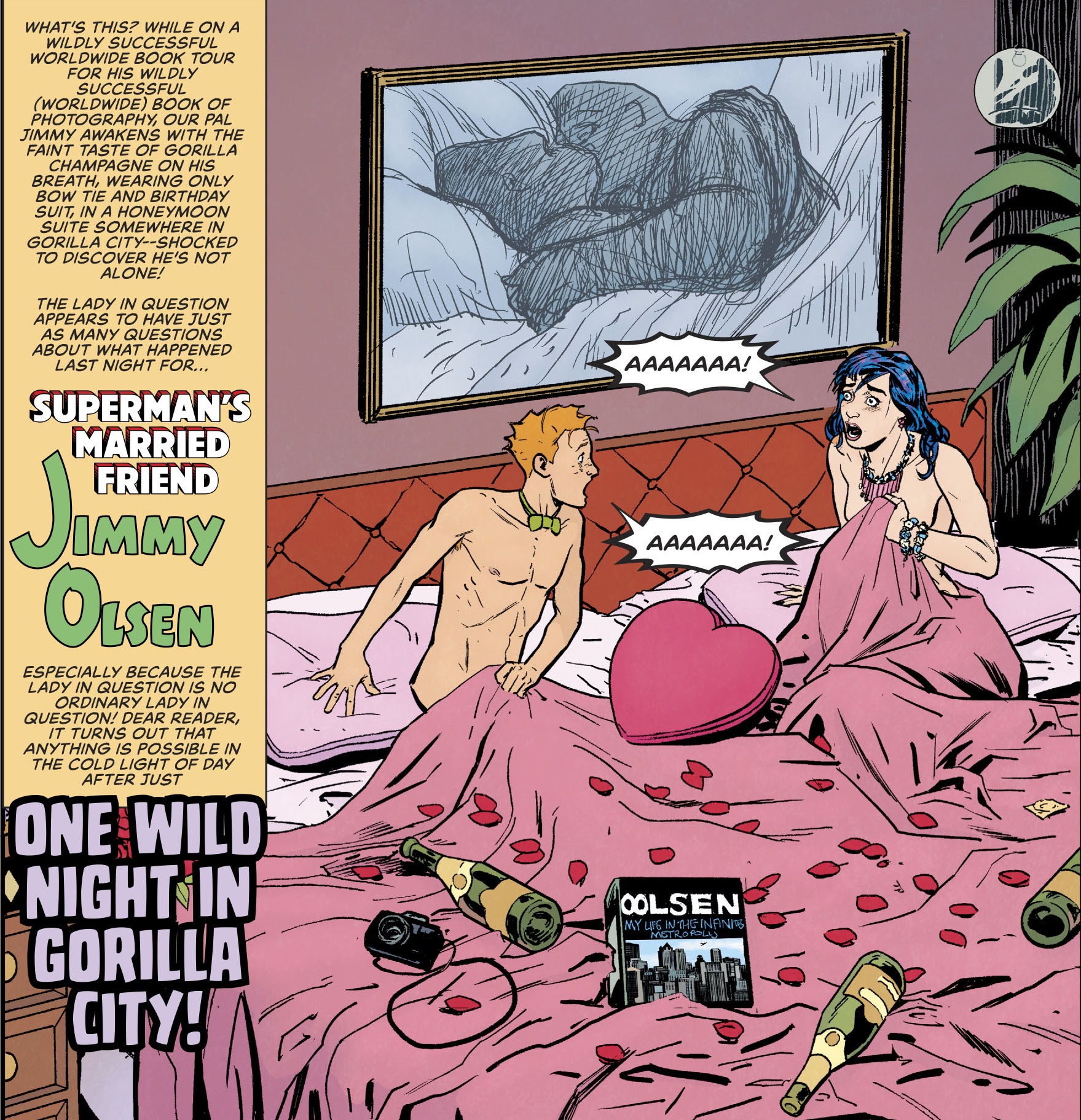
The original Superman’s Pal Jimmy Olsen series (1954-1974), about the wacky misadventures of the eponymous Daily Planet photographer/columnist, has become an emblem of Silver Age comics, with its parade of surreal mutations, berserk science fiction, psychedelic visuals, and convoluted twists forcing characters into the most surprising behavior (thus justifying the typically shocking covers) – and that was even before Jack Kirby joined the title and took it to new degrees of folly! It’s the sort of material that was bound to be reimagined in the current era of superhero ‘reconstructionism,’ where the most colorful, fantastic elements of old are no longer just a source of embarrassment, but something to be celebrated and, ideally, injected with new life (sure enough, both Grant Morrison and Nick Spencer wrote cool, if brief, tributes to the series in 2006’s All-Star Superman and in 2010’s Action Comics). The recent 12-part series collected as Who Killed Jimmy Olsen? (together with a section from the Superman: Leviathan Rising special) recreates the original’s anything-goes spirit while updating it to the age of click-baiting, vlogs, and social media, as Jimmy Olsen finds himself trying to investigate a conspiracy against him while simultaneously feeding an online fanbase with silly stunts and cranks.

Manic and hilarious, the book derives much of its charm from Jimmy’s defiantly cheerful attitude, but it also makes the most out of DC’s shared universe, much like Deadpool does with Marvel. Rather than getting bogged down in continuity, Who Killed Jimmy Olsen? will delight knowledgeable fans who spot geeky references, like the theme park devoted to the Bottle City of Kandor or the extended parody of ‘Reign of the Supermen…’ Above all, though, it uses the DCU as a chance to play with a variety of concepts that shouldn’t fit together, but which do so quite neatly for comedic purposes. This is a magical world where anything can happen, from a dinosaur mayor to an interdimensional jewel thief!

Superman - Leviathan Rising Special

(There are also tons of jokes involving Batman, which of course is right up my alley…)

Matt Fraction brings in his A-game, which isn’t always the case when he’s writing for the Big Two (for once, his indie work feels less inspired… although not without a certain charm, so far his latest series, Adventureman, is way too derivative for my taste). Not only does Jimmy Olsen deliver a barrage of gags worthy of Harvey Kurtzman, but it tells the story out of sequence, in short segments, cleverly crafting an elaborate narrative that’s like a jigsaw puzzle, so that part of the joy is watching the pieces gradually fall into place.

Fraction’s fusion of Silver Age-like imagination with the slickness of modern storytelling is beautifully pulled off by artist Steve Lieber, who knows just when to keep a straight tone (so that the amusement derives from contrast) and when to go into all-out caricature (like the Peanuts pastiche in the flashbacks of Jimmy’s childhood). The same goes for colorist Nathan Fairbairn, whose lively palette reinforces the comic’s madcap energy, and letterer extraordinaire Clayton Cowles, whose work shines especially in the over-the-top, tongue-in-cheek title boxes that introduce each segment.


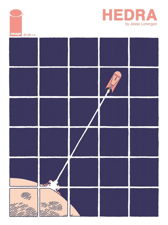
3. HEDRA

jesse lonergan

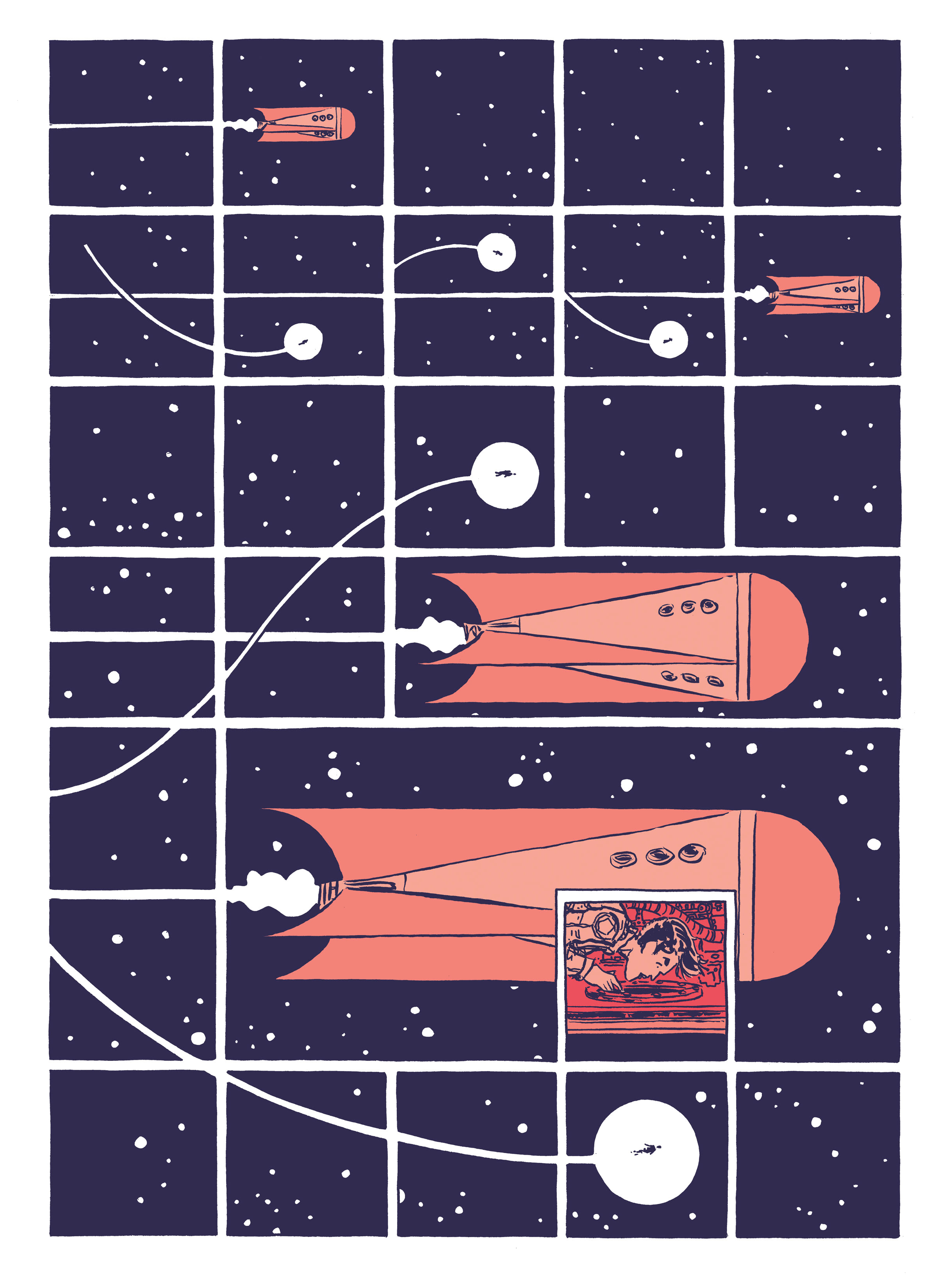
Jesse Lonergan’s wordless one-shot Hedra is all about the trip, not the destination. I don’t mean the exploration trip that takes its protagonist into space, away from a devastated Earth, so much as the trip of engaging with each of Lonergan’s intricately constructed layouts. A relatively simple – if wide in scale – story told through complex visuals, Hedra conveys information through symbols and thoughtful composition while cramming panels by the dozens, whether to generate claustrophobia or to ramp up the illusion of movement.

Everything in this gem seems carefully crafted, from the temperature evoked by each color choice to the design of every single image and how it affects the trajectory of the reading process. Yet there is also something whimsical about the disorienting way Hedra plays with the structure of the comic book page and with the medium-specific possibilities of sequential art. This is what makes it a ‘top 3’ comic: by this stage of the countdown, I’m privileging the stuff that most surprised me last year. As much as I dug classically constructed genre pieces like Fantastic Four: Antithesis (in which talented veterans of the field drew on decades of experience to deliver a perfectly satisfying sci-fi fantasy yarn), reading Hedra was ultimately more memorable and riveting.

Just look, in the scan below, at how the rocket and the tiny figure (soon revealed to be a flying robot) dance across the gutters – and the way the gutters merge with their propulsion lines – making you squint and then widen your vision as they rhythmically guide your eyes along the page:

jesse lonergan

Yes, this smacks of formalism and cold narrative exercise, perhaps first coming across as a mere vehicle to show off Jesse Lonergan’s artistry. Yet the execution is so exquisite that it does achieve a kind of touching, invigorating transcendence. Hedra is not a work you enjoy by merely appreciating its technique. The cosmic payoff has a genuinely lyrical resonance and the action is damn exciting – hell, watching an astronaut and a magical robot battle a horde of aliens is pretty much the definition of pulpy fun!

(Lonergan’s other 2020 space-based one-shot, Paradise Planet, is also worth checking out – although a much less impressive achievement than Hedra, it compensates by providing more than its fair share of chuckles…)


2. LOUD!

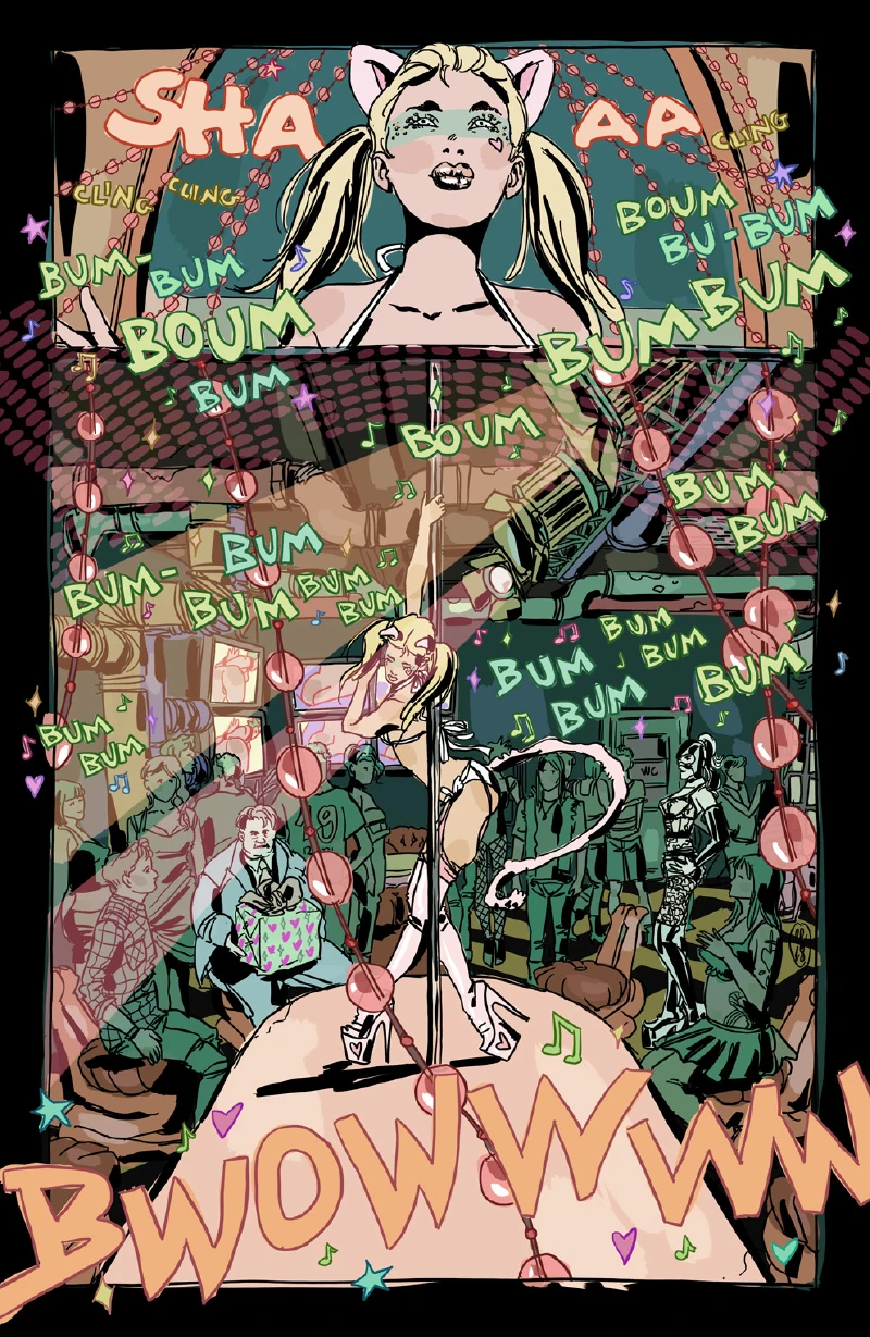
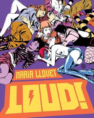
maria llovet

With its quasi-dialogue-free antics and virtuoso storytelling, LOUD! could almost be compared to Hedra, even if its command of comic book language involves less formal experimentation than Jesse Lonergan’s intergalactic odyssey. Yet LOUD! gets extra points because of its freewheeling grindhouse vibe and more relatable characters. This is one punk-rock comic whose blistering artwork and broken people struck a chord with me. Or maybe it was just confinement fatigue making me nostalgic for crowds and stories about human contact…

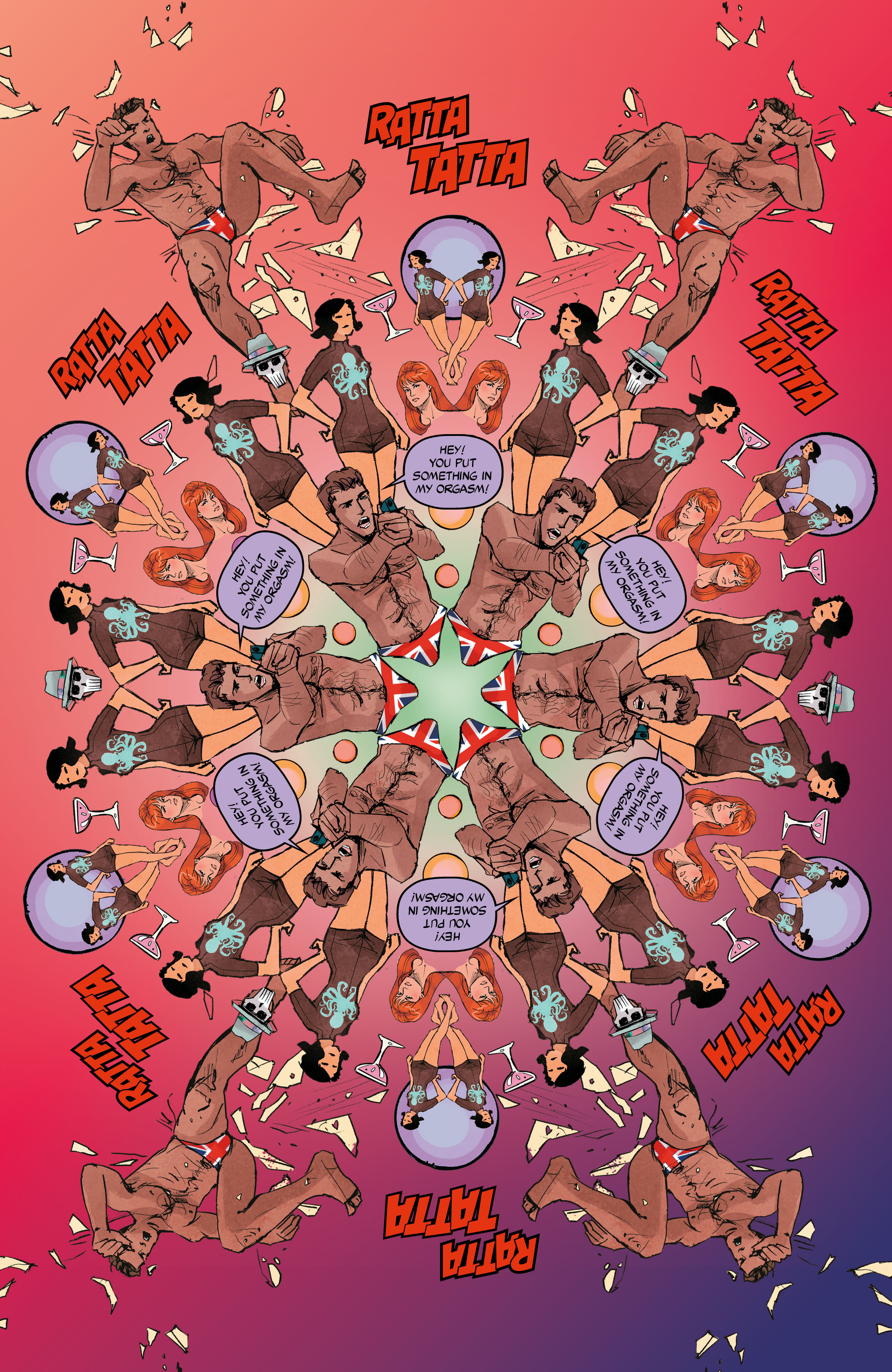
Set during a chaotic night at a music bar / strip club, with an ensemble cast and a kaleidoscopic framework, the driving force of Maria Llovet’s graphic novel is that specific club environment in which the sound coming out of the speakers makes lengthy conversations impossible, so communication tends to move beyond words, prioritizing exchanged looks and gestures. Not that LOUD! is exactly wordless – it’s chockfull of huge sound effects! – but it trades on a similar sort of visual emphasis. Moreover, by forgoing color finesse in the name of gutsy choices and pounding contrasts, Llovet captures the disco-induced mental confusion that comes with sensory overload.

maria llovet

The fact that the book is called LOUD! despite being mostly a ‘silent’ comic appears to be a wink at how silly this term is… Not so much because comics are always technically silent, but because they seldom are – bright colors, busy details, and a forceful sense of motion all create constant noise in my head while I’m reading (not to mention the fact that the best artists can project music with their drawings in ways that truly reverberate, like Jason Lutes in Berlin or David Lapham in Murder Me Dead). Of course, Maria Llovet takes this ability especially far in LOUD! through garish pigments, jam-packed images, and a roving ‘camera’ that rarely slows down. And if her transitions and mise-en-scène aren’t always immediately comprehensible, that only brings us closer to the characters’ perspectives, distorted as they are by drugs, alcohol, and trauma (it also invites you to reread the book, picking up new stuff the more familiar you are with the cast and setting).

And the best part is that Llovet puts all this in the service of a depraved, violent crime & erotic horror tour-de-force!


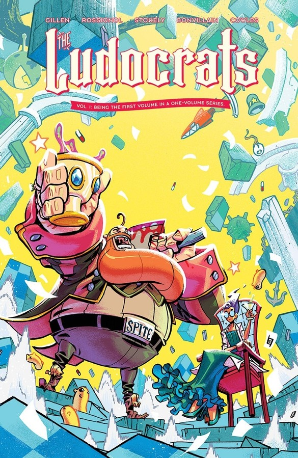
1. THE LUDOCRATS

kieron gillen

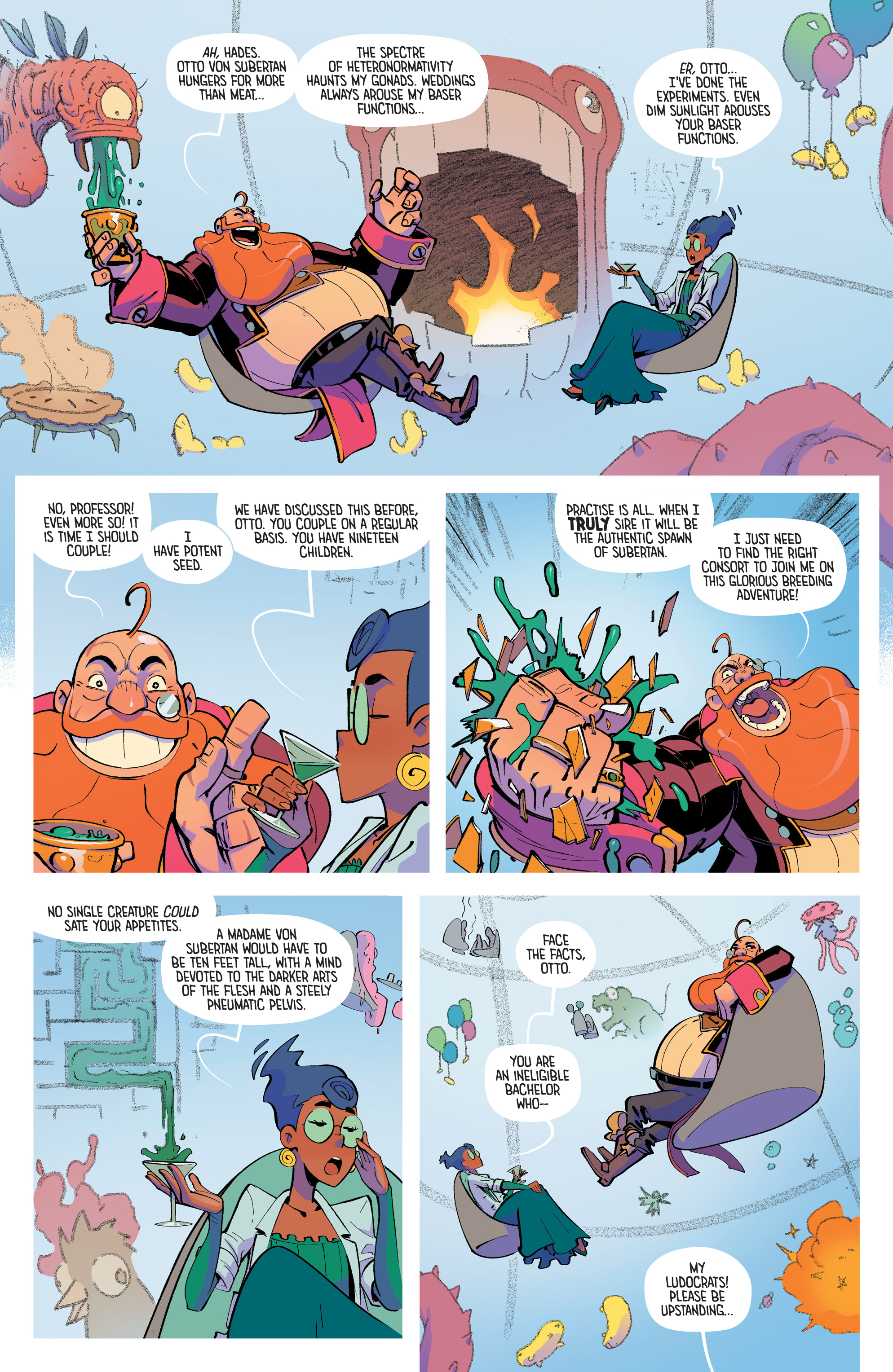
Gotham Calling’s 2020 Book of the Year is a surrealist orgy of colorful fantasy, cartoony adventure, and bawdy comedy. Both in single issues and in collected book form, The Ludocrats was like nothing else on the stands: set in a delirious – or, better yet, ludicrous – reality, this mini-series follows a clan of debauched, lunatic aristocrats, led by the boisterous Baron Otto von Subertan and his (comparatively more reasonable) sidekick Professor Hades Zero-K, who try to prevent the Seventy-Ninth Eldritch Hyper-Pope from unleashing the forces of boredom onto their world.

Writers Kieron Gillen and Jim Rossignol throw readers into this exuberant setting without first bothering to introduce its M-rated Looney Tunes-like logic, only some of it eventually explained through the occasional fourth-wall-breaking monologues of Doctor X-Position (and, in the individual issues, through the pompous summaries on the back). The constant sense of confusion and surprise thus becomes part of the fun, as a D&D-like narrative gives way to one zany twist after another. It’s also in line with The Ludocrats’ increasingly explicit celebration of comics’ sheer ability to shape realms of wonder and impossibility (as opposed to the depiction of the recognizable and the mundane in more ‘serious’ works).

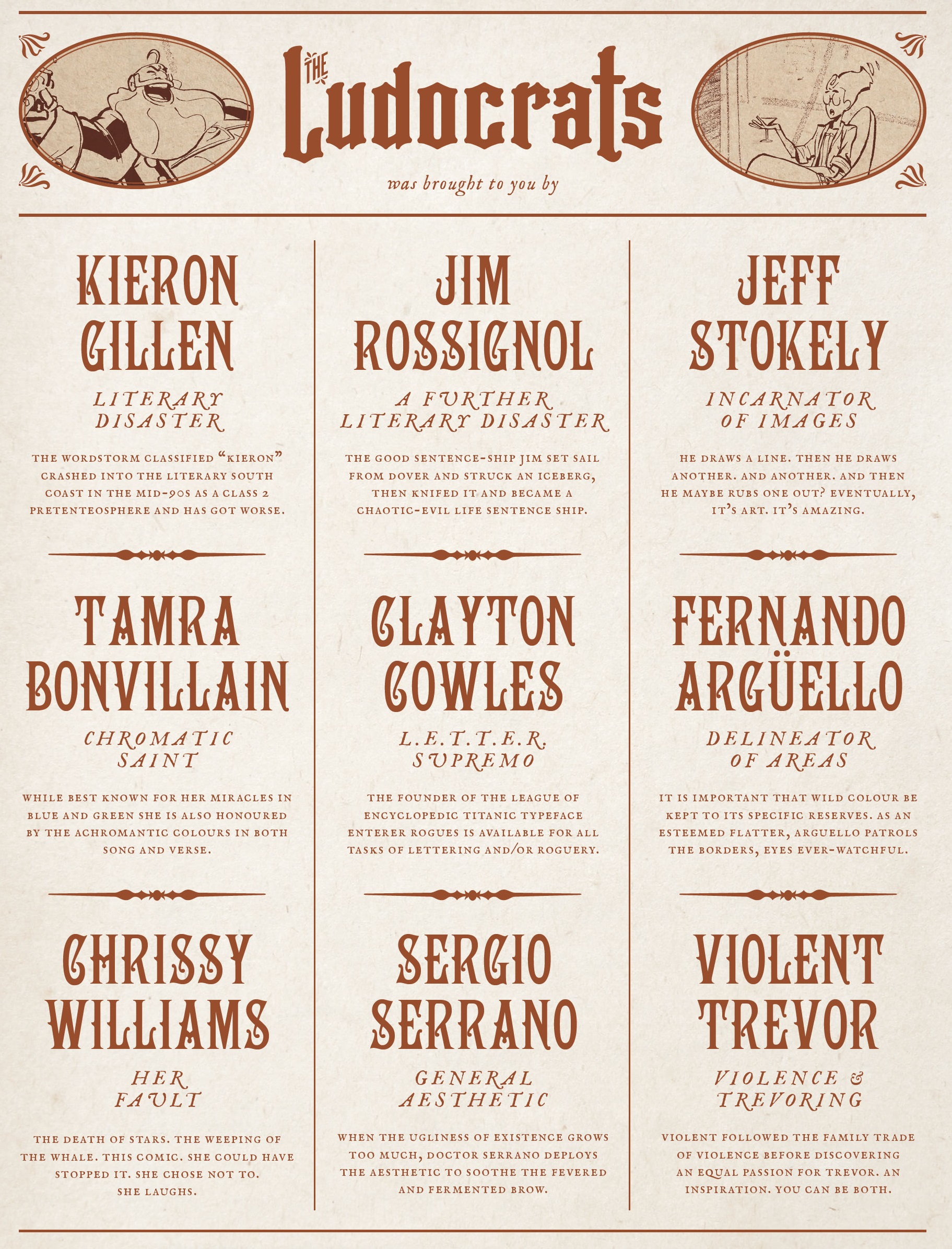
Artist Jeff Stokely, colorist Tamra Bonvillain, flatter Fernando Argüello, letterer Clayton Cowles, and designer Sergio Serrano are all in on the joke, each one providing a more exaggerated version of their craft, further generating the feel of a full-on assault on our senses:

jeff stokely

I grew up on a diet of absurdist slapstick, worshiping the Marx Brothers, Monty Python, and the Zucker-Abrahams-Zucker trio, compulsively re-watching Woody Allen’s and Mel Brooks’ earlier films, laughing out loud at the Muppets’ quirkiness and at Blackadder’s pitch-black satire, memorizing bits from The Simpsons and South Park – and, more obsessively, Duckman – while avidly reading the Discworld novels and The Hitchhiker’s Guide to the Galaxy. In comics, it was René Goscinny who, more than anyone else, fed my appetite for this kind of humor through Asterix, Lucky Luke, and Iznogoud. Looking back, I realize all of these works were written by privileged white men and do reflect various levels of reactionary, somewhat racist, and quite sexist (when not downright misogynistic and homophobic) worldviews, which can make some of them cringeworthy to revisit. Yet it’s not just nostalgia that makes them appealing – they have a contagious joie de vivre and an anarchic disrespect for rules and for anything that takes itself too seriously, not to mention a sense of metafictional deconstruction (spoofing tropes, breaking the fourth wall), that continues to inform my sensibilities even as an adult.

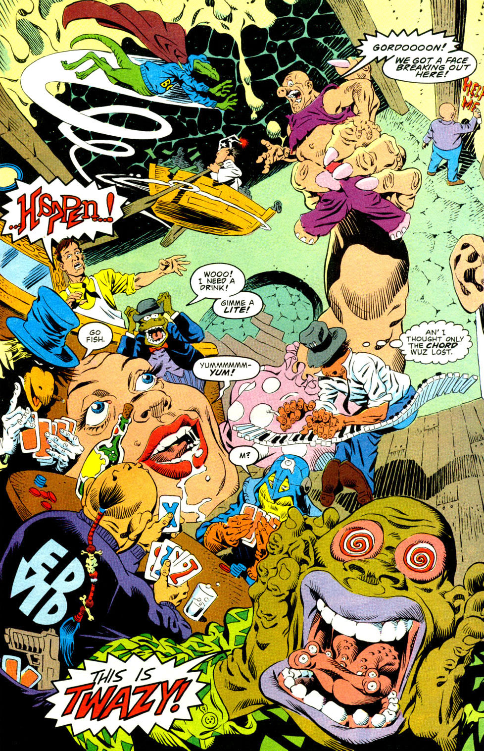
The Ludocrats‘ relentless antics brought me back to that type of irreverent, pun-prone mood, albeit with a new spin, deploying nonsense not just as a form, but as a plot element and a central theme. So, while its drawing of amusement from unbridled male libido reeks of juvenile pre-#metoo political incorrectness and while mocking introspective realism as ‘boring’ sounds like facile anti-intellectualism, The Ludocrats nevertheless managed to be the right book for my 2020 frame of mind. In a year spent mostly locked indoors while haunted by sick and dying people, it felt deliciously liberating to read about Subertan’s brazen excess and enthusiasm, not least because of the art team’s magnificent ability to dynamically render even the most gonzo, physics-defying concepts (like the Drawing Room seen above, where doodling becomes corporeal).

With its explosive combo of wild ideas (the Psycho-Czars? the Profanicannon? the Gigantipedic Spermatazoic Lepidopterapede?) and bouncy, dreamlike visuals (rich in Easter Eggs and background gags), this comic comes across as the drunken bastard child of Richard Lester’s swashbucklers and the brilliant cult series Casanova (there’s even a cameo!). You can also find clear echoes of The League of Extraordinary Gentlemen, especially as The Ludocrats includes tons of extra material, from numbered maps to fake letter pages and elaborate glossaries, all written in the same witty faux-retro style. In fact, if you get the chance, it’s worth tracking down the single issues just for the (constantly changing) cheeky credits…

the ludocrats

I mention all this pedigree, but I don’t want to shortchange The Ludocrats’ originality. Notably, 2020 also saw the publication of the first collections of another Gillen & Bonvillain collaboration, Once & Future, about a klutzy academic who finds out his grandmother is a badass monster hunter and embarks on a rollicking quest involving Arthurian myths-come-to-life. That series looks gorgeous (thanks to artist Dan Mora) and is pretty entertaining (the trope of a foul-mouthed, gun-totting old lady is a dependable crowd-pleaser), but it ultimately boils down to just another variation of elements we’ve seen countless times before. The Ludocrats, in turn, kept surprising me in almost every page… It’s certainly not for all tastes, but I’m kind of shocked it hasn’t shown up in more ‘comics of the year’ lists.

Posted in BOOKS OF THE YEAR | Tagged , , , , , , , , , , , , , , , , , , , , , , , , , | Leave a comment

COMICS CAN BE AWESOME (1 February 2021)

A deeply colored reminder that comics can be awesome…

mister terrificStrange Adventures (v4) #2
jason howardBig Girls #2
godlandGødland #17
Posted in GLIMPSES INTO AWESOMENESS | Tagged , , , , , , , , | Leave a comment

2020’s books of the year – part 4

If you read last weeks’ posts, you know what’s going on. Here are four 2020 books that reminded me of why I love comics:


8. PULP

sean phillips

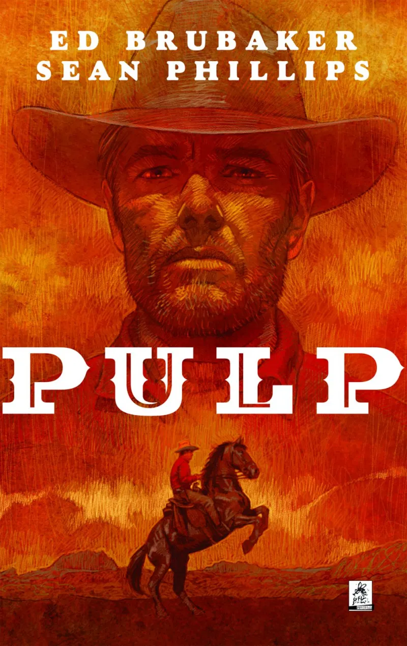
The creative duo of Ed Brubaker and Sean Phillips (known among some fans as Brubillips) have carved out a peculiar place in the field, regularly putting out critically acclaimed crime comics in the form of different projects, disconnected from larger franchises, which appeal both to nerdy aficionados and to a broader strain of readers who aren’t generally into comics at all. Their work can actually be described as having a mature, literary sensibility in the best sense of those terms: not ‘mature’ in the sense of featuring gratuitous R-rated content, but in the sense of developing a cast with realistic psychology; not ‘literary’ in the sense of sounding pompous or mannered, but in the sense of engaging with ambitious themes and emotional depth while avoiding sensationalism.

For all their ostensive realism, the focus is very often on fiction: Brubaker seems to be writing odes to – or, better yet, meditations on – the kind of noirish books and films that influenced him (and on the environment that produced those works, back in the day). His output rarely transcends those sources at their best, but it nevertheless adds up to rock-solid genre entries with compelling characterization and plotting. Phillips elevates the material: while the stories often riff on classic movies, his unfussy figure work doesn’t so much bring to mind the language of film as the aesthetics of film posters, not to mention paperback covers and the illustrations of pulp magazines. It’s the tension between that dream world and the overall grounded tone that gives these comics such a distinct personality.

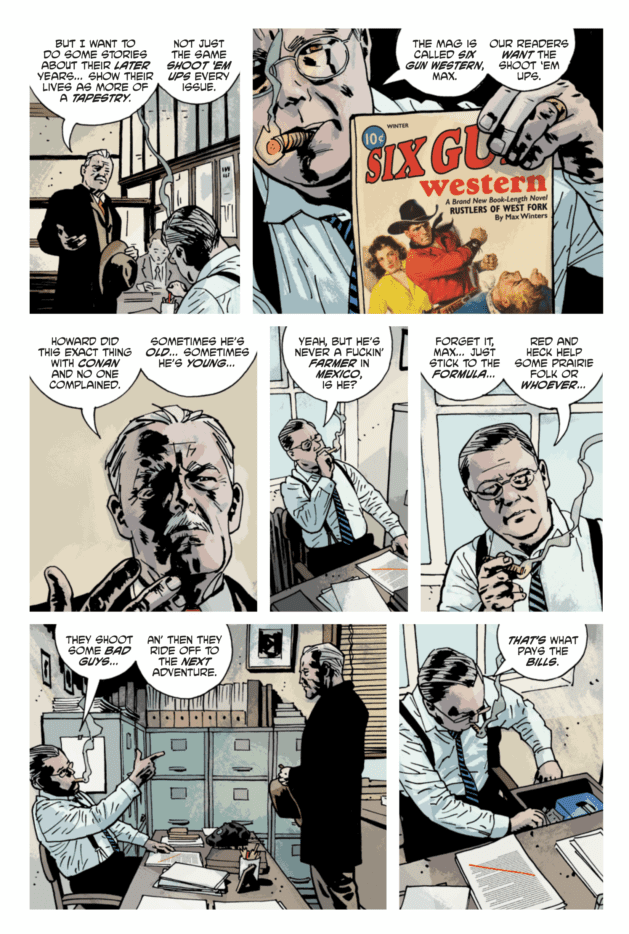
Besides the latest installment of their ongoing crime saga Criminal (‘Cruel Summer’) and the first volume of their new series (Reckless), in 2020 Brubillips put out the original graphic novel Pulp, about Max Winters, an aging pulp writer of western yarns in the late 1930s whose life – past and present – turns out to be much closer to the breed of violent thrillers he typically describes in his stories. Again, there is a fascination with the history of cultural production (the scenes with Winters’ publisher are on point for the subject matter, but they also feel like Brubaker settling scores with the comic book industry) and a conscious, if subdued, remix of genre tropes: while this list’s other neo-western, Undone by Blood, was imbued with 1970s’ exploitation, Pulp taps into the subgenres of film noir, back-from-retirement-for-one-last-job heists, and vigilante justice.

Ed BrubakerThe period setting allows for more than a genre exercise. The book also effectively uses this era, in which the German American Bund was advocating fascism in the US, to provide a displaced revenge fantasy against Trump supporters.

The intertextuality and the political parallel, however, don’t get in the way of a fine read that works by itself, strong on atmosphere and with plenty of affecting passages (‘And this room is just another room where I don’t want to die.’). Pulp empathically captures the sense of weariness and malaise that comes with getting older, which gained additional resonance in a year marked by so much contempt for the lives of senior citizens… Indeed, it’s a melancholic affair, nailed by colorist Jacob Phillips’ tonal range (wintery in the present, autumnal in the past), which distinguishes the fiction-within-fiction portions through an inspired visual that comes across as a combination of watercolors and faded crayons. (Yes, Jason Wordie used a variation of this technique in the book-within-the-book portions of Undone by Blood, but the effect is even more pronounced here.)

7. BRITISH ICE

owen d. pomery

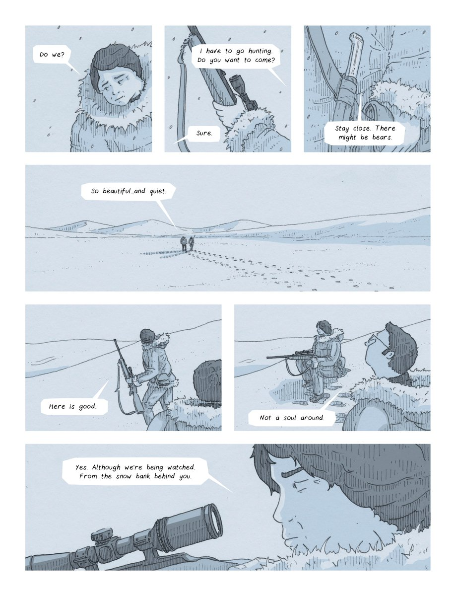
That cover tells you so much about the comic inside. The Union Jack pattern and the icebergs aren’t just a visual pun on the title, but also the first of many demonstrations of Owen D. Pomery’s beautiful sense of design and willingness to exploit the book’s engaging snowbound setting for all its metaphorical potential. Set in the 1980s, this psychological thriller follows Harrison Fleet, a British colonial officer sent to a remote outpost in the Arctic, where he feels increasingly threatened by the locals who still recall the atrocities committed in the early days of the settlement.

It’s colonialism as a vehicle for horror – although not so much the horror of the natives brutalized by the empire, but rather the horror of a man sent to the middle of nowhere, surrounded by hostile people and weather… and perhaps something more. You may not sympathize with Fleet’s mission and he’s certainly not the main victim here, but building the story around his estranged experience helps suggest some of the absurdity of colonialism, whereby a man without any connection to this community and territory wields a power granted to him by a faraway kingdom that has no consideration for anyone here.

british iceA few flaws appear obvious. Most of the cast (especially the natives) are so underdeveloped that British Ice ends up reproducing a colonial outlook, as the locals remain a strange, scary Other and our sole source of identification is the western settler (for a more politically-conscious, less exploitative, and even more visually breathtaking take on this sort of subject, you can pick up Joe Sacco’s non-fiction graphic novel Paying the Land, which also came out last year). Genre-wise, though, the limited point of view and characterization convey Harrison Fleet’s sense of isolation and alienation, generating suspense along the way. In that sense, if anything the book should be blamed for not going deep enough into his psyche: there is some nice buildup early on, but on the whole the narrative feels too rushed to pack a proper wallop. I wanted more pages of Fleet struggling with the cold and the lack of resources. I wanted his creepy house to feel even creepier, like a haunted mansion. Hell, I wanted the whole island to feel like that!

To be fair, the tone Owen D. Pomery appears to be going for is cold and low-key all the way, from the cast’s understated background to the art’s sanitized minimalism, including a palette composed of different shades of grey. If you end up having to project a bit more than what the story gives you, I say it’s a low price to pay. An architectural illustrator, Pomery excels not only at the straight lines of man-made construction but also at the starkness of frozen nature, making the most out of negative space while creating expansive landscapes through the *absence* of drawing.

Plus, while the whole may not live up to the promise of the earlier pages, there are more than enough witty moments and details to make British Ice a worthy read. One of my favorites involves Fleet spotting a cross at the top of a mountain, only to be informed that it’s actually the tail of a crashed Russian aircraft (another character quips: ‘Certainly makes me keep the faith.’). Modernity and religion are thus reduced to a half-buried piece of scrap in what is just one of the many symbols, both subtle and flagrant, that populate the book, rewarding careful consideration of every exchange and visual choice.

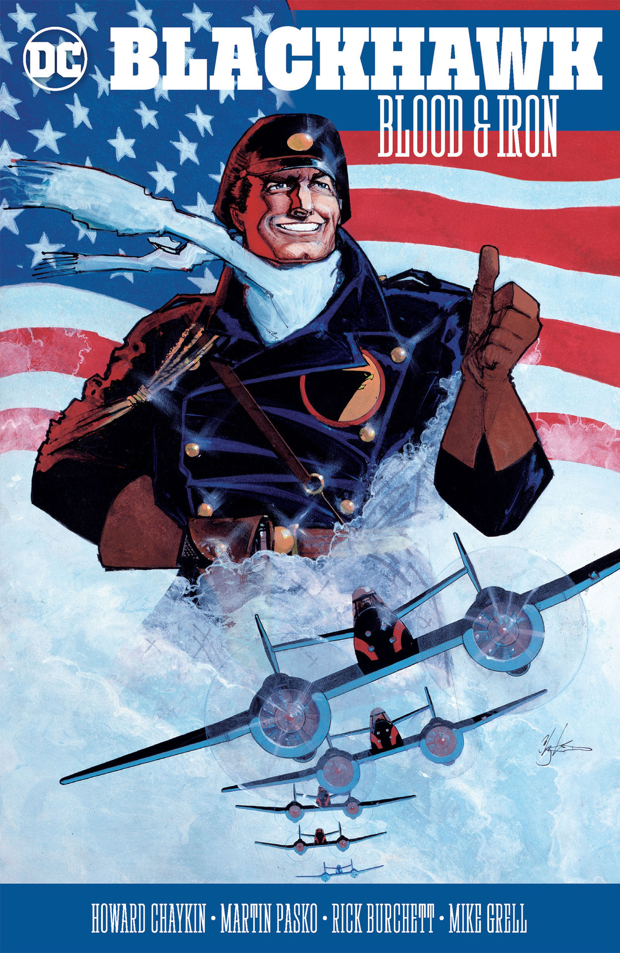
6. BLACKHAWK: BLOOD & IRON

howard chaykinThis hardcover includes not only Howard Chaykin’s 1987 reboot of the classic war adventure series Blackhawk (which I believe may have been collected before), but also the (definitely previously uncollected) follow-up strip that came out in Action Comics Weekly in 1988 and a Secret Origins tale. If you don’t mind your anti-heroes smug and sometimes downright despicable, these are a bunch of fun two-fisted yarns packed with foreign intrigue and neat historical cameos.

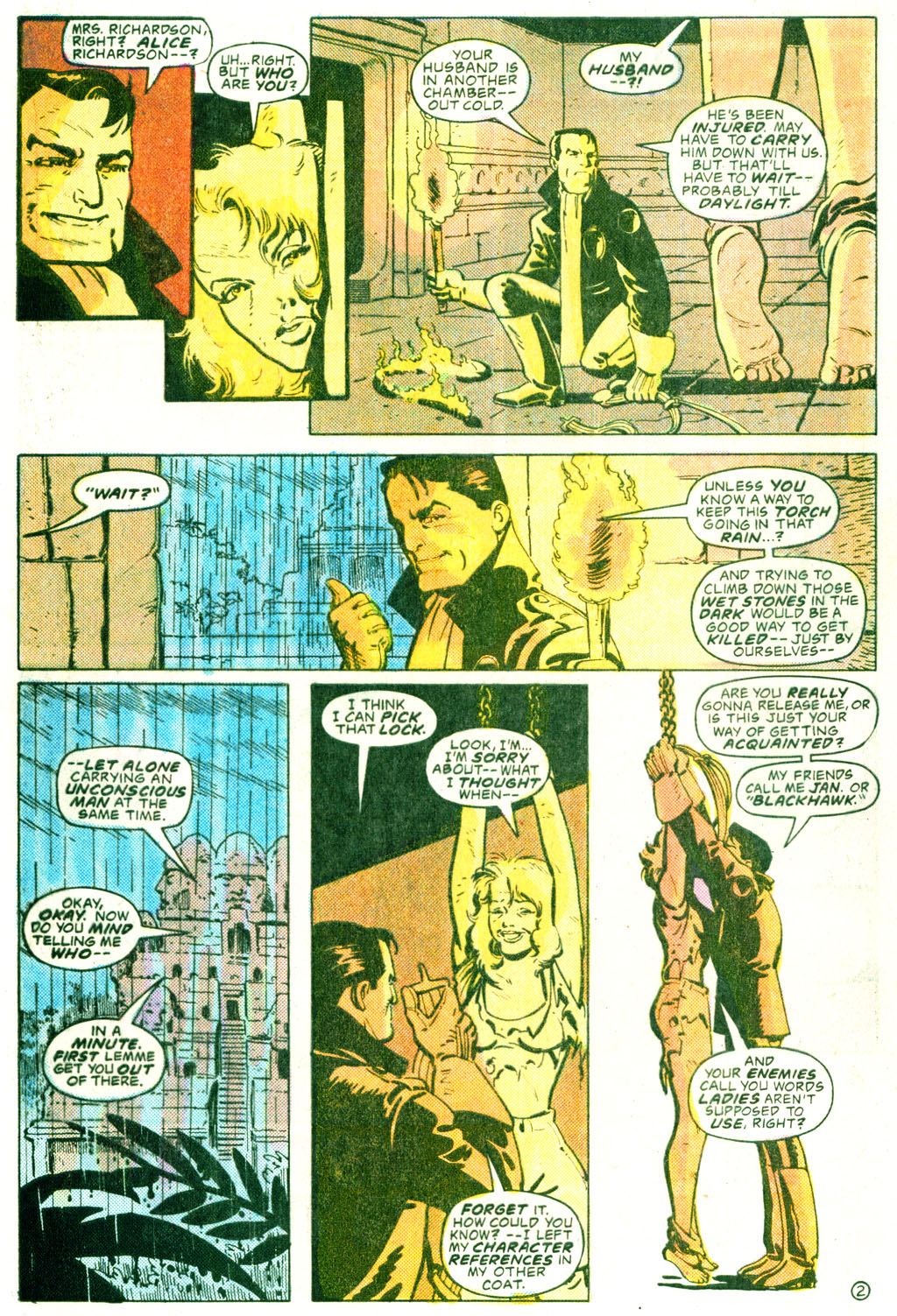
I’m a huge fan of Chaykin’s mini-series, which throws pilot Janos Prohaska into an ultra-labyrinthine spy thriller in World War II, written and drawn in the kind of overwhelming maximalist style of Chaykin’s other masterpieces from this era (American Flagg! and The Shadow). Chaykin has a field day bringing in all sorts of groups that are often left out of the WWII public imaginary, from Jewish gangsters to American communists. He also interweaves layers upon layers of intertextual winks, playing with the franchise’s racist history (understandably, his Weng Chan doesn’t like being called ‘Chop Chop’) and modelling key players after actors Errol Flynn and Mary Astor (the later in the role of her character from 1941’s The Maltese Falcon… indeed, there are several references placing that film in the same continuity as this story!).

The plotting may be more confusing than your average comic, but I appreciate Chaykin’s willingness to take advantage of the medium’s potential – after all, although flipping through the book back and forth to pick up on certain threads makes for a less-than-fluid reading experience, the truth is that unpacking the various subplots provides its own type of entertainment. Plus, you can always just bask in the glorious visuals, especially as Steve Oliff does such a wonderful job with the colors… and, for the most part, so does Ken Bruzenak with the lettering, except for the terrible faux-Cyrillic font he uses for the Russians (which makes those sequences even more difficult to follow).

The big novelty for most people, I suspect, are the follow-up stories, written by Mike Grell and Martin Pasko, who embrace Chaykin’s caustic mix of sex and politics, even if Rick Burchett’s lovely artwork is more reminiscent of Milton Caniff (which doesn’t prevent Pablo Marcos, who inks some of the stories, from trying his best to ‘chaykinify’ Burchett’s pencils). Caniff is also a blatant influence on the scripts, which move the action to Southeast Asia, in 1947 (the year of Steve Canyon’s debut), where the Blackhawks, without a war, have fallen from grace and now spend their time gambling, drinking, brawling, and screwing prostitutes (there is great emphasis on the fact that they’re all horndogs, including the most tasteless cliffhanger I’ve ever seen, which misleadingly suggests the protagonist may be about to rape a tied-up woman).

blackhawk

These adventures, which take the Blackhawks from Burma to Indonesia and occupied Germany, all have an element of cloak & dagger, bringing to mind old Hollywood pictures like Robert Aldrich’s World for Ransom and Richard Thorpe’s Malaya. As for the Secret Origins tale (drawn by Grant Miehm and Terry Beatty in Burchett’s style), it wraps up loose ends from the Chaykin mini while elaborating on Prohaska’s communist background. Plus, it opens with a cute newsreel that does triple duty as a) exposition, b) Chaykin-esque pastiche of period propaganda, and c) a nod to Citizen Kane.

Finally, you also get a team-up set in 1988 between an older Weng Chan, Green Lantern, Black Canary, and Superman, but that comic (by Mark Verheiden and Eduardo Barreto) is by far the weakest of the bunch, serving more as a curiosity for aficionados than anything else.

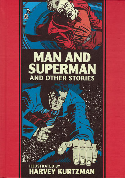
5. MAN AND SUPERMAN AND OTHER STORIES

kurtzman

No, despite the title, the misleading cover image, and the cheeky color choices, this is *not* a collection of Superman comics…

I’m a huge fan of Fantagraphics’ EC Artists Library series, which reprints classic EC comics in black & white and organized by artist, spotlighting their craft. The high point in the past year was this collection of Harvey Kurtzman’s work from 1950-1951. Before he went on to fully explore his comedic talent as writer, editor, and artist for Mad, Kurtzman bounced around other EC anthologies for a few years, lending his distinctively thick, cartoony style to short tales about bloody battles, ghostly hauntings, killers on the loose, or science run amok against the backdrop of the Cold War and of society’s growing mechanization… Having previously reprinted Kurtzman’s war stuff in Corpse on the Imjin! and Other Stories, Fantagraphics now gave us this collection of his horror, crime, and sci-fi tales. In other words, it gave us not only a bunch of darkly funny comics, but also the chance to learn about a lesser known phase in the career of one of pop culture’s most influential humorists.

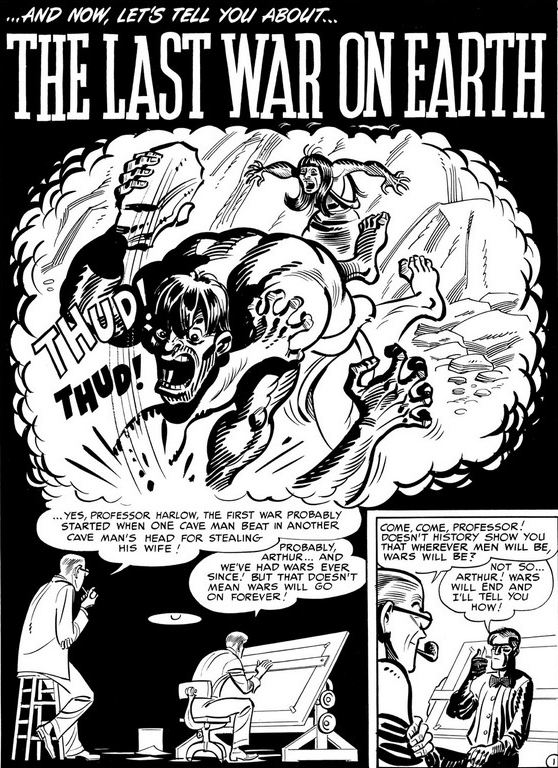
Honestly, the only reason Man and Superman and Other Stories isn’t even closer to the top of this list is because the first handful of tales, scripted by other writers, suffer from rushed endings and underdeveloped plots (with the exception of ‘Lost in the Microcosm,’ penned by Al Feldstein, which is a gem). Once we get into the stories written and drawn by Kurtzman (which is most of the book), then things really start rolling, with practically one hit after another. His style is so lively and iconoclastic that the result almost feels like a parody of EC’s typical output. High points include ‘Atom Bomb Thief!’ (a knock-out spy adventure, complete with gunplay, a plane crash, and a shark attack), ‘The Mysterious Ray from Another Dimension!’ (a bonkers satire set in a future 1970 where ‘the skirts are now back to above the knee line’ and every person in the world watches television), and the titular ‘Man and Superman’ (a slapstick take on physical culture that doubles as a spoof of superhero bodies).

harvey kurtzman

I’m not saying Harvey Kurtzman’s plots are highly original or outstanding just by themselves… What makes these comics so effective is that, more than an inspired writer, Kurtzman was a cartoonist genius, able to craft a zany, rhythmic interplay between art and words, grabbing your attention from the get-go before hitting you with a perfectly delivered punchline (usually a viciously ironic twist that mocked men’s self-importance and the futility of their plans). Unlike most EC stories, these ones actually feature silent panels and experimental layouts, as you can see Kurtzman playing around with the medium’s form (it also helps that many of the stories are hand-lettered, breaking away from EC’s standard mechanical lettering). ‘The Man Who Raced Time’ uses neat details to convey the impression of characters moving at very different speeds in the same panel. ‘Television Terror!’ is framed almost entirely by a TV screen, an especially innovative gesture considering that the story originally came out in 1950 (i.e., not only decades before The Dark Knight Returns popularized this technique, but years before television itself became a common household item). ‘Lucky Fights It Through’ (the oddest tale in the book, about a syphilitic cowboy) has as its centerspread a music sheet and lyrics for a Western Swing record.

As usual, the book comes with an informative introduction (by Thommy Burns) that provides background and/or analysis of the various stories and a final piece (by Steve Ringgenberg) about Harvey Kurtzman’s career. It also includes a curious two-fisted seafaring adventure tale that Kurtzman edited, written by his assistant Jerry DeFuccio and drawn by Joe Kubert.

Posted in BOOKS OF THE YEAR | Tagged , , , , , , , , , , , , , , , , , , , , , , , , , , , , , , , , , , | Leave a comment

COMICS CAN BE AWESOME (25 January 2021)

Your reminder that comics can be awesome – Quino edition:

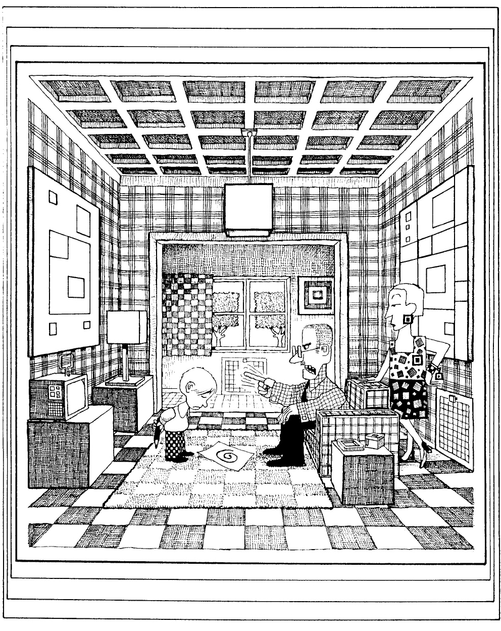
QuinoPotentes Prepotentes e Impotentes
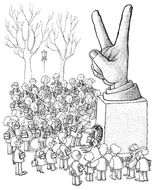
QuinoHumano Se Nace
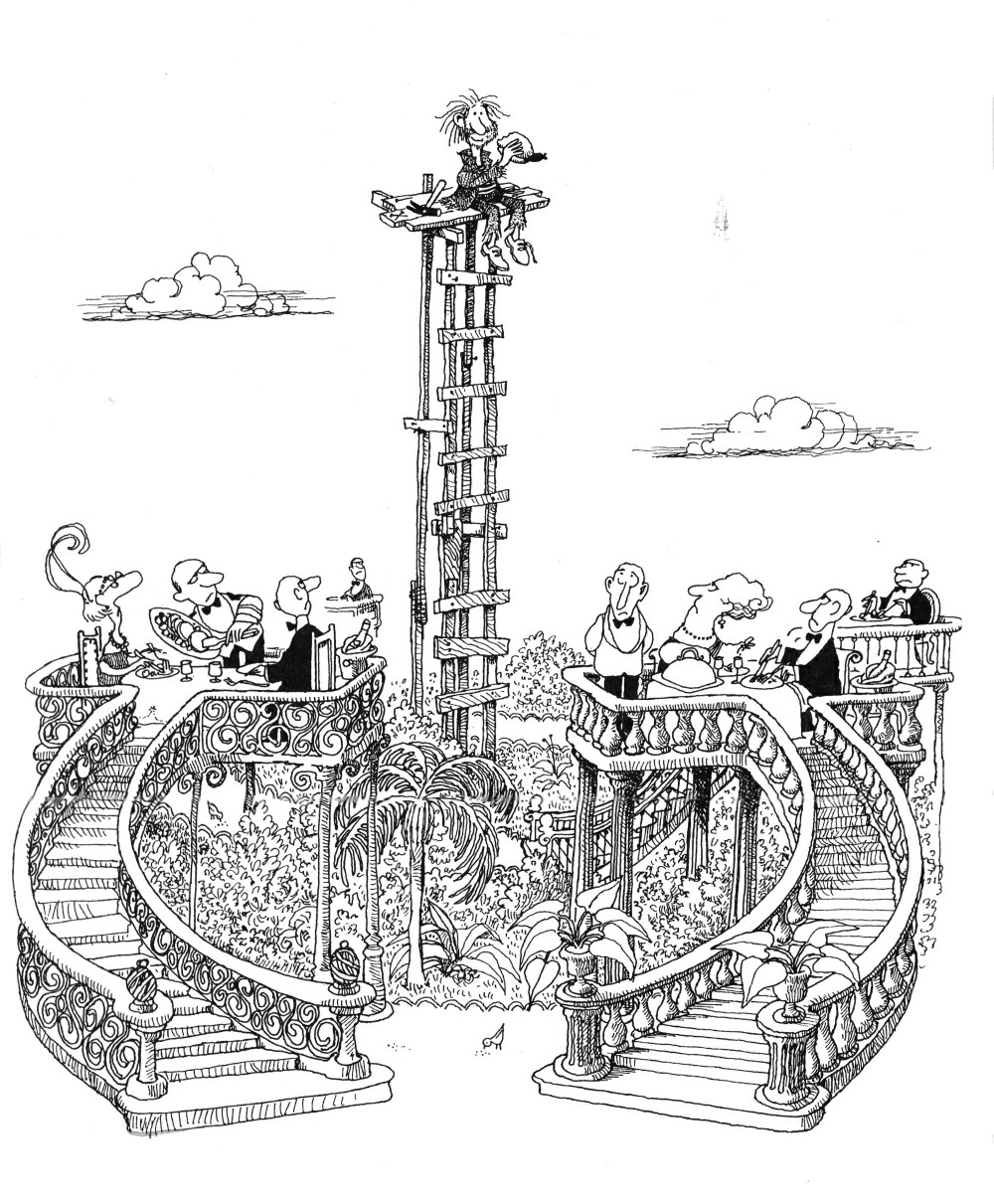
QuinoLa Aventura de Comer
Posted in GLIMPSES INTO AWESOMENESS | Tagged , | Leave a comment