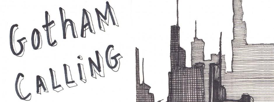
Kelley Jones is one of the most divisive Batman artists. His Dark Knight has absurdly long ears that look like devilish horns and fingers that look like claws. And it’s not just Batman who feels like a nightmarish hallucination: most characters in Kelley Jones’ comics tend to be downright grotesque (with the occasional cartoonishly voluptuous lady). As a result, many fans consider Jones’ art amazing horror, while many others consider it amazingly horrible.
Me, I’m mostly fascinated that such an eccentric artist, more than being given a chance to draw the odd one-shot or out-of-continuity mini-series, actually got to pencil the mainstream Batman title for four years! After all, we’re talking about someone whose style often crosses the border into black metal album territory:

(You can hear those guitars getting goddamned shredded to death!)
Kelley Jones’ most blatant sources of inspiration range from Bosch’s hellscape paintings to Escher’s freaky litographs as well as classic horror films (especially German expressionism and those old Universal monster movies). The latter influence, in particular, is plastered all over his props and poses:
(Yes, the last one probably owes more to 50s’ sci-fi schlock.)
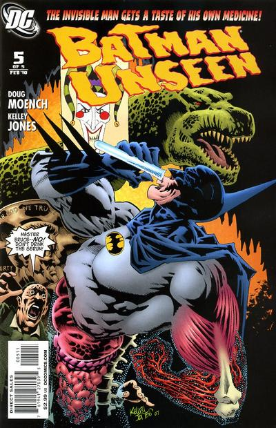
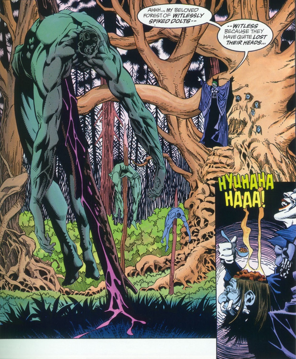
Jones is cleary a fan of the horror genre. In Batman #541, he has the Spectre pull off a straight-up homage to Alien. In Batman #548, the design of one of the key players seems inspired by Boris Karloff’s Frankenstein monster. Outside of Gotham City, Jones was responsible for ‘Calliope,’ one of the creepiest issues of The Sandman (which is saying something).
Given this affinity, it’s no wonder Kelley Jones made his Batman debut with a Dracula story, back in 1991. It became the first of an Elseworlds trilogy in which the Caped Crusader eventually turned into a bloodthirsty vampire. This was followed by another special featuring a monstrous version of Batman: Dark Joker – The Wild, a gory sword & sorcery yarn that sounds like the kind of sick fairy tale people would tell each other in Westeros (it also established the team of penciller Kelley Jones, inker John Beatty, and writer Doug Moench, who became regular collaborators).
 Dark Joker – The Wild
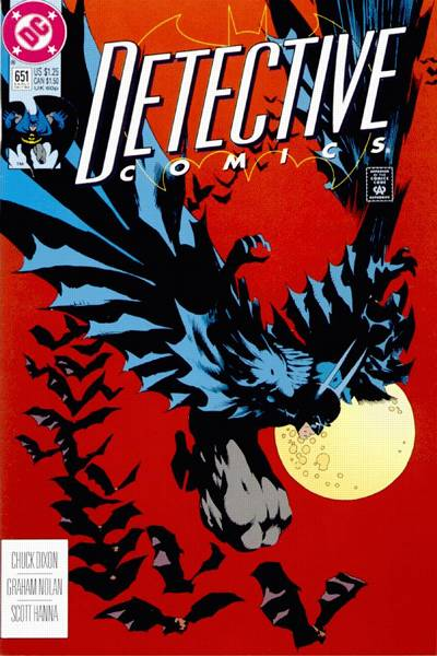
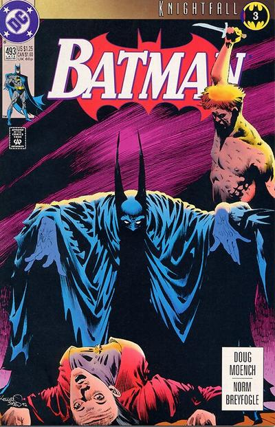
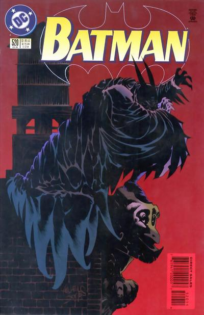
In the cannonical DCU line, Kelley Jones became a popular cover artist, illustrating several iconic covers in the early nineties, most notably during the Knightfall story-arc. Jones began to draw interiors with Batman #515 (cover-dated February 1995), where he was put in charge of revealing Batman’s post-Prodigal look… and, of course, it turned out to be the most demonic thing you could imagine:
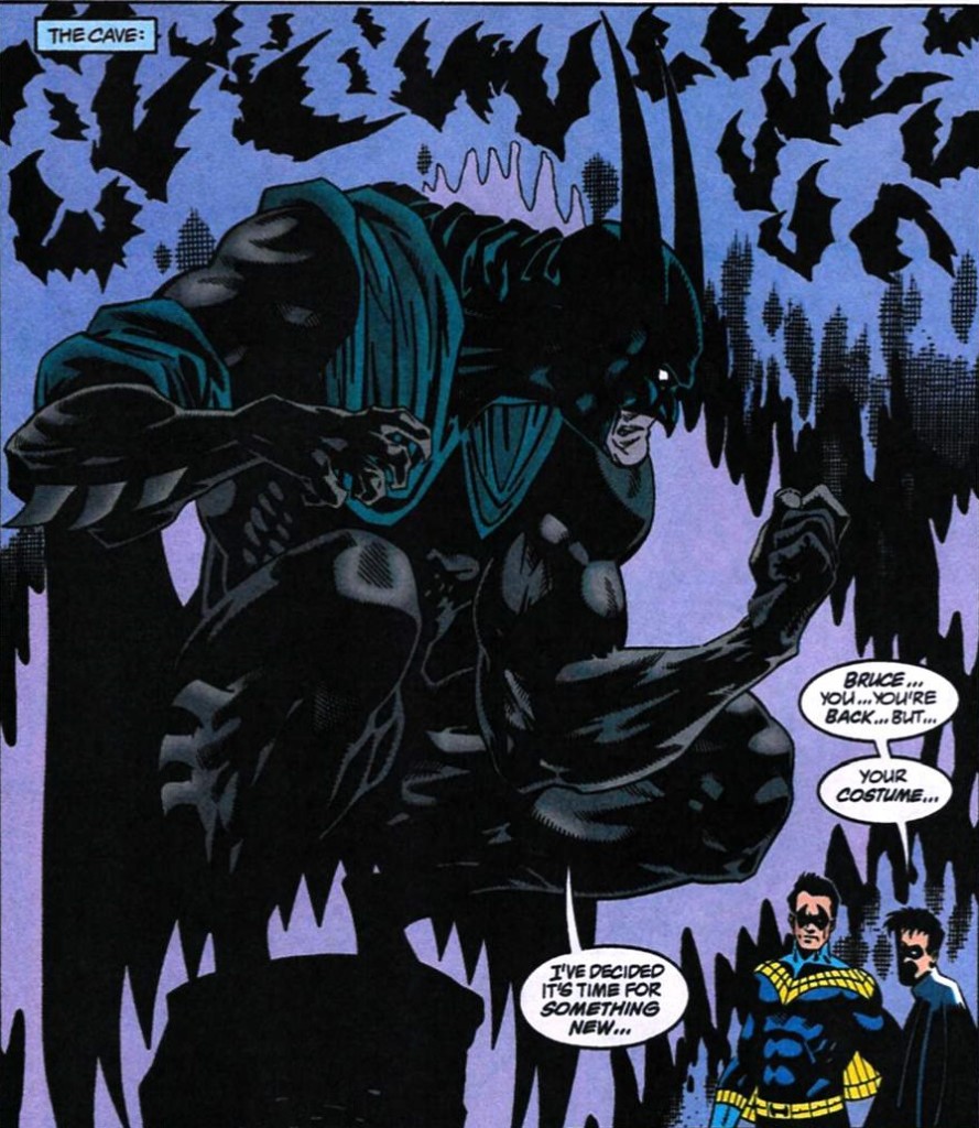 Batman #515

(As if the horns and grim expression were not enough, his feet look like cloven hoofs…)
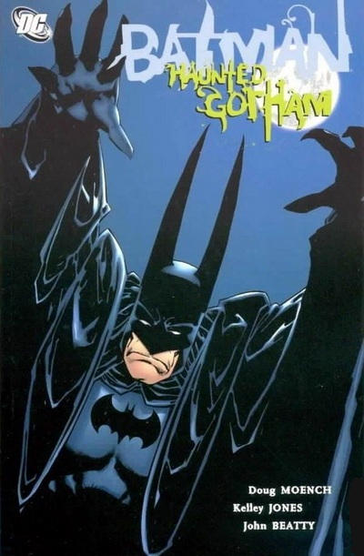
As you can see, even though he was no longer working under the Elseworlds banner, Kelley Jones continued to draw the Dark Knight like a muscular vampiric beast. It wasn’t a brief stunt either – Jones stuck around, pencilling most issues until Batman #552 (plus a handful of standalone tales afterwards), without ever softening his über-gothic aesthetics.
This choice would’ve felt bold by itself, but what made it even more extreme was the fact that Doug Moench’s scripts at the time were as over-the-top as Jones’ pencils, treating Batman’s world like a macabre comedy that filtered adult themes through the distorted fantasies of a traumatized child. For a while, the flagship Batman series seemed to take the spirit of the Tim Burton films and blow it up with the kind of flair for wild exaggeration you found in early Image Comics. Here was one of the weirdest pairings at one of the weirdest times in comic book history.
Complemented by John Beatty’s thick inks and Greg Wright’s psycho colors, the ensuing run kept treading a narrow line between seriously ugly comics and luscious-looking comics that happened to have ugly people in them.
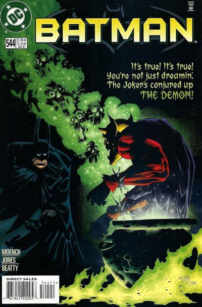
 Batman #521
(Those purple pants have got to be a nod to the Hulk, right?)
Not only was Doug Moench writing specifically for Kelley Jones’ twisted sensibility, but you could tell his stories were essentially pretexts for Jones to have a go at all the main villains in Batman’s rogues’ gallery. Thus, in these issues, Jones put his unmistakable spin on the Joker, Black Mask, Killer Croc, Scarecrow, Mr. Freeze, Two-Face, Poison Ivy, Man-Bat, Penguin, and Clayface. It was an epic run, even if we never found out who the hell was the mysterious puppeteer that kept showing up in the background…
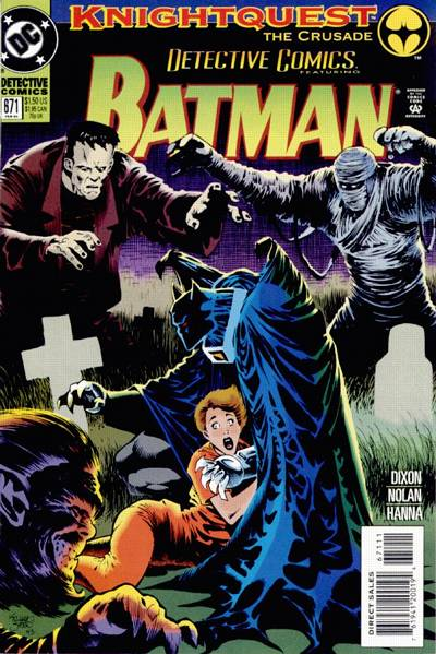
In order to make the most out of Jones’ knack for surreal, bone-chilling imagery, Moench packed the comics with supernatural creatures, including guest appearances by DC’s spookiest anti-heroes:


For example, in Batman #530-532, Jones got to revisit the skull-headed version of Deadman he had introduced a few years before. The poor ghost possessed a corpse that was visibly decomposing throughout the story – a crazy adventure in which the Dark Knight traveled to Peru to face evil mercenaries and restless Inca spirits…
 Batman #531
(Still, as Peru adventures go, it’s not as crazy as that comic Moench wrote back in the ‘70s, where he had Doc Savage fight the Peruvian version of Mothra before uncovering the radioactive ruins of a lost civilization in the Amazon and learning that the Mayans had actually descended from alien test tube babies!)
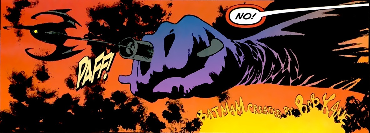
There is something malignant and disturbing about Kelley Jones’ linework – it isn’t always pleasant to look at, but it’s full of extravagant, interesting touches. Famously, as shown by the image above, one of the features of Jones’ gargoyle-looking Batman is that he has fantastically long capes.
 Red Rain
 Gotham After Midnight #8
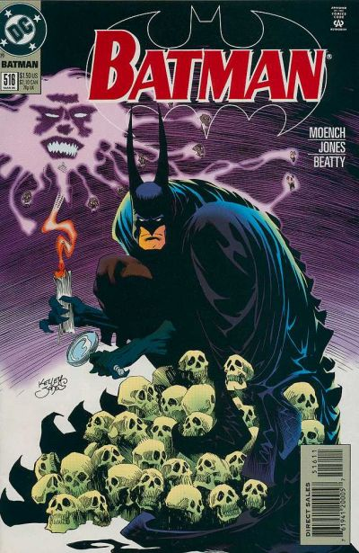
As if this wasn’t enough to create a ridiculously goth vibe, Jones also has a thing for shadows, which he sometimes combines with his cape fetishism:
 Batman #518
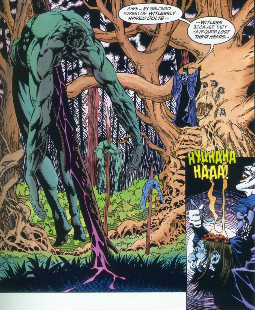
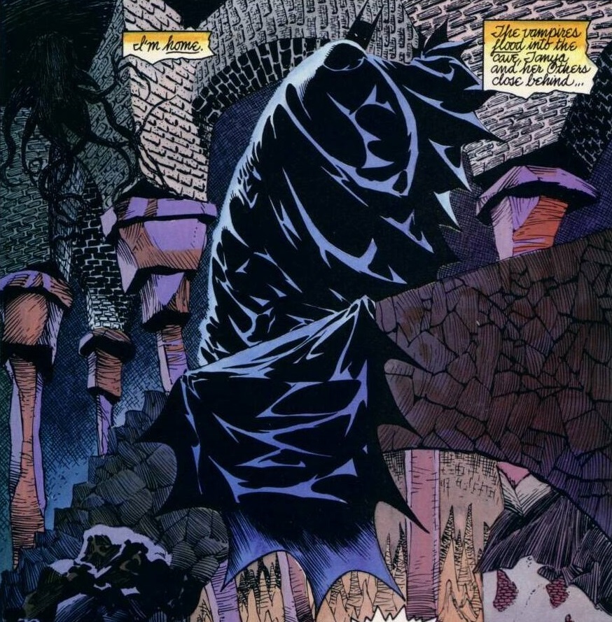
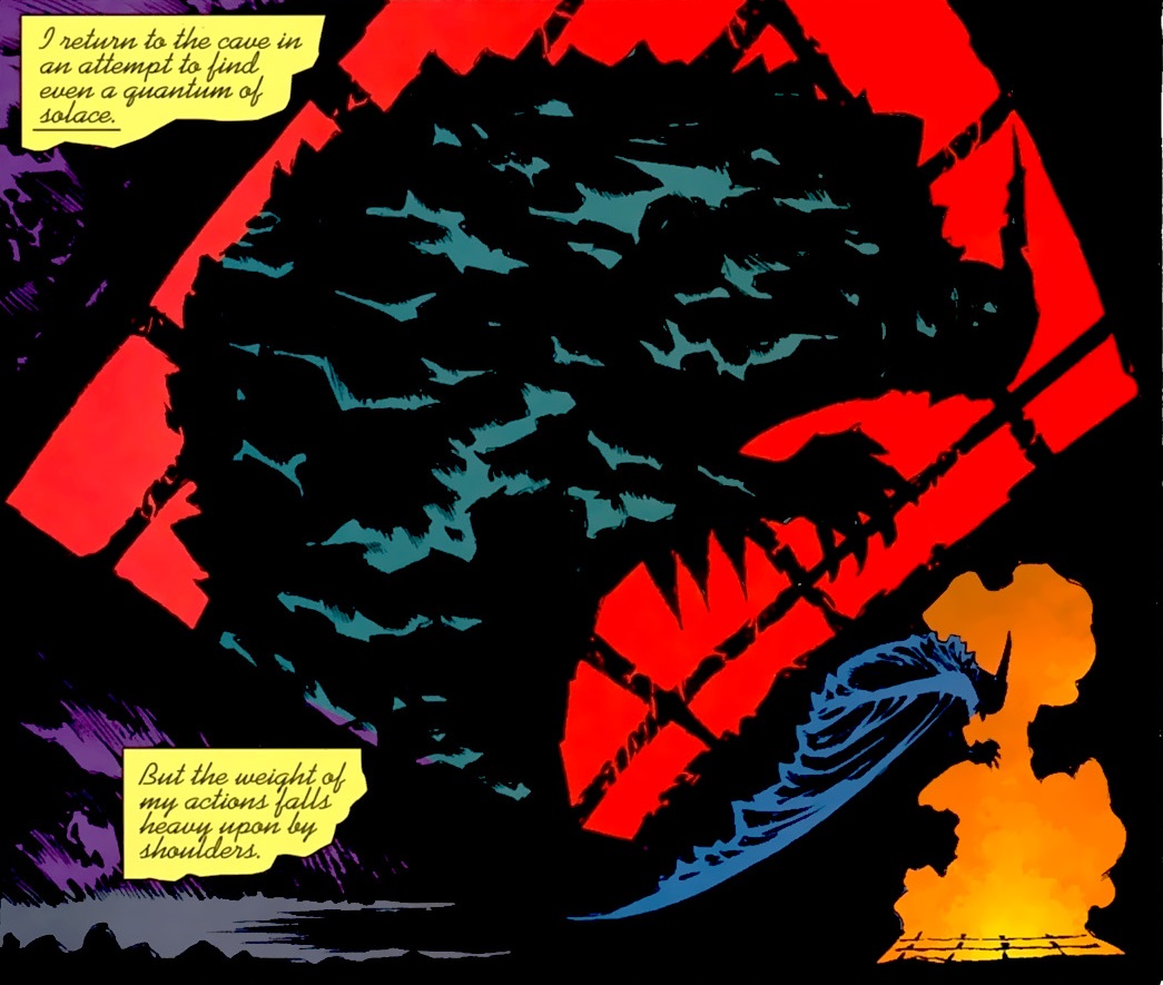
It isn’t just the deformed bodies and impractical costumes that make Kelley Jones’ pencils so special. His buoyant art has a malleable feel, coming alive on the page. Plus, Jones’ drawings of everyday objects and architecture are a strange mishmash of medieval, Victorian, and retro-futuristic designs, which creates a quasi-mythical, out-of-time atmosphere, as if Gotham was one of Italo Calvino’s Invisible Cities.
Hell, this is how Jones visualizes the Batcave:
 Gotham After Midnight #3
That said, what really gets me is the way Kelley Jones tends to playfully adorn his comics with all sorts of nifty ornaments. He sometimes draws the Dark Knight peeking from the corners of pages, beyond the panels, as if somehow outside the narrative, looking in. There are also small thematic drawings at the beginning of each issue, like the historiated initial of an ancient manuscript.
Take a look at these chapter headings:
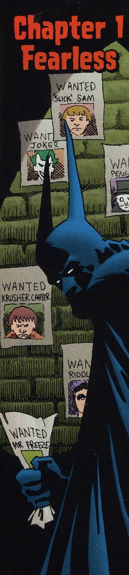
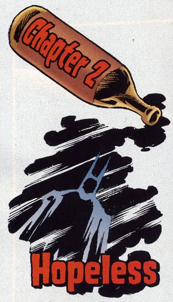
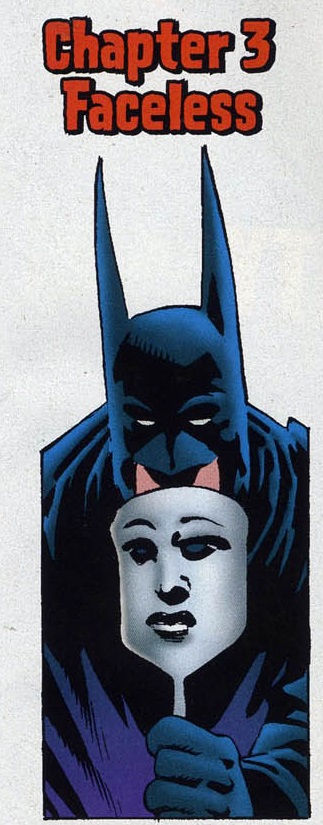
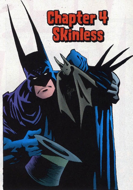
Batman: Unseen #1
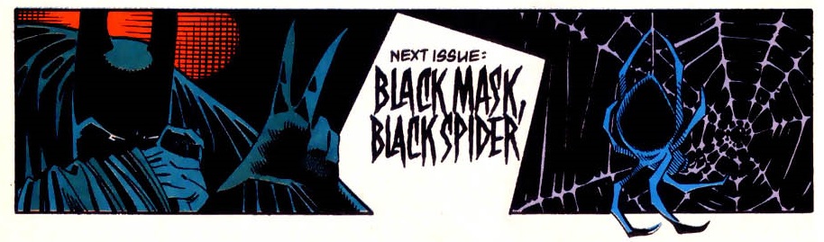
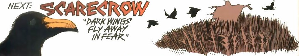
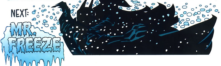
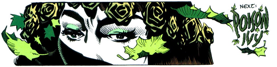
And what about these Next Issue previews:
 Batman #517
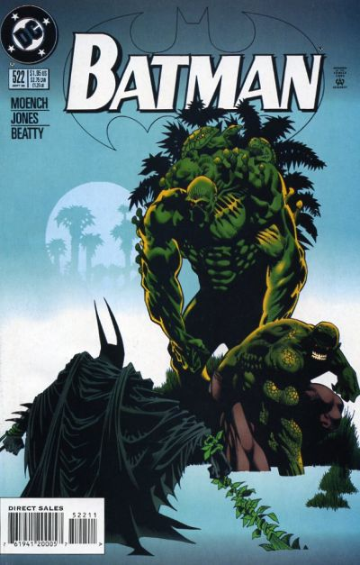
 Batman #522
 Batman #524
 Batman #528
By framing the comics with these beautiful side illustrations instead of just the usual text title and final blurb, Kelley Jones blurs the line between the main action and outside elements commenting on it.
The 2008-2009 twelve-issue series Gotham After Midnight went even further, as letterer Pat Brosseau integrated the opening credits into the early images of most issues… It’s hardly a new technique, but it expands the effect Jones seems to be going for. And it’s always cool to see the credits list on newspapers blowing in the wind, restaurant menus, tombstones, party banners, balloons, and even written through fire flames:
 Gotham After Midnight #12
Visually, Gotham After Midnight is one of the high points of Kelley Jones’ ventures into Batman comics. For once, Jones inked himself and the colors were by Michelle Madsen, whose autumnal choices turned out to be a perfect fit for his Halooween-esque artwork. The story was penned by Steve Niles, an obvious partner in crime – after all, Steve Niles is also hugely into classic horror and, while I don’t think he’s particularly talented, in his best days Niles still manages to write slightly better than Doug Moench in his worst days.
Much like the nineties’ Batman run, Gotham After Midnight reads like a string of set pieces designed to let Kelley Jones unleash one remarkable image after another, reminiscient of every horror trope in the book. You’ll find yourself taking in precious little moments, like when Commissioner Gordon’s pipe smoke turns into a silhouette of the Caped Crusader or when the Batcave’s screens and lamps all turn into tiny versions of the Bat-Signal as a warning that the police is calling – and then you flip the page and you’re blasted away by the awesome sight of a gigantic Clayface attacking the city!
Notably, the drawings are full of F.W. Murnau riffs, culminating in what is possibly the most Kelley Jones Batman panel ever:
I was actually a fan of Kelley Jones on his Batman run. I thought it was really unorthodox in how he portrayed Batman which I found captivating. Although a lot of it is impractical it was cool to see how Batman’s suit almost seems alive (like Spawn’s symbiote) and it seemed that fighting crime has consumed him in the way Jones drew his arched posture and demeanor in each panel.
My favourite run on the comics. I have all but one of them. Batman #543 continues to elude me. Someday…