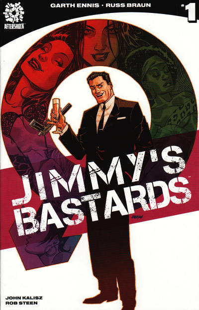
In the fourth week of this year’s Gotham Calling spy month, we’re looking at Jimmy’s Bastards, a recently completed mini-series about a thinly-veiled version of James Bond, called Jimmy Regent (because Bond and Regent are both London tube stations, get it?), facing the wrath of all the abandoned children that resulted from his one-night stands over the years.
Written by Garth Ennis, drawn by Russ Braun, colored by John Kalisz, and lettered by Rob Steen, this is much less interesting as a 007 parody than as Ennis’ contribution to the ongoing culture wars…
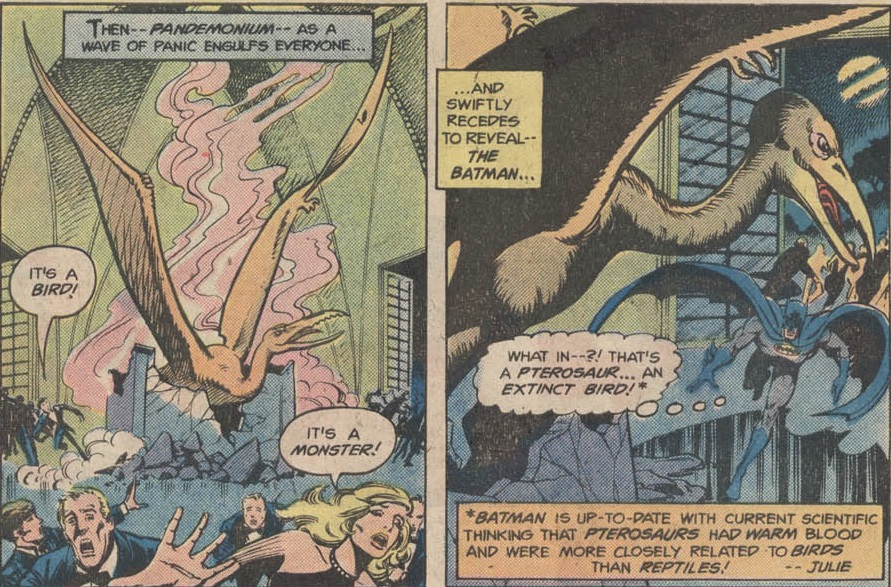
Let’s get the parody problem out of the way. My issue with spoofing the 007 film franchise is not just that this has already been done to death for the past six decades; it’s that the Bond series is itself a parody to a large degree… Basically, Dr. No and From Russia With Love were relatively straightforward spy/adventure movies, yet almost everything from Goldfinger onwards has been a spoof of those two (with the occasional attempt to get back to basics – For Your Eyes Only, the Dalton pics, the first couple of Craig ones).
Dr. No had a Fu Manchu-esque villain in a lavish den, but he was essentially played straight – most villains since then look like caricatures of this archetype, laying out plans for world domination through long, arrogant speeches in their over-the-top lairs, delighting in personal eccentricities, leaving Bond to die in elaborate deathtraps. In From Russia With Love, Blofeld commanded killers with gimmicky (if realistic) weapons – a wristwatch with a garrote, a shoe with a poison-tipped switchblade – but later henchmen evolved into live-action cartoons, like Oddjob, Nick Nack, and Jaws. In those early movies, 007 flirted and bedded a few women, including the suggestively named Honey Rider, but this soon grew into a central motif, with Bond screwing and harassing gorgeous women all the time, many of them with jokey names (Pussy Galore, Plenty O’Toole, Xenia Onatopp).
There are all these running gags, like how James Bond tends to be an expert on whatever M asks him about that day, or his snobbery about drinks, or the multiple gadgets that look like everyday objects. In your average film, much of Bond’s dialogue consists of puns – usually sexual innuendo or heartless one-liners after killing someone. The action scenes have long ago given up on any restraint, often reaching Looney Tunes levels. Moreover, 007’s visits to Q headquarters are clearly played for laughs, with the backgrounds packed with nerdy scientists testing out goofy deadly contraptions. These are shameless action comedies and, while it is possible to mock comedies, spoofs of the Bond formula tend to merely exaggerate what is already deliberately exaggerated or point out the silliness of elements that are already done with tongue in cheek in the original…
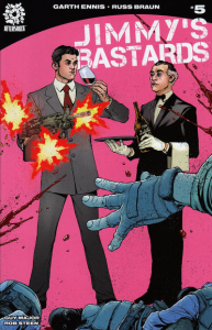
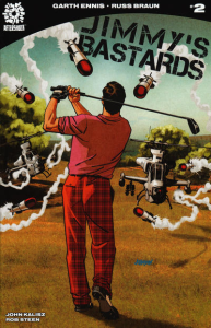
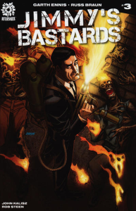
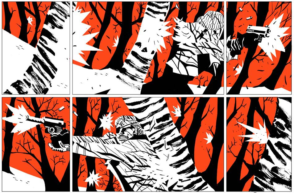
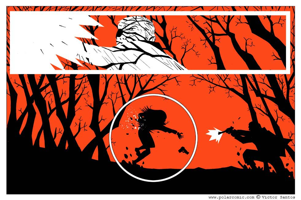
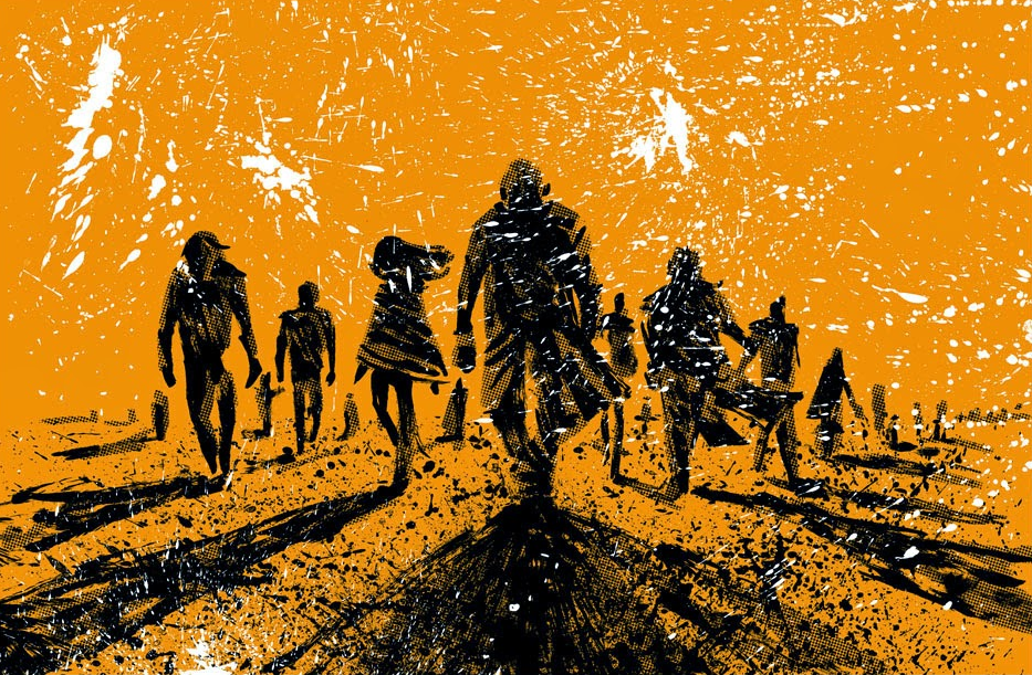
Jimmy’s Bastards is no exception. It kicks off with Jimmy Regent shooting a terrorist in the cock – who interrupts his villainous monologue with some profanity – as if this is hilariously outrageous, even though it’s still more tasteful than your typical Roger Moore double entendre. The series’ covers – which have fun with the contrast between the protagonist’s posh demeanor and his familiarity with ultra-violence – could easily have been covers for the official Bond franchise:
Mocking James Bond seems lazy, especially when focusing on such an obvious target as the character’s promiscuity and missing other features (class, imperialism, extrajudicial impunity…). There are more interesting ways to play with this archetype, whether through nasty deconstruction (League of Extraordinary Gentlemen: The Black Dossier) or through clever revisionism (the actual James Bond mini-series and one-shots currently being published by Dynamite).
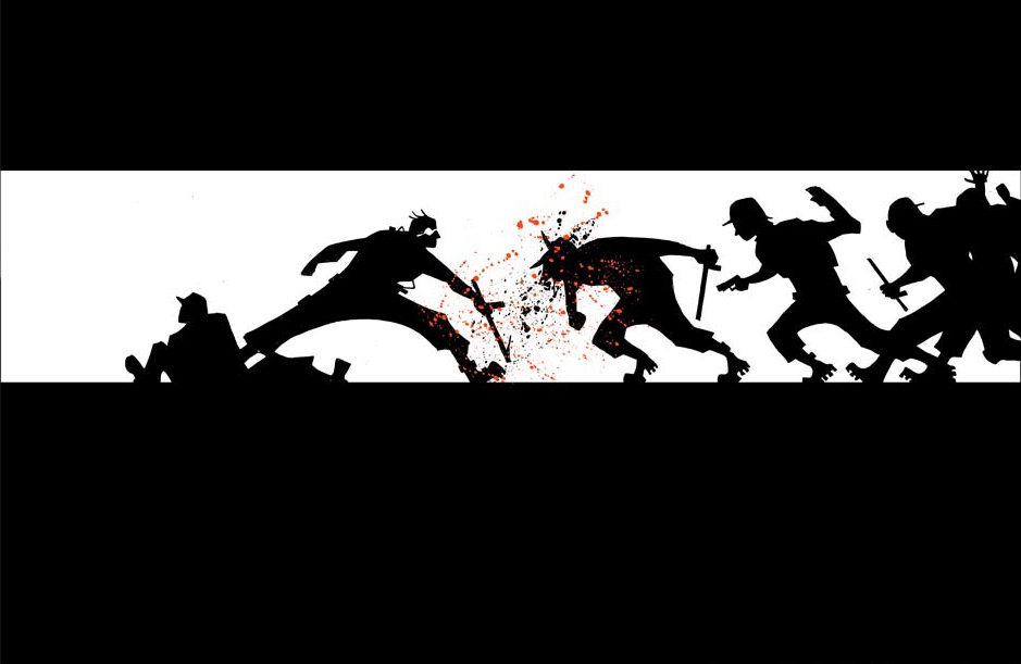
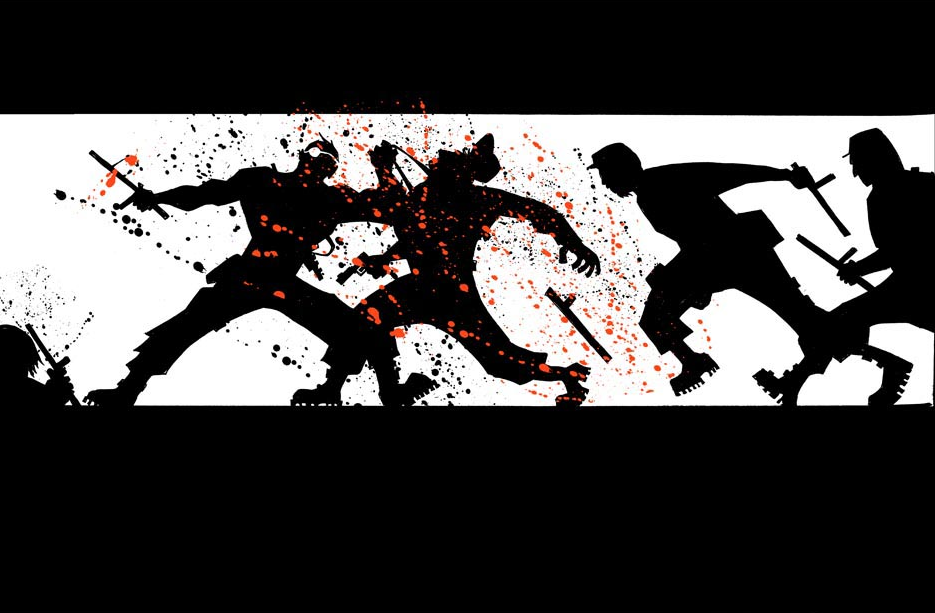
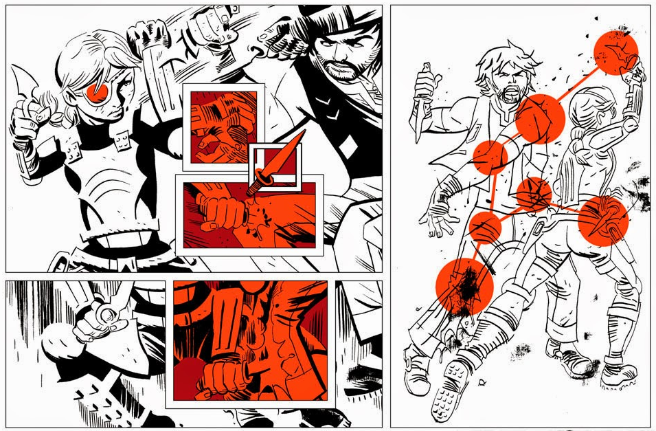
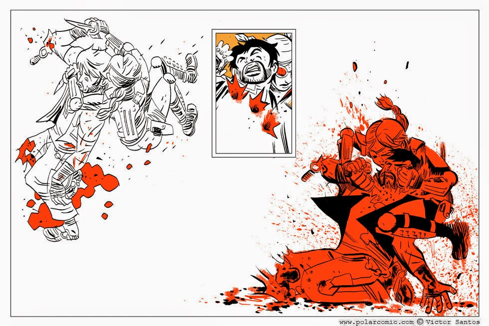
So, Jimmy’s Bastards isn’t particularly inspired as a Bond satire, but is it an inspired slapstick comedy, at least? Well, as always, it largely depends on your affinity with Garth Ennis’ notoriously lowbrow humor. For me, although the salty language and gory carnage can be entertaining – and Russ Braun’s art certainly nails most beats with fine comedic timing – too many of the gags feel tired and repetitive… They’re insulting not so much because they deal with offensive material (which they do), but because they’re so unfunny. Even the subplot about Ugandan dictator Idi Amin being blackmailed by people who removed his testicles – which, in theory, could work in a twisted sort of way – falls flat, drags for too long, and cannot avoid a whiff of mild racism by going back to the old ‘pathetic minority supporting character’ well (one of many stale tropes in the series).
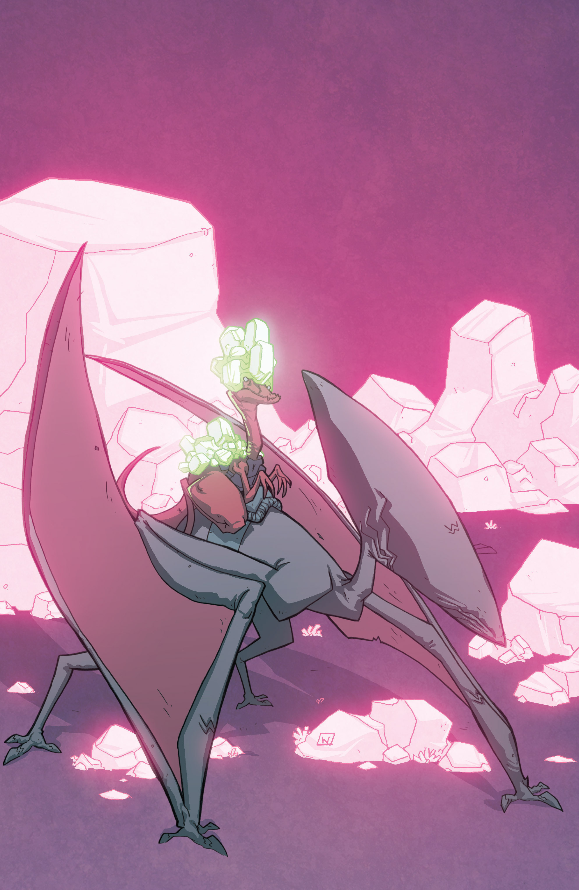
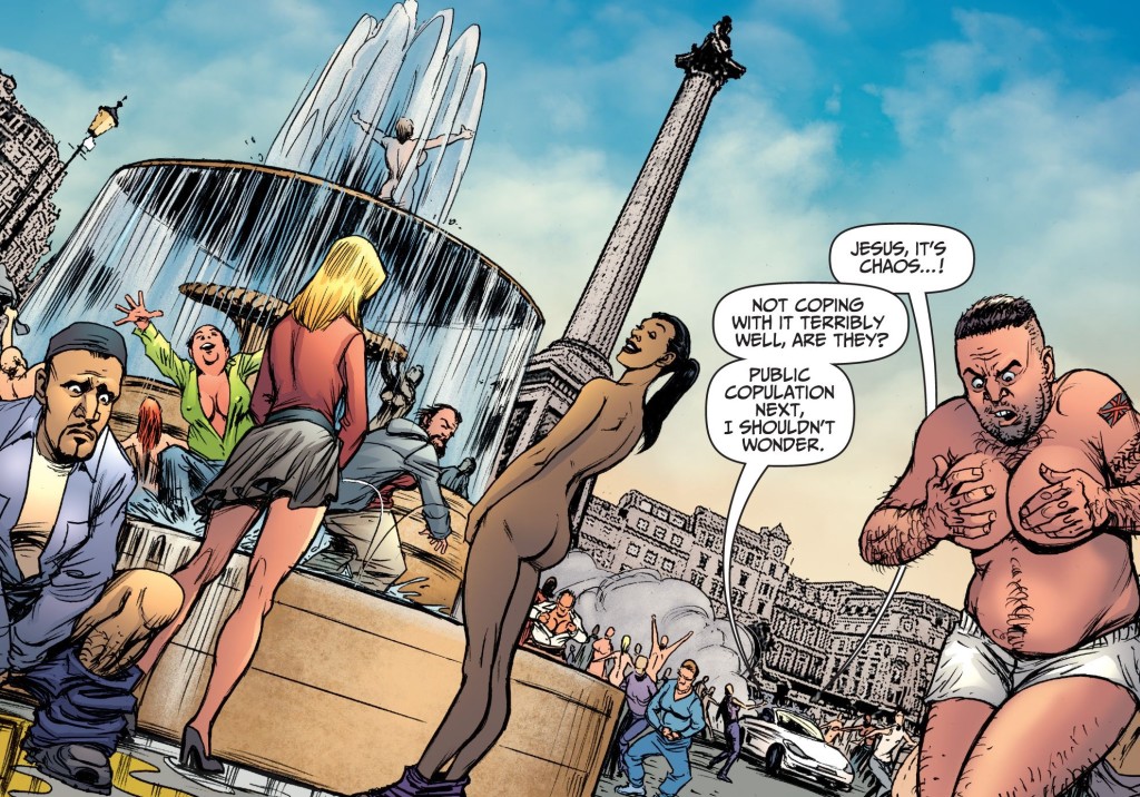
If you’re noticing a genital injury pattern, then you’re not off the mark. In fact, many of the jokes revolve around a weapon called Gender Fluid, which switches the sex organs of everybody in London. I won’t pretend like there is nothing transphobic about this source of humor – while the suddenness and involuntariness of the process is part of the joke, it only fully works if you think sex changes are a bit ridiculous, as you’re repeatedly expected to laugh at the fact that people’s gender and bodies don’t match (look, that overweight bearded man now has huge, soggy female boobs!). Still, I give Jimmy’s Bastards credit for presenting different reactions: while some characters freak out (an acknowledgement that trapping people in a body they don’t identify with can be a problem), others embrace it with cheerful open-mindedness and curiosity (suggesting that gender identity and sexuality can indeed be fluid). In every splash that Braun draws depicting a collective reaction, there are signs of both panic and joy:
Jimmy’s Bastards #4
At the end, some of the Londoners actually reach out to the transgender community for guidance in adjusting to their new condition, leading to an activist’s amusingly indignant response:
Jimmy’s Bastards #9
The sequence encapsulates the comic’s spirit: it gleefully draws on off-color jokes while seeking laughs in a caricature of identity-politics-gone-wild, but it doesn’t completely dismiss social justice causes. And if this sounds like overinterpretation, bear in mind that the series begs for such an analysis. Jimmy’s Bastards isn’t just another raunchy black farce having a laugh at Bond’s expense. We’ve had plenty of those in comics, from the French album Spoonfinger to Mark Millar’s and Dave Gibbons’ The Secret Service (aka Kingsman) – what makes this one stand out is that it consciously uses the 007 pastiche to address ongoing debates about the Snowflake Generation.
Bastards is at its best when, rather than engaging in outright polemics, it merely merges the latest trends and concepts in weird, out-of-context ways. For example, in the opening set-piece, Jimmy is apparently fighting jihadists, but he quickly undermines the orientalist stereotypes at play (‘Your name’s Martin, you were radicalized at sixth form college, you’re a tit–’) and reveals that the whole thing has been staged by Theophilus Trigger, a villain specialized in triggering traumas, who speaks only through microaggressions (‘graphic violence,’ ‘swearing,’ ‘swastikas! skeletons! pictures of shit!’). This not only sets up the comic’s theme and cartoonish tone, but it also immediately establishes that Jimmy sees himself as immune to that sort of attack.
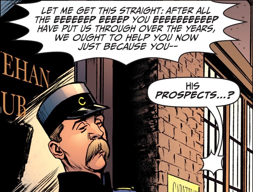
Not only do Jimmy’s one-liners often allude to SJW terminology (‘I have no safe space,’ ‘Checking my privilege.’), but the whole premise is basically a send-up of the notion of ‘failed parenting strategies,’ with the main villain coming across as a whiney millenial complaining about daddy issues:
Jimmy’s Bastards #1
(He even has a smart phone that he swipes right to execute his henchmen!)
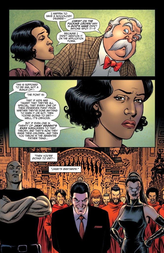
Yet it’s not all played for laughs… Jimmy’s Bastards often pontificates about the issues, usually in the form of condescending conversations between Jimmy and his latest spy partner, a young black woman called Nancy McEwan. These scenes are somewhat painful to read, as they follow the annoying formula of having Jimmy tease Nancy (‘So, do you get the token business a lot?’) followed by her clichéd overreaction, followed by Jimmy showing her that he is quite a reasonable, nice guy after all (‘Well, why would I fight to defend a democracy with a parliament at its heart, if I didn’t believe in the notion of social progress?’).
Perhaps these exchanges wouldn’t be so terrible if the comic didn’t make the protagonist sound like a blunt mouthpiece for Garth Ennis. We’ve seen this before: Jimmy Regent belongs to a long line of straight-talking Ennis heroes outlining straw-man arguments to secondary characters who keep supplying convenient cues… At least here Ennis tries not to slow down the pace too much, by integrating the conversations into the action (like the tirade about ‘political correctness’ below, during a gunfight at the British Museum), but they still look quite contrived and on-the-nose:
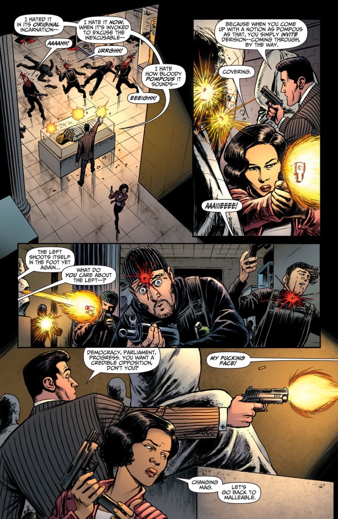
Jimmy’s Bastards #3
We get this over and over again in the first issues – Jimmy has Nancy figured out from the outset and he keeps telling her what’s what. There is even a gratuitous scene early on in which she talks to her sister (who plays no other role in the story) just so that we can get slices of expository characterization like ‘There is something about him, something I can’t quite put my finger on…’ and ‘he’s not a complete arsehole, he’s about… maybe… ninety-five percent what you’d expect.’
All this is made slightly more bearable by the art team of Russ Braun and John Kalisz, who not only excel at the abundant action, sex, and graphic violence, but they also make it visually clear that Jimmy Regent is as damn smug as they come… and Nancy McEwan isn’t necessarily buying all of his bullshit:
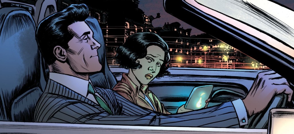
Jimmy’s Bastards #3
Indeed, Nancy is more than a symbol for leftist sensibility. She is smart, confident, and competent. Sure, she gets taken hostage (twice), forcing Jimmy to come to her rescue, but she also singlehandedly breaks out – in a kickass action scene – and later attacks the villains’ headquarters by herself, massacring a bunch of the bastards. She is no delicate damsel in distress, but the kind of tough woman ideal you find in other Ennis comics (Bloody Mary, The Fall & Rise of Anna Kharkova, Caliban).
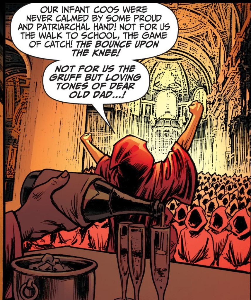
For instance, remember when I said the whole thing hinged on a send-up of failed parenting strategies? Nancy McEwan is the one who gets to make it explicit:
Jimmy’s Bastards #6
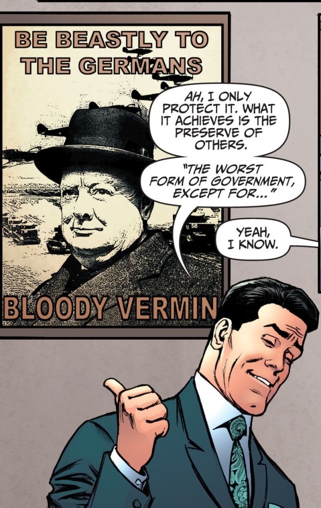
To be fair, for every ham-fisted exchange, you get a few witty details as well. There is the bit when the villains have seemingly won the day but can’t agree on what to do next… While one of them wants to use the Gender Fluid weapon to blackmail the rest of the world, another one pragmatically explains that they can’t exactly threaten the US because the current administration is such a poor negotiator (‘The only significant change would be that he’d start grabbing women by the dick.’). Then there is the penultimate gag, near the end, when Nancy finds out her mother’s identity (I won’t spoil that one). I also like the fact that the MI6 headquarters are decorated with posters of Churchill and anti-German insults, implying that some forms of discrimination are more tolerated than others, having been engrained in the UK’s proudest moment.
Jimmy’s Bastards #4
(Nation-based generalizations in the name of anti-fascism!)
All in all, I admit that an ersatz-James Bond is not an inappropriate vehicle to explore topics such as toxic masculinity, since the original character has been a poster boy for the kind of misogynist attitude that has dominated pop culture at least since WWII. Jimmy’s Bastards trades on that iconic resonance in the second part of the story, when it pulls the rug from under the hero, taking him down a notch (albeit not in a way that truly challenges his earlier remarks). In a predictable twist, Jimmy is ‘triggered’ and retreats to his ‘safe space’ (I use the words in the sense the book does, but I’m not entirely sure Ennis knows what they’re supposed to mean).
Again, Bastards wants to have it both ways. On the one hand, the villain is ultimately defeated with the help of microaggression and the hero learns that there is such a thing as a trauma trigger. On the other hand, the villain is clearly supposed to be foolish and the hero’s arc invites us to laugh at the notion of a hypersensitive 007 who is scared silly and compulsively cuddles a puppy.
It gets worse: when Jimmy is committed to a psychiatric hospital with other insane 00 agents (who resemble Moore, Brosnan, Dalton, Craig, and Connery), Nancy asks the doctor if there is any PTSD therapy, to which he replies: ‘Yes, we’ve tried that. Turned out to be a lot of balls.’ Nancy tries to gently talk Jimmy out of his catatonic state, but of course that doesn’t work (the doctor warned her: ‘Absolute waste of time.’). She ends up admitting she *needs* Jimmy in order to save the day and tries to get him off his ‘pathetic traumatized arse’ by yelling at him to ‘man the fuck up!’

Jimmy’s Bastards #8
The rest of the cast seems to agree about the effectiveness of Jimmy’s brand of virility. At one point, the main villain admits to his sister that the bastards have little chance against their father, because they lack discipline, are easily discouraged, and didn’t earn their credentials (‘you’ve got a black belt in karate, but only because you wanked off your instructor every lesson’). Jimmy Regent, on the other hand, is the product of a tougher form of education: he ‘had the shit beaten out of him every day for years – until he got good enough to beat the shit out of the shit-beaters-outers. That is training.’
This makes it sound as if there is no middle ground between manly stoicism and paranoid fragility… However, after having a go at the two extremes, the comic wraps up with versions of Jimmy and Nancy that combine a bit of both attitudes.
At a time when so many high-profile creators mostly complain that they are not allowed to say what they want (i.e. to say it without criticism, without people taking offense and not buying their products), it’s refreshing to see that Garth Ennis does not reduce the issue to free speech, but actually tries to engage with social justice revindications in a way that speaks directly to his usual thematic concerns. There is a recurring tension in his work – which is much more thought-provoking than it is often given credit for – between Ennis’ support for progressive causes and his infatuation with conservative methods, between his liberal ideals and his cynicism regarding naïve liberals, between a respect for ethics and the kind of anthropological pessimism that leads to the conviction that, at the end of the day, only immoral behavior will get things done.
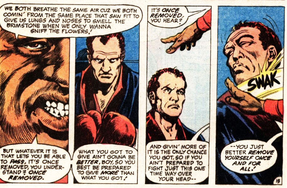
Ennis’ comics – especially his war stories – keep going back to the notion that, while there is something wrong with both old-school machismo and modern sensitivity, there are valuable features in each of them as well, so that ideally the old machos should become more sensitive and the younger generation should toughen up. One of the first series to stress this thesis in pretty unambiguous terms was the crime thriller Pride & Joy, published twenty years ago. It culminated in a sequence where father and son simultaneously found redemption by showing/repressing their emotional vulnerability:
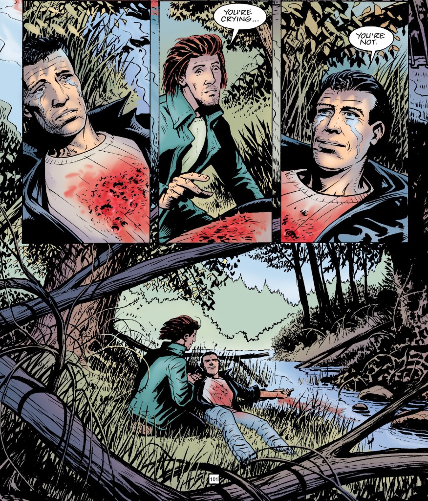
Pride & Joy #4
Yes, this is a highly questionable false equivalent, but I see it as part of a larger motif in Garth Ennis’ oeuvre, namely the drive to rub in readers’ faces that empathy, ideology, and social awareness are not set in stone – they’re muddy and relative and under constant negotiation between contradictory impulses. Ennis has done variations of this gesture throughout years, using genre comics as a springboard to complexify manly discourse about homosexuality (for example, in A Man Called Kev and The Boys: Get Some) or different ways to relate to warfare (J for Jenny, among many others).
Underneath all its gross-out, body-shaming humor and uncomfortable, mean-spirited depictions of mental illness, Jimmy’s Bastards continues to explore Ennis’ obsessions, delivering a 21st century version of the ending of Pride & Joy:
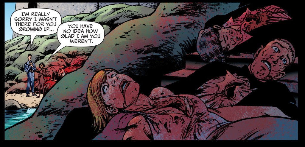
Jimmy’s Bastards #9


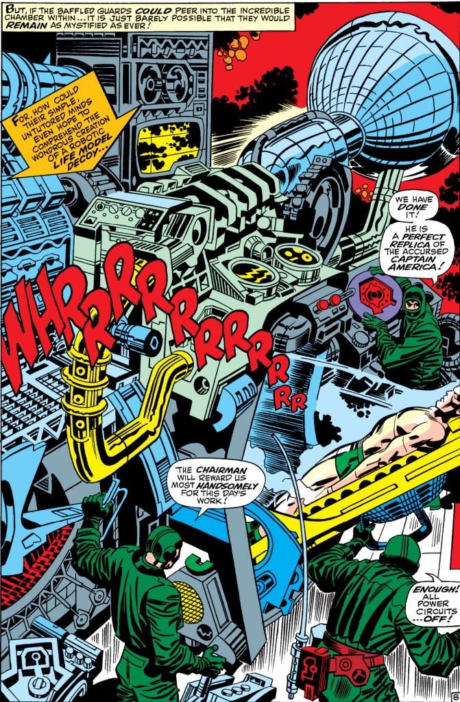
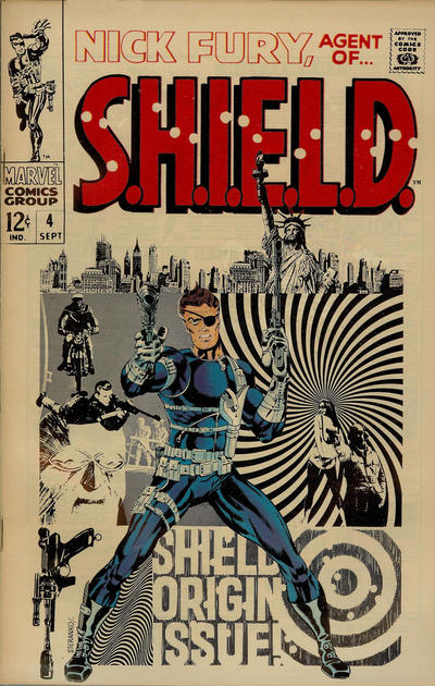
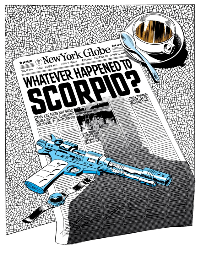
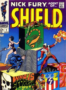
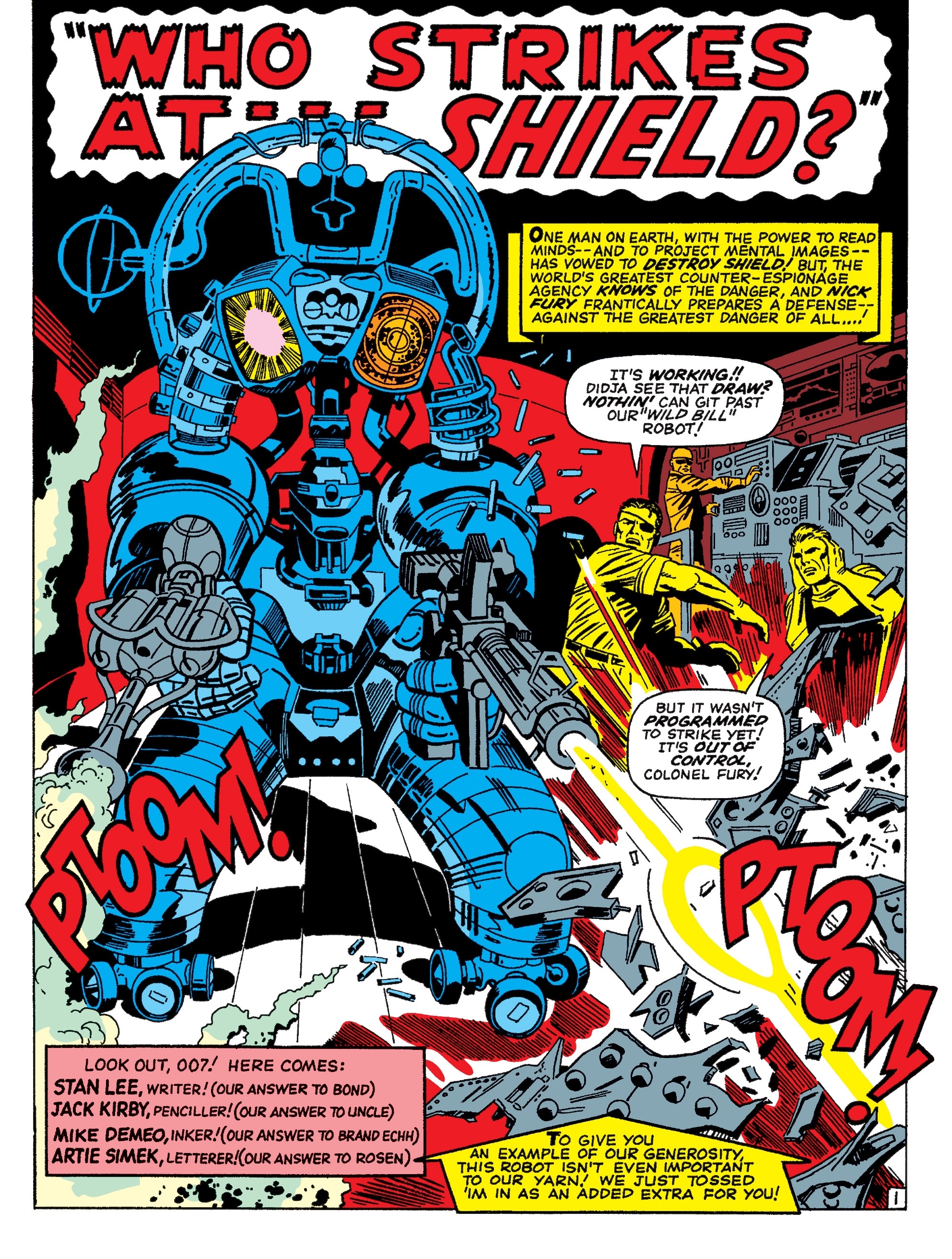
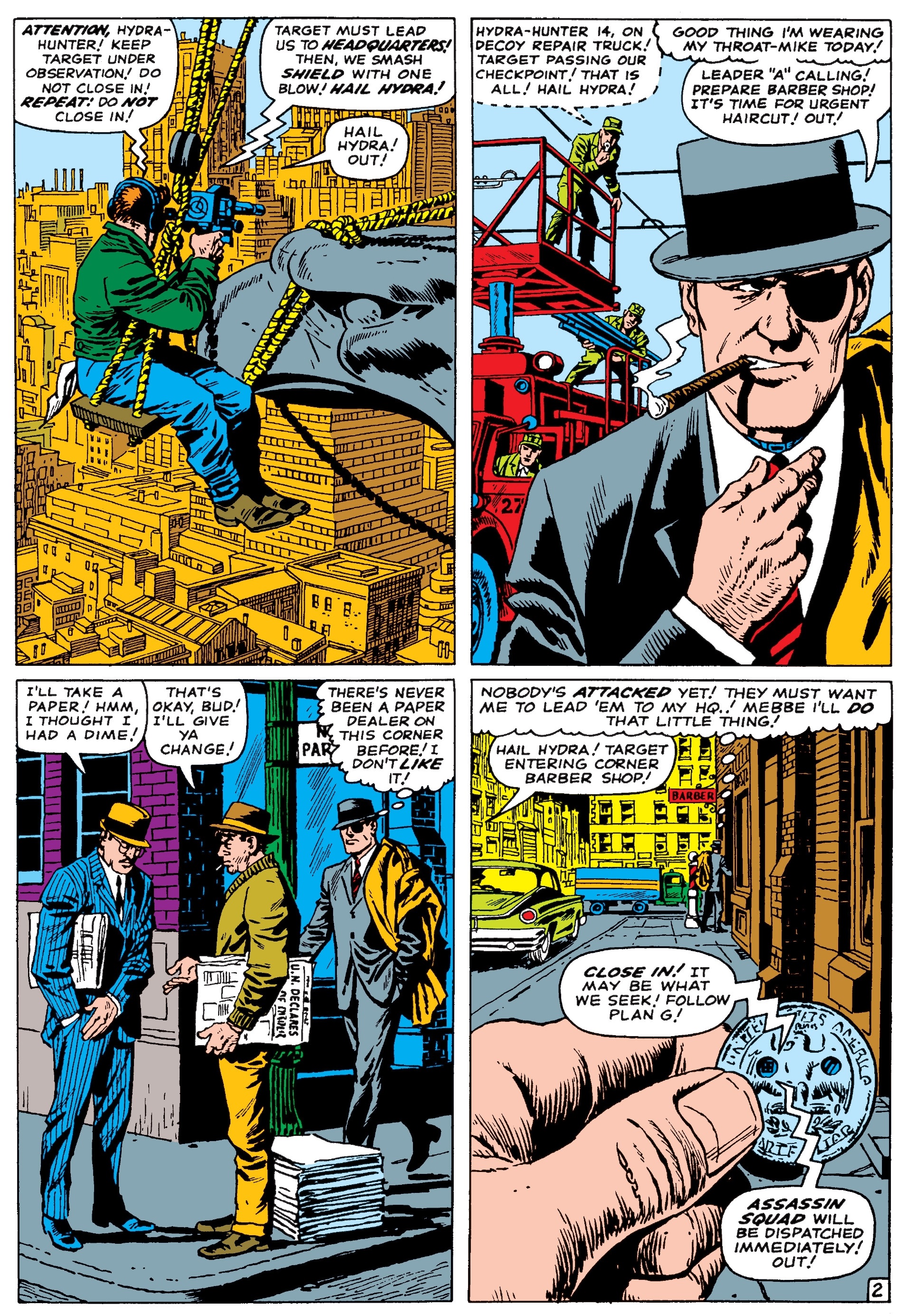
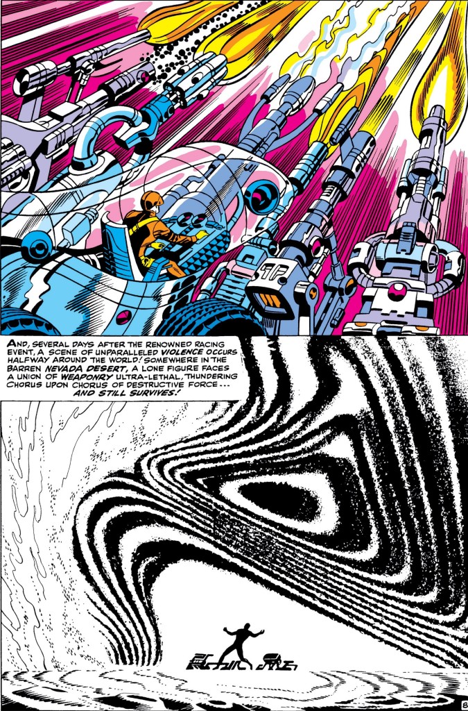 Nick Fury, Agent of S.H.I.E.L.D. #1
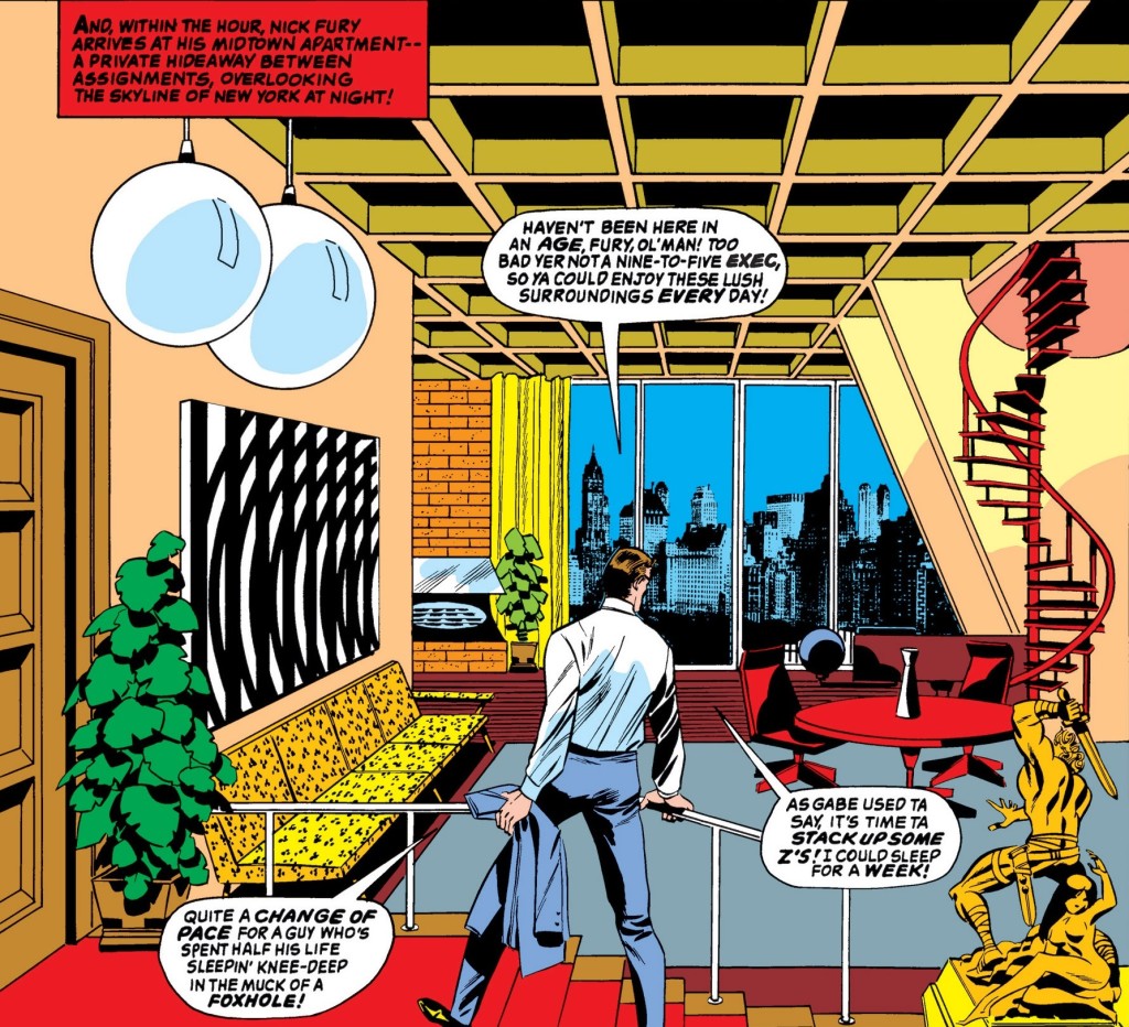
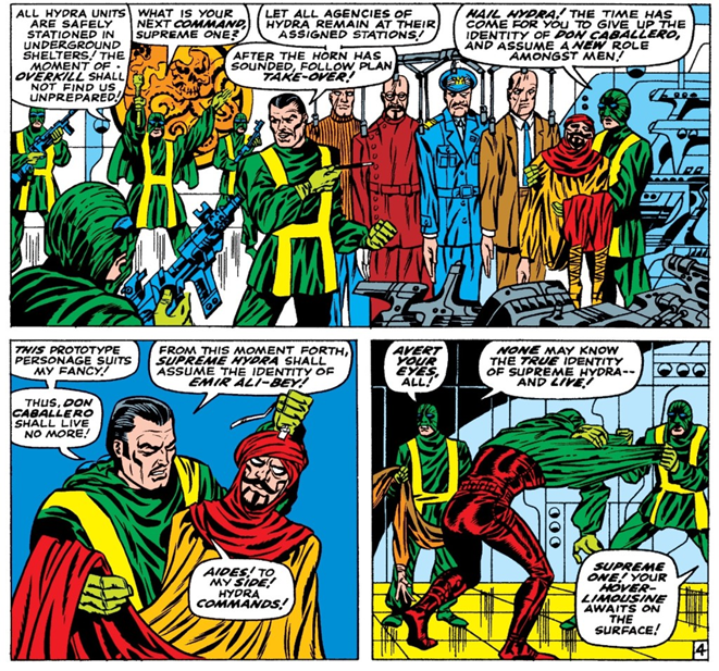
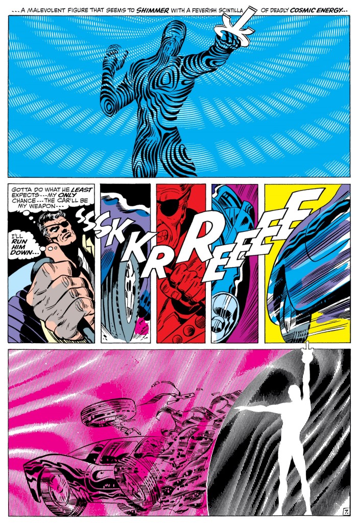
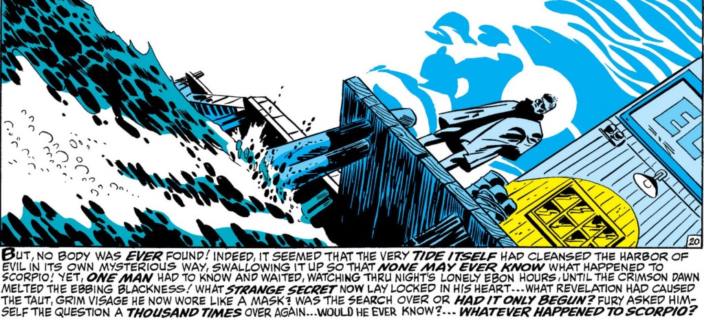
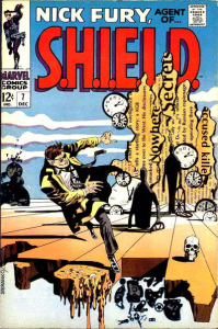
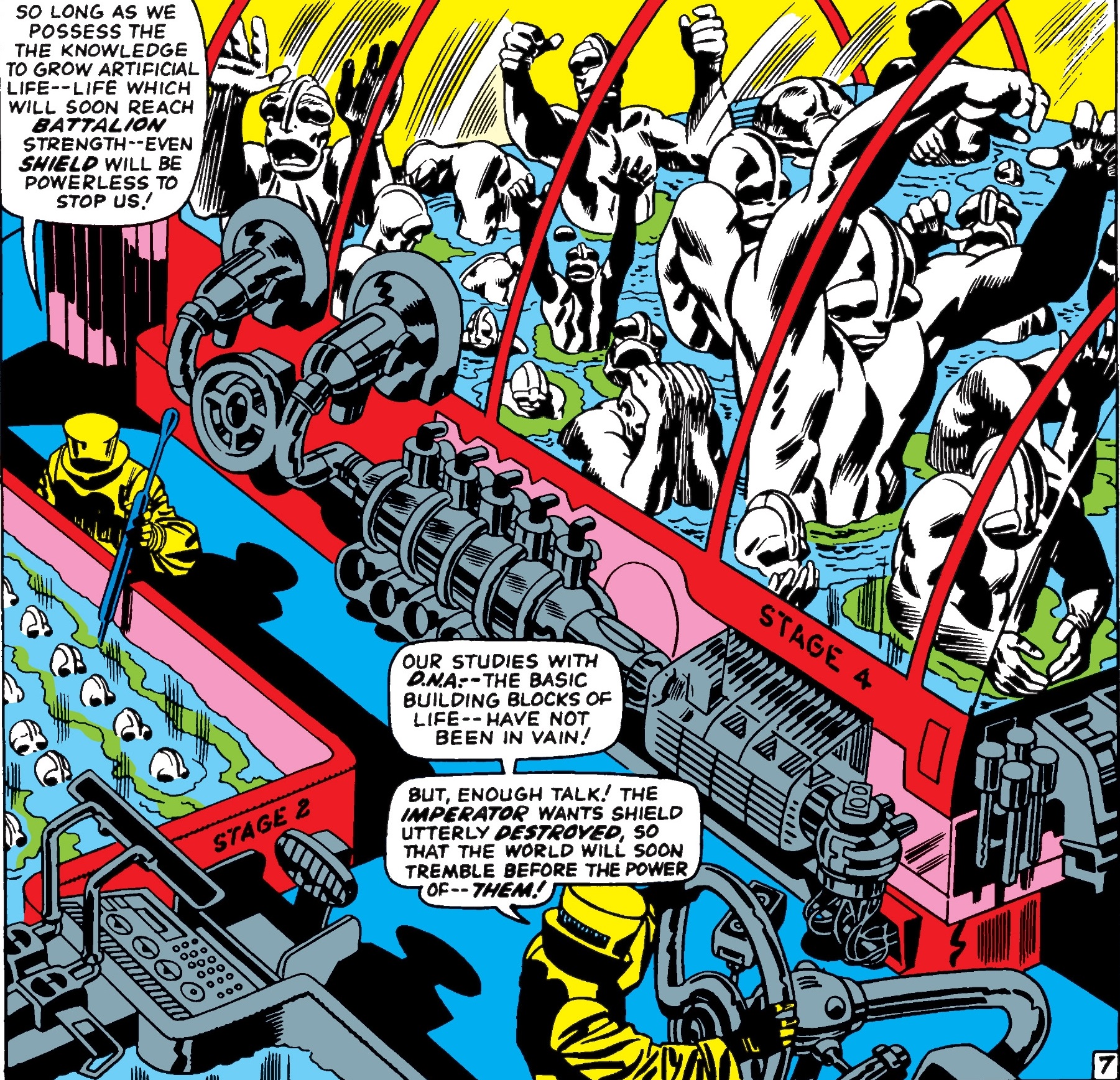
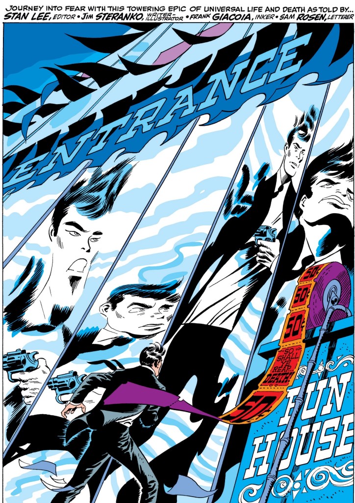 Nick Fury, Agent of S.H.I.E.L.D. #2
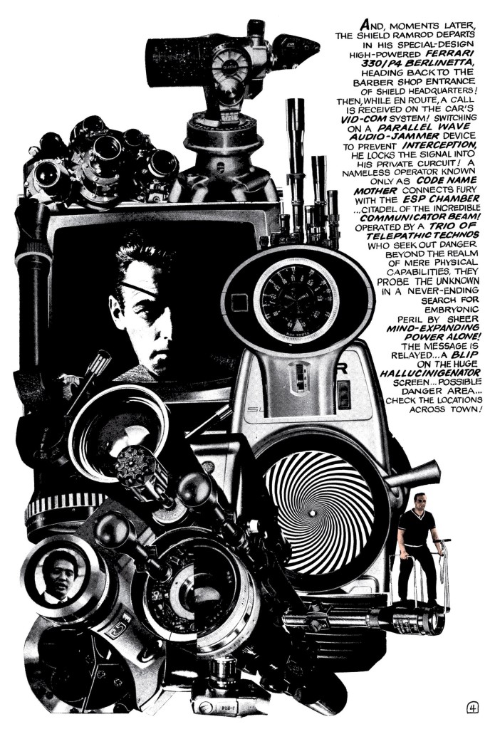
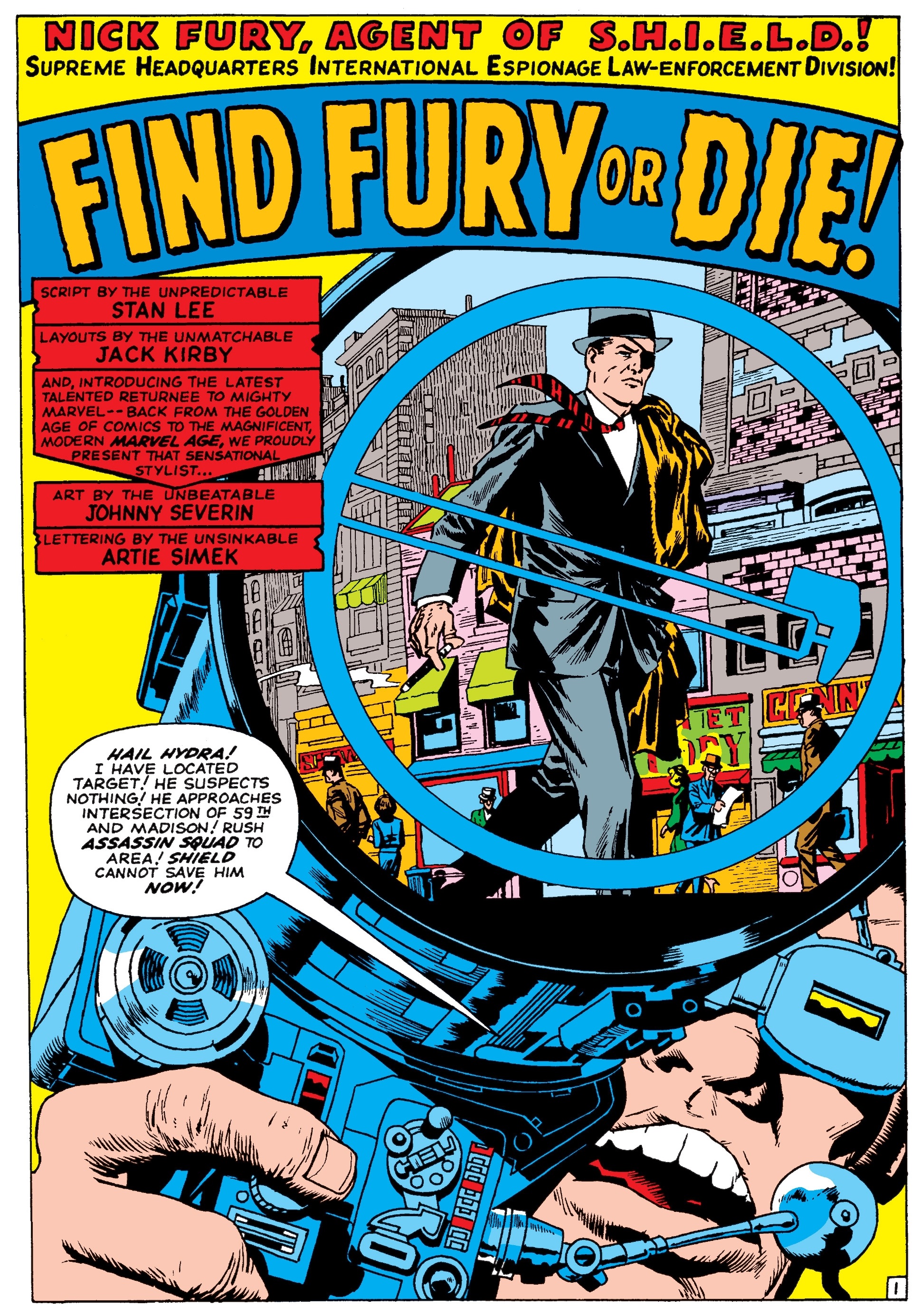