


-
Recent Posts
Categories
- ART OF BATMAN COMICS (36)
- ART OF HORROR COMICS (36)
- AWESOME COVERS (63)
- BATMAN COMICS FOR BEGINNERS (37)
- BOOKS OF THE YEAR (22)
- COLD WAR CINEMA (12)
- COVERS OF BATMAN COMICS (53)
- FANTASTIC ADVENTURES (49)
- GLIMPSES INTO AWESOMENESS (98)
- GLIMPSES INTO THE FUTURE (24)
- GLIMPSES INTO THE PAST (88)
- GOTHAM CITIZENS (37)
- GOTHAM INTERLUDES (86)
- HARDBOILED CRIME (38)
- HEADSHOTS (14)
- IF YOU LIKE THE COEN BROTHERS… (11)
- MANIFESTO (3)
- POLITICS OF BATMAN COMICS (21)
- SPYCRAFT & WARFARE (47)
- SUPER POWERS (16)
- WEBS OF FICTION (57)
- WILD WEST (8)
- WRITERS OF BATMAN COMICS (20)
- WRITERS OF SUPERMAN COMICS (4)
Drop me a line at
imbaytor@yahoo.com
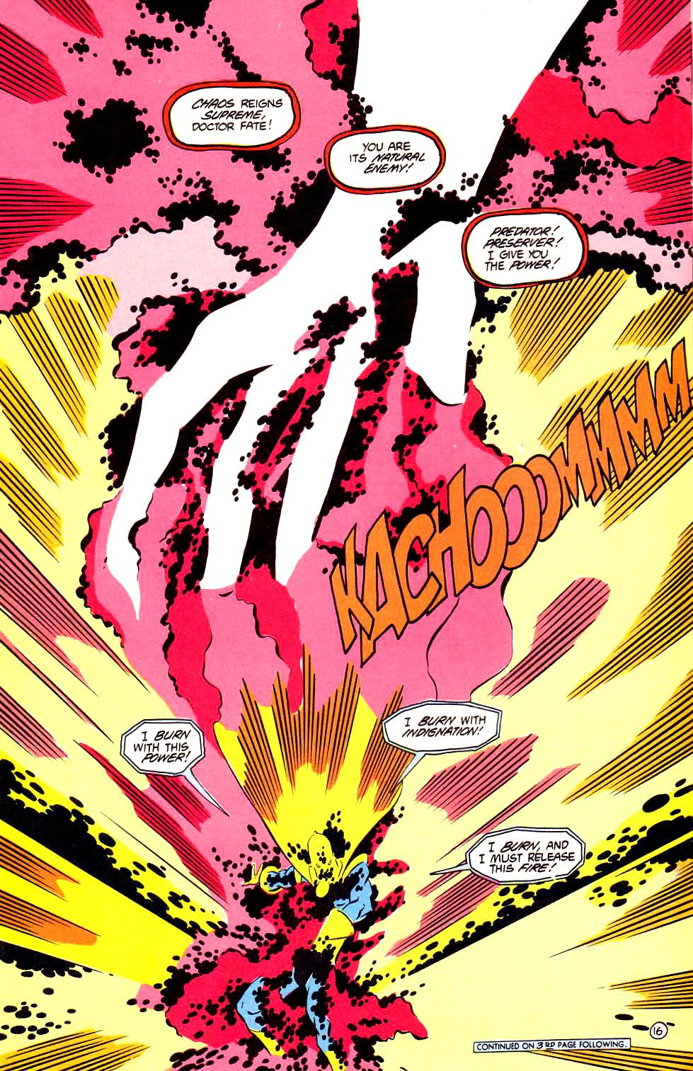
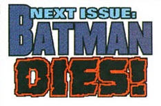
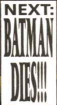
On the discreet BATMAN DIES!!! event
In November 2000, the ‘Next Issue’ blurbs in the Batman family of comics announced that something big was about to go down…
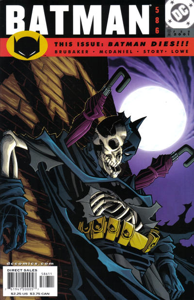
 Batman #585
 Catwoman (v2) #88
 Robin (v4) #84
The premise of a story in which the Dark Knight seemingly kicks the bucket is hardly unique (there is even a whole collection devoted to this subgenre). Still, some of you may find it odd that this event remains relatively unnoticed, especially in comparison with the much-publicized Batman deaths written by Grant Morrison less than a decade later (in Batman R.I.P. and Final Crisis). The reason for this is that the blurbs’ promise was extremely misleading: rather than a crossover in which Batman met his demise, the following month DC delivered a set of unconnected issues focusing on different members of the rogues’ gallery, with many of them fantasizing about killing the Caped Crusader.
Even if it was just a cynical stunt, this gimmick allowed creators to present the world as viewed through the rogues’ distorted eyes. They could therefore shift each series’ gaze, taking the side of the foes rather than that of the heroes, and even play intertextual games by providing alternative views on the events from previous comics. As a result, they actually gave us some very cool tales…
Sadly, Batman #586 wasn’t one them. It’s readable, for sure, but very light on ideas… This fantasy about the Penguin’s rather pedestrian plot to kill Batman has a fairly decompressed approach – the whole thing is basically an extended action scene and, even though it’s rendered by Scott McDaniel with his usual gusto and dynamism, there isn’t anything particularly original about it. The only clever twist comes near the end, but it isn’t enough to make up for either the lacklustre lead-up or the uninspired final revelation. I find this a shame, really, since writer Ed Brubaker has proven that he can do alternative history/speculative tales with interesting nuances, for Batman (Gotham Adventures #33) as well as for other superheroes (What If Aunt May Had Died Instead of Uncle Ben?), but here he wasn’t at the top of his game.
Chuck Dixon took greater advantage of the ‘Batman Dies!!!’ gimmick, penning a couple of insightful issues about the psychologies of an A-list villain, the Joker (Robin #85), and a Z-list one, Nite-Wing (Nightwing #51). (He also wrote one about Bane, ‘The Suitor’ (Birds of Prey #26), but it’s a run-of-the-mill yarn that is as much about characterization as about deftly setting up plot points for future arcs, something that Dixon can pretty much do with his eyes closed.)
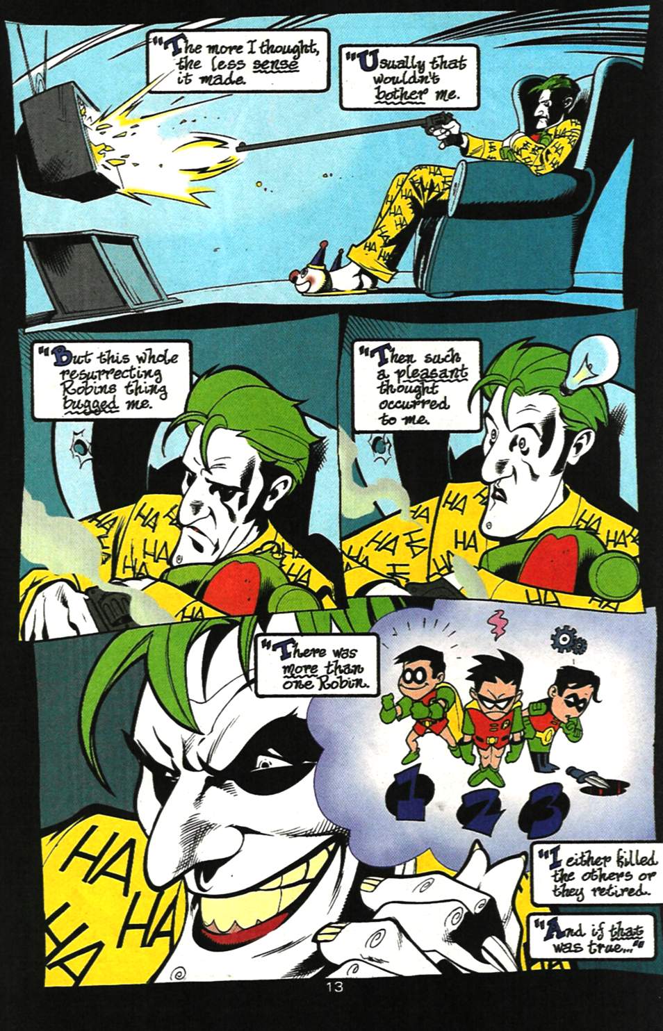
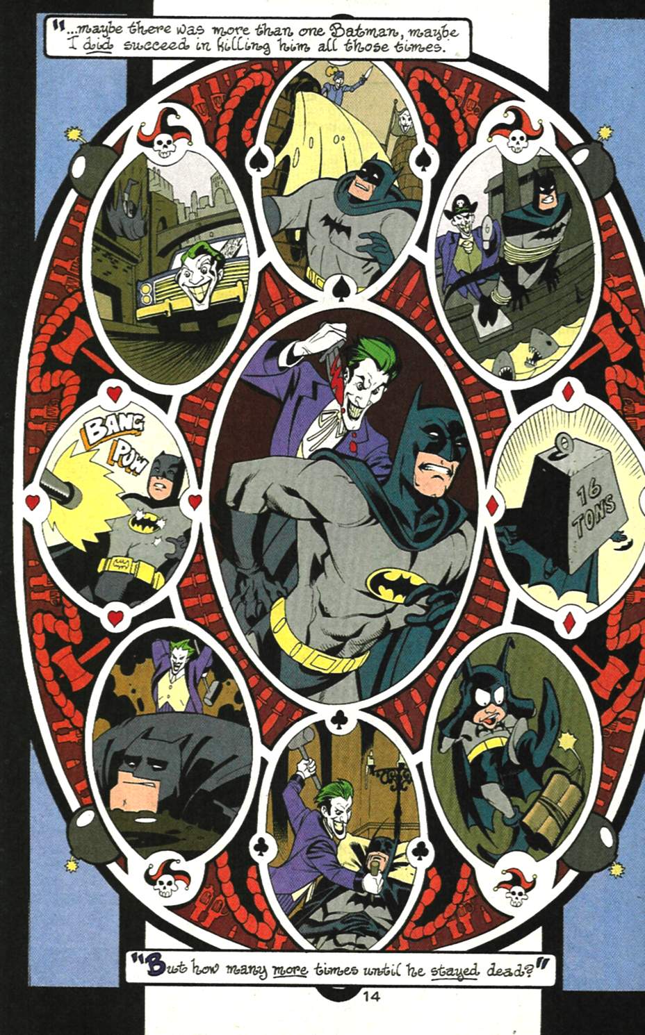
The Joker tale, ‘Fool’s Errand,’ is loads of fun, with the villain, locked up in Arkham Asylum, recounting his history with the Boy Wonder throughout the years. The result is amusing not just because the Joker only knows one side of his previous encounters with Robin, but also because the way he puts together the missing bits is both absurd and intelligent, which is my favorite take on the Clown Prince of Crime. Thus, we get to revisit older comics – such as A Death in the Family and Joker’s Wild – with a fresh eye. (There are even nods to out-of-continuity Silver Age stories, explained by the fact that we are looking at the delusions of a madman.)
Plus, the art team of Pete Woods, Jesse Delperdang, and Noelle Giddings does justice to Dixon’s script by finding visually inventive ways to convey the Joker’s warped mind:

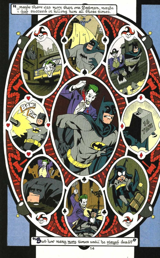 Robin (v4) #85
(As you can see above, letterer Willie Schubert also totally got into the looney spirit of things!)
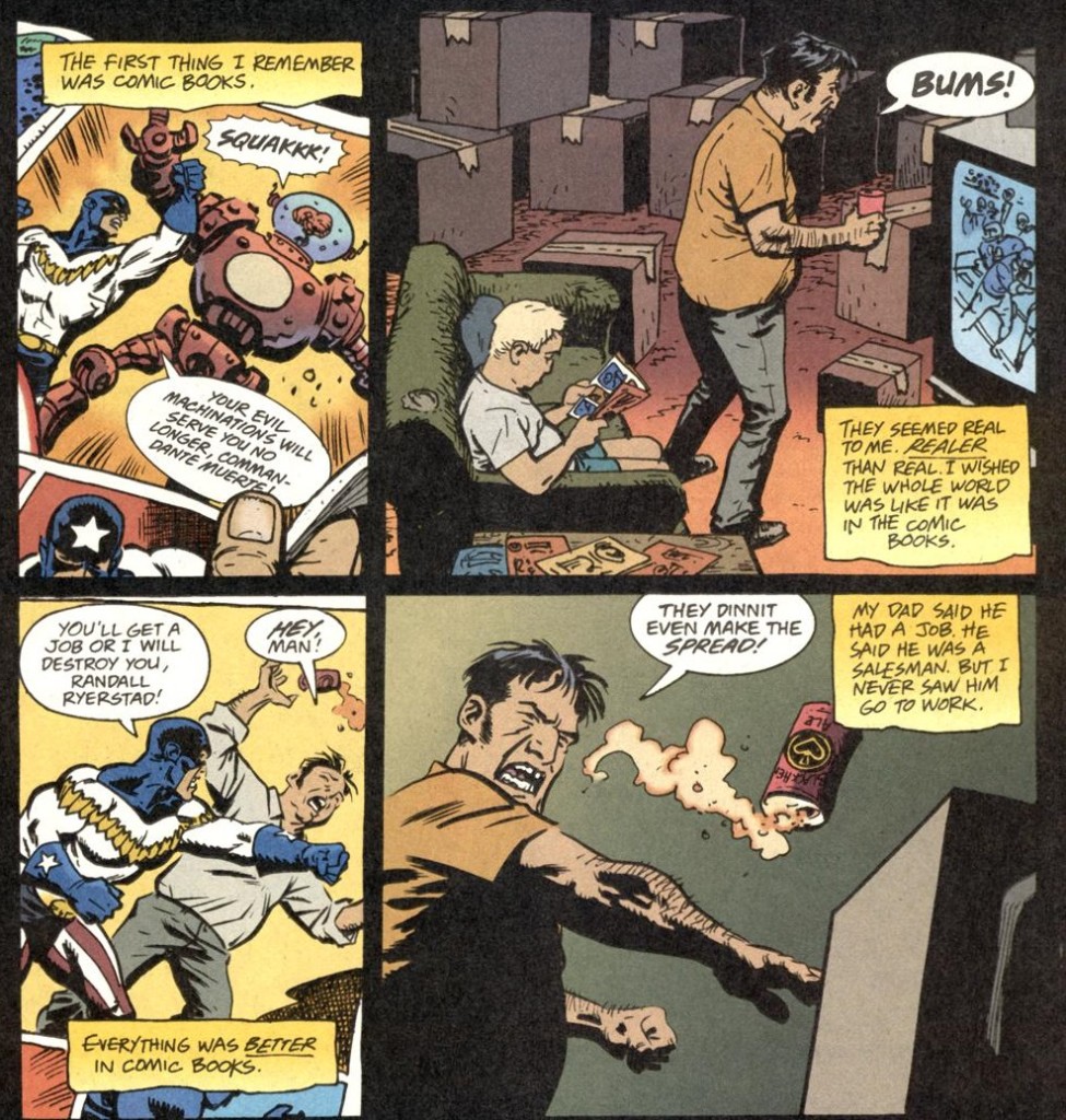
Technically, Nightwing’s contribution to the ‘Batman Dies!!!’ event is ‘Modern Romance’ (issue #52), which Chuck Dixon wrote from the point of view of Catwoman, even including an early fantasy sequence (with lovely Greg Land art) in which she kills the Dark Knight. However, the previous issue – about Tad Ryerstad, the confused vigilante who briefly went by the name of “Nite-Wing”– is the one that best captures the event’s potential.
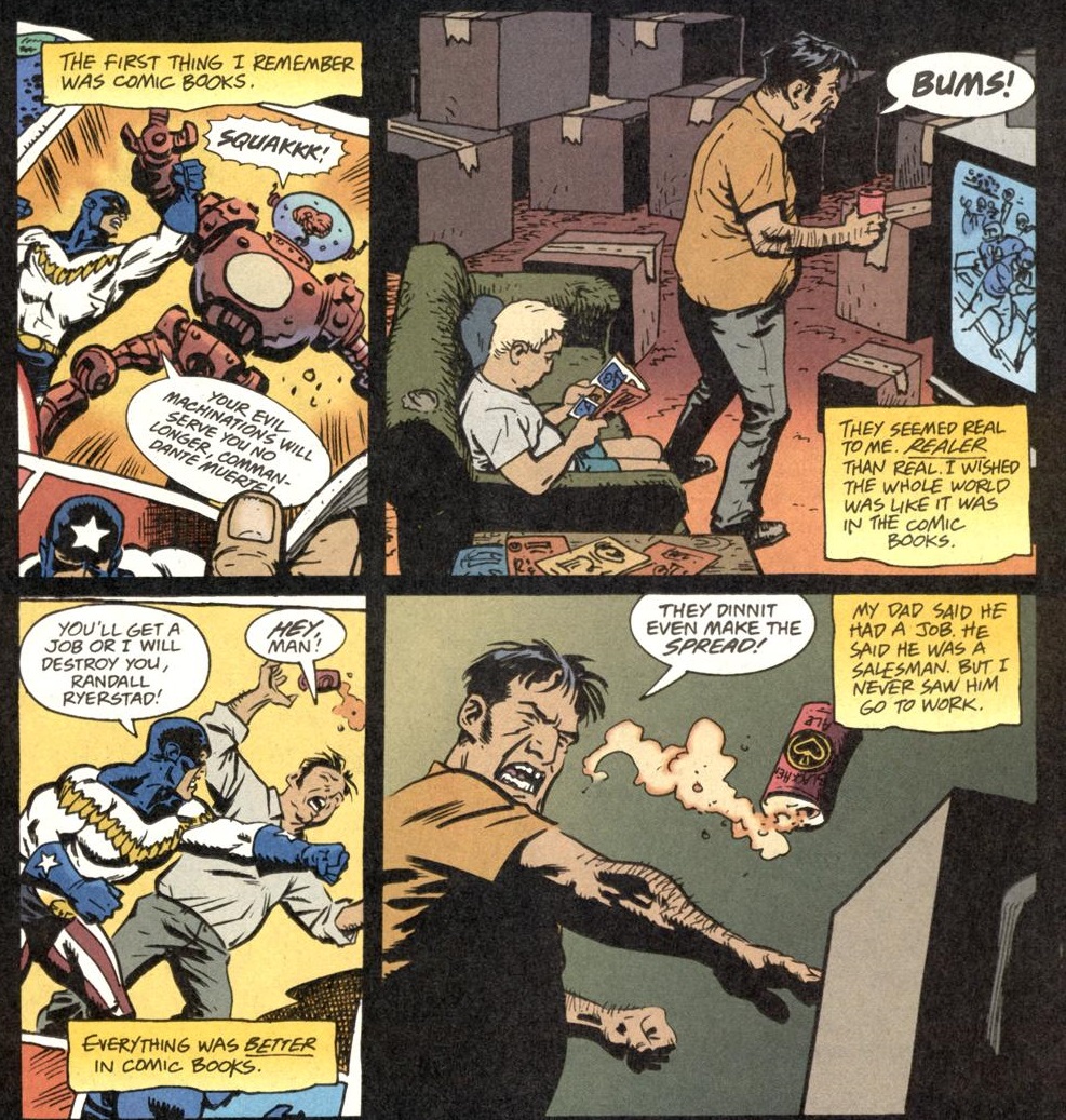
On the surface, ‘Tad’ appears to be a variation of the ‘Fool’s Errand’ formula, giving us a glimpse into the psyche of a recurring foe of Nightwing as he reminisces while locked up in a Blackgate prison cell. Yet Dixon ultimately does something quite different here, revising our perspective in much more drastic terms. Tad’s character was initially mostly played for laughs, albeit of a darker breed, in line with the overall tone of Dixon’s Nightwing run. In this issue, though, he comes across as a decidedly tragic figure, his early childhood an amalgamation of white trash imagery, his conviction that he’s a hero as misguided as Travis Bickle’s…
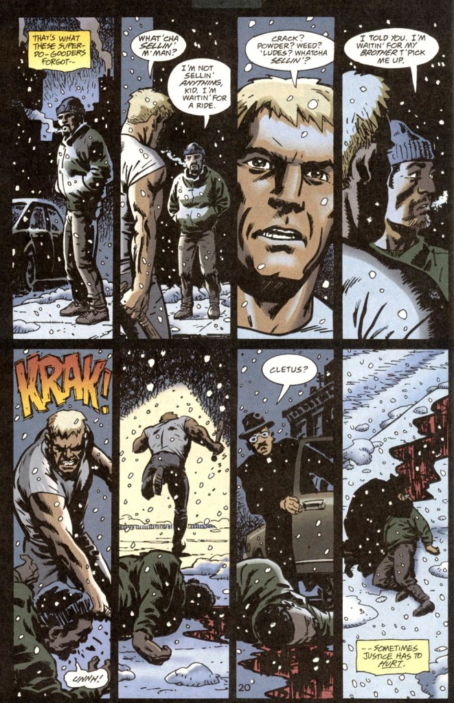
If the Joker’s schizophrenia served as a pretext for surrealism, Tad’s sociopathic disposition informs a grittier tale, one where the violence of the real world is contrasted with the typically escapist narratives of superhero comics:
 Nightwing #51
Let me rephrase: the contrast isn’t really between escapist fiction and reality, since, at the end of the day, the ‘reality’ presented in the comic is itself part of a superhero narrative… in fact, this kind of ‘realism’ has its own tradition in the genre, with the most renown example being 1986’s Watchmen. Tad, as presented in this story, may think of himself as having a more realistic understanding of the world, but he’s actually the representative of a type of fiction – he’s a less successful version of Watchmen’s Rorschach, he’s the flip-side of the way the Punisher is usually depicted (including by Dixon himself).
Guest artist Kieron Dwyer and colorist Patricia Mulvihill drive the point home in this brutal scene:
 Nightwing #51
Catwoman’s ‘Always Leave ’em Laughing’ has a couple of metafictional levels as well. Bronwyn Carlton’s approach to the ‘Batman Dies!!!’ gimmick consists of having Harley Quinn pitch a television show about Catwoman to a group of TV producers. On one level, Quinn’s ideas are illustrated through sequences drawn in the style of Bruce Timm’s animated series (Staz Johnson and Craig Rousseau are listed as pencillers – based on their other works, I’m guessing Johnson drew the ‘real world’ stuff and Rousseau did the pitched material). On another level, Carlton uses the producers’ notes to jokingly comment on previous comics, questioning continuity gaps (‘Oka-aa-ay, right, okay, then – we lose the sister.’) and looking back on the tastelessness of Selina Kyle’s post-Crisis origin (‘It’s much too dark!’). The final product is an entertaining issue all around, even if it doesn’t even bother to justify the promise that Batman was going to die!
The best use of meta-narrative, however, took place on the pages of Detective Comics, where an art therapy program served as a pretext to depict Two-Face’s fantasies in mesmerizingly strange terms:

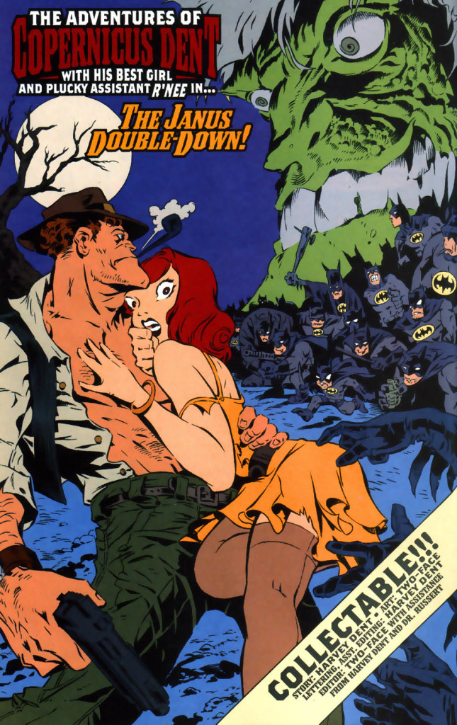 Detective Comics #753
Greg Rucka clearly had a blast writing this one. The comic-within-a-comic hilariously channels Two-Face’s infatuation with Renée Montoya (a long-running subplot in Rucka’s work) into a two-fisted (of course) pulpy adventure where Harvey Dent fights himself, the repetitive storyline reflecting his obsession with doubling and duality. That said, the ending is actually a bit touching if you take into account that it reveals not just Harvey’s sense of inadequacy (‘He only wanted the world to change for him.’) but also his own tragic awareness of it (since he is the one writing about it).
What sells the whole thing, though, is the exuberant art. The first and last pages are consistent with the previous issues in this run, from Brad Rader’s restrained pencils and John Lowe’s firm inks to Wildstrorm FX’s minimalistic colors. In turn, the middle section feels like something from another world: it opens with what appears to be a crude homage to Bernie Wrightson’s work on Swamp Thing, but it soon adopts a more Mad-like cartoon style, quite suited to the material’s whacky tone. Steve Mannion’s exaggerated pencils are inked by Hilary Barta, a perfect choice for this kind of stuff (as proven by his stint on Splash Brannigan).
In the end, we get a comic in which sharp lines and a melancholic mood temporarily give way to wild designs and riotous fantasy before returning to a dark version of normality. I can’t think of a neater embodiment of Two-Face’s inner self!
Posted in WEBS OF FICTION
Tagged Brad Rader, Bronwyn Carlton, Catwoman, Chuck Dixon, Ed Brubaker, Greg Land, Greg Rucka, Hilary Barta, Jesse Delperdang, John Lowe, Joker, Kieron Dwyer, Noelle Giddings, Patricia Mulvihill, Pete Woods, Rousseau, Scott McDaniel, Staz Johnson, Steve Mannion, Two-Face, Willie Schubert
Leave a comment
COMICS CAN BE AWESOME (March 2019)
Your March reminder that comics can be awesome…
 Paper Girls #5
 Five Ghosts #2
 Archer & Armstrong (v2) #21
3 striking uses of red by Greg Wright
I don’t write much about colorists in this blog. Coloring is one of those ungrateful tasks that, while absolutely vital to the feel of a comic, tends to go unnoticed when it’s merely done well. According to mainstream coloring conventions, competence implies not drawing attention to your craft, which means that fans – and even professional critics – often dismiss colorists in favor of a discussion about pencillers (revealingly called ‘artists’), even though the latter’s work can actually be brutally elevated or spoiled by the color choices.
There are exceptions, of course. Even in more traditional books, some colorists’ styles do manage to stand out, either because they try out innovative techniques or because they go for particularly flashy effects. A perfect example of the latter is Gregory Wright’s work on the main Batman series, which he colored from 1995 to 2002 (with some holes in the middle). While I’m not always a fan of Wright’s coloring, his over-the-top approach fit especially well into the Doug Moench/Kelley Jones/John Beatty/Todd Klein run, where – under the editorial supervision of Jordan B. Gorfinkel and Dennis O’Neil – everyone’s contribution seemed deliberately extreme.
True to the expressionistic, horror-tinged slant of the comic, Greg Wright’s hauntingly eerie palette looks like something he put together after watching the original Suspiria. With that in mind, let’s check out three ways he uses the color red, each of them creating a different mood:
 Batman #519
This is the more playful one of the lot. Having fun with the fact that Kelley Jones draws the Dark Knight like a demon – the beast-like posture, the hooves-like feet, the claws-like hands, the horns-like ears, the tail-like cape – Greg Wright colored Batman in the top panel with a hue somewhere between red and orange, as if he’s watching his prey from a hellish pit. Besides generating a visual pun, the choice contributes to the overall atmosphere: Wright reverts to nocturnal tones in the rest of the page, but that sinister scarlet silhouette looms menacingly over everything else.
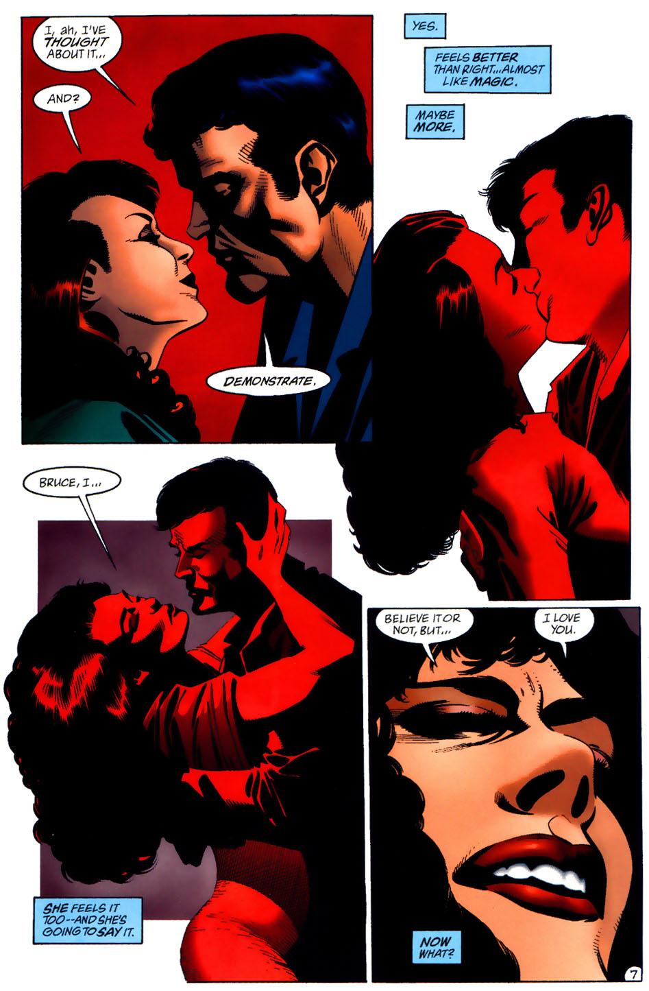
Thirty issues later, Wright used red to establish a whole other vibe in this exchange between Bruce Wayne and Vesper Fairchild:
 Batman #549
It’s a romantic scene, so you could argue the prominent red symbolizes love and the blood pumping through the couple’s hearts. But let’s face it: this tone of crimson suggests carnal passion. Check out the way it starts as a background color and then takes over their whole beings as they kiss before concentrating on Vesper’s lips in that final close-up… This is lust enveloping them. That third panel in particular, with Vesper (in a drawing with hints of Bride of Frankenstein, consistent with Jones’ gothic horror obsession) pressing her body against Bruce while grabbing his head and pouting, is a forceful image of barely contained sexual desire threatening to explode.
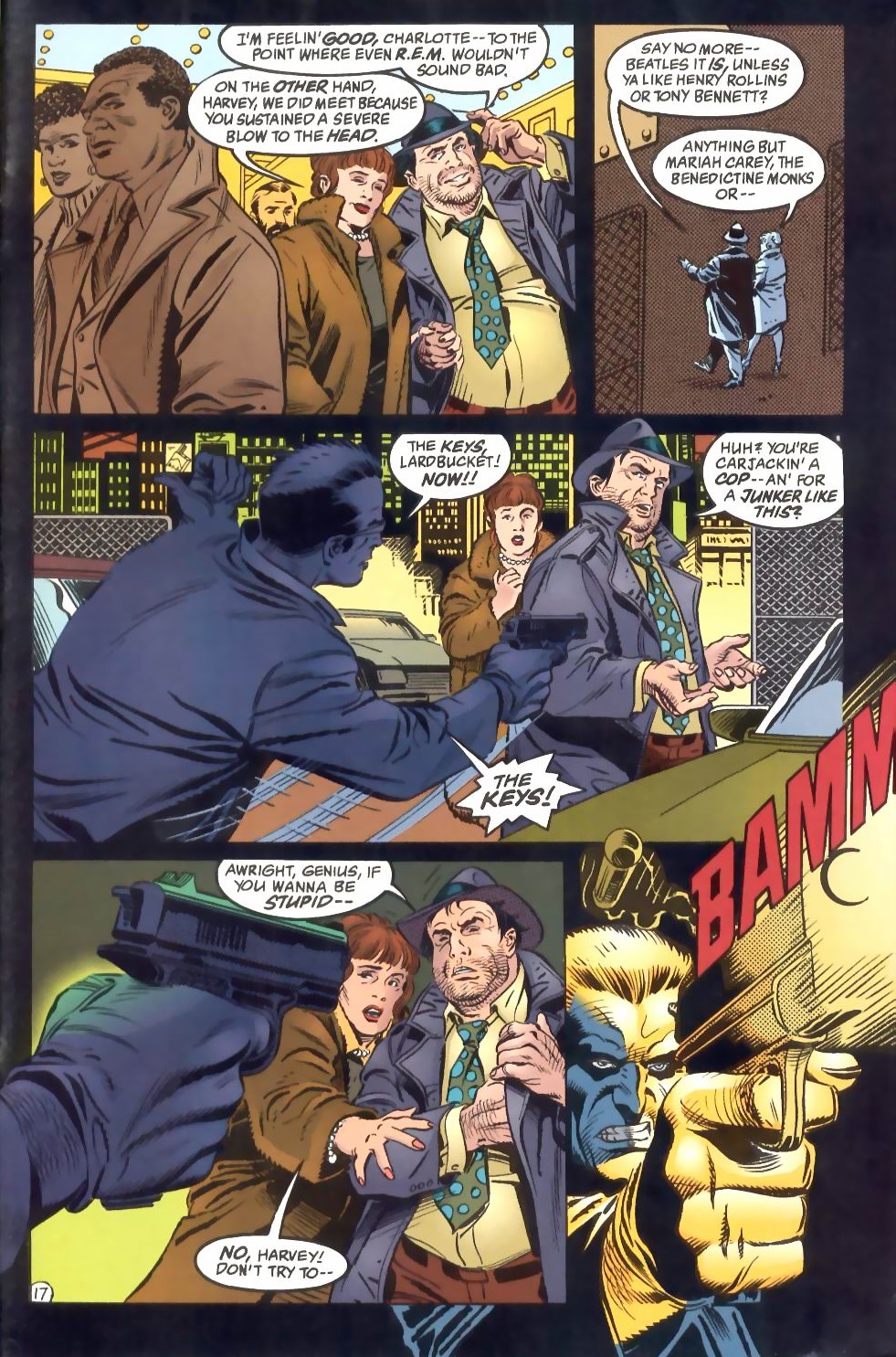
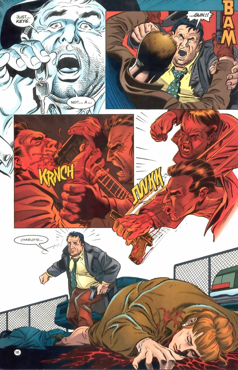
Kelley Jones didn’t draw the next example, taken from the crime story ‘Fades to Black.’ It was penciled and inked by Eduardo Barreto, who has a much more realistic linework, so Wright went for less flashy color choices, for the most part:

 Batman #520
The red clearly represents violence in this sequence, starting with the shot’s onomatopoeic ‘BAMM’ and finishing with the blood flooding out of Charlotte. Between those two instances, Wright uses red to illustrate Harvey Bullock’s fury, once again spreading from the background and taking over a couple of panels. These expressionist panels are also an interruption in the grounded colors of the protagonists in the images that open and close the scene – they mark a moment when Bullock is seeing red (another visual pun), consumed by out-of-control rage before regaining his sanity at the end of the page, thus rendering the back-to-earth transition all the more powerful and tragic.
There you have it. Greg Wright raised the impact of three great pages with his variations of red. Now don’t get me started on his shades of blue…
Posted in ART OF BATMAN COMICS
Tagged Denny O'Neil, Doug Moench, Eduardo Barreto, Greg Wright, horror, John Beatty, Jordan B. Gorfinkel, Kelley Jones, Todd Klein
2 Comments
Brilliant sci-fi short stories
As much as I enjoy sci-fi epics, I’m also a huge sucker for a tauter brand of science fiction. Short stories are an ideal form for this genre: since sci-fi often revolves more around ideas than characters, it can be fun to just briefly wrap your head around a thoughtful concept without having to read a sprawling saga about it. Writers like Ray Bradbury (‘The Rocket Man’), Philip K. Dick (‘The Defenders’), and Isaac Asimov (‘Reason’) – not to mention Italo Calvino (‘World Memory’) and Jorge Luis Borges (‘Tlön, Uqbar, Orbis Tertius’) – elevated this type of tale to an art form, building entire worlds and exploring mind-blowing premises in only a handful of pages.
In comic books, sci-fi short stories have a very long tradition, with specialized anthologies ranging from the golden age of EC Comics to the British cyberpunk magazine 2000 AD. Some of the most talented writers and artists in the medium know how to use this space to full advantage, whether by giving readers glimpses of possible futures, by sketching out alternative societies, or by hinting at the ramifications of all kinds of speculative scenarios. In no more than ten pages, they can craft brief-yet-memorable reading experiences, usually culminating in a twist ending or an ironic punchline.
Here are 10 masterpieces everybody should read:
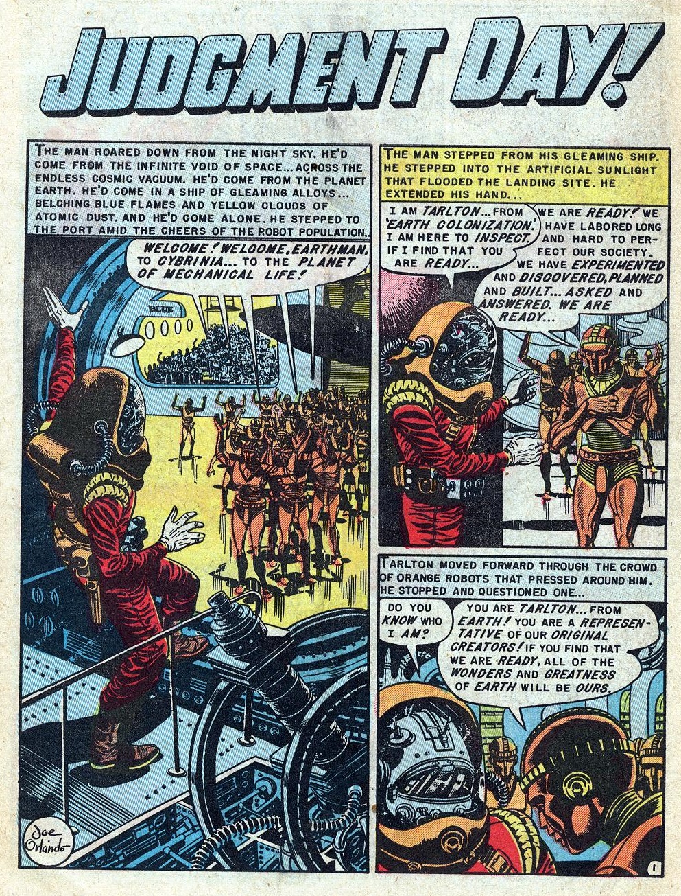
‘Judgment Day!’ (originally published in Weird Fantasy #18, cover-dated March-April 1953), by Bill Gaines, Al Feldstein (plot), Al Feldstein (script), Joe Orlando (art), Marie Severin (colors), Jim Wroten (letters)
This story has become mostly known for the dispute it caused between editor Bill Gaines and the censors at the Comics Code Authority. However, ‘Judgment Day!’ deserves to be just as well-remembered for what it is: a powerful example of socially aware sci-fi, using the futuristic robot planet of Cybrinia to denounce what was going on at home in the 1950s. It’s also praiseworthy for Joe Orlando’s meticulous rendition of intricate circuitry and bendy architecture. Marie Severin’s colors, with their shifts from shiny surfaces to rusty metal, help sell the poignant message.
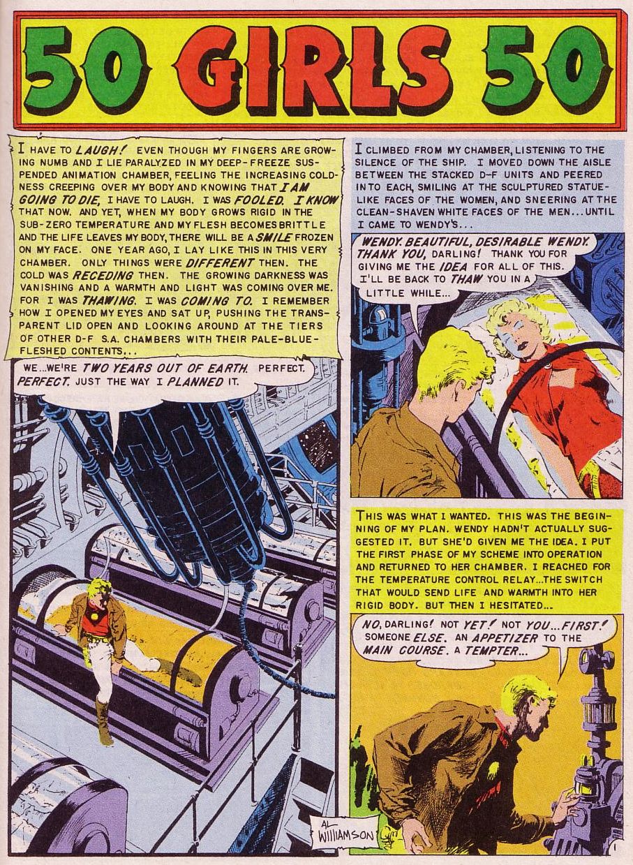
‘50 Girls 50’ (originally published in Weird Science #20, cover-dated July-August 1953), by Bill Gaines, Al Feldstein (plot), Al Feldstein (script), Al Williamson (pencils), Al Williamson, Frank Frazetta, Roy Krenkel (inks), Marie Severin (colors), Jim Wroten (letters)
A dark tale of lust and greed about a man who manipulates women by thawing them out of deep-freeze suspended animation during a century-long space trip… and just when you think things couldn’t get more noir, ’50 Girls 50′ hits you with another disturbing twist! The typically gorgeous art by Al Williamson and Frank Frazetta creates an eerie contrast with the seedy tone.
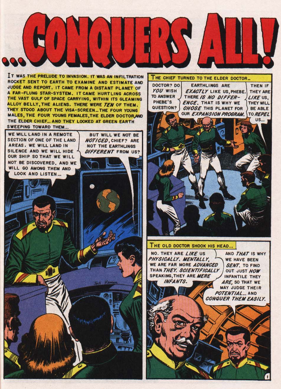
‘…Conquers All!’ (originally published in Weird Fantasy #20, cover-dated July-August 1953), by Bill Gaines, Al Feldstein (plot), Al Feldstein (script), Jack Kamen (art), Marie Severin (colors), Jim Wroten (letters)
One more gem from the prolific partnership of Bill Gaines and Al Feldstein. This one is also a sexual tale, albeit much less cynical. Although there is something dated in the strict link between love and gender division, I have a soft spot for this quirky story of alien invaders from an ultra-technological race coming to grips with human emotions.
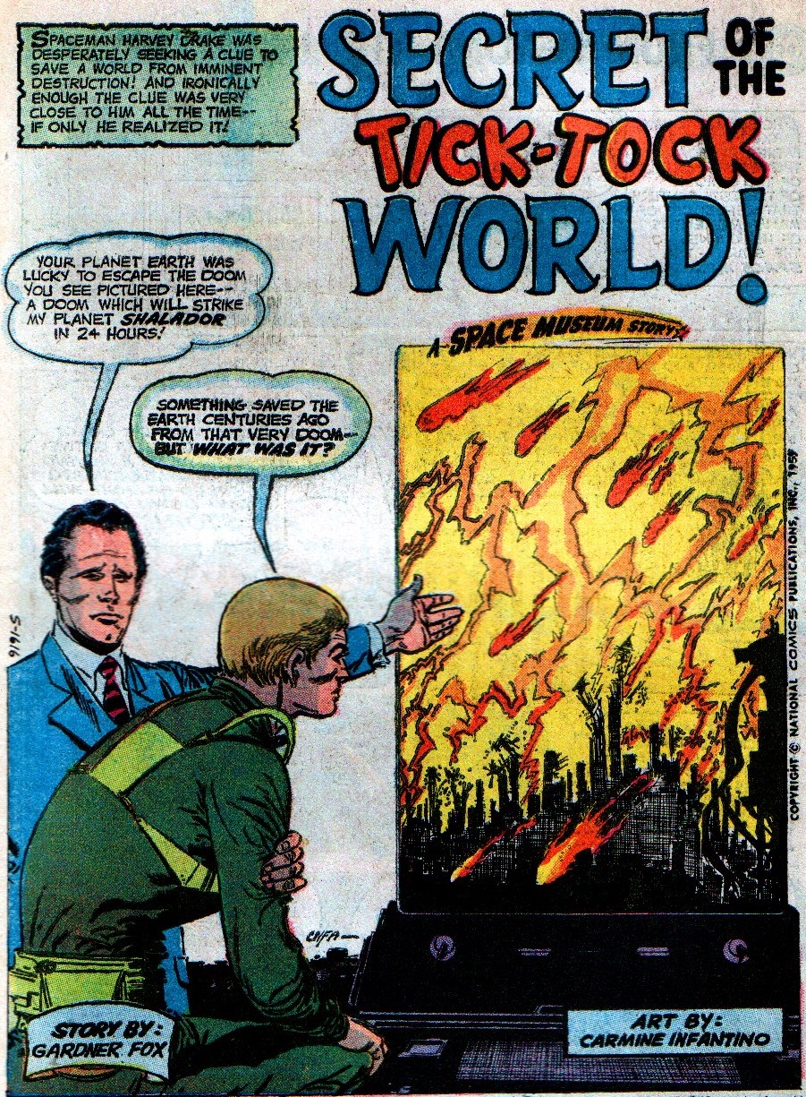
‘Secret of the Tick-Tock World!’ (originally published in Strange Adventures #109, cover-dated October 1959), by Gardner Fox (script), Carmine Infantino (art)
Because sci-fi can also be a springboard for pulpy adventure. Gardner Fox’s approach to the genre tends to be sunnier than the folks at EC, loosely using science as a gateway for enthralling escapades and wild vistas rather than provocative statements. Appropriately served by Carmine Infantino’s wholesome art, ‘Secret of the Tick-Tock World!’ is a charming, unpretentious tale that nevertheless touches on the classic sci-fi theme of how predetermined humanity’s destiny really is, after all…
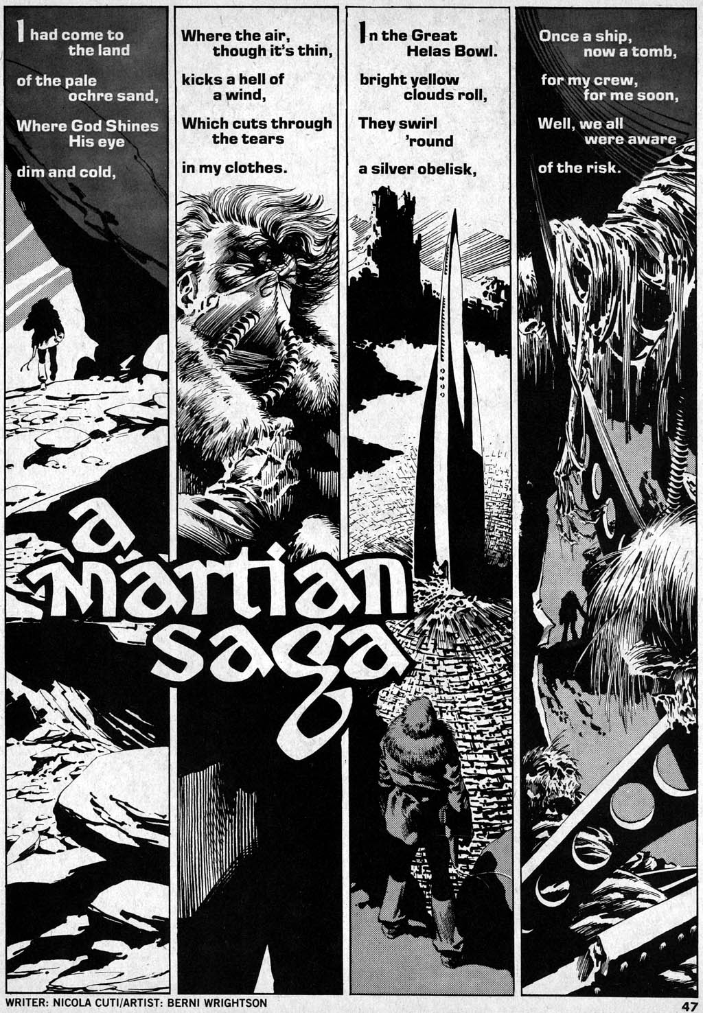
‘A Martian Saga’ (originally published in Creepy #87, cover-dated March 1977), by Nicola Cuti (script), Bernie Wrightson (art)
More interplanetary adventure, this time in the form of a tongue-in-cheek poem about an astronaut stuck on Mars with only three days worth of oxygen, majestically illustrated by the master of gothic art, Bernie Wrightson.
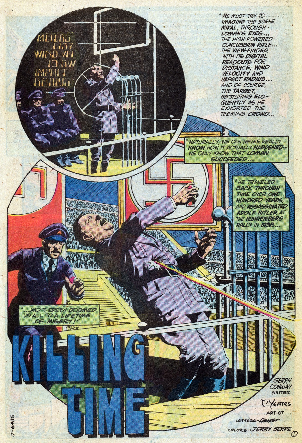
‘Killing Time’ (originally published in Mystery in Space #114, cover-dated December 1980), by Gerry Conway (script), Tom Yeates (art), Jerry Serpe (colors), Gaspar Saladino (letters)
Sure, the old travelling-back-in-time-to-kill-Hitler premise has become a cliché (Ivar, Timewalker #2 had a lot of fun with this). And not just that: it betrays a simplistic reading of history as solely shaped by outstanding individuals, with little regard for structural forces. That said, it’s all in the way you tell the story – and in ‘Killing Time’ Gerry Conway and Tom Yeates manage to put a clever spin on it by playing with perspective, leading to a transcendent finale.
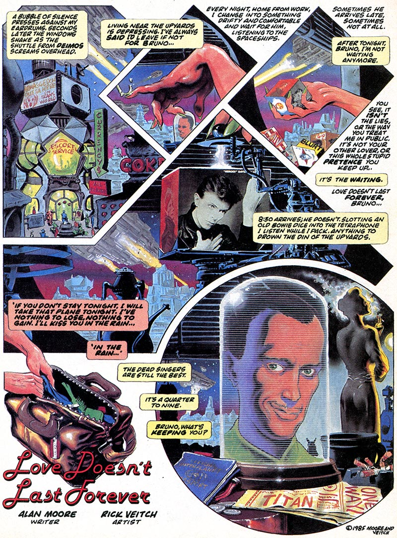
‘Love Doesn’t Last Forever’ (originally published in Epic Illustrated #34, cover-dated February 1986), by Alan Moore (script), Rick Veitch (art, colors)
A bitter extrapolation from 1980s’ anxieties and attitudes towards sex, with an Alan Moore touch. I guess the twist is meant to expose readers’ prejudices (hence the strategically placed word balloon early on), but the beauty of it is that ‘Love Doesn’t Last Forever’ works regardless of whether or not the ending feels like a revelation – it’s still a breathtaking example of sophisticated worldbuilding and characterization in just eight pages, each of them fabulously brought to life by Rick Veitch’s art and colors.
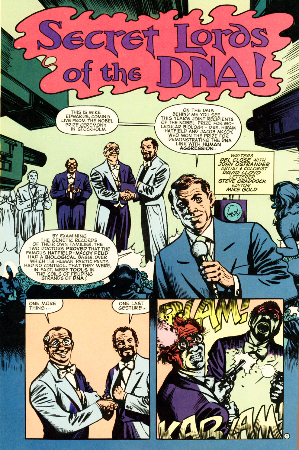
‘Secret Lords of the DNA!’ (originally published in Wasteland #7, cover-dated June 1988), by Del Close, John Ostrander (script), David Lloyd (art, colors), Steve Craddock (letters)
An absurdist satire about surrendering to determinism, blatantly written under the auspices of renewed Cold War tension, like much of DC’s output at the time. If nothing else, ‘Secret Lords of the DNA!’ would be worth reading just for David Llloyd’s trippy forays into surrealism.
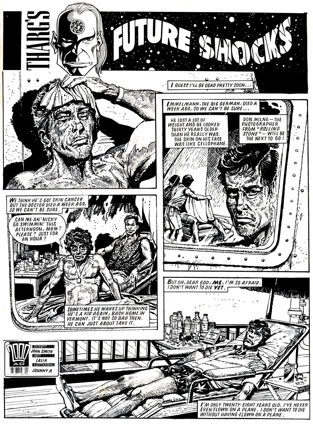
‘The Osmotic Man’ (originally published in 2000 AD #605, cover-dated December 1988), by John Smith (script), Horacio Lalia (art), John Aldrich (letters)
A nightmarish slice of speculative fiction, ‘The Osmotic Man’ takes a sci-fi premise and runs with it until its logical conclusion, rendered with grit and precision by Horacio Lalia. Probably less an environmentalist parable than a sick fantasy prompted by too much British rainy weather.
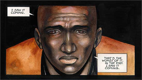
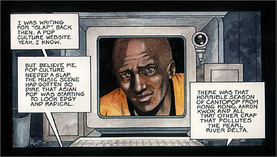
‘Superidol’ (originally published in artbomb.net, in 2001-2002), by Warren Ellis (script), Colleen Doran (art)
This is the only story on the list to cross the ten-page limit (it’s has thirteen!), but I just couldn’t resist including Warren Ellis’ and Colleen Doran’s underrated webcomic about pop culture taking over society. A 21st century companion piece to Borges’ ‘The Zahir.’
Posted in FANTASTIC ADVENTURES
Tagged 2000 AD, Al Feldstein, Al Williamson, Alan Moore, Bernie Wrightson, Bill Gaines, Carmine Infantino, Cold War, Colleen Doran, David Lloyd, Del Close, Frank Frazetta, Gardner Fox, Gaspar Saladino, Gerry Conway, Horacio Lalia, Jack Kamen, Jerry Serpe, Jim Wroten, Joe Orlando, John Aldrich, John Ostrander, John Smith, Marie Severin, Nicola Cuti, politics, Rick Veitch, Roy Krenkel, science fiction, Steve Craddock, Tom Yeates, Warren Ellis
3 Comments
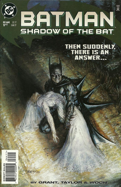
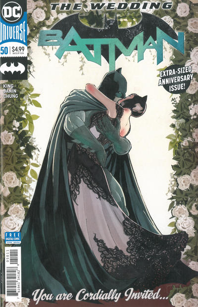
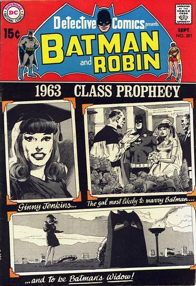
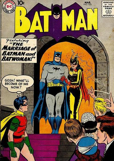
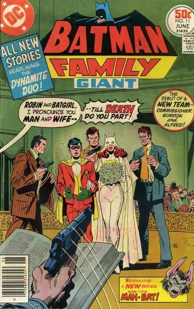
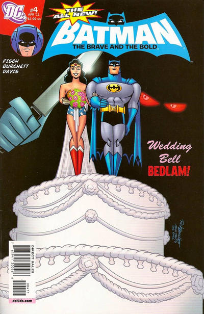
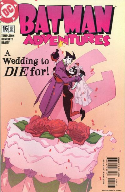
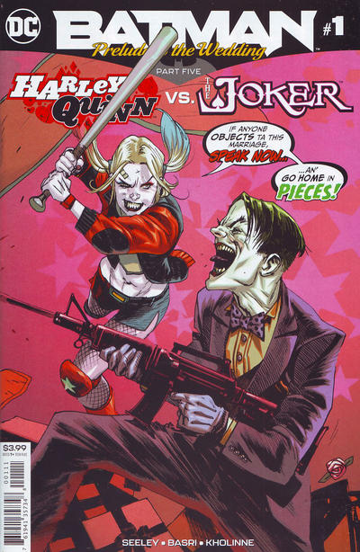
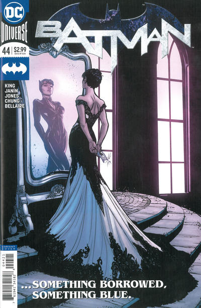
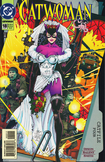
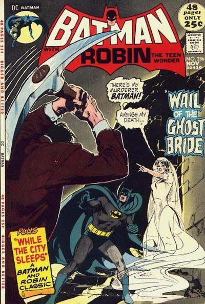
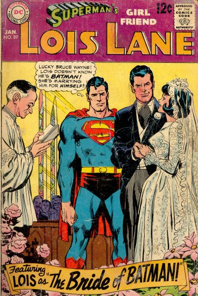
15 wedding-themed covers of Batman comics
Valentine, Schmalentine. Still, everything can serve as a pretext to browse through goofy covers of the Batman family of comics…
Throughout the years, brilliant artists like Neal Adams, Curt Swan, and Joëlle Jones have had a field day enveloping the Dark Knight and his supporting cast in wedding-themed imagery. The pompous formality and traditional respectability of wedding ceremonies make for a fun combination with the masked insanity and mayhem of Batman’s world. After all, if the Caped Crusader, Catwoman, and/or the Joker are around, you know frantic violence cannot be far behind!
Here are 15 covers that gleefully exploit this contrast:
Posted in COVERS OF BATMAN COMICS
Tagged covers, Curt Swan, Joëlle Jones, Neal Adams
Leave a comment
COMICS CAN BE AWESOME (February 2019)
Your monthly reminder that comics can be awesome…
 2000 AD #1778
 DC Challenge #11
 Prism Stalker #2
Great post-‘No Man’s Land’ stories
A year ago, I did a couple of posts about the coolest stories from the 1999 mega-crossover No Man’s Land, in which Gotham City, partly destroyed by an earthquake, descended into chaos and was cut off from the rest of the United States. That crossover marked an editorial high point in Batman comics, with a strong sense of geographical consistency and narrative unity across the various series, creating an effect that really appeals to me: rather than a mere backdrop to the Caped Crusader’s adventures, Gotham felt like a lived-in city where several simultaneous sagas were taking place and affecting each other.
This didn’t end with No Man’s Land. In 2000, after that crossover wrapped up, group editor Denny O’Neil gave the new creative teams detailed instructions on how the reconstructed Gotham was to be handled, visually as well as sociologically. During the ensuing ‘New Gotham’ era, we got to see the city gradually return to its version of normality as both recognizable characters and anonymous citizens recovered from the events of the previous year. In other words, O’Neil found a way to make the act of returning to the old status quo seem fresh and engaging.
I’m quite fond of this era, with its subplots about local politics and its forceful sense of purpose. These are some of my favorite stories to come out at the time:
‘Constants’
(Gotham Knights #1)
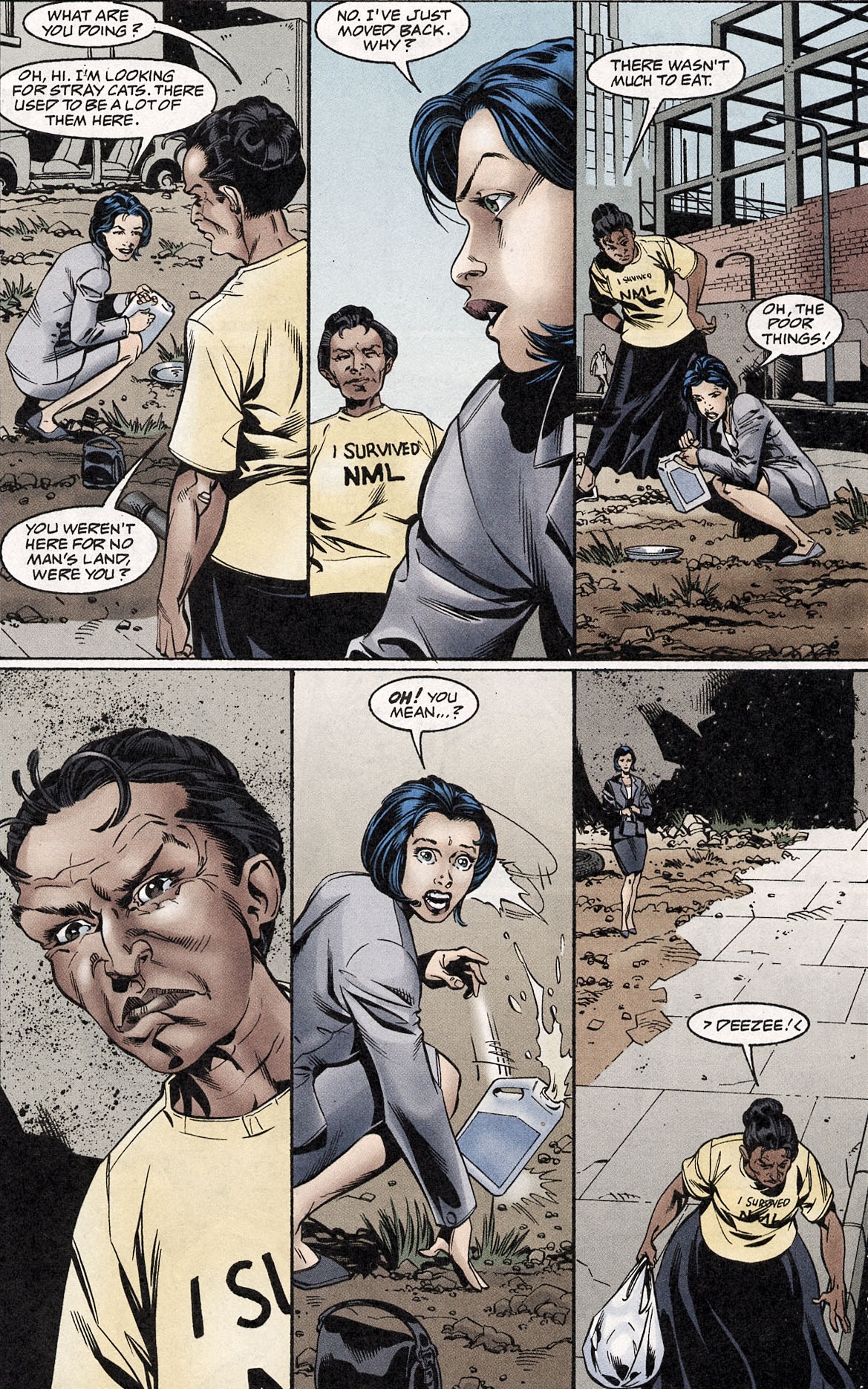
The ‘New Gotham’ era saw the debut of Gotham Knights, which replaced Shadow of the Bat as the series with a greater focus on Batman’s supporting cast. It kicked off with this excellent tale about the Dark Knight and his network of crimefighters (Robin, Nightwing, Oracle, Huntress, Azrael, Batgirl) investigating the double-homicide of Senator Jack Myles and his wife Eileen. Myles, who had been among the senators that voted to give up on Gotham, had left the city during NML and, upon his recent return, kicked four members of the Xhosa gang out of his house. The investigation therefore introduces readers to the booming rivalry between those who deserted Gotham (‘Deezees’) and those who stayed (‘Original Gothamites,’ or OGs) as well as to the city’s predictably rampant corruption over zoning regulations.
That said, the obvious dramatic tension revolves around everybody’s concern for Batman’s objectivity, since the fact that the murdered couple left an orphaned boy behind hits particularly close to home. The final twist isn’t unique (a later Batman arc followed the same beats), but it’s well-earned through the sharp characterization written by Devin K. Grayson, who makes the question of nostalgia-vs-evolution a central motif in the comic (ultimately a meta-commentary, since Batman comics were themselves undergoing a transformation).
As a bonus, the issue is notable for Warren Ellis’ and Jim Lee’s gritty backup short story ‘To Become the Bat.’
‘Happy Birthday Two You…’
(Detective Comics #747)
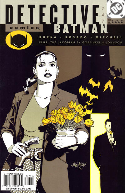
Let’s start with Dave Johnson’s cover. Detective Renee Montoya is in the foreground, which makes sense since she is the true star of this issue. She has a gun, but it’s holstered, because this is not an action comic – if anything, it’s about the least thrilling aspects of being in the police force. Montoya is holding the tulips she receives early on in the story (and which play a central role in the narrative). The flowers turn into stylized bats that fly in the direction of Batman’s silhouette, lurking in the background and hovering over the figure divided between light and darkness. The design and colors guide our eyes in a specific movement (from the center to the figure in the top right and then down to the figure in the bottom right) that suggests Montoya’s own path in the story. Yet this also works thematically, conveying the duality motif while highlighting the fact that Batman is watching over the characters (and on top of things).
Inside, the color scheme (by Wildstorm FX) is just as narrow, consisting mostly of variations of orange and blueish purple, with people often appearing in a different tone than the world around them (thus suggesting a sense of alienation). The lack of realism works well with the art of William Rosado and Steve Mitchell, which is more about functional storytelling than needless details. The result is incredibly moody in its simplicity.
All of this helps Greg Rucka get away with what is essentially a melancholic character piece about Renee Montoya having a lousy birthday (among other things, because she helps put an OG in prison for stabbing a Deezee) yet turning it around with a good action. Because Rucka is such a great writer, not only is the whole thing refreshingly restrained and mature, it also calls back to Montoya’s arc in No Man’s Land while subtly planting the seeds for the excellent ‘Half a Life’ storyline in Gotham Central, five years later.
‘Urban Renewal’
(Detective Comics #748-749)
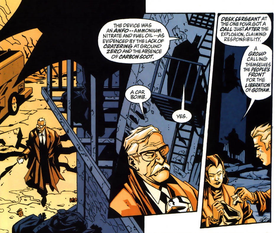
Much of Greg Rucka’s 2000-2002 run in Detective Comics was written as a sophisticated police procedural (it’s ultimately a precursor to Gotham Central, establishing many of its character dynamics). He followed ‘Happy Birthday Two You…’ with this taut two-parter mystery about the bombing of a Wayne Enterprises housing development by a terrorist organization that appears to be a splinter group from the OG movement.
It’s always nice to see Batman doing proper detective work (including a very nifty use of the Batcomputer!), but it’s extra-nice to see his investigation in parallel with the police force’s, each following different clues and methods. Even Commissioner Gordon – still dealing with the loss of his wife, Sarah, during NML – gets involved, revisiting his hardboiled cop roots.
Phil Hester’s pencils are blockier than William Rosado’s, but Steve Mitchell’s inks and, especially, Wildstorm FX’s noirish palette assure the visual continuity. I particularly like the splash page with Bruce Wayne changing from his Batman costume to civilian clothes while carrying on with his investigation at every step – this is the kind of ultra-efficient and determined rendition of the Dark Knight that makes him such a fun character to watch.
‘Plus Ça Change’
(Catwoman (v2) #78)
As the title suggests, ‘Plus Ça Change’ is another comic about the tension between changing and staying the same, with Gotham’s identity once again mirroring the state of the Bat-books. Indeed, the ‘New Gotham’ era marked a whole new direction for Catwoman: after seven years of Jim Balent’s hyper-voluptuous art, Staz Johnson brought in a noticeably less exploitative style (albeit also sensual, in its own way). Meanwhile, writer Bronwyn Carlton, who would eventually take Selina Kyle into some pretty dark places, wisely chose to open her run with the confident, resourceful version of the character we all love.
In this first issue, a recently returned Selina sets her sights on the Crystal Spire, the heavily protected symbol of Gotham City’s rebirth. In order to show the world that she’s back, Catwoman uses her wits and feminine wiles to go through the security system and humiliate the police force (something that will come back to bite her in the ass in later issues). The twist, when it comes, is especially satisfying because it ties into Gotham’s atmosphere of cynicism about its gentrified future, with Carlton populating the comic with a variety of distinctive supporting characters.
‘Down with the Ship’
(Gotham Knights #2)
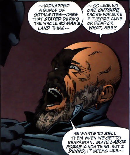
The second issue of Devin Grayson’s and Dale Eaglesham’s Gotham Knights run is even tighter than the first. ‘Down with the Ship’ starts with a fast-paced montage that culminates in the realization that Batman and Batgirl have to race against time if they hope to save the lives of a bunch of kidnapped Gothamites… It’s one hell of a thriller – although Pamela Rambo’s colors drown some of the elegance out of Eaglesham’s pencils and John Floyd’s inks, the artists manage to convey the dynamism and claustrophobia of the rescue mission, including a key confrontation in a room quickly filling up with water.
Ostensibly, this is a story about the latest Batgirl (Cassandra Cain) and her death wish. Yet Grayson keeps adding layers through the juxtaposed narration, so that keen readers will realize it’s also a story about the Dark Knight dealing with his traumas and trust issues regarding his partners (at a time when the death of Jason Todd was still canon). And yes, in a way ‘Down with the Ship’ is also a story about the fact that Gotham authorities and records are still kind of a mess, to the point that they’re not even sure of who’s alive or dead.
The issue finishes with an entertaining Golden Age pastiche, written and illustrated by John Byrne.
‘All the Deadly Days’
(Batman 80-Page Giant #3)
Speaking of pastiches, ‘All the Deadly Days’ opens with a wonderful flashback of Batman and the original Robin (Dick Grayson) fighting the Calendar Man at an exhibition about time (‘Man and the 4th Dimension’). The sight of the Dynamic Duo kicking the butt of goofy-looking henchmen while trading quips among giant clocks and hourglasses is given the proper Golden Age feel by Joe Staton’s art (which evokes the bulky style of Dick Sprang) and Glenn Whitmore’s bright colors (which become considerably muted in the subsequent section, suiting Manuel Gutierrez’s more realistic pencils). Besides the nostalgic wink, the visual delight, and the set-up for a later pay-off, I love this sequence for the way it suggests that, somehow, this remote era of comics is still part of current continuity (the issue goes on to reference events from Knightfall and Cataclysm), having taken place in an undetermined past, its inconsistencies easily attributed to fuzzy memory.
This loose approach to history may seem like an odd choice for a tale so rooted in a specific period – the main story is explicitly set in the spring and summer of 2000, when a recently released Calendar Man seeks revenge for having just missed the turn of the millennium. However, I love the sequence precisely because it underlines how relative time is, which is the whole point of the issue… the relativity of time and our many attempts to give it some order are what makes the villain’s obsession so silly, what makes his punishment so cruel, and ultimately what makes his crime plot so difficult to decipher. You can also see the randomness of time conventions in the fact that Calendar Man fails to grasp that the technical turn of the millennium would only take place at the end 2000 – since the Gregorian calendar has no year zero – although that’s kind of a moot point, since what he’s trying to recreate is the fear of the apocalypse linked to the Y2K scare (which did indeed take place in the 1999/2000 New Year’s Eve).
Even though ‘All the Deadly Days’ doesn’t address the tension between OGs and Deezees, this comic remains an underrated gem of the ‘New Gotham’ era. The impressive roster of artists includes Mike Deodato, Graham Nolan, Louis Small Jr, Dale Eaglesham, and Bill Sienkiewicz, plus further color work by John Kalisz and Sherilyn Van Valkenburgh. The whole thing is strung together by Chuck Dixon’s typical wit and plotting skills. Dixon knows exactly how to write my platonic ideal of a Batman yarn, one where the Dynamic Duo put together clues to in order to stop a crime spree that comes across as equal parts funny and terrifying.
Posted in BATMAN COMICS FOR BEGINNERS
Tagged Batman's personality, Bill Sienkiewicz, Bronwyn Carlton, Chuck Dixon, Dale Eaglesham, Dave Johnson, Denny O'Neil, Devin Grayson, GCPD, Glenn Whitmore, Gotham City, Graham Nolan, Greg Rucka, Joe Staton, John Byrne, John Floyd, John Kalisz, Louis Small Jr, Manuel Gutierrez, Mike Deodato, No Man's Land, Pamela Rambo, Phil Hester, Sherilyn van Valkenburgh, Staz Johnson, Steve Mitchell, William Rosado
Leave a comment
Yet another busy week in the life of Batman
MONDAY

Detective Comics #69
TUESDAY
Batman #13
WEDNESDAY
Detective Comics Annual #3
THURSDAY
Batman and the Mad Monk #4
FRIDAY
 World’s Finest (v2) #3
SATURDAY
JLA #43
SUNDAY
Batman #552
Posted in GOTHAM INTERLUDES
Leave a comment
Weird futuristic war comics
It has become a kind of winter tradition here at the blog to do a post spotlighting cool sci-fi comics about warfare. This started out years ago, as a one-idea post prompted by Rogue One, but there is an endless amount of material worth covering, including a bunch of futuristic weird war tales…
On retrospect, the number of interesting comics is hardly surprising. After all, on the one hand, the genre of science fiction keeps branching in new directions in order to keep up with scientific breakthroughs and the latest sociological concepts. On the other hand, war stories lend themselves to genre mash-ups fairly easily, in part because war produces such a heightened reality that otherwise outrageous, fantastical elements tend to fit right in. Moreover, the tropes of war are so firmly established in readers’ minds that the mere act of twisting or recontextualizing them can be fun.
War/horror mash-ups work particularly well, creating obvious supernatural allegories about the dehumanizing violence of combat and the distorted views of the enemy (John McTiernan’s Predator) or the overwhelming fear of civilians caught in the crossfire (Babak Anvari’s Under the Shadow). Recently, Julius Avery’s Overlord exploited the Nazis’ fixation on – and experimentation with – bodies (although the most outlandish element in the movie was the existence of a non-segregated unit in 1944). In comics, zombies and vampires and the like have shown up in World War II (Red Snow), in Vietnam (‘68), in Afghanistan (Stitched and the underrated Graveyard of Empires), and even in the Guinean liberation war (Os Vampiros).
In the case of science fiction, the appeal is usually to extrapolate about the future of military strategy, with new technology thrown into the mix or devasted landscapes forcing characters to get back to basics. Let’s look at three very different takes on it:
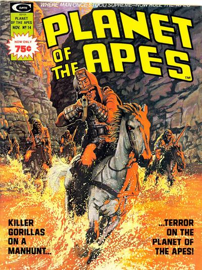
TERROR ON THE PLANET OF THE APES
Planet of the Apes is one of my all-time favorite franchises, even though I’ve conflicted feelings about the fact the it became a franchise at all. My problem is that the original 1968 movie had a perfect ending, one that was powerfully in tune with its Cold War context. It packed a punch precisely because, when those iconic final shots came up, everyone imagined what must’ve happened. The sequels (which, except for the schlocky Beneath the Planet of the Apes, are all prequels) took much of the power away from that ending by detailing what had brilliantly been suggested.
That said, the series has been boldly imaginative and strange, with most entries trying something ambitious: the shocking ending of Beneath, the quirky satire of Escape, the grim dystopia of Conquest… It’s a franchise of fascinating, politically provocative gestures, which is at its best when it blends them with eerie imagery and at its weakest when it provides stunning images without enough substance to back them up (like in the Burton remake as well as in War for the Planet of the Apes, despite the latter’s attempt to achieve transcendence through biblical riffs). I suppose the first installment was so successful that expansion was too damn irresistible, but that doesn’t explain the creativity that followed or the fans’ enduring interest… The core concept of a nightmarish planet where chimps, gorillas, and orangutans dominate humans was strong enough for creators to keep building on it, branching into various (albeit not irreconcilable) timelines. It was memorable enough for pop culture to keep echoing lines like ‘Take your stinking paws off me, you damn dirty ape!’ or ‘Ape shall not kill ape.’ It was appealing enough for suckers like me to keep coming back for more.
The films’ visionary ideas left quite a mark on comics, both indirectly (from Jack Kirby’s post-apocalyptic Kamandi, the Last Boy on Earth to Keenan Marshall Keller’s and Tom Neely’s trippy exploitation-tribute The Humans) and in the form of official spin-offs. Marvel’s tie-in series – which ran from 1974 to 1979 in one of those lengthy magazine formats, packed with extras about the original movies and TV show – is a great example of what I was talking about: set in an intermediary period when humans and apes still share a civilization, the ongoing storyline ‘Terror on the Planet of the Apes’ further cheapens the original premise by giving us a world that initially feels too familiar, but it still turns out to be highly engaging. After opening with an obvious allegory about racial violence (with the standard twist that white humans are now the vulnerable minority), writer Doug Moench turns the strip into a boys’ adventure saga, with characters constantly running, climbing, and fighting for their lives. Like the films, these comics approach the material with a straight face, never apologizing for the fact that they feature talking chimpanzees and all sorts of mutants. Similarly, Mike Ploog’s moody black & white art keeps things earnest and grounded, even when Moench’s scripts veer into wild territory…
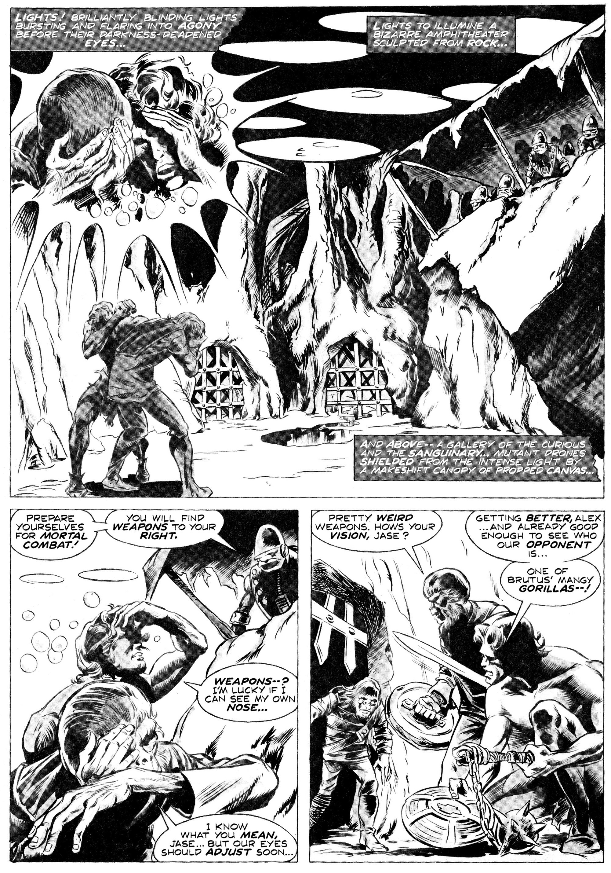
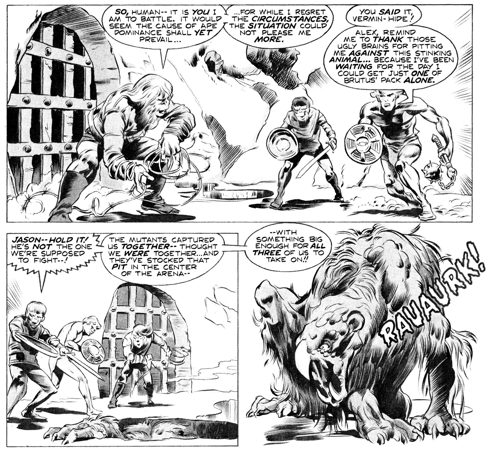
War is all over this storyline. For one thing, there are constant reminders that it’s set after a nuclear holocaust. At one point, Doug Moench describes a valley as ‘splashed in vivid swirls of phosphorescent purple and scarlet… a forest gone mad with the fever of radiation.’ At another level, the first chunk of ‘Terror on the Planet of the Apes’ takes place under the looming shadow of a kind of race war (something that was even more topical in the mid-70s than it is now). Again, it’s not new ground, but, in Moench’s defense, at least he doesn’t pretend like this is an easy issue, as even the heroes have to struggle with their own impulses and prejudices.
The second part of the story is campier, with the protagonists getting stoned out of their minds and a deluded historian regularly bringing humor to the proceedings. It also expands the range of targets by taking potshots at US politics and capitalism (holding an old Bank of America passbook, the historian explains: ‘Now this was absolutely vital to the ancients. It fed God’s emissaries on earth – called computers – and if the computers weren’t fed enough, they’d get sick and report it to their God and things would start to fall apart.’). On the art front, Mike Ploog gives way to Tom Sutton, whose panel borders bend and collapse into engulfing displays of alien technology and madness. By the final stretch, the army of tank-riding gorillas is the least oddball thing around, as we also get winged monkey-demons and brainwashing machines, not to mention the possibility of yet another nuclear Armageddon!
The remaining stories weren’t as entertaining, even if ‘Evolution’s Nightmare!’ (drawn by Ed Hannigan, inked by Jim Mooney) deserves praise as a pacifist parable that revisits the franchise’s Cold War themes. As for the later comics that have gone back to the original continuity, my favorite remains Ty Templeton’s and Joe O’Brien’s Revolution on the Planet of the Apes, which was a smart follow-up to the underrated Conquest of the Planet of the Apes movie (and much cooler than that film’s lame sequel, Battle for the Planet of the Apes).
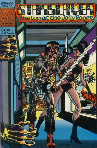
STARSLAYER: THE LOG OF THE JOLLY ROGER
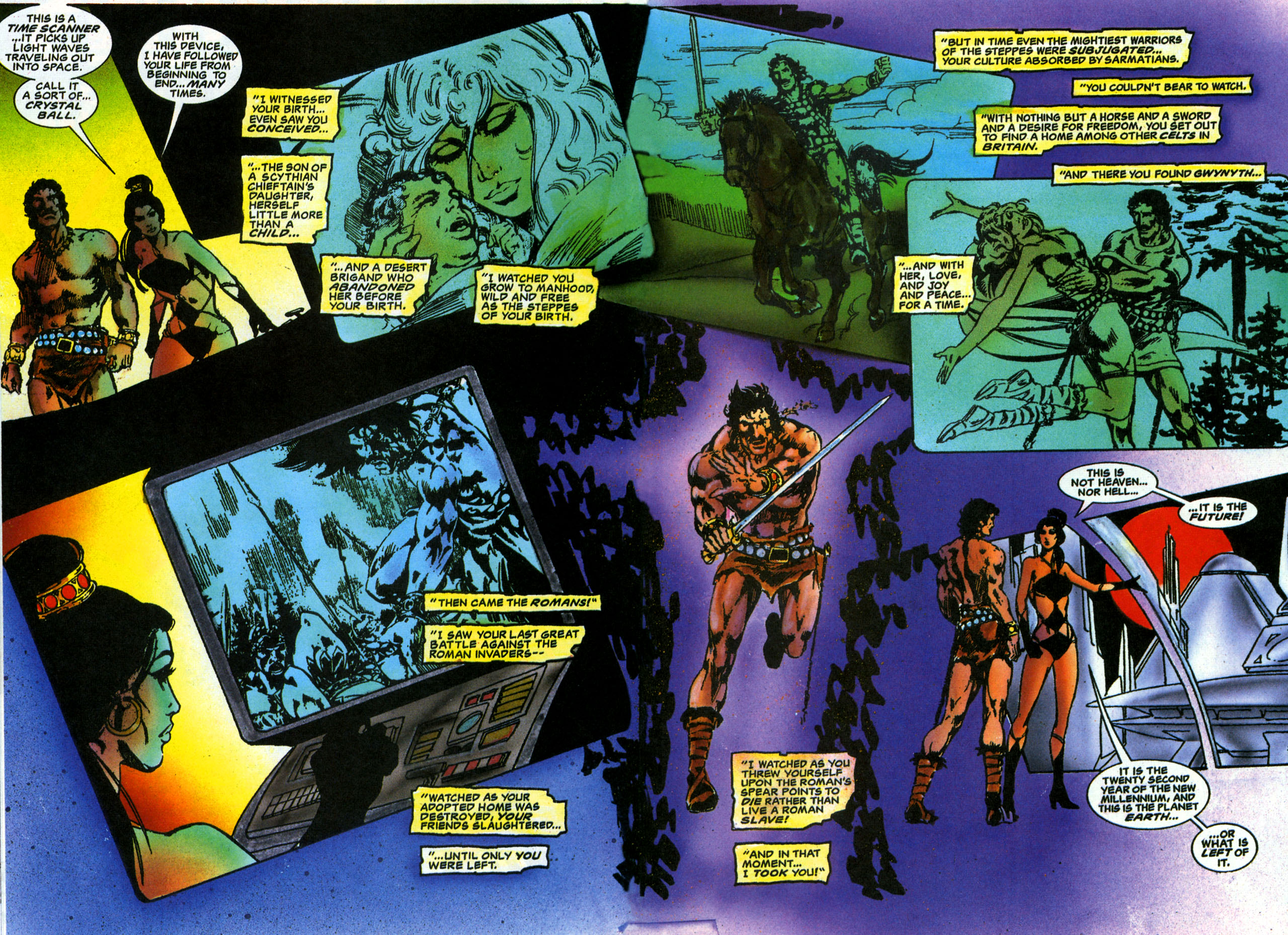
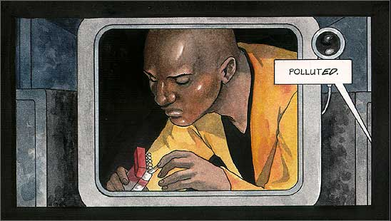
When the damage caused by industrial pollution and out-of-control population growth became irreversible, Earth scientists devised a way to colonize the rest of the solar system by genetically altering settlers so that they could adapt to other planets’ atmospheres. The ensuing confederacy of planets prospered for millennia, but then the sun went nova, engulfing Mercury and Venus while drastically changing the temperatures of the outer colonies… a shift that led settlers to abandon their dying worlds and encroach on the territories of warmer planets, culminating in interplanetary war! This is all just background, though: Starslayer is actually the saga of a Celtic warrior from the Roman era who is brought back from the past to save the cosmos, because the Earth’s Board of Directors is convinced his ‘savage instinct for survival’ may give him an edge in the conflict.
Initially written, illustrated, and lettered by Mike Grell, Starslayer – which started at Pacific Comics in 1982 before moving to First Comics the following year – is a hallmark in the field of indie publishing (not least because its backup features launched fan-favorite series such as Rocketeer and GrimJack). You can plainly see the influence of Conan, Star Wars, John Carter of Mars, pirate swashbucklers, cyberpunk sci-fi, orientalist adventures, and countless two-fisted yarns. Yet Mike Grell proves willing to match all those other works at their game: not only does he take some ballsy narrative turns, but he also raises the level of testosterone, his characters constantly spouting lines like ‘The least you owe a worthy adversary is the chance to die in battle’ or ‘Better to die a free man than to live a Roman slave.’ Moreover, Grell amusingly gives the protagonist a disco look as well as a sidekick robot that talks mostly through lines from Humphrey Bogart movies (playing with yet another ideal of masculinity), plus a spaceship equipped with nautical sails (‘People though it was more… romantic… to take a leisurely cruise of several days, rather than leaping from star to star at warp speed.’).
The art is as luscious as you’d expect from Mike Grell. The original colors were by Steve Oliff, but the version I own (a remastered ‘Director’s Cut’ of the first eight issues, published by Acclaim Comics in the mid-90s and recently collected by Dark Horse) is colored by Rob Prior, who tends to go for quasi-psychedelic, not-quite-neon tones. Grell, who can knock out epic splashes and fluidly choreographed action scenes like nobody’s business, feels especially inspired when drawing Starslayer’s badass, statuesque co-star, Tamra:
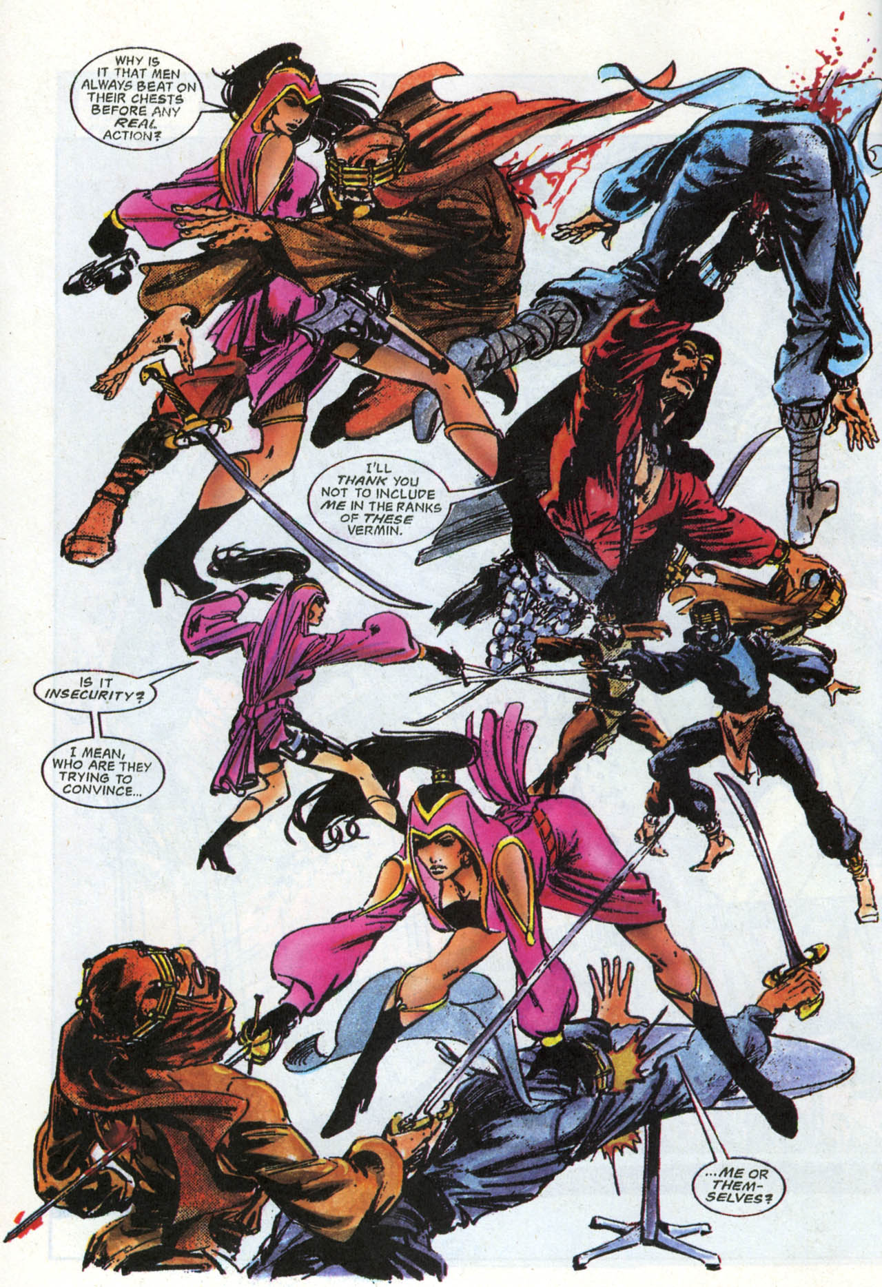
After Mike Grell wrapped up the interplanetary war plot and left the book, John Ostrander came in as writer with issue #9 and stayed for another couple of years. Edited by the great Mike Gold (the king of eighties’ action comics), Ostrander’s run kept the tone of absurd macho bullshit while adding quirky ideas like the contraband planet Keldomage, which is one vast black market, including its capital city (aptly named Lassay Faire), in whose Bazaar of the Bizarre you can hear loose Monty Python lines. Notably, Starslayer’s heroes travelled to the pan-dimensional city of Cynosure (‘where all possibilities are realized, where dream and reality are indistinguishable, where fact and fantasy play together like children’) and met Grimjack in one of the series’ finest moments.
That said, as much as I love John Ostrander and Tim Truman (who became the regular artist for a while, working with Hilary Barta), their comics never really reached the bravado of Mike Grell’s issues (or of Ostrander’s and Truman’s later space operas in Hawkworld and in the aforementioned GrimJack). Likewise, Lenin Delson’s pencils and Mike Gustovitch’s and Mark Nelson’s inks didn’t match Grell’s raw-yet-elegant style, even if they still delivered dynamic visuals, especially when complemented with Janice Cohen’s stark colors.
All and all, Mike Grell’s Starslayer is a classic whose spirit continues to echo to this day (for example, in Robert Venditti’s and Cary Nord’s run in X-O Manowar).
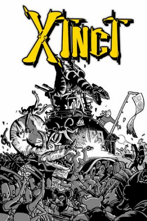
XTNCT
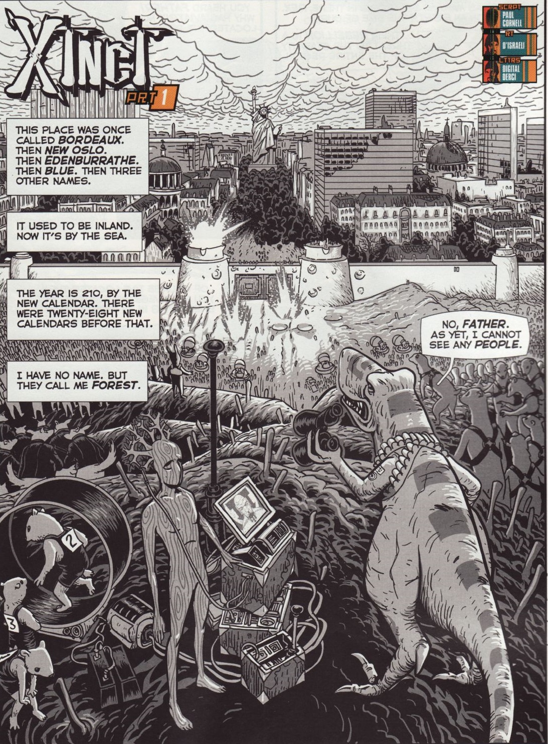
Originally published in the pages of Judge Dredd Megazine in 2003, the awesome short-lived series Xtnct takes place in a war-torn Earth and it follows a rogue commando of genetically modified dinosaurs (and a sentient tree!) chasing down the last few hundred humans on the planet. Yes, it feels like a modern spin on Pat Mill’s misanthropic cult comic Flesh and it sure lives up to that series’ violent, anarchic spirit. Not only that, but D’Israeli makes a kooky concept even kookier through the kind of cartoony, rubbery art and impeccable sense of design he also used in other surrealist sci-fi gems, such as Lazarus Churchyard and Stickleback.
Because it’s written by Paul Cornell, the comic is both funny and somehow smarter than it had any right to be. At one point, the dinosaurs face hipster anti-globalizers obsessed with conspiracy theories about powerful international cabals that sound particularly ludicrous in a world without humans (‘But… there’s only one Jew left in the world.’).
The breakout star is, inarguably, Raptor, a psychotic velociraptor with super-speed who speaks without vowels:
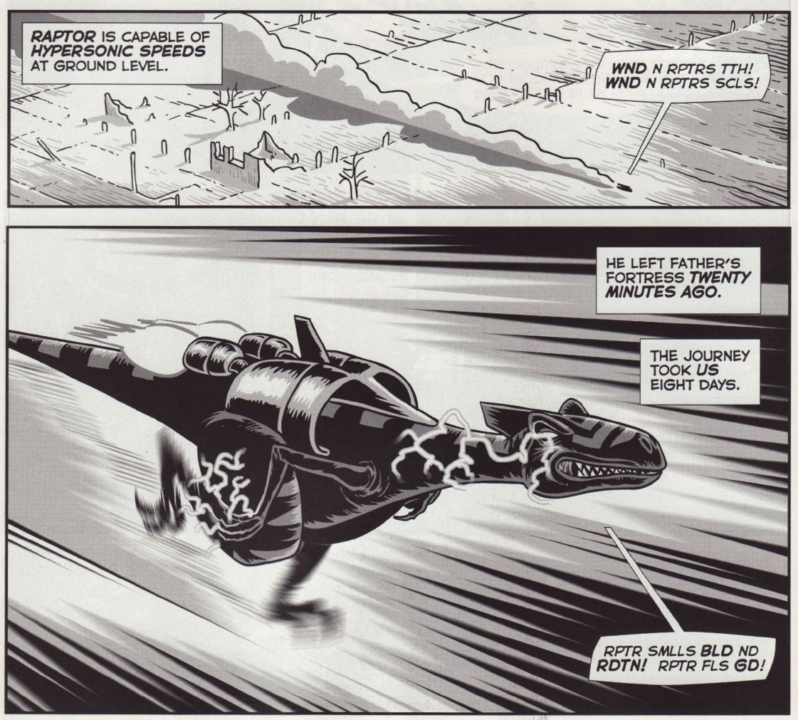
In a clever bit of storytelling, one of the tales is mostly told from the Raptor’s perspective, with everyone’s dialogue hilariously reduced to the basic ways he perceives their reactions (‘Surprised disagreement’; ‘Annoyed mutter.’). And all this takes place before the team causes a chain of atomic strikes, ushering in nuclear winter and spending the rest of the series covered in snow!
The entire run of Xtnct has been collected in the hardcover CM ND HV G F Y THNK YR HRD NGH as well as in the paperback anthology 2000 AD presents Sci-Fi Thrillers.
Posted in FANTASTIC ADVENTURES
Tagged 2000 AD, Cary Nord, Cold War, D'Israeli, Doug Moench, Ed Hannigan, Hilary Barta, Janice Cohen, Jim Mooney, Joe O'Brien, John Ostrander, Keenan Marshall Keller, Lenin Delson, Mark Nelson, Mike Gold, Mike Grell, Mike Gustovitch, Mike Ploog, movies, Paul Cornell, Planet of the Apes, politics, Rob Prior, Robert Venditti, science fiction, space opera, Starslayer, Steve Oliff, Timothy Truman, Tom Neely, Tom Sutton, Ty Templeton, Xtnct
Leave a comment