I don’t write much about colorists in this blog. Coloring is one of those ungrateful tasks that, while absolutely vital to the feel of a comic, tends to go unnoticed when it’s merely done well. According to mainstream coloring conventions, competence implies not drawing attention to your craft, which means that fans – and even professional critics – often dismiss colorists in favor of a discussion about pencillers (revealingly called ‘artists’), even though the latter’s work can actually be brutally elevated or spoiled by the color choices.
There are exceptions, of course. Even in more traditional books, some colorists’ styles do manage to stand out, either because they try out innovative techniques or because they go for particularly flashy effects. A perfect example of the latter is Gregory Wright’s work on the main Batman series, which he colored from 1995 to 2002 (with some holes in the middle). While I’m not always a fan of Wright’s coloring, his over-the-top approach fit especially well into the Doug Moench/Kelley Jones/John Beatty/Todd Klein run, where – under the editorial supervision of Jordan B. Gorfinkel and Dennis O’Neil – everyone’s contribution seemed deliberately extreme.
True to the expressionistic, horror-tinged slant of the comic, Greg Wright’s hauntingly eerie palette looks like something he put together after watching the original Suspiria. With that in mind, let’s check out three ways he uses the color red, each of them creating a different mood:
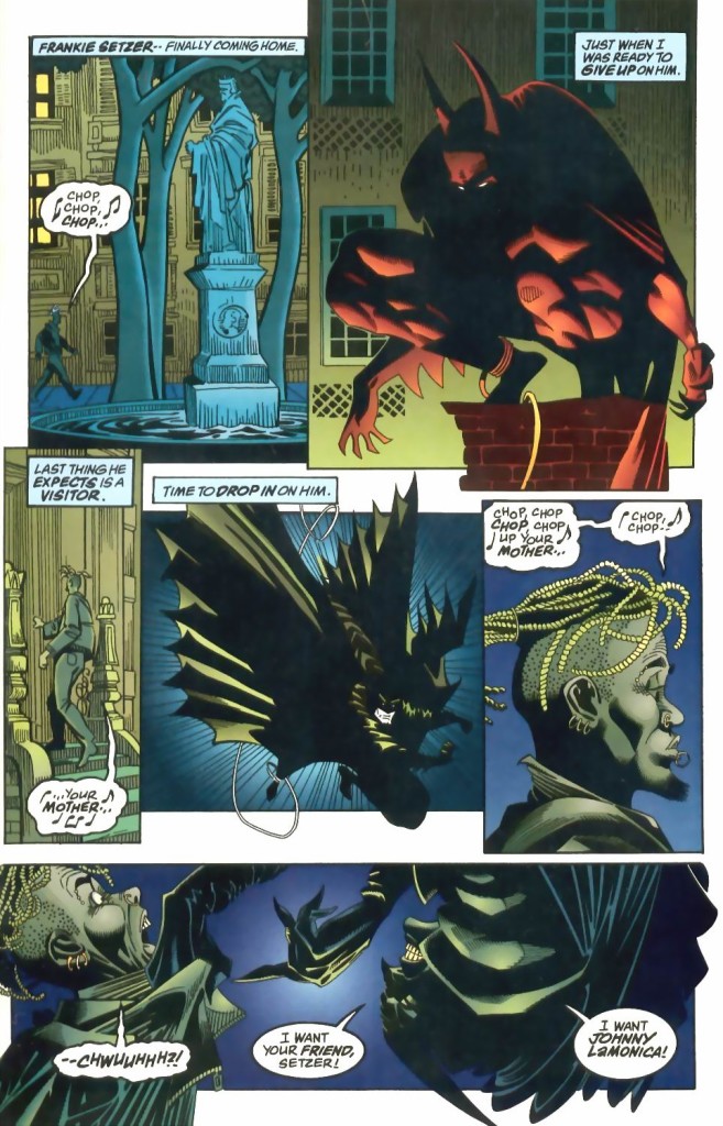 Batman #519
This is the more playful one of the lot. Having fun with the fact that Kelley Jones draws the Dark Knight like a demon – the beast-like posture, the hooves-like feet, the claws-like hands, the horns-like ears, the tail-like cape – Greg Wright colored Batman in the top panel with a hue somewhere between red and orange, as if he’s watching his prey from a hellish pit. Besides generating a visual pun, the choice contributes to the overall atmosphere: Wright reverts to nocturnal tones in the rest of the page, but that sinister scarlet silhouette looms menacingly over everything else.
Thirty issues later, Wright used red to establish a whole other vibe in this exchange between Bruce Wayne and Vesper Fairchild:
 Batman #549
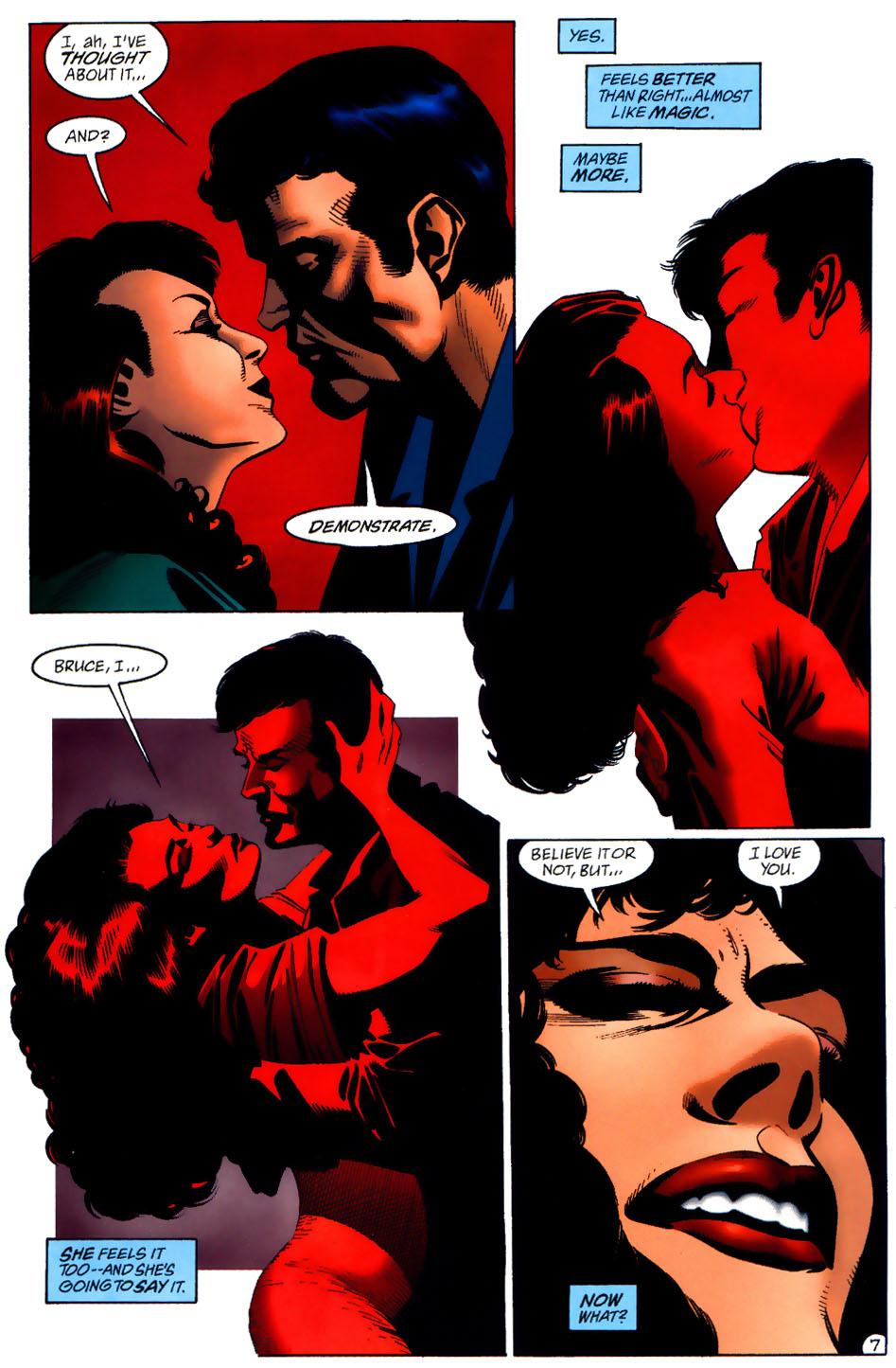
It’s a romantic scene, so you could argue the prominent red symbolizes love and the blood pumping through the couple’s hearts. But let’s face it: this tone of crimson suggests carnal passion. Check out the way it starts as a background color and then takes over their whole beings as they kiss before concentrating on Vesper’s lips in that final close-up… This is lust enveloping them. That third panel in particular, with Vesper (in a drawing with hints of Bride of Frankenstein, consistent with Jones’ gothic horror obsession) pressing her body against Bruce while grabbing his head and pouting, is a forceful image of barely contained sexual desire threatening to explode.
Kelley Jones didn’t draw the next example, taken from the crime story ‘Fades to Black.’ It was penciled and inked by Eduardo Barreto, who has a much more realistic linework, so Wright went for less flashy color choices, for the most part:

 Batman #520
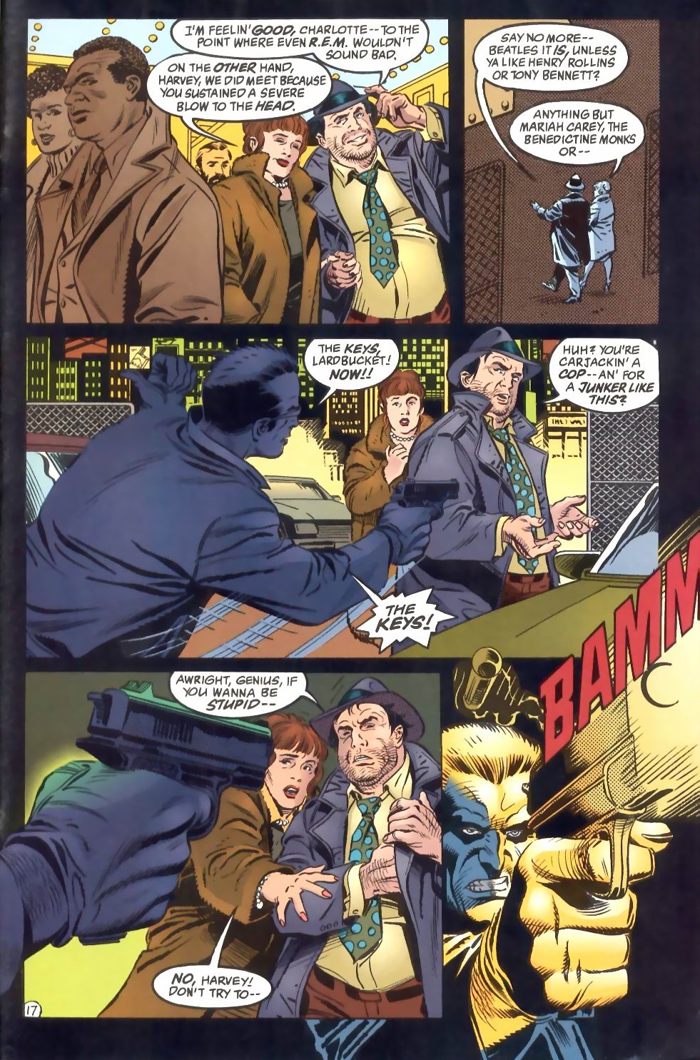
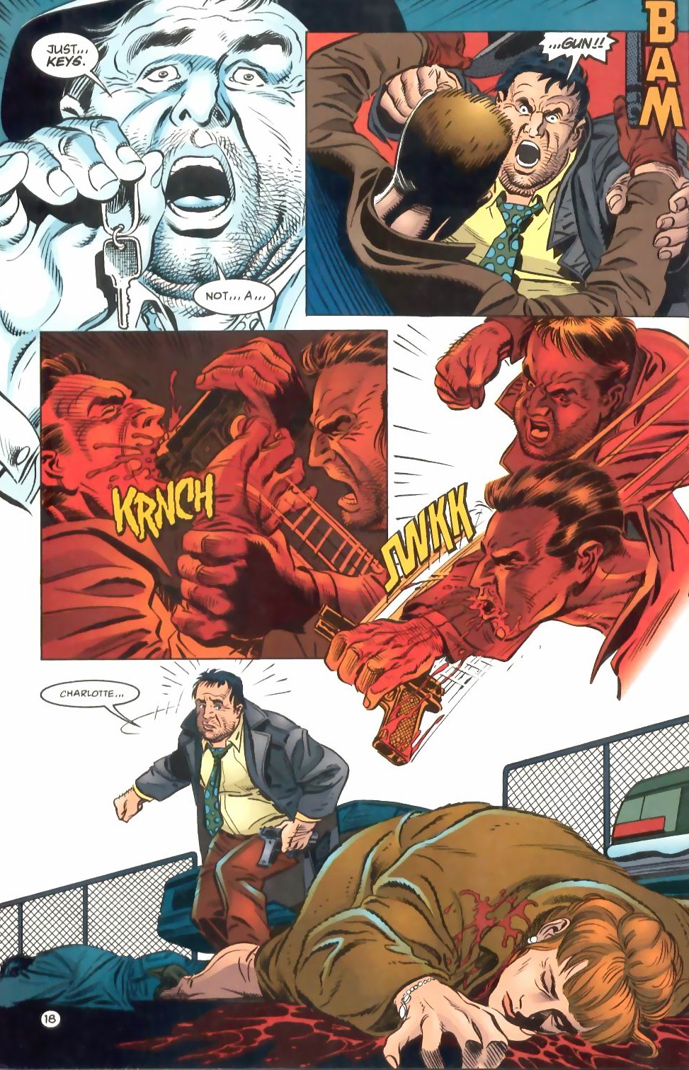
The red clearly represents violence in this sequence, starting with the shot’s onomatopoeic ‘BAMM’ and finishing with the blood flooding out of Charlotte. Between those two instances, Wright uses red to illustrate Harvey Bullock’s fury, once again spreading from the background and taking over a couple of panels. These expressionist panels are also an interruption in the grounded colors of the protagonists in the images that open and close the scene – they mark a moment when Bullock is seeing red (another visual pun), consumed by out-of-control rage before regaining his sanity at the end of the page, thus rendering the back-to-earth transition all the more powerful and tragic.
There you have it. Greg Wright raised the impact of three great pages with his variations of red. Now don’t get me started on his shades of blue…
I’m trying to reach Gregory Wright concerning his work as a colorist on the 1994 OGN Modesty Blaise for DC. I’m not a Facebook or Instagram guy so is there a way of contacting via email? If you have his information could you reach out to him and tell him I am doing an article on the MB graphic novel for the Comic and Fantasy Art Amateur Press Association? Thanks!
I have no clue how to reach him, but I’m leaving this comment online, so hopefully he may stumble on it one of these days…