Much of this blog has been devoted to writers and artists of Batman comics but, like many other fans, I don’t talk nearly as much about colorists. With that in mind, this week Gotham Calling pays homage to Adrienne Roy, who did the colors for most of the Batman line throughout the 1980s and 1990s. Specifically, I wish to highlight slightly different ways in which she played with the lighting during blackout scenes.
Adrienne Roy’s style went through many stages and ranged from fairly naturalistic to highly expressionist. The three examples I’ll focus on in this post are all taken from the excellent Detective Comics run written by Chuck Dixon in the early ‘90s. Dixon’s storytelling usually had a firm sense of geography and managed to create grounded set pieces (even when they involved super-athletes in circus costumes), which allowed Roy to try out some neat visual effects.
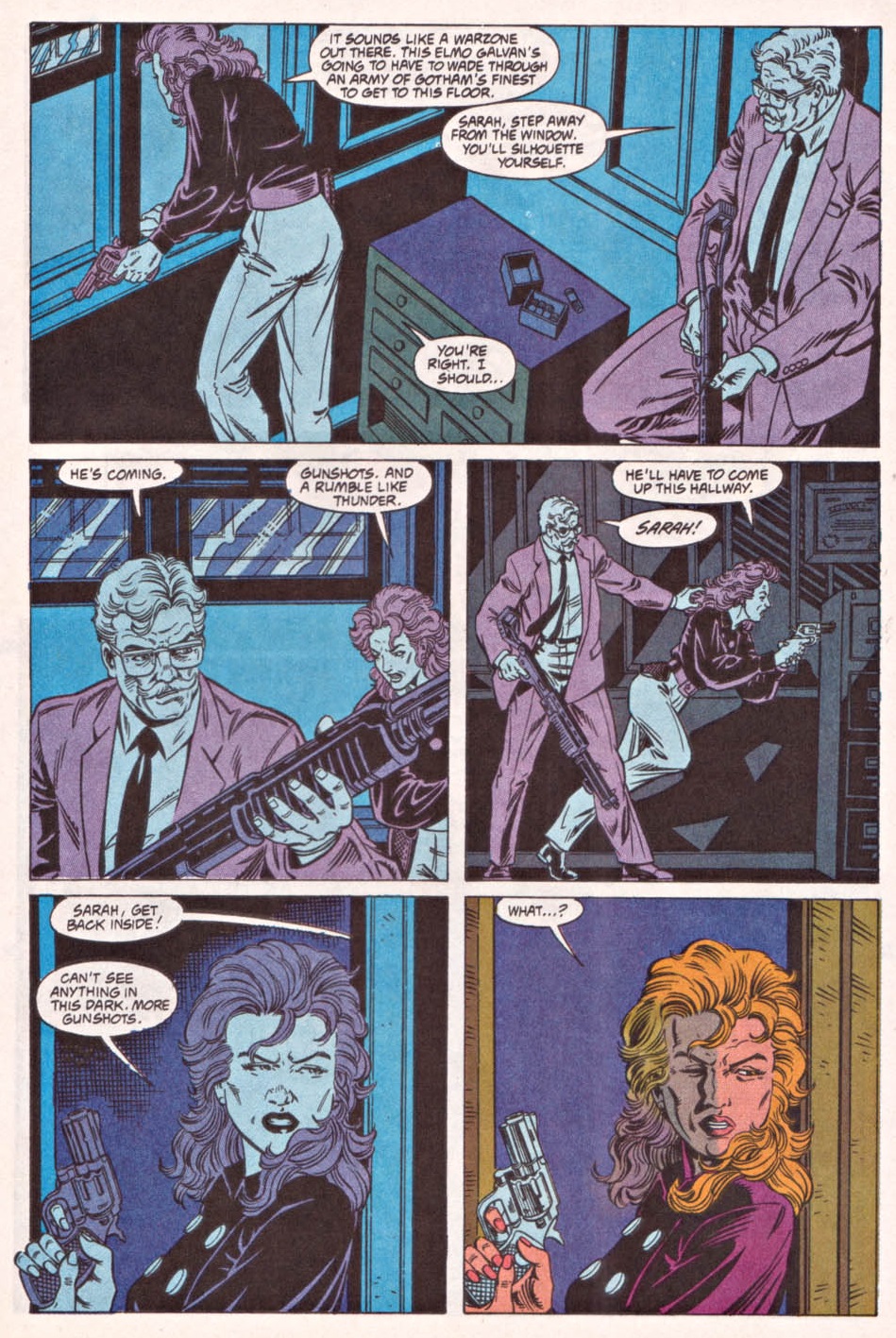
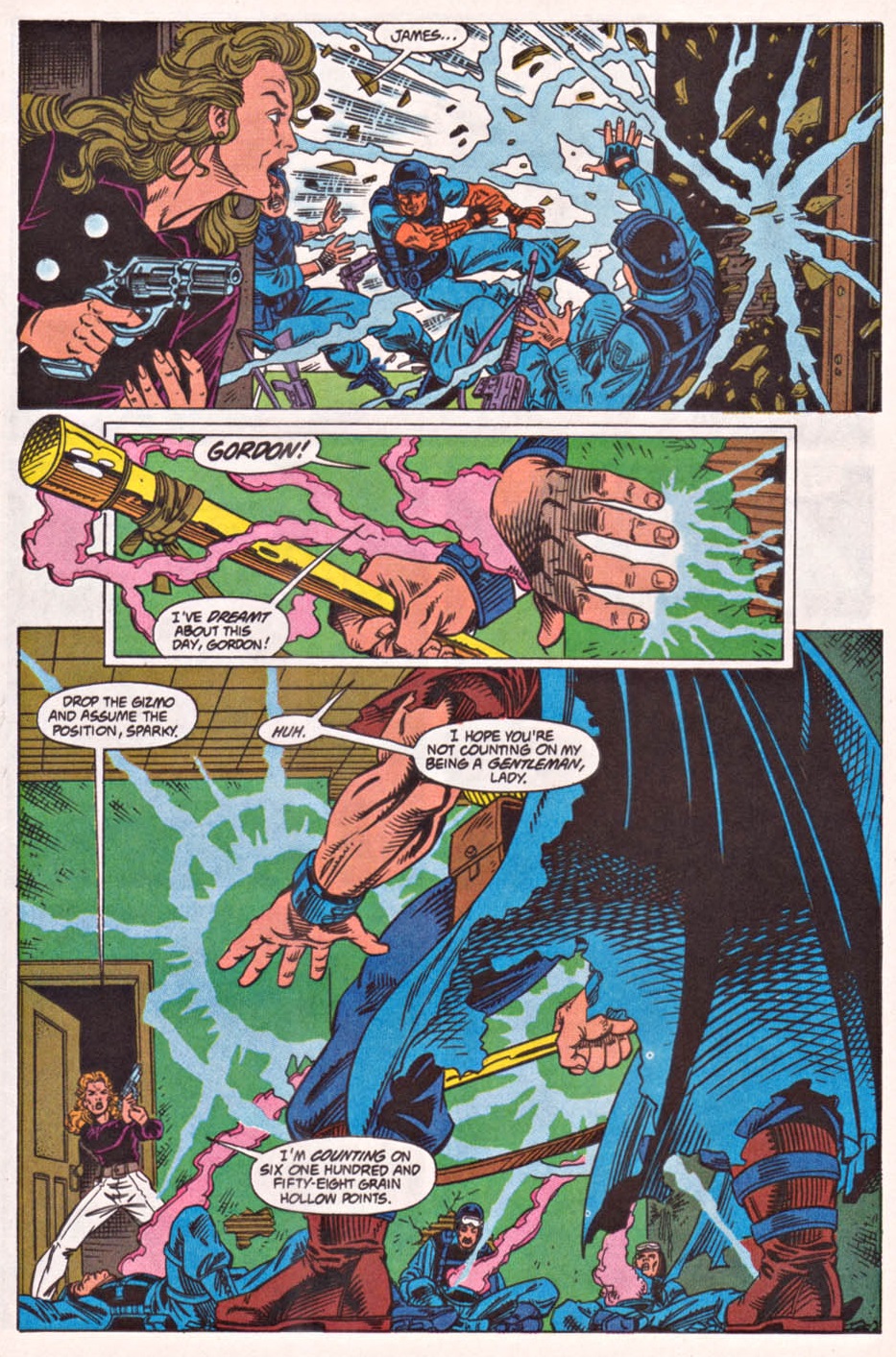
I’ll begin with a sequence from 1992’s ‘Electric City’ (Detective Comics #644-646, with art by Tom Lyle and Scott Hanna). In this scene, the electricity-powered killer Elmo Galvan comes to a police station in order to murder Commissioner James Gordon, who is waiting for him alongside the awesome Lieutenant Sarah Essen. Galvan cuts the station’s power, so the scene opens in the ‘dark,’ conveyed by shades of blue, black, and purple. Because Galvan emanates electricity, however, his approach leads to a stellar transition halfway through, from muted colors to bright ones:

 Detective Comics #646
1992 was actually quite a bad year for Gotham City’s police headquarters, which were also attacked in the climax of the nifty crossover ‘The Destroyer’ (Batman #474, Legends of the Dark Knight #27, Detective Comics #641). As if that wasn’t enough, the following year Chuck Dixon wrote yet another riveting attack on police facilities, this time against the 43rd precinct, in the rotten neighbourhood of Lyntown. ‘Besieged’ (Detective Comics #656, with art by Tom Mandrake) is the culmination of a three-part story arc about a kid genius who unites the Gotham gangs by using military tactics before going after the ‘toughest gang in town,’ i.e. the police. Basically, what starts out as a twist on The Warriors turns into a riff on Assault on Precinct 13 (showing that Dixon has great taste in flicks from the ‘70s).
If in the previous excerpt Adrienne Roy delivered a vivid transition from a page set in darkness to a page set in the light, this time around she produces a stark clash within each panel:
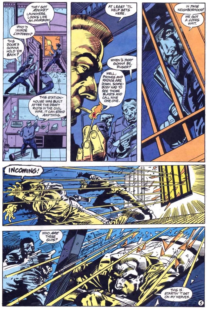 Detective Comics #656
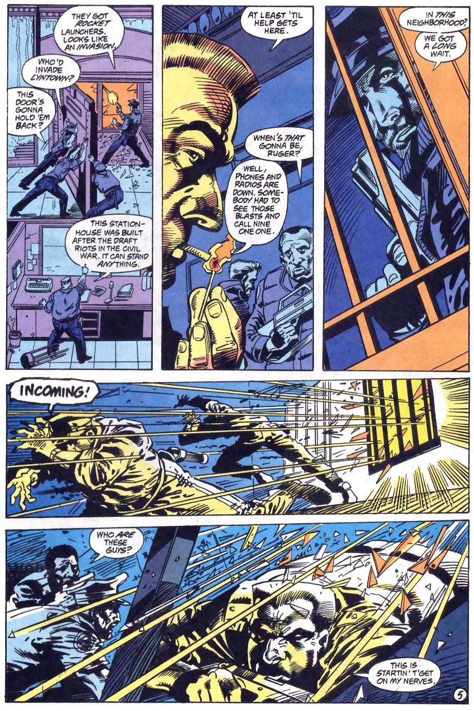
As you can see, in addition to the darkness – once again represented by blue and purple – there is a kind of orange light coming from the outside and a yellowish glow emanating from the match and the gunfire, spreading to the cops it illuminates. This minimalist, high-contrast use of color, combined with Mandrake’s dynamic art and Dixon’s effective and somewhat sardonic dialogue, creates one hell of a moody scene!
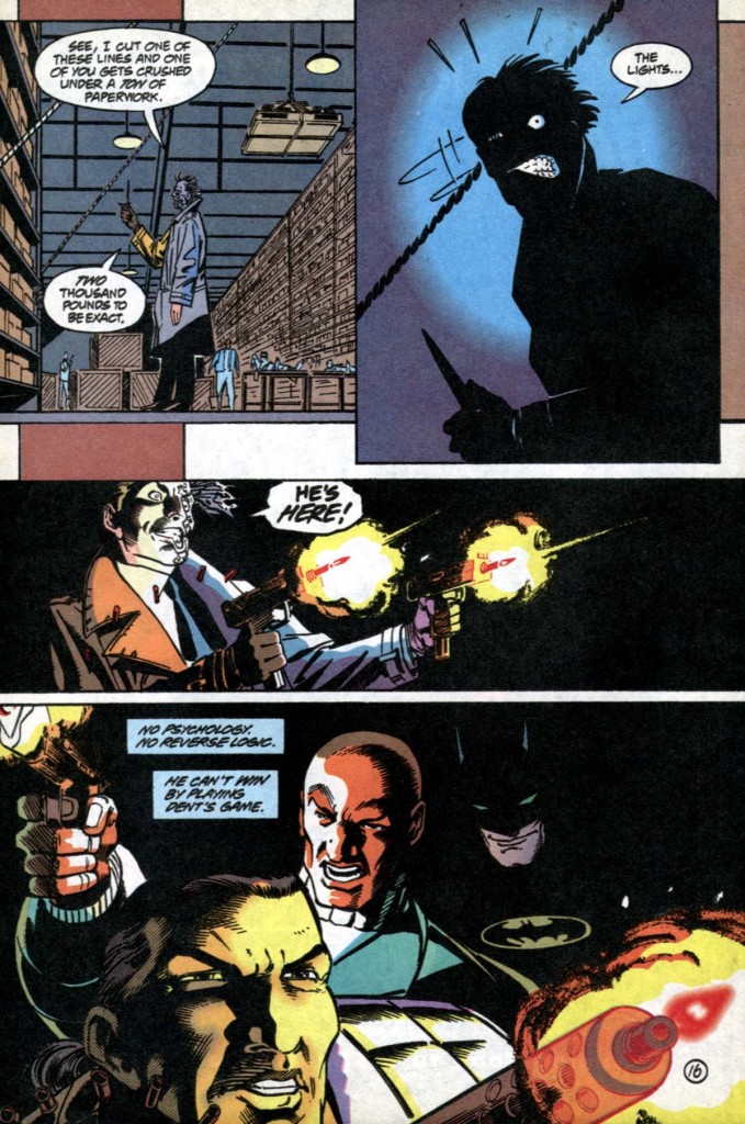
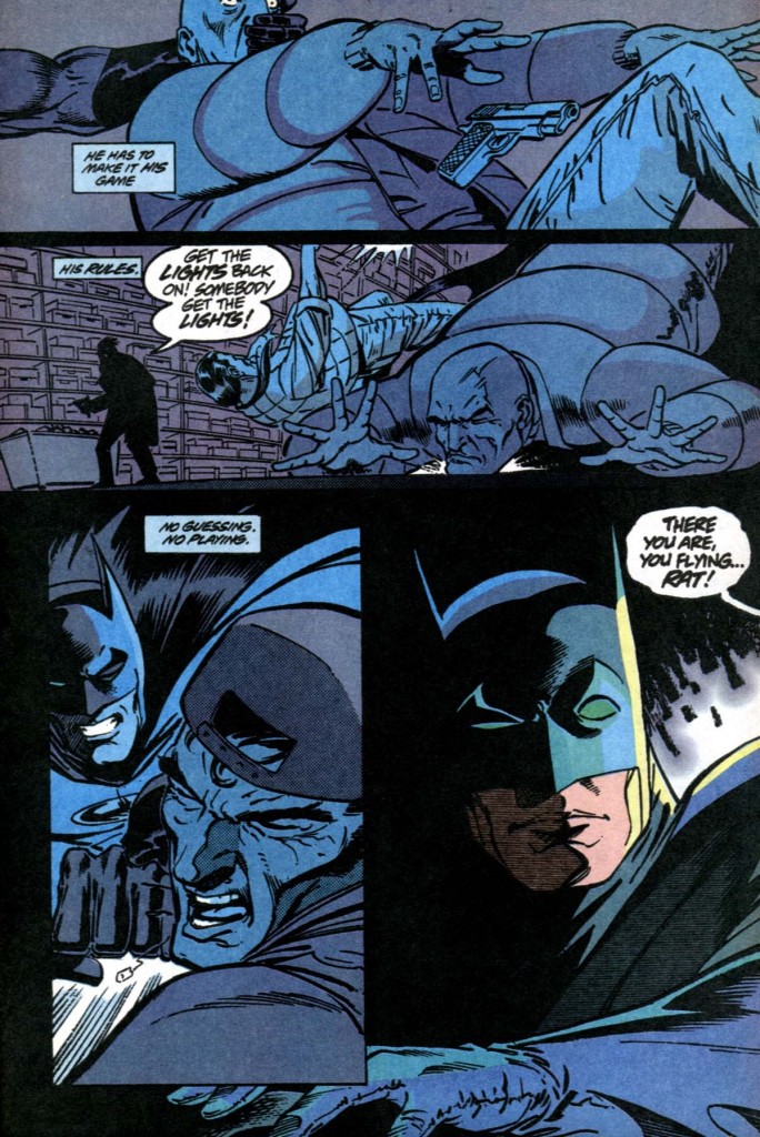
Let’s finish with a sequence from 1994’s ‘A Twice Told Tale’ (Detective Comics #680, with art by Lee Weeks, Graham Nolan, and Joe Rubinstein), set in Gotham’s hall of records, where Two-Face is about to literally drop tons of paperwork on Robin. In order to get an edge, Batman (Dick Grayson at the time, equipped with night vision) kills the lights, thus forcing his opponents to fight him in the dark:
 Detective Comics #680


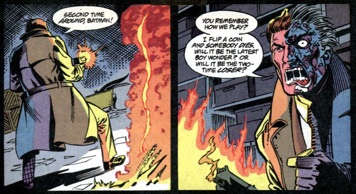
Like in the basement scene from Fede Alvarez’s Don’t Breathe, even though this sequence is supposed to take place in total darkness, we can still see what’s going on – instead of pitch-black, Adrienne Roy colors the second page with blues and grays. Besides the decrease of purple, Roy further tweaks her approach to this type of set piece by having the flashes of light – from the gunshots and Two-Face’s pyre – partly illuminate the nearby characters with a more colorful palette than just a yellowish hue. This works especially well in that last panel, as it emphasizes the division within Two-Face between the part of him that is more connected to reality and his darker, scarier side.
All in all, these examples are just a small sample of how Adrienne Roy played with the lighting in Batman comics. Notably, her colors helped shape other elements of the stories as well, such as movement and temperature, which I’ll explore in future posts.
Thanks for posting this. I have a lot of late 80s/early 90s Batman issues and Roy coloured practically every single one of them! I love the “feel” of Batman comics from that era, and she played a big part in it.