
At its best, Will Eisner’s post-World War II work on the noir comedy series The Spirt gave us some of the greatest comics ever – not just groundbreaking stuff at the time, but a string of truly ingenious approaches to the medium that are still a joy to read today.
Although the protagonist, Denny Colt (a former detective widely believed to be dead who reinvented himself as the titular crimefighter), does look pretty cool in his blue domino mask and rumpled fedora, he is not the main reason for the comic’s success. Hell, he barely appears in many of the episodes! As I’ve argued before, the true stars of The Spirit are the storytelling techniques developed by Eisner and his team throughout the 1940s. And, among these, none has become more recognizable than their famous title pages…


Check out the way the layout in the images above fluidly guides your eyes from top to bottom, from left to right, ushering you to turn the page… While the use of wide negative space and a relatively limited color palette concentrate your gaze, the forceful impact and dynamic sense of movement create a thrilling feeling even before you know much about the story ahead.
Yes, the occasional racist stereotypes can be hard to stomach (most infamously, the characterization of Ebony White), but, as a rule, the first page of each tale of The Spirit was a beautiful piece of art on its own, deserving of adorning your living room walls. You can tell there was plenty of care and creativity put into conceiving every single installment… For one thing, Will Eisner kept coming up with new designs for the series’ logo and integrating them in striking ways – more often than not in the form of a splash – which gave each adventure a slightly distinct mood.
The inventive logo design played such a big role in the comic’s identity that it often took over the whole page, which was clearly constructed around it. In many of those openers, the logo was even depicted as an actual object, somehow becoming part of the diegetic materiality…


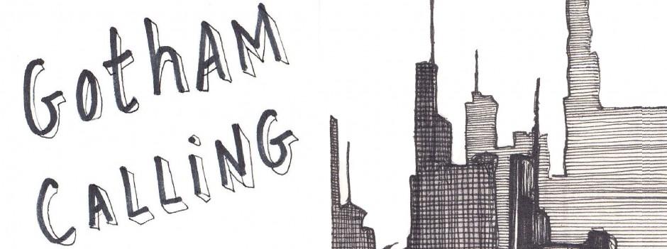
I never get tired of this gimmick. It establishes straight away that we are entering an unreal world, unashamed of its artificiality. And, indeed, the main setting, Central City, is made up of mashed tropes of crime fiction and slapstick comedy – certainly gritty, yet also proudly cartoony.
In fact, the device of physically manifesting the series’ title is so perfectly suited to the tone of The Spirit that it started showing up early on, even before the strip’s golden years (after Eisner’s return from the war). For instance, here are a couple of examples from 1940 and 1942, respectively:


You’ve probably also noticed how much of The Spirit’s style comes from the same place as film noir. The link is both visual and thematic: the comic is full of desperate losers, urban criminals, dilapidated tenements, smoked-filled rooms, and several femme fatales who seem to have transitioned to the paper straight from the big screen. Between the dirty alleys and the subliminal postwar malaise, some stories feel aimed at the maddening pitch of expressionistic despair from that sequence in The Set-Up where Robert Ryan tries to escape from the sports arena.
The title pages reflected these links not only by being noirish as hell, but also by being incredibly cinematic… Will Eisner studied the language of Hollywood thrillers – from lighting choices to the tight mise en scène – and brilliantly translated it into the comic book medium. The result resembled, not merely the storyboards that precede film shooting, but finalized movies deaccelerated and broken down into expressive, individual images. By channeling familiar audiovisual motifs like the motion of a camera peeking into and entering a window or the phone ringing in the distance (instantly building up suspense), these still pictures captured some of the energy and timing of movies, albeit with all the intense exaggeration that drawing allows:


I’m not saying The Spirit is pure noir literature. If you want a proper hardboiled read from this era, go grab yourself a copy of Raymond Chandler’s The High Window or The Little Sister. What Will Eisner – and the uncredited assistants at his studio – did was to take prototypical elements from this genre and cleverly figure out how to best put them in the service of a fun cartoon strip.
For example, few things scream NOIR more than neon signs, so, bellow, you’ll find a couple of pages that evocatively turned The Spirit’s logo into neon… This effect, combined with a simulation of black & white photography and a flexible approach to panel borders, effectively kickstarts their narratives with a film-like, dreamy atmosphere.


Another signature mark of The Spirit that was frequently on display in the title pages was the series’ flair for adopting unconventional perspectives for framing its stories. Some tales largely disregarded the Spirit and his regular cast, preferring to follow small-time crooks or peripheral players who found themselves entangled in an encroaching criminal web, Ozark-style. Other tales were told from the point of view of animals or even inanimate objects… This was no doubt an extension of the same will to experiment that ushered in the originality and virtuosity of the opening visuals.
Here is a particularly amusing composition that illustrates this tendency:

In 1950, Will Eisner left The Spirit in the hands of a host of talented ghost writers and artists, keeping a mostly supervisory role. Fortunately, though, his replacements kept the tradition alive, coming up with awesome openers that embedded the comic’s logo into the initial pages…
Here is a great one by Al Wenzel that is definitely worthy of Eisner:

I especially like the title pages done by Jim Dixon, who had a grimier, more detailed touch… Seriously, you can practically hear the wood creak in this one:

Actually, I’m not much of a fan of Dixon’s artwork in the rest of the stories, but he sure nailed most of his openers. Even when he failed to come up with an imaginative design for The Spirit’s logo (like in the examples below), he knew how to pull off disorienting POVs that pulled readers into the comic while conveying the sordid environment that characterized the material.


Next week, we’ll see if modern day creators have also done justice to this feature of The Spirit.