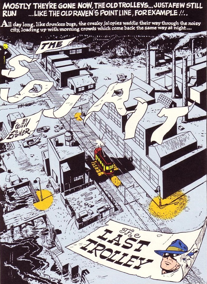
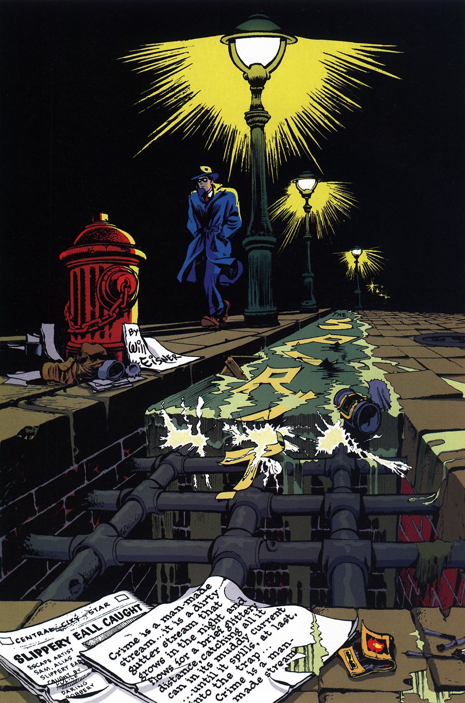
 The Spirit (v2) #3
I tend to be quite distrustful of attempts to update Will Eisner’s The Spirit. Because most creators cannot begin to match Eisner’s experimentalism, the appeal ends up being little more than the curious, nostalgic exercise of checking out all the modern variations of the original cast and concepts (which usually do little more than to tone down the original’s racism, if not its sexism).
Not that we haven’t gotten some stylish comics out of this nostalgia, starting with Darwyn Cooke’s run at DC in 2006-2008. Although overrated in some circles, given that it was sadly plagued with pretty superficial stories, at least that series did look absolutely delightful. Cooke, who was above all an incredible artist, made sure to always introduce a different logo in each issue through breathtaking, gobsmackingly vibrant double spreads…
 The Spirit (v2) #4
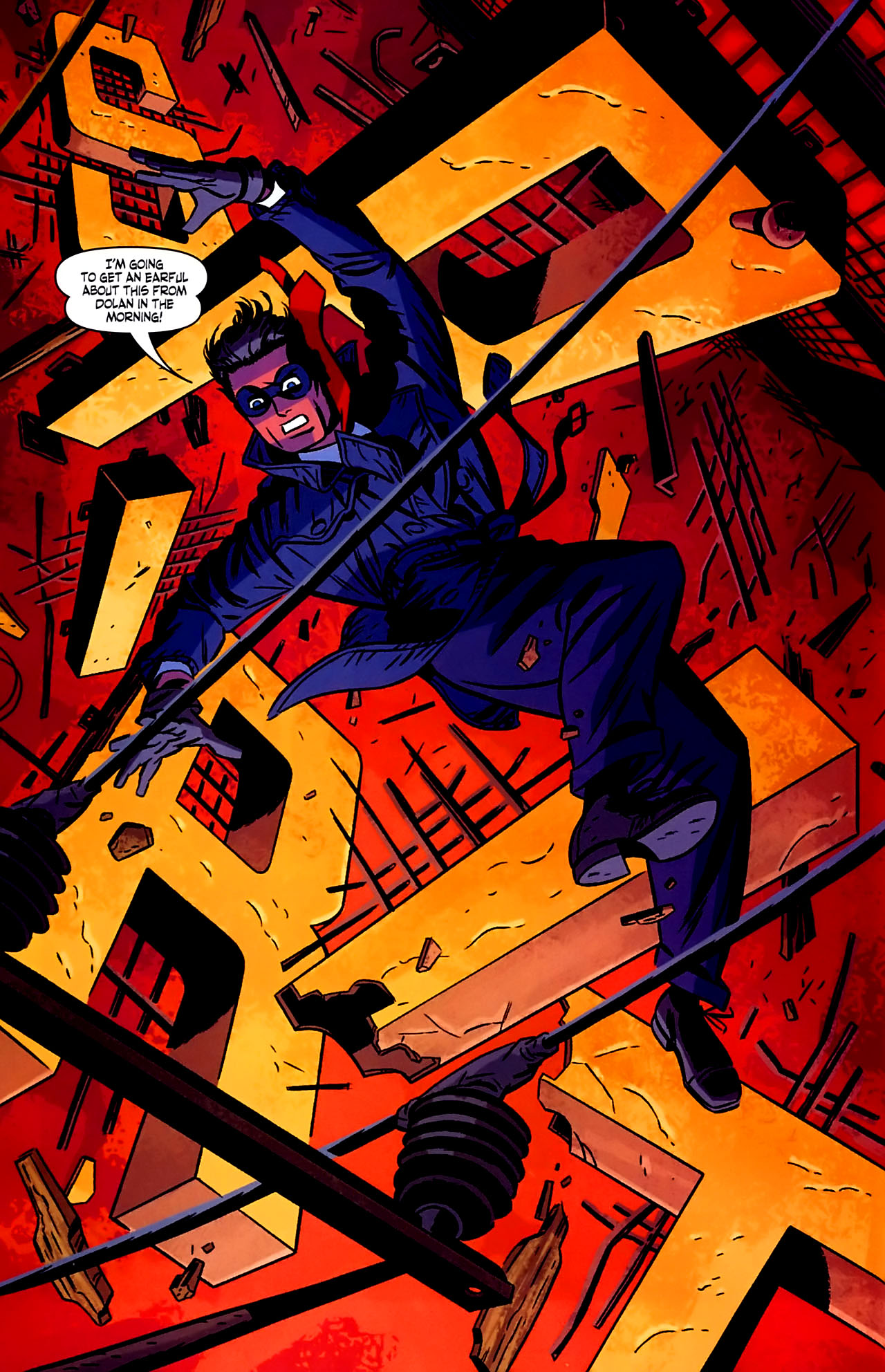
At the time, Darwyn Cooke also worked on a Batman / The Spirit one-shot, written by Jeph Loeb. There, Cooke and Loeb came up with a very neat wink to the series’ fanciful logos. This gag took place while the Spirit escaped from a gunfight by climbing a set of huge letters on top of a building signaling Pier Sixteen:
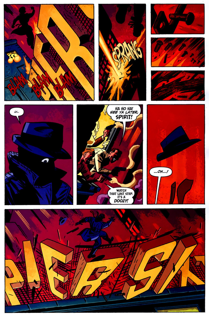
 Batman / The Spirit

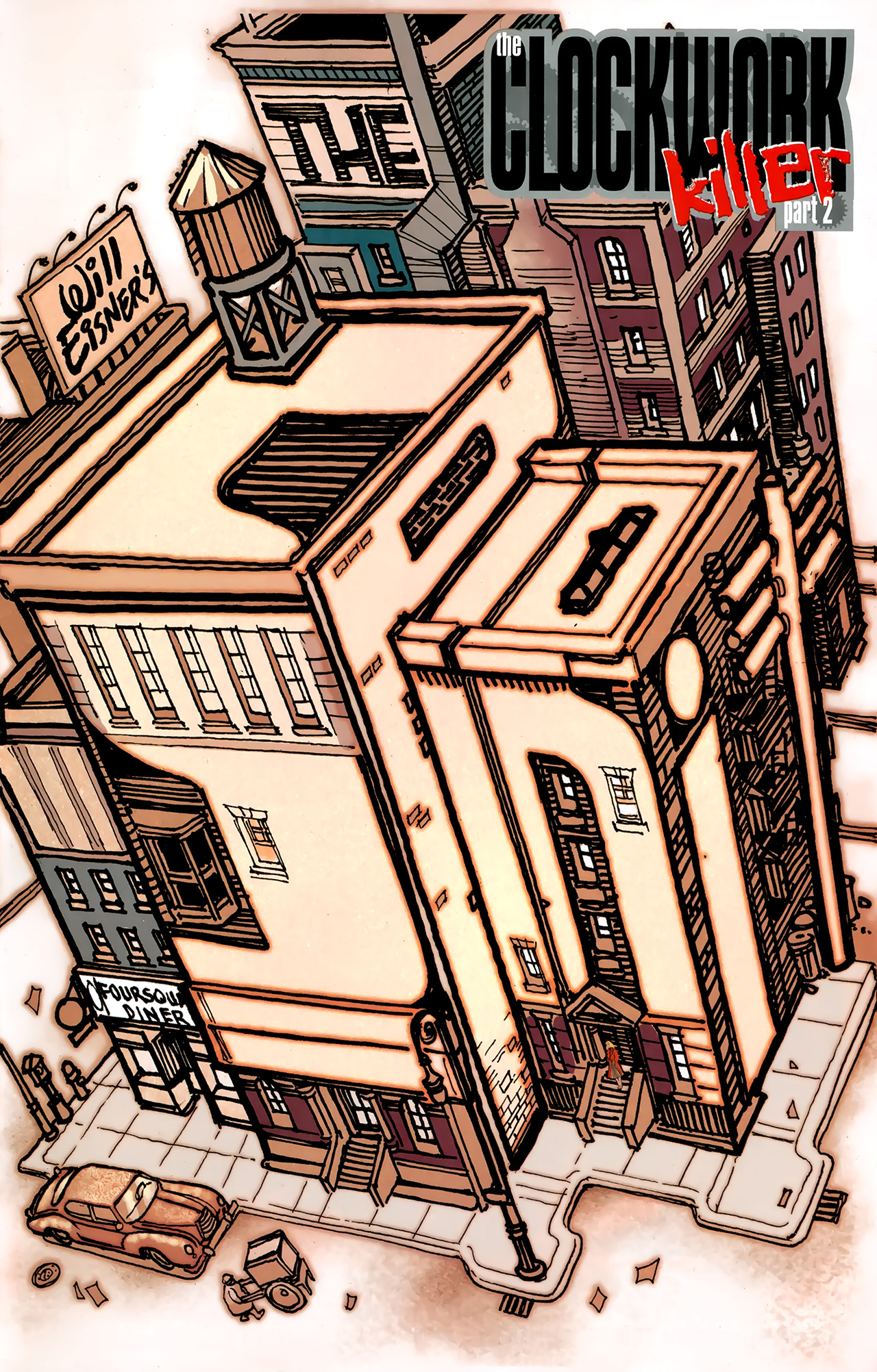
Despite Cooke’s noirish style, his DC reboot of The Spirit sought, first and foremost, to emulate the lighter side of Will Eisner’s comic, including its goofy humor and rollicking adventure tone. After Cooke left the title, many of the creators that followed did the same, with scripts – especially those co-written by Sergio Aragonés and Mark Evanier – as well as artwork – especially when drawn by Paul Smith – going for laughs, albeit of a stale, old-school variety (resorting, for example, to outdated caricatures of the film industry, in ‘Stand In for Murder’). Mark Waid’s and J. Bone’s mini-series The Rocketeer / The Spirit: Pulp Friction and, more recently, Matt Wagner’s and Dan Schkade’s reboot of the franchise for Dynamite went with a similar corny direction.
To be fair, these issues do kind of evoke the comedic mysteries of the 1940s’ run, but they lack the panache of the series at its best – in other words, they feel like tales of The Spirit’s classic era, they just don’t feel like the good ones. (The same goes for most of Dark Horse’s anthology The Spirit: The New Adventures, despite contributions by many of the biggest names in the business).
That said, while modern creators haven’t always lived up to Eisner’s drive to innovate and to uncover the untapped possibilities of comic book narratives, at least they’ve proven apt at imitating one of his work’s most distinctive features, namely the pages playing with the series’ logo. The results can therefore be considered either original in their unoriginality or vice-versa, but I admit I’m a sucker for this kind of device anyway…
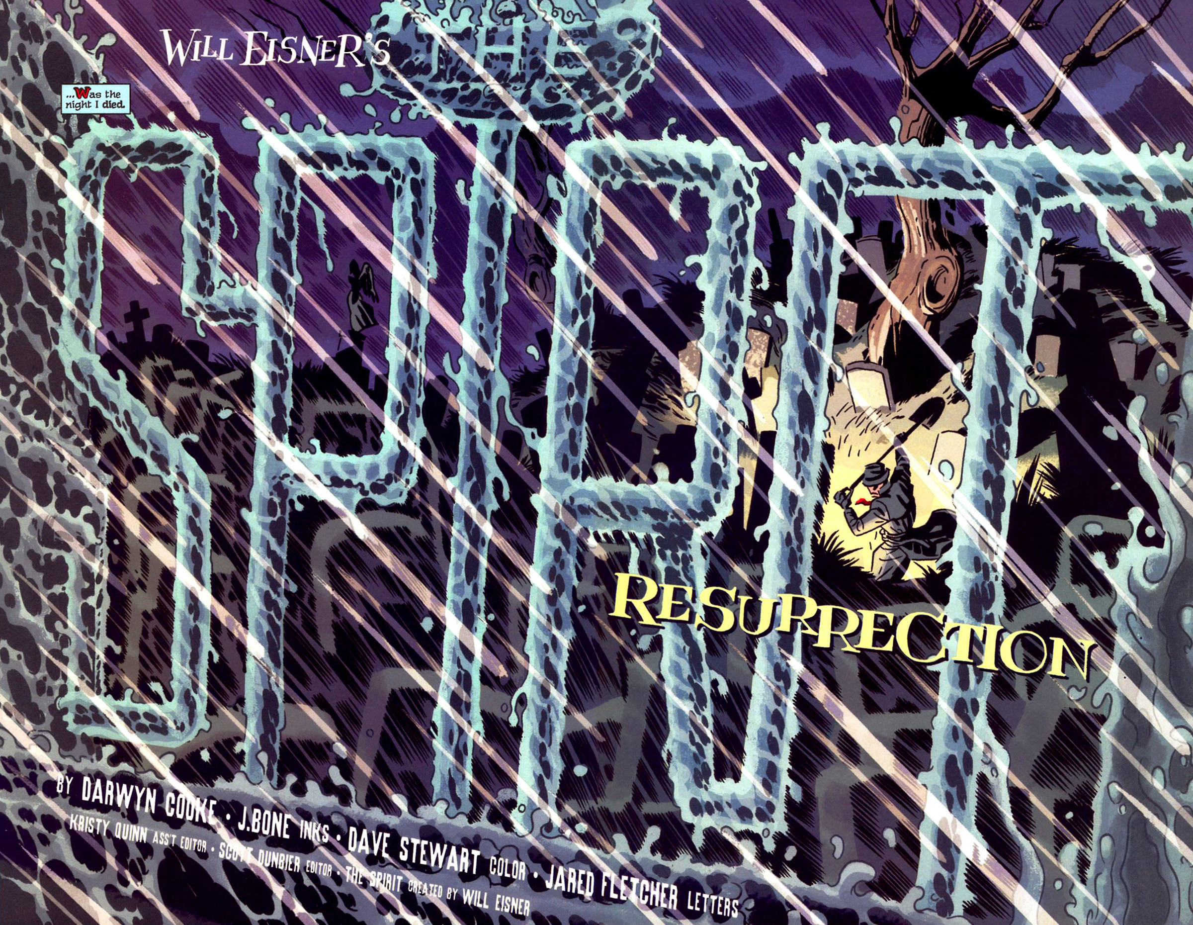
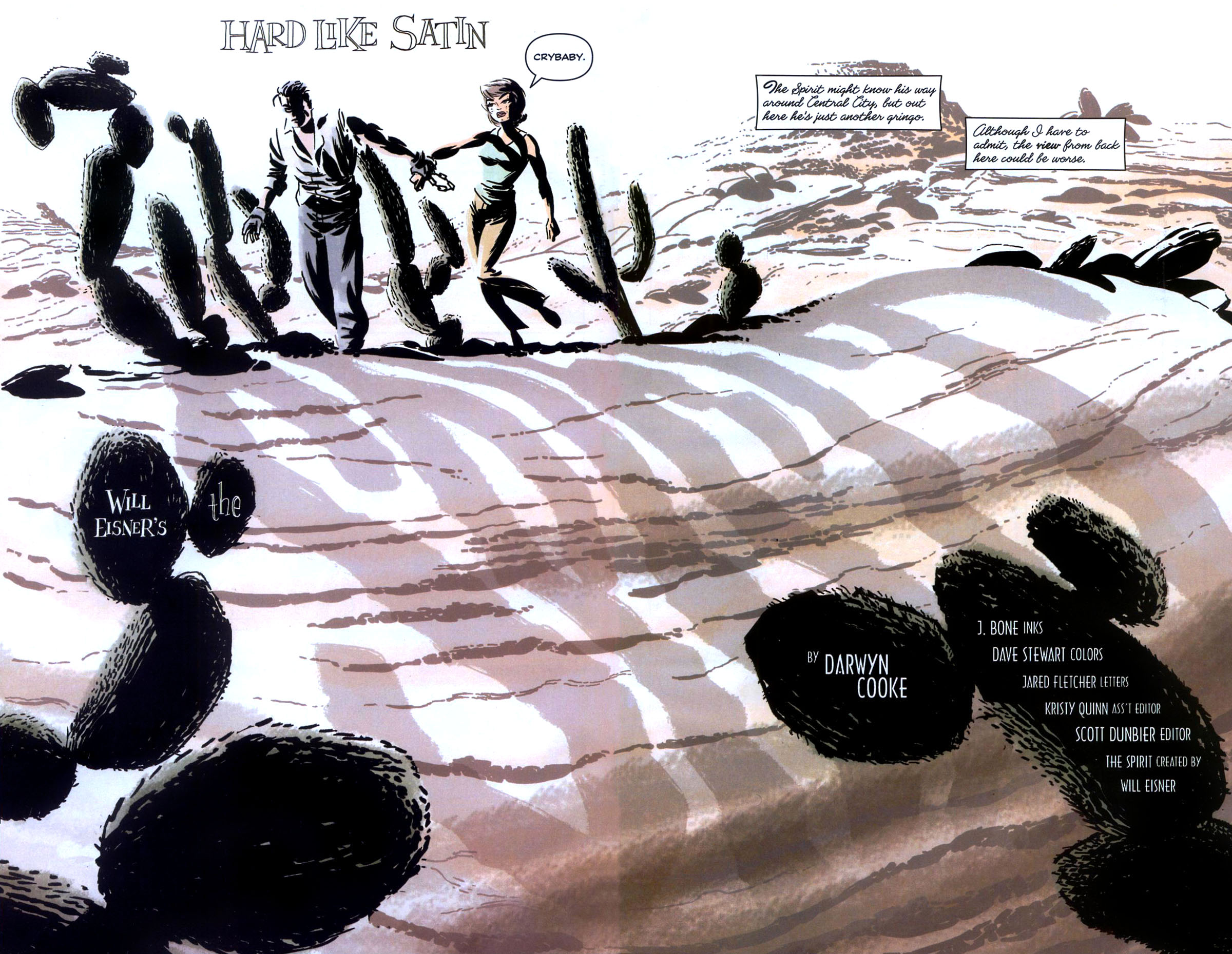
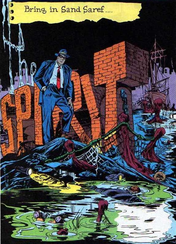
 The Spirit (v2) #25
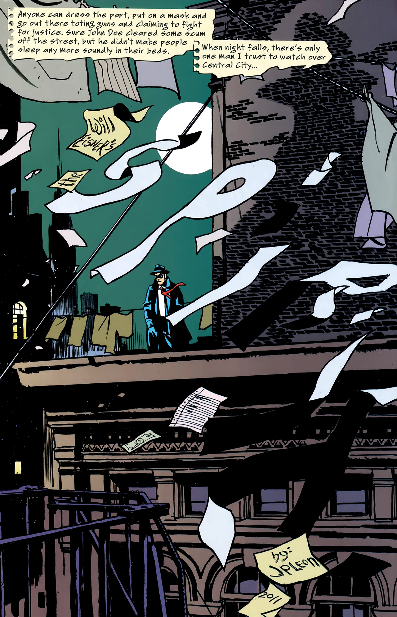
 The Spirit (v4) #4
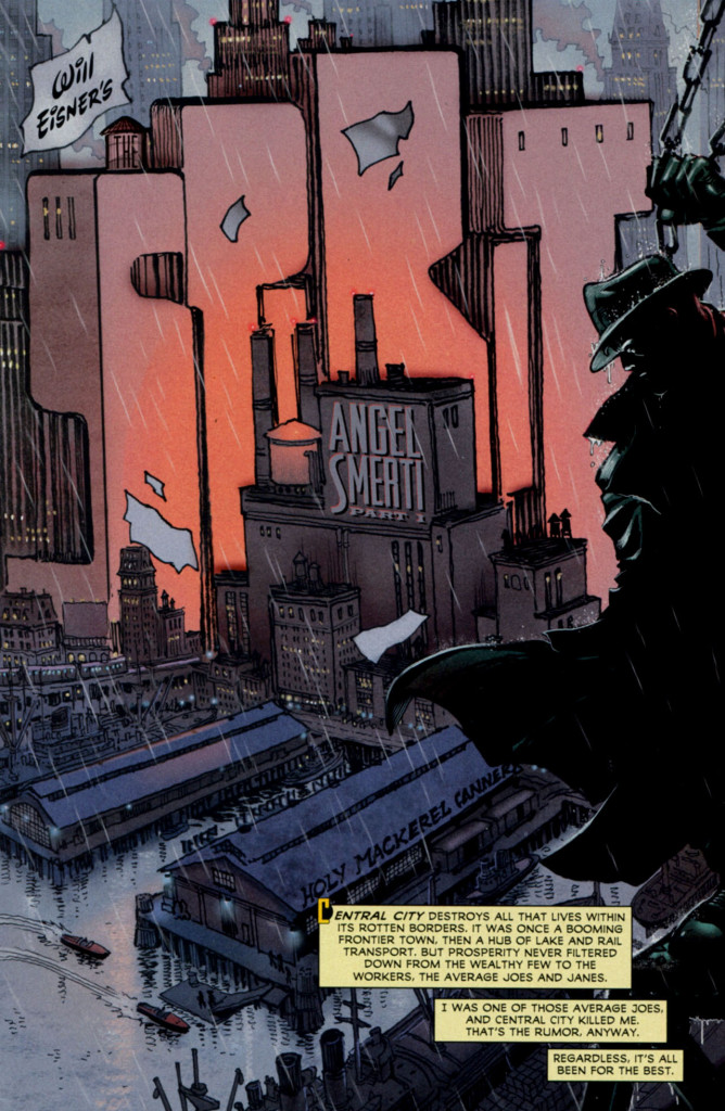
As you can see, the words ‘The Spirit’ are often treated as a material presence, either by twisting the shape of surrounding objects or by presenting the logo as an (unexplained) object in itself, one with which the cast nonchalantly interacts.
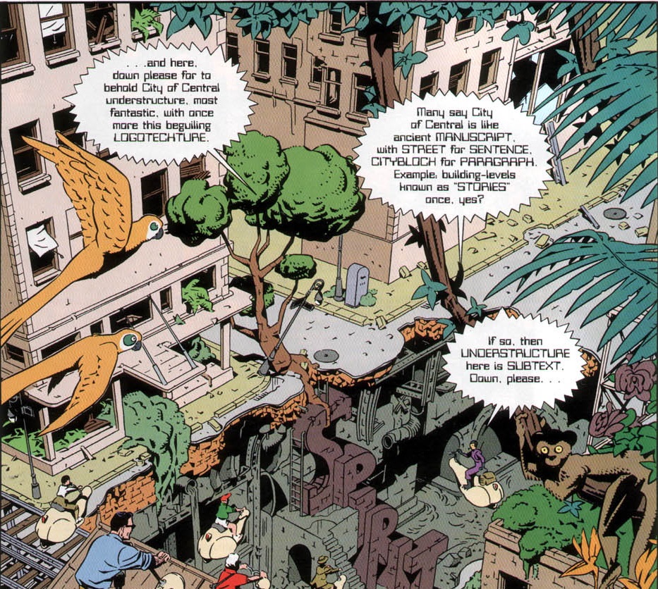
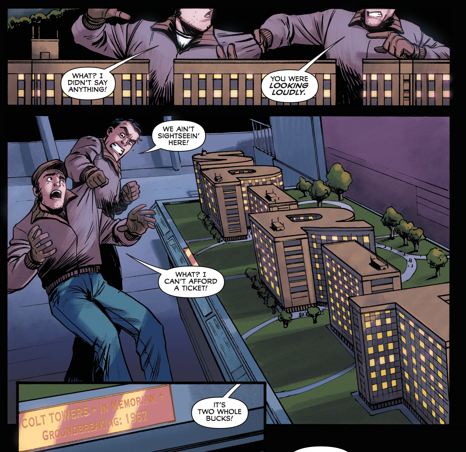
Back in 1998, Alan Moore and Daniel Torres had already done a playful take on this tradition of the series, in the memorable ten-page story ‘Last Night I Dreamed of Doctor Cobra.’ Set in the future, that comic followed a tour through Central City’s ruins, including what the guide called the city’s ‘logotechture’ (i.e. its buildings shaped like words, specifically ‘Spirit’), thus amusingly breaking the unspoken rule about the characters acknowledging the logo’s shape:
 The Spirit: The New Adventures #3
If it’s comedy you want, I suggest feasting your eyes on Gail Simone’s and Phil Hester’s short story ‘The Cold Depths of the Icicle Heart’ (The Spirit (v2) #13, cover-dated February 2008), which conveys the kind of masterful ability to play with the language of comics that made Will Eisner’s work so great. Similarly, you could do much worse than to track down the spot-on pastiches in Big Bang Presents #1 and in the criminally short-lived Greyshirt.
Moreover, Fred Van Lente and Bob Q brought all kinds of fun to the pages of The Green Hornet ’66 Meets The Spirit, a truly madcap romp set at a 1966 World Expo in Central City. Like many of Van Lente’s comics, this mini-series has become one of those tales I’ll gladly reread whenever I need a chuckle. And while it doesn’t mimic Eisner’s classic title pages, it does include a brief homage early on:
 The Green Hornet ’66 Meets The Spirit #1
Not everyone has gone with the humorous route in adapting The Spirit, though. For instance, Francesco Francavilla’s mini-series The Corpse-Makers leaned hard on the noir vibe (mixed with a bit of horror), which was also a staple of the original. If you’re into rainy streets and an omnipresent sense of doom, this comic has them in spades, more than compensating for a weak plot through some ultra-atmospheric visuals, including eye-popping double page spreads near the start of each issue that bring to mind some of the greatest film noir posters of the classic era:
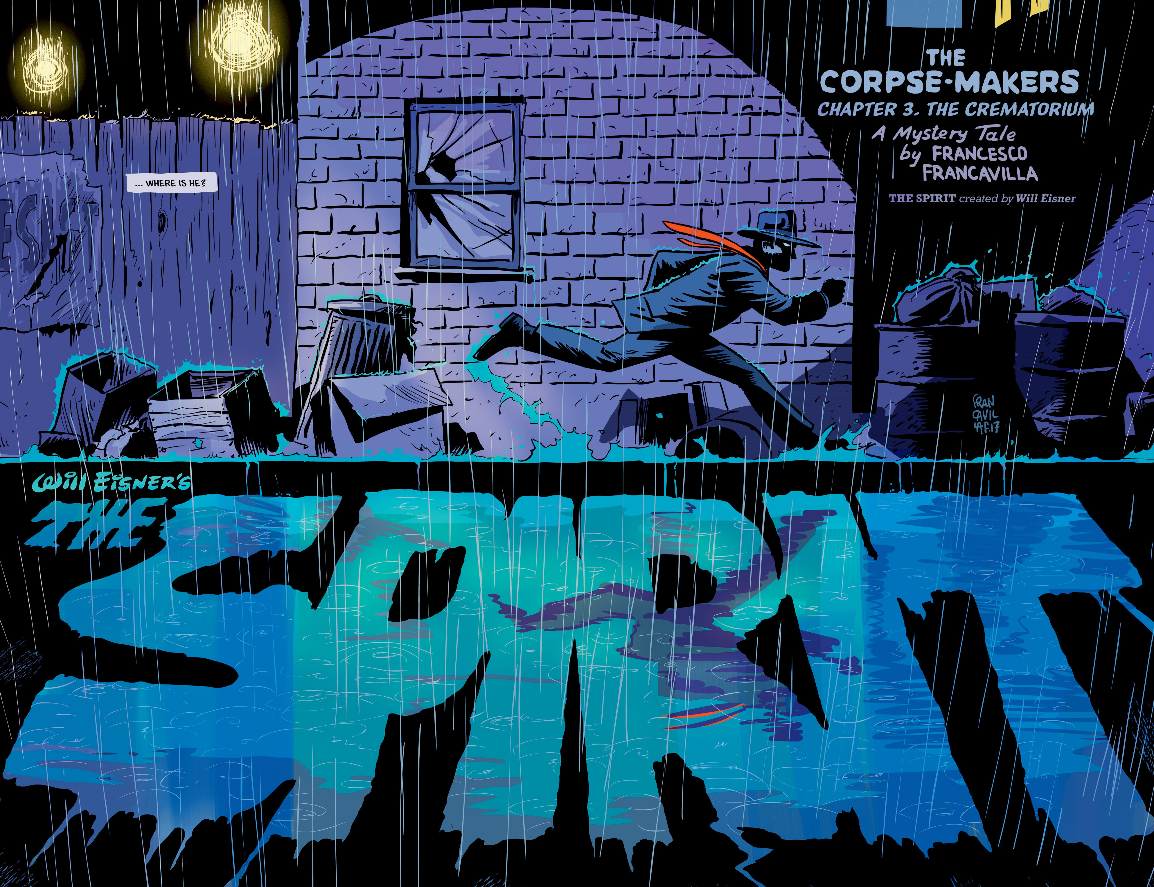 The Spirit: The Corpse-Makers #3
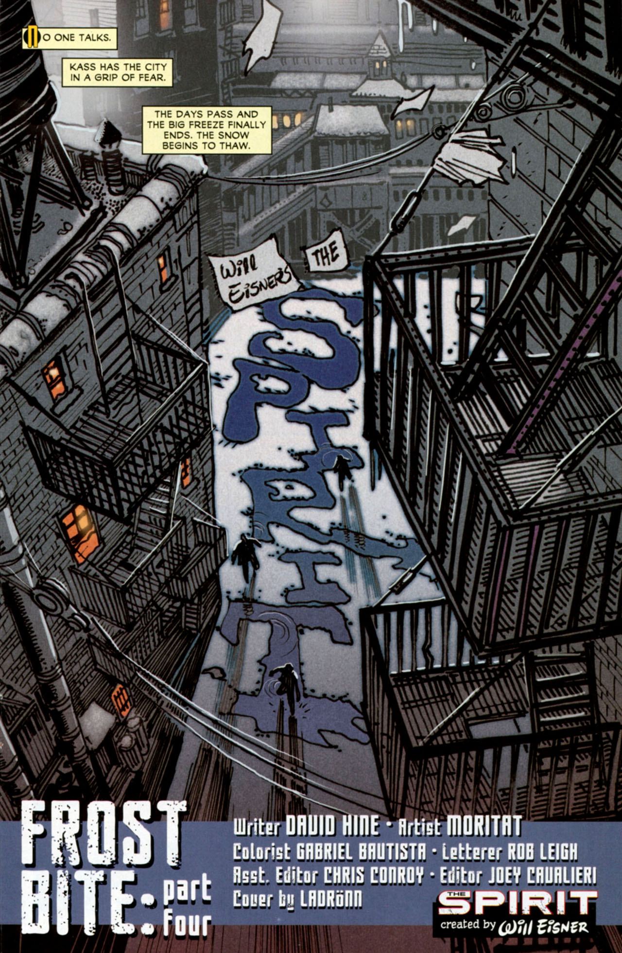
One of the grimmest takes on this property was actually published by DC back in 2010-2011, as part of their pulpy ‘First Wave’ line. Initially written by Mark Schultz and, since issue #4, by David Hine, with regular art by Moritat, that series loosely reimagined The Spirit’s world and characters while delivering a two-fisted crime saga with a trashy, surrealist edge that was not too far from Sin City (another comic that was no doubt inspired by Will Eisner’s early work). Mining the same type of material that must have influenced Eisner in the first place, this neo-noir version of The Spirit captured the nightmarish, hardboiled vibe of a Cornell Woolrich yarn and the gritty aesthetics of postwar movies like The Naked City, The Racket, and Force of Evil.
Moritat was more than up to the task of designing remarkable splashes that ingeniously integrated the comic’s name – at one point, he even got away with writing ‘The Spirit’ in cocaine lines! However, it annoyed me that, in most issues, letterer Rob Leigh (I assume it was him) made little effort to smoothly blend each story’s title into the images, bluntly superimposing his own titles and credits over Moritat’s carefully constructed logos in a whole different style…
 The Spirit (v3) #7
 The Spirit (v3) #12
(You may have to squint to spot this last logo, written through the building’s shape, but it’s totally worth it…)
These awkward clashes stand out even more because, every once in a while, Leigh did manage to merge story title and artwork more organically, leaving us yearning for a more consistent effort to do so. Crucially, the series’ very first title page created expectations that weren’t matched by most subsequent issues:
 The Spirit (v3) #1

(That said, the credits in issue #8 are pretty good as well.)
Likewise, although I understand the gesture (not least for legal reasons) of explicitly crediting Will Eisner for the series’ original creation, I don’t see why Rob Leigh – or perhaps somebody else at DC – decided this had to be done through the addition of such a glaring standard extra logo, diminishing the power of Moritat’s designs. After all, if you scroll up back to the splash pages by Darwyn Cooke and Francesco Francavilla, you can see their letterers (Jared Fletcher in the former, Francavilla himself in the latter) were both able to credit Eisner in unobtrusive ways.
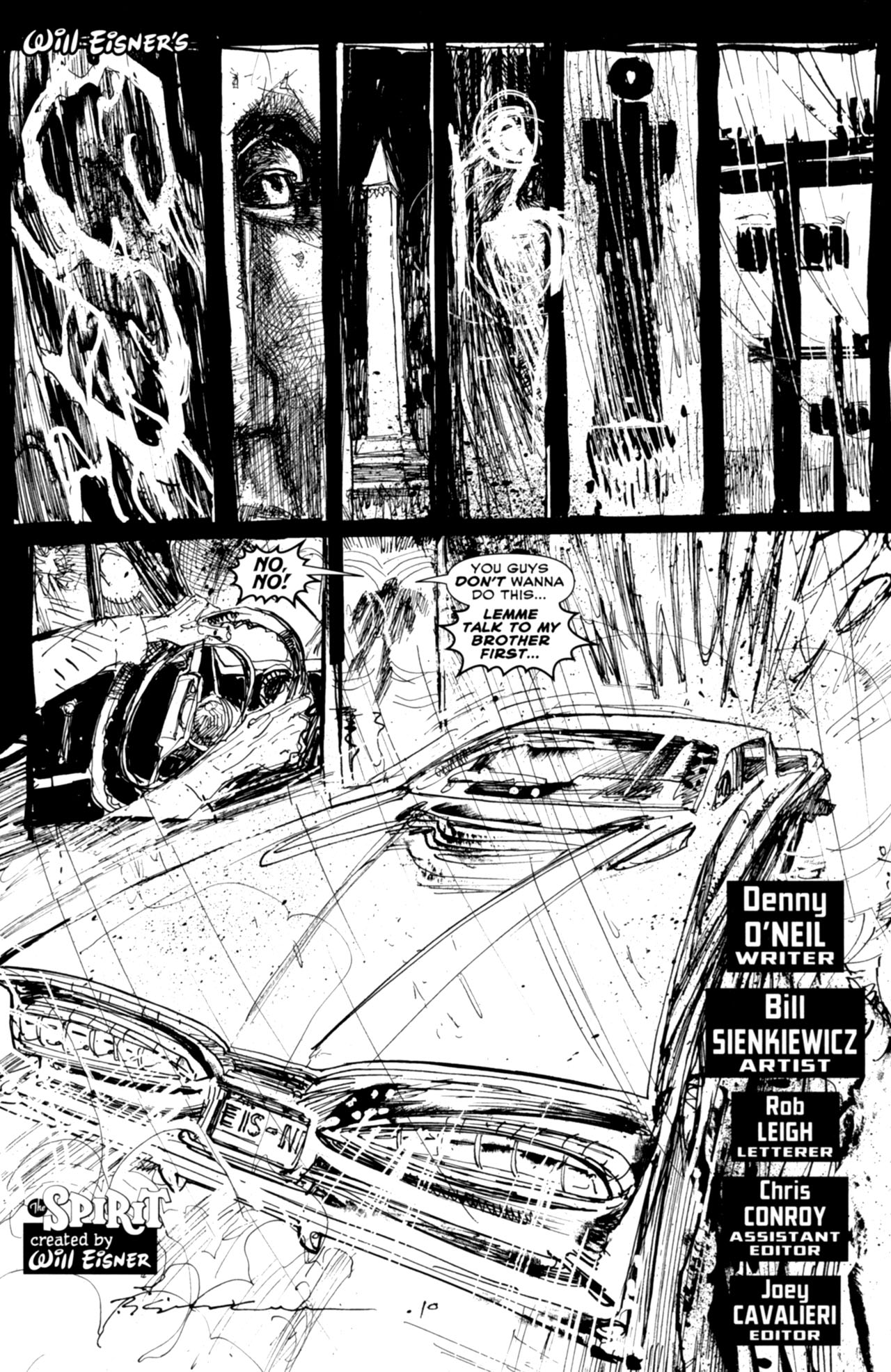
I have the same problem with Leigh’s work in the black & white backups. For example, the amazing Bill Sienkiewicz did such a splendid job with the title page below that it’s a damn shame the image was partially spoiled through the addition of a more conventional logo to the bottom left corner…
 The Spirit (v3) #1
(Did Will Eisner’s signature really have to show up twice in the same page? Did the logo at the bottom really have to be so close to the license plate, drowning the reference inside the picture itself? Shouldn’t the splash in the lower half of the page be given more room to breathe?)
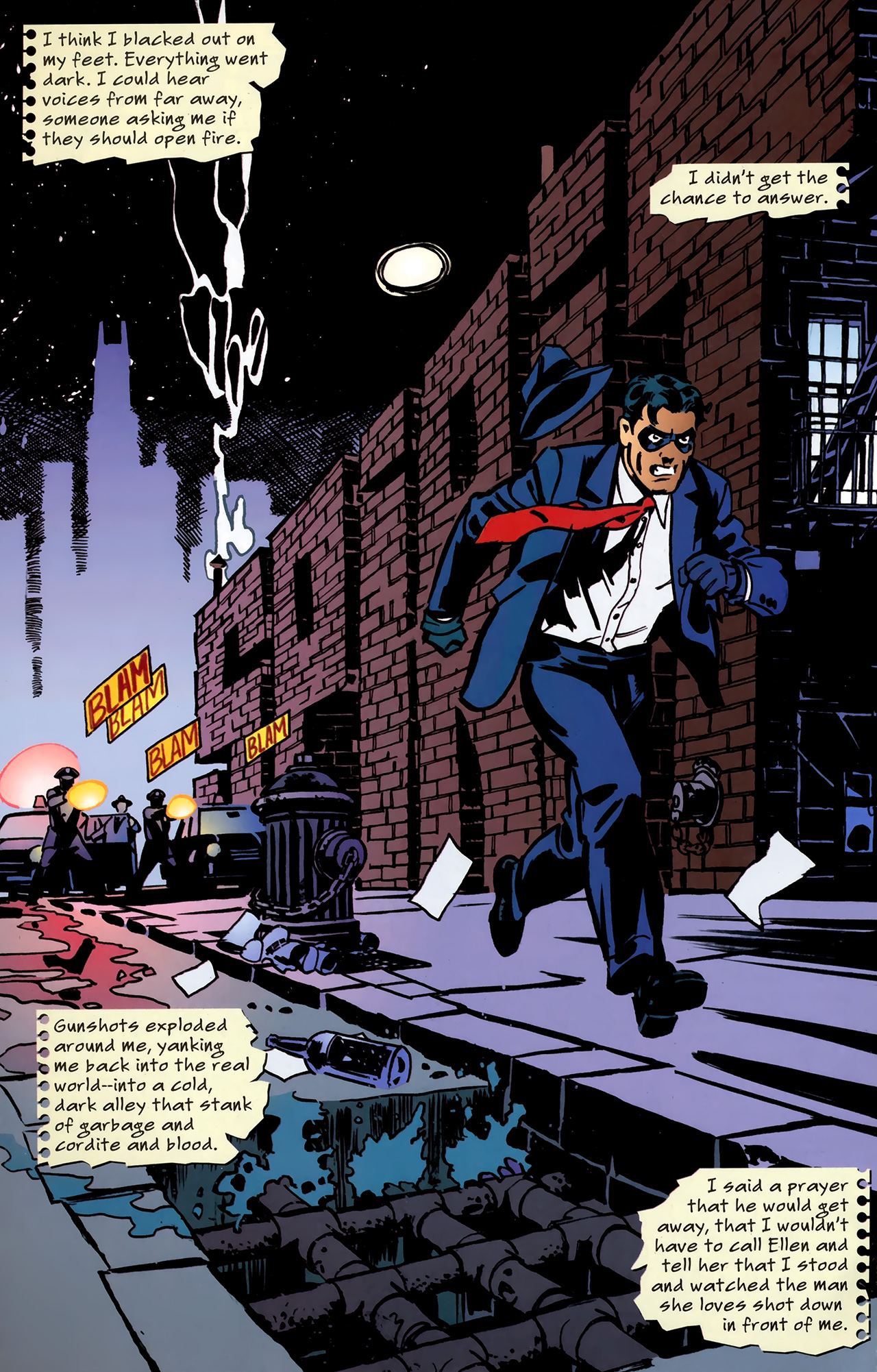
As for the writing, while David Hine has repeatedly displayed a willingness to push the boundaries of comic books that is truly worthy of Eisner (as seen, most notably, in Strange Embrace and The Bulletproof Coffin), his work on The Spirit didn’t do much to break the mold. For the most part, the result were solid genre comics, wrapping Denny Colt in an intricate web of drugs, corruption, revenge, human traffic, organized crime, sexy dames, and relentless violence. Oh, and don’t forget the killer robots!
The major exception in terms of the series’ formal experimentation was ‘The Big Picture’ (#16, cover-dated September 2011), a bravura tribute both to Will Eisner’s daring narrative tricks and to The Spirit’s trademark openings… The whole story was told through splash pages and all of them incorporated variations of the series’ logo in one way or another:
 The Spirit (v3) #16
(The smoky ‘The’ is especially nifty!)
I was actually quite unfair in failing to include ‘The Big Picture’ in my top non-Eisner Spirit comics, when I did a post about them a while back. David Hine, Rob Leigh, colorist Daniel Vozzo, and guest-artist John Paul Léon all did an excellent job of creating splashes that are not only gorgeous on their own, but which also channel (without copying) Will Eisner’s specific designs.
For instance, the page above seems to combine elements from these two classics:
 The Spirit – November 20, 1947
 The Spirit – January 15, 1950
The story itself was a bit meta, since it consisted of a mistaken identity thriller in which another vigilante – with a more vicious attitude – dressed up in the same costume as our hero, arguing that the Spirit was not a man, but an idea. While simple and ultimately clichéd, this premise nevertheless suggested a veiled acknowledgement of the fact that all these series appropriating Will Eisner’s creation could never fully replace the original, no matter how much they tried to simulate its appearance.
The final page of the issue – and of David Hine’s run – clinched this notion in the form of Commissioner Dolan’s closing words, which can be read as applying to the Spirit (within the story) and to Eisner himself (in the real world)…
 The Spirit (v3) #16
And if you think I’m forcing this reading, bear in mind that the paper strips flying in the wind have probably drifted here from one of Will Eisner’s most famous splashes: