In a world of uncertainty and subjective truths, inexorably spinning towards its entropic doom, there is one unshakable idea we can all hold on to: Ed Hannigan is one of the greatest cover artists to have ever graced Batman comics with his pencils.
Hannigan illustrated different titles, including the first five issues of Legends of the Dark Knight, which featured a clever motif of faces breaking through masks and vice-versa… this was conceptually interesting and it fitted in well with the story going on inside (for which he also provided interior art), but the images themselves were not that memorable. By contrast, working with inker Dick Giordano and colorist Anthony Tollin, in the 1980s Ed Hannigan drew a long run of unforgettable covers for Batman and Detective Comics. And because no one demanded it, here are my top 10:
10. Batman #355
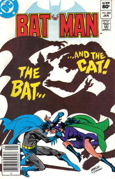 Hannigan’s very first Batman cover has a nice concept: Batman fights Catwoman, and their shadows are those of a humanoid bat and a humanoid cat. I would have done away with the caption identifying them as ‘The bat… and the cat!’ though, as it doesn’t add anything – readers can easily tell what the conflict in the comic is going to be without this tagline. Then again, if I actually had a say, 50% percent of Batman covers would feature dinosaurs, so take that as you will.
9. Detective Comics #524
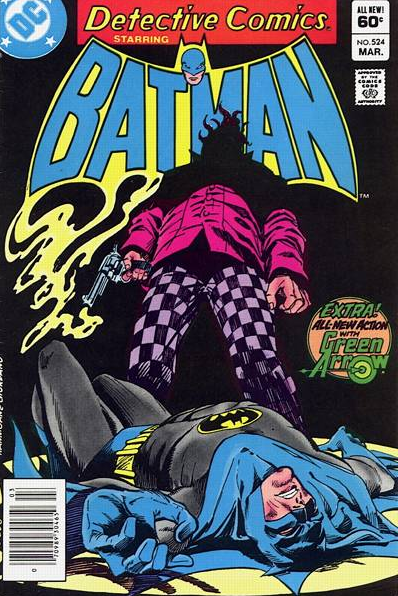 This one is so visually striking that I considered moving it up, but there is too much goodness still ahead! The dramatic pose, the encroaching shadows, the way the smoke from the gun merges with the logo… Furthermore, if you had been following the story on the monthly titles, you would have known that the shooter is called Squid, which is just what his hair looks like in the silhouette.
8. Batman #360
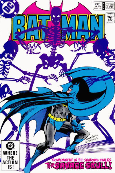 As it will soon become clear, I’m a huge fan of covers that play with the titles’ logo on top of the page. You can tell from previous examples how during this period the logos featured Batman’s tiny head at the center of the Bat-symbol… In this cover, the way a skeleton’s strategically placed skull replaces Batman’s face may be meaningless in symbolic terms, but it looks freaking cool!
7. Batman #377
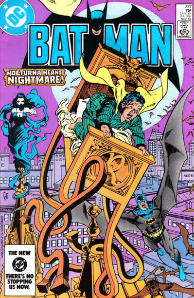 Besides playful logos, the other trick I’m a sucker for are homages… This is why I’m so grateful to Brian Cronin for using his encyclopedic knowledge to spot cover homages each week. Here Hannigan, Giordano, and Tollin riff on the classic strip Little Nemo in Slumberland, with Jason Todd as Nemo being carried through the land of dreams. What makes it even cooler is that this fits thematically with the story inside – which involves a nightmarish Nocturna and a desperate Batman fighting for Jason’s custody.
6. Batman #356
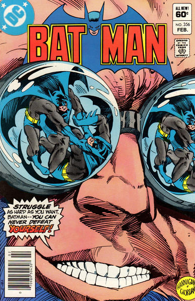 This is one of those covers that just gets engrained in your memory. Besides the neat visual of the Dark Knight’s reflection on Professor Hugo Strange’s lenses, there is the enthralling notion of Batman strangling another Batman, made even more intriguing by Strange’s ominous words.
5. Batman #358
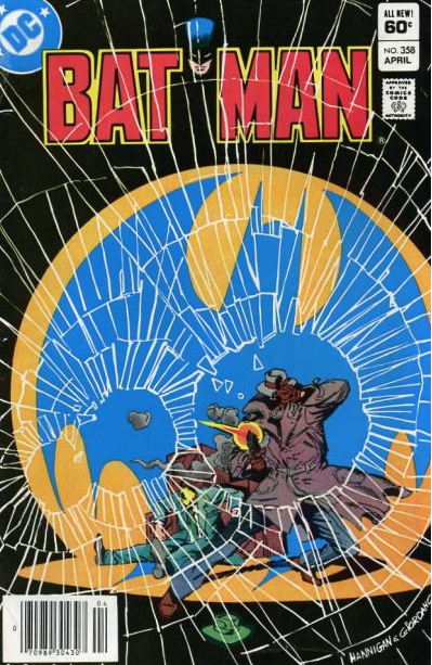 Such a powerful image doesn’t need much explanation. The shooter (Killer Croc) seems to be shattering the cover itself as he presumably pierces the Bat-signal with his bullets. Also, because part of this month’s Bat-logo is black, it gets diluted in the image’s black background. Neat.
4. Batman #362
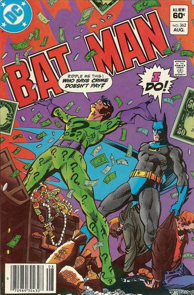 Speaking of putting a twist on the logo’s bat-shaped portion… Here Hannigan tilts the title to the left and projects a huge Batman shadow on top of it, which basically replaces the usual design. Also, you’ve got to love the contrast between the Riddler’s gloating rhetorical question and Batman’s I-just-defeated-your-henchmen, straight-faced reply!
3. Batman #369
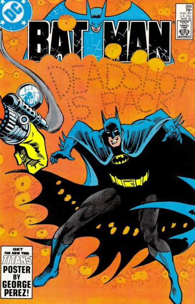 Here the logo gets shot up, like everything else, as the hitman Deadshot shows off his marksman skills, almost castrating the Caped Crusader in the process… There is nothing particularly clever about this, but it is nevertheless an awesome image.
2. Batman #367
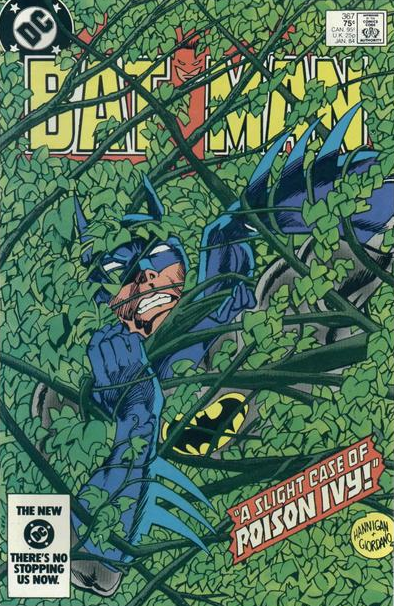 Another one where the logo comes under attack by a villain, this time by Poison Ivy’s weeds. I love the whole green effect and just wish they had gone overboard with the concept, also partially covering up the tagline, the price, and DC’s boasting in the lower corner.
1. Batman #370
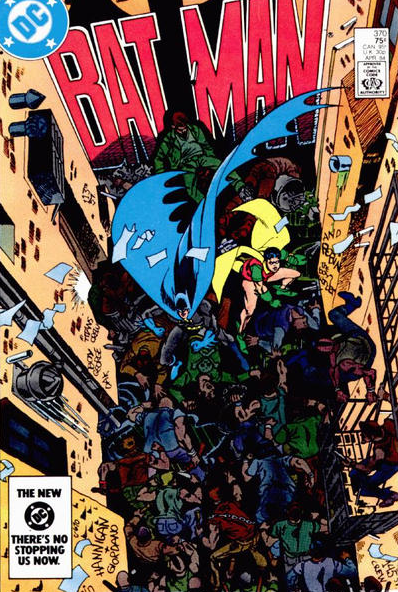 And finally there is this gem. The Dynamic Duo fighting a gang of hoodlums in an alley which is so crowded that they find themselves with their backs against the book’s title. As if the notion of the Batman logo painted on a wall wasn’t cool enough, the logo is amusingly framed by other walls that are also filled with writings, the closest one adding ‘and Robin the Boy Wonder’ (and another one sporting Hannigan’s and Giordano’s signature). Plus, the flying trash and the dripping pipes manage to give the scene even more of a gritty vibe. So groovy.
NEXT: The henchman manifesto.
The ways Hannigan played with the Batman logo remind me of Will Eisner’s The Spirit, which probably is as high of a praise as comics can get.
Great job on a great site! Please keep it up!