Jordan Peele’s The Twilight Zone has started off on the wrong foot. It’s not just that most episodes so far have been weaker than 90% of Rod Serling’s original series (or, at least, 90% of the first three seasons, since the show became more uneven in the final years) – even setting aside that comparison, we’ve seen much better versions of Twilight Zone-style fiction in recent times, from Black Mirror to Peele’s own Get Out. Indeed, 21st century identity politics are ripe for the kind of fusion of nightmarish science fiction/fantasy and social commentary that lies at the heart of the TZ franchise. I can even see how cool this sounded at the pitching stage: remaking ‘Nightmare at 20,000 Feet’ to reflect post-9/11 terror-in-the-air paranoia; turning ‘It’s a Good Life’ into an allegory about Trump; doing a variation on ‘A Most Unusual Camera’ and ‘A Kind of Stopwatch’ that taps into Black Lives Matter… The problem lies with the execution.
The worst offender of the lot was the very first episode, ‘The Comedian’ (in which, oddly enough, nobody seems to understand how comedy works or the fact that lasting success is related to the audience’s ability to recall the material), closely followed by the heavy-handed ‘Not All Men’ (an ultra-simplistic take on toxic masculinity that feels particularly underwhelming when compared to the way the topic was handled in the latest seasons of BoJack Horseman and Luke Cage). Admittedly, the demagoguery and naiveté affect me more here because 2019’s TZ addresses current debates – as opposed to the original’s engagement with the ‘50s/’60s zeitgeist – but it’s not just that. After all, Twilight Zone has certainly never been about subtlety as much as about visualizing pervading anxieties in imaginative and powerful ways. Yet even the episodes that come the closest to doing a millennial version of this, like ‘Replay’ and ‘A Traveler,’ drag for too long and cannot help but feel annoyingly predictable or repetitive before they’re over. It’s a shame that (except for ‘Six Degrees of Freedom,’ a genuinely tight slice of sci-fi) the latest TZ incarnation misses the main strength of the original, namely the fact that Serling’s team absolutely mastered the language of short stories, telling neatly tied standalone tales that left on a high note without overstaying their welcome (the drop in quality in the fourth season was, in part, a result of CBS stretching the running time).
I don’t think I’ll stick around. In an anthology series, there really needs to be a reliable batting average… And since I was left hungry for ingenious narratives that successfully use a brief, self-contained format in satisfying ways, I decided to do another list of brilliant sci-fi short stories from comics across the ages:
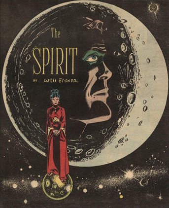
‘Visitor’ (originally published in The Spirit newspaper strip, February 1949), by Will Eisner (script and art), Abe Kanegson (letters)
This classic tale from Will Eisner’s acclaimed run on The Spirit seamlessly merges that series’ film noir motifs with a foray into pulpy sci-fi, as the titular masked detective investigates a bank robbery and finds himself in the middle of an extraterrestrial conspiracy. ‘Visitor’ is a beautiful sample of what made Eisner’s work so groundbreaking – the panel borders shift to evoke flashbacks, deacceleration of time, and the ultimate dissolution of reality; the layouts hypnotically carry you up and down the pages; the distorted angles and POVs give the whole thing a dreamlike quality; the body language flows from humor (the Spirit on the phone) to action (the old carpet trick) and sensuality (Cosmek’s smoldering femme fatale).
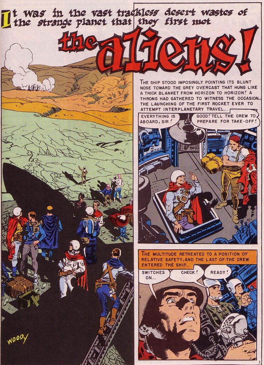
‘The Aliens!’ (originally published in Weird Science #7, cover-dated May-June 1951), by Bill Gaines, Al Feldstein (plot), Al Feldstein (script), Wally Wood (art), Marie Severin (colors), Jim Wroten (letters)
A tale of two species meeting on an alien planet, their miscommunication a clear allegory of the Cold War escalation in the early 1950s (a core theme at EC Comics). I particularly like the final panel, which poignantly anticipates the notion that it is the Third World who will pay the ultimate price.
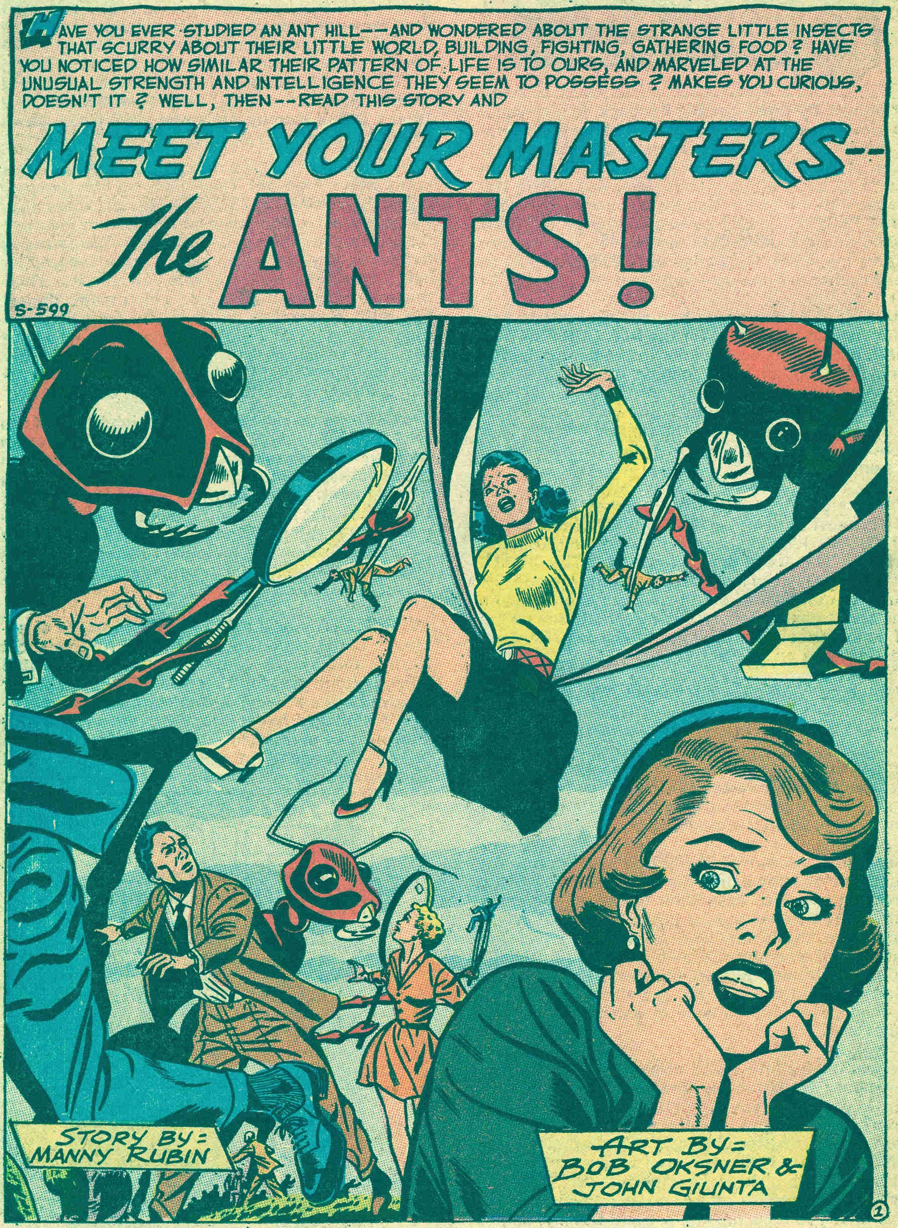
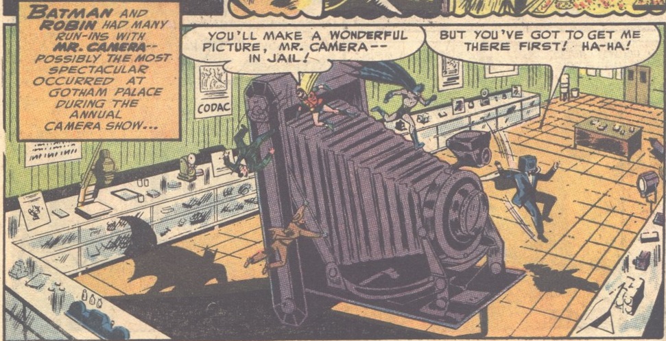
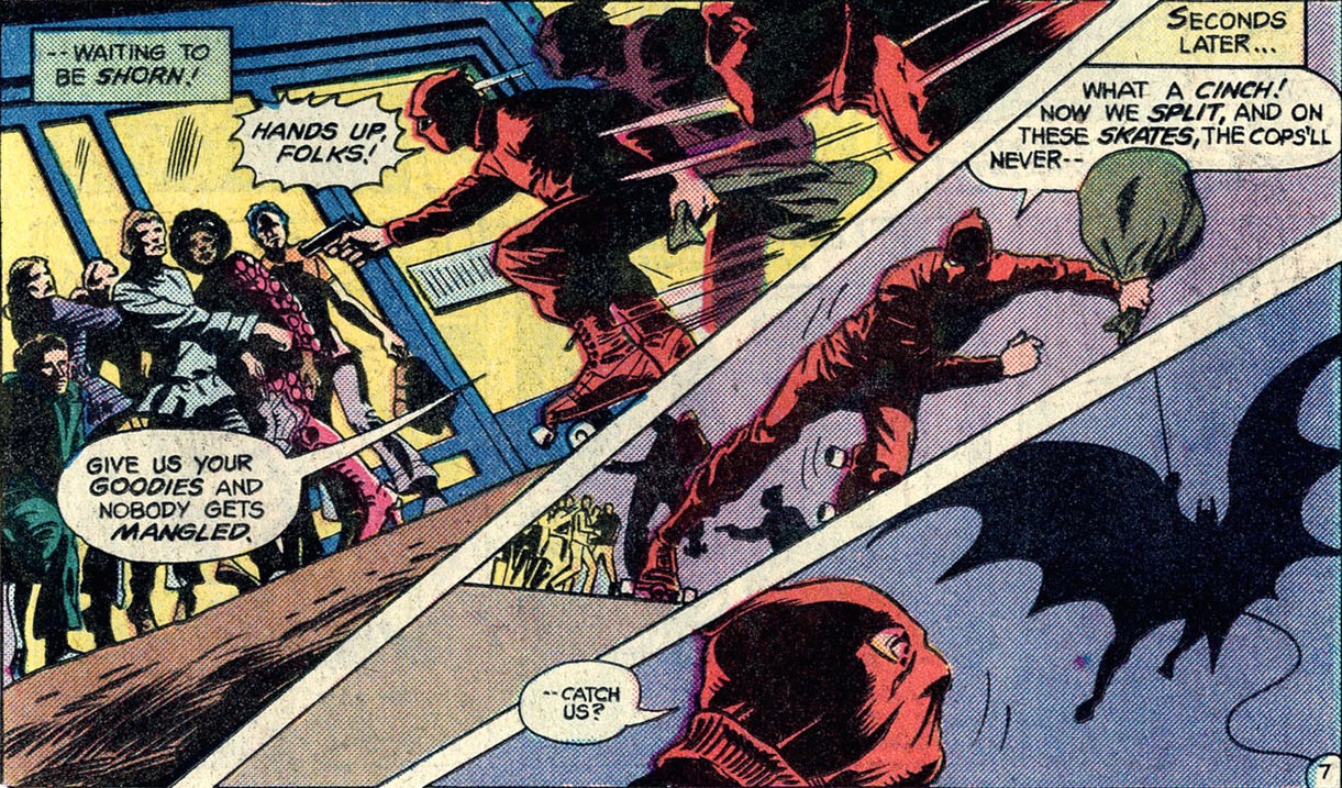
‘Meet Your Masters – the Ants!’ (originally published in Strange Adventures #23, cover-dated August 1952), by Mann Rubin (script), Bob Oksner (pencils), John Giunta (inks)
The science in this story about a world where humans are the insects is hardly foolproof, but every single page has at least one amusing idea. Above all, this is a pretext to watch haunting images of giant ants (creepily brought to the page by Bob Oksner’s mise-en-scène), a visual that was echoed two years later in the awesome horror film Them!
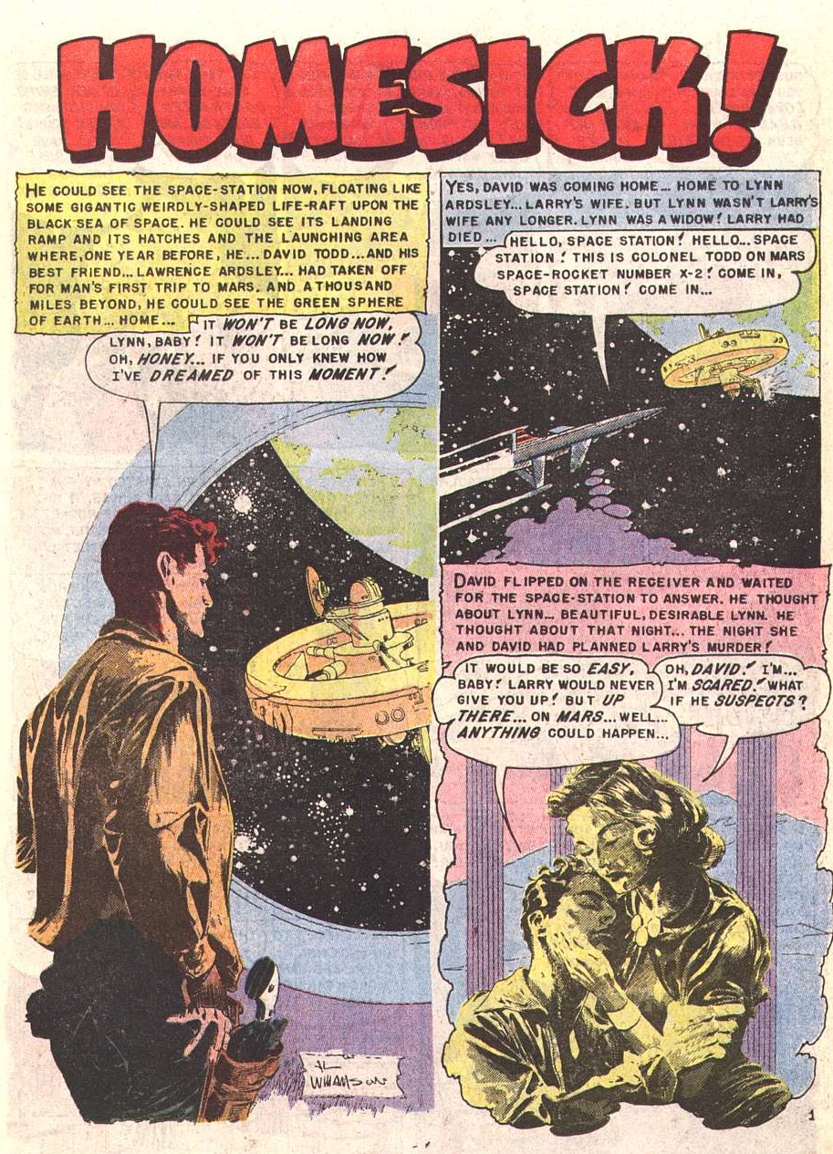
‘Homesick!’ (originally published in Weird Fantasy #18, cover-dated March-April 1953), by Al Feldstein (script), Al Williamson, Roy G. Krenkel (art), Marie Severin (colors), Jim Wroten (letters)
Throughout his career, Al Williamson made a mark as one of the best artists at evoking romantic heroism and old-school cliffhanger serials (he even did a series called Cliff Hanger, with Bruce Jones, as a backup to the Hitchcockian thriller Somerset Holmes). Back in his EC days, though, writer-editor Al Feldstein often preferred to throw Williamson twisted plots with tragic endings, which resulted in stunningly atmospheric blends of noir and sci-fi, such as ‘Homesick!’
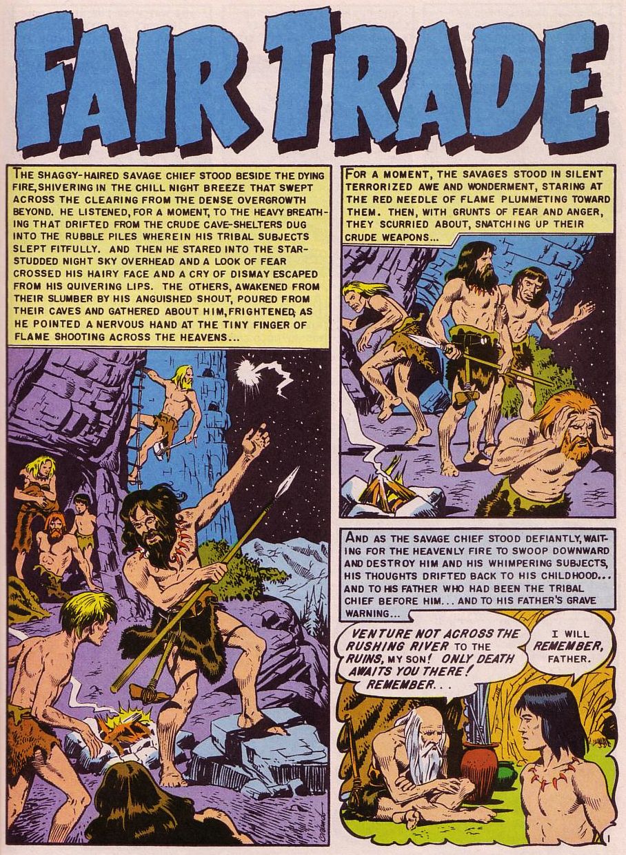
‘Fair Trade’ (originally published in Weird Science-Fantasy #23, cover-dated Spring 1954), by Bill Gaines, Al Feldstein (plot), Al Feldstein (script), Joe Orlando (art), Marie Severin (colors), Jim Wroten (letters)
While Al Feldstein’s script is needlessly wordy and the political message is pretty in-your-face, ‘Fair Trade’ is still a shining example of science fiction critically conjuring up both the future and the past, including through a striking final panel.
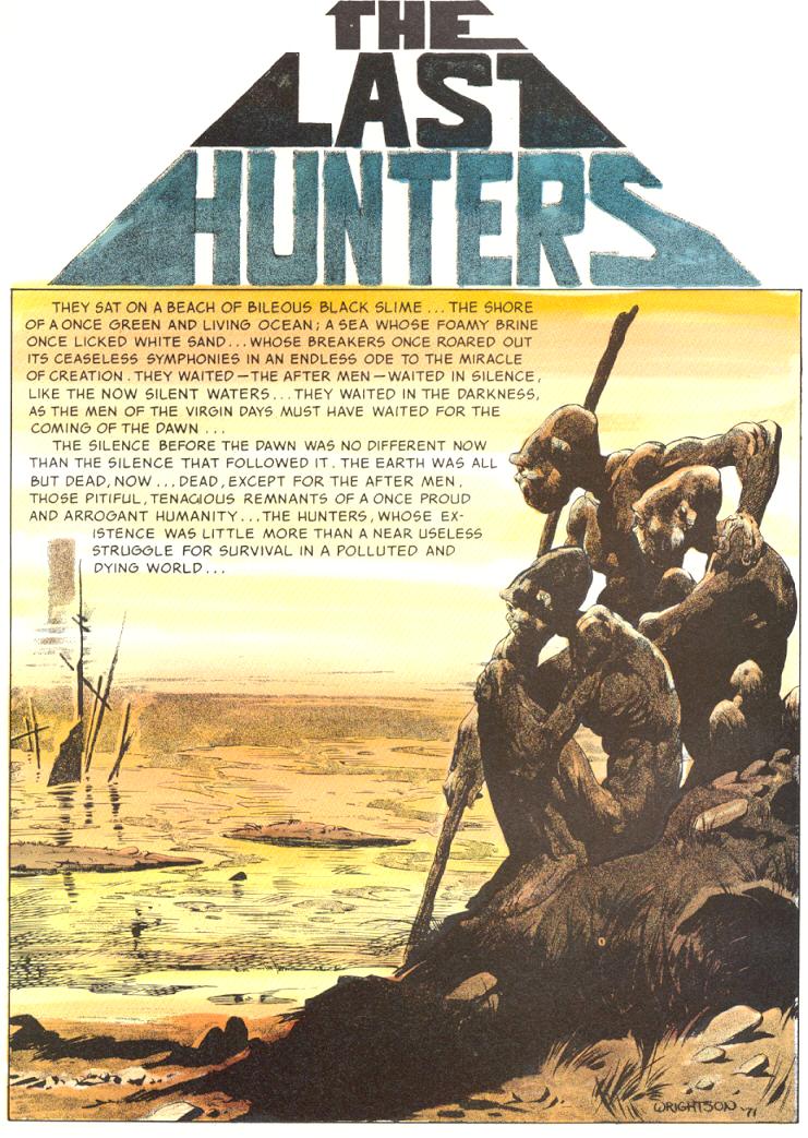
‘The Last Hunters’ (originally published in Badtime Stories, cover-dated 1972), by Bernie Wrightson (script and art), Ray Kohloff (letters)
A mesmerizing post-apocalyptic tale filled with sumptuous prose and powerful visions. As usual, Bernie Wrightson’s ghoulish style channels classic horror and German expressionism, bringing to mind the kind of stark visuals you’ll find in Rüdiger Suchsland’s From Caligari to Hitler. (The scan above is from the reprint in Master of the Macabre #3, with moody colors by Steve Oliff.)
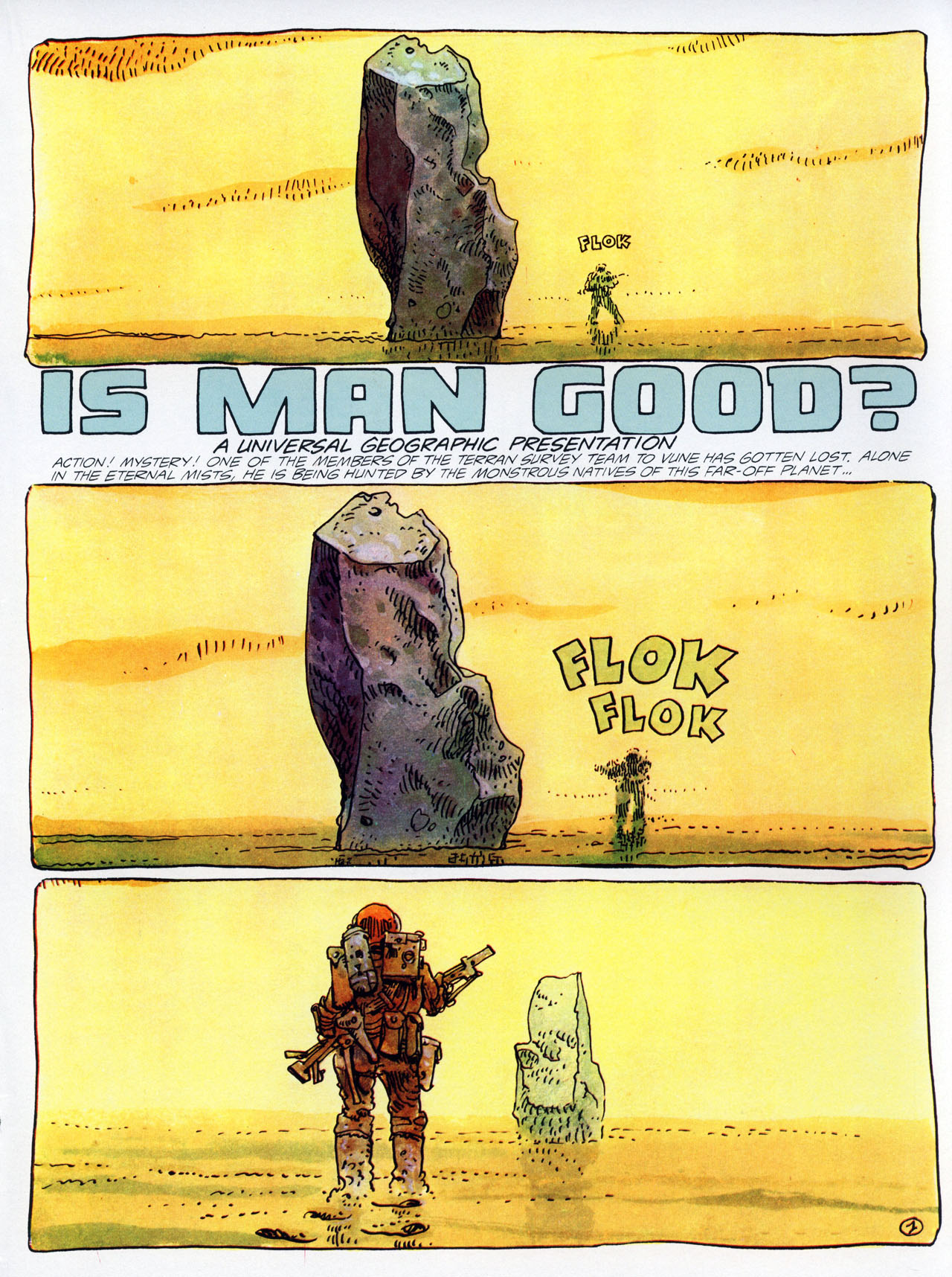
‘Is Man Good?’ (originally published in Pilote #744, cover-dated February 1974, translated version published in The Long Tomorrow & Other Science Fiction Stories), by Moebius (script, art, colors), Jean-Marc Lofficier, Randy Lofficier (translators), Phil Felix (letters)
Despite the seemingly self-important title, don’t expect anything particularly deep out of ‘Is Man Good?’ This one is just a pure exhibition of Moebius’ uncanny ability to navigate awe, tension, action, gore, and dark comedy.
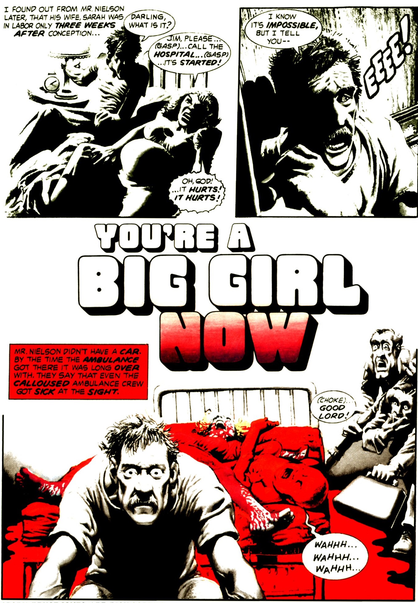
‘You’re a Big Girl Now’ (originally published in Eerie #81, cover-dated February 1977), by Bruce Jones (script), Richard Corben (art, colors)
Speaking of visually-commanding storytelling, this macabre farce about a giant girl allows the great Richard Corben to draw – and, crucially, color – one nightmarish image after another. Still, Bruce Jones’ script provides more than just a sick twist on the cult classic Attack of the 50 Foot Woman both by exploring the sci-fi ramifications of its premise and by imbuing the protagonists with a touching degree of humanity.
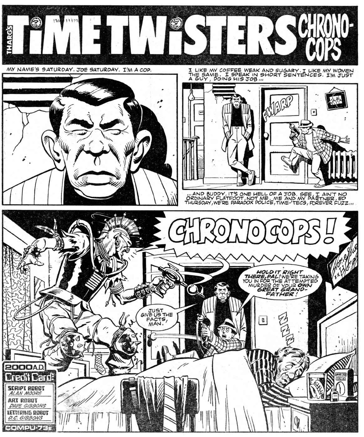
‘Chronocops’ (originally published in 2000 AD #310, cover-dated April 1983), by Alan Moore (script), Dave Gibbons (art), D.C. Gibbons (letters)
This hilarious romp about a Dragnet-style time-travelling cop plays with every paradox in the book. Although the absurdist tone is quite removed from their work on Watchmen, leave it to the team of Alan Moore and Dave Gibbons to pack each panel of ‘Chronocops’ with subtle gags that reward close reading.
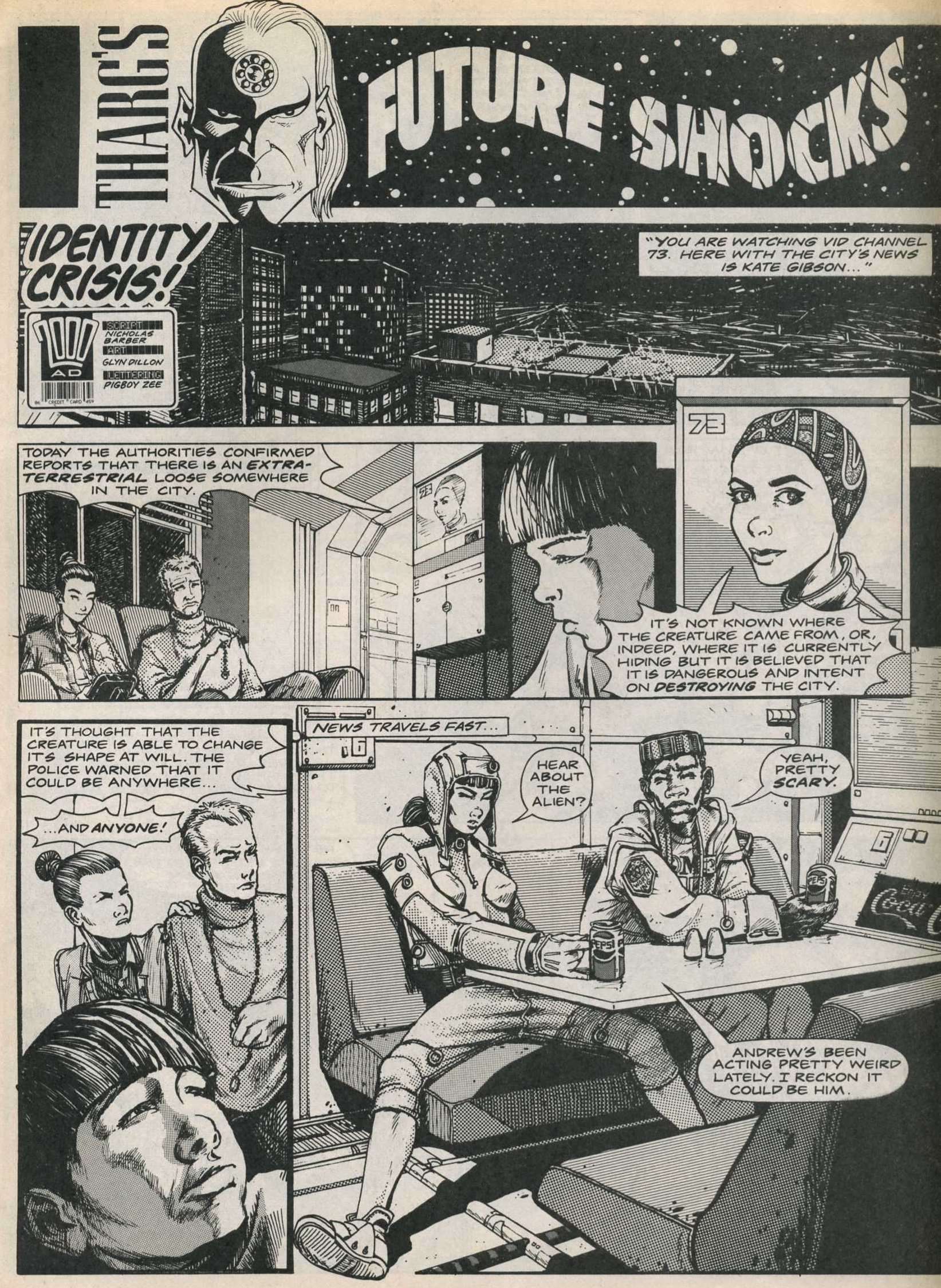
‘Identity Crisis!’ (originally published in 2000 AD #644, cover-dated September 1989), by Nicholas Barber (script), Glyn Dillon (art), Pigboy Zee (letters)
Let’s finish with a cyberpunk riff on one of the most famous Twilight Zone episodes. ‘Identity Crisis!’ revisits Rod Serling’s recurring musings on the fact that, even if there is an enemy out there, our own panic and paranoia can be terribly corrosive in their own way (a concern that was as relevant in the Cold War as it is now).