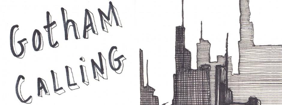
For the past couple of weeks, I’ve been spotlighting one of the trademarks of The Spirit, namely the way Will Eisner and later creators kept adjusting that series’ logo to fit the title pages, ingeniously inserting new designs into each particular image. Since The Spirit – along with Zorro, Dick Tracy, and The Shadow – is one of the main influences on Batman comics, it shouldn’t come as much of a surprise that a number of artists have tried to pull off a similar trick in the Bat-books.
After all, artists love playing with the logos on the covers, so why wouldn’t they do the same in the interior work?
That said, this is still rarer than you might think. The vast majority of Batman comics’ title pages either feature a pretty standard logo or – as it is often the case with modern comics – actually do without the logo altogether (it’s already on the cover, after all).
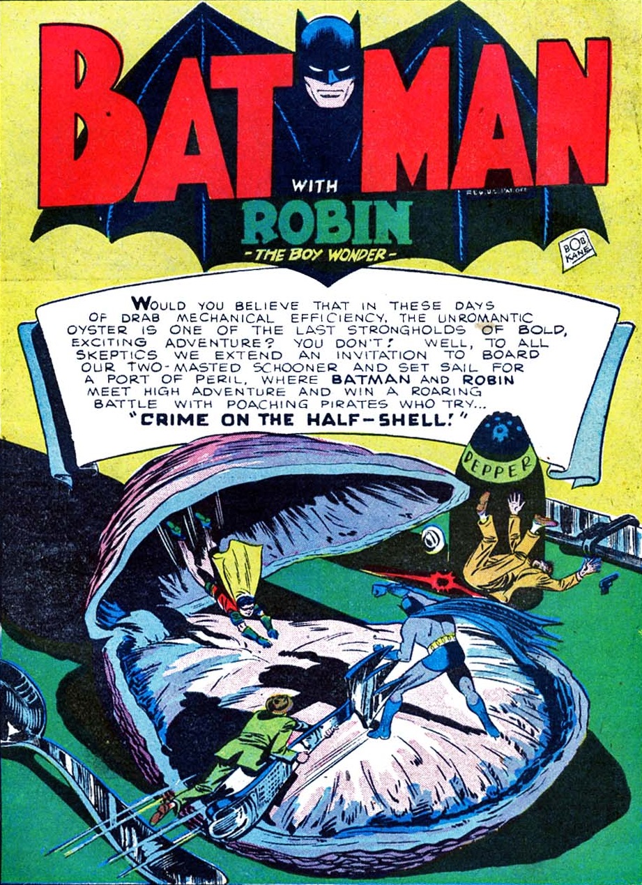
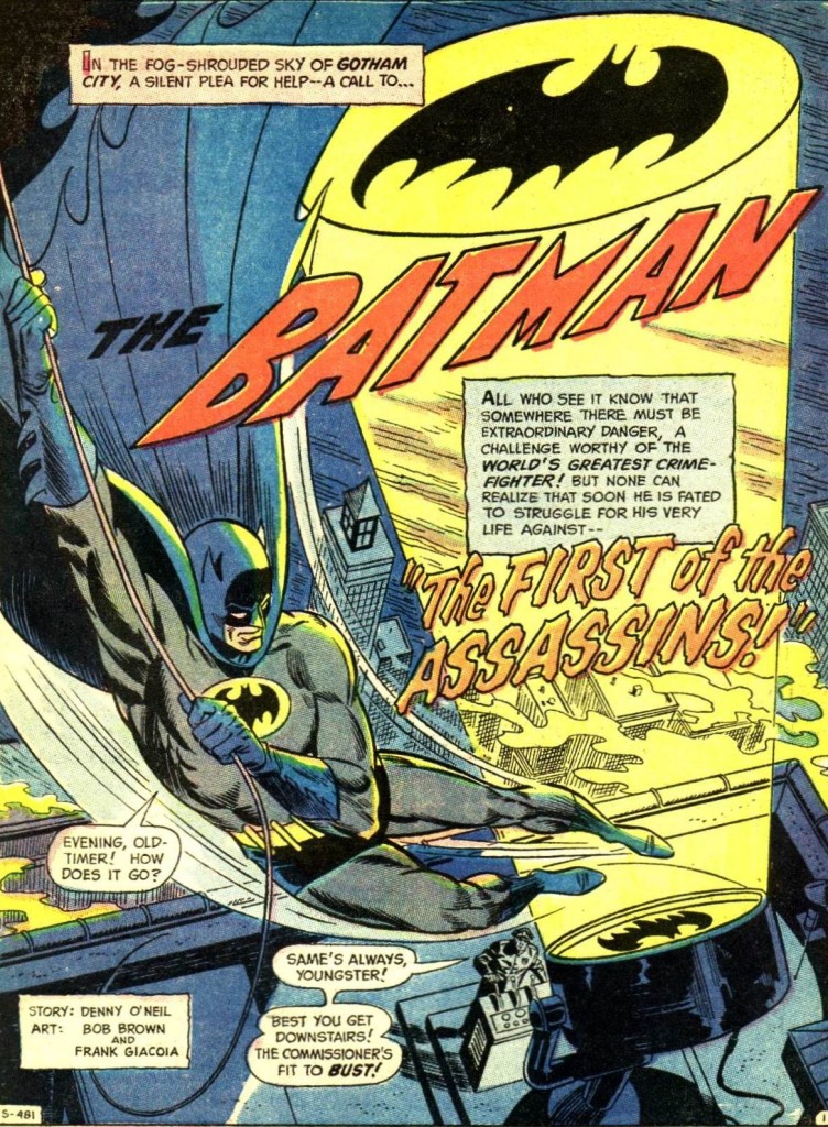
Bob Kane was no Will Eisner. If you go back to the franchise’s first decades, you’ll see that traditionally the series’ logo (which changed over time, but tended to consist of variations of a stylized bat shape with the Caped Crusader’s creepy face and the word ‘Batman’ in an art deco-ish font) hovered over each opening splash like a generic stamp or a fixed background with little relation to the rest of the image…
 Detective Comics #113
It was only in the 1970s that this rule became more flexible. Irv Novick’s opening pages were among the first to mess with the logo, although I’m not sure whether the credit for this should go to him or to letterer John Costanza.
Here is one of the earliest attempts, which still preserves the logo’s shape, but places it in a smooth continuum with the story title’s psychedelic design (and colors):
 Batman #225
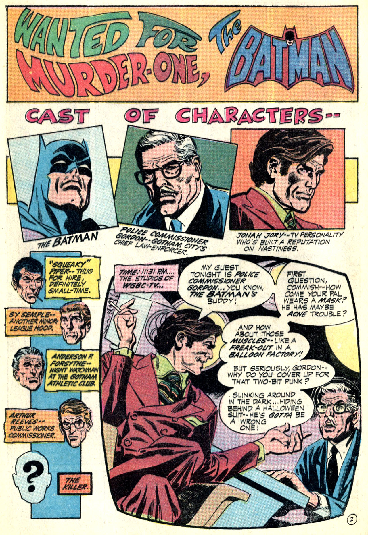
Notice that, while the logo remains stuck at the top, it doesn’t feel as isolated from the rest of the page because the whole layout is composed of separate boxes with similarly explicit information – except for the last box/panel, which transitions into the narrative by simulating a television screen!
One device that became increasingly common around this time was to move the series’ title away from the top, shifting it to different, specific areas of the page and thus allowing the words ‘The Batman’ to be incorporated into the initial narration while still standing out for readers at first glance. You can see an example of this device in the freaky beauty below (another Novick/Costanza collaboration):
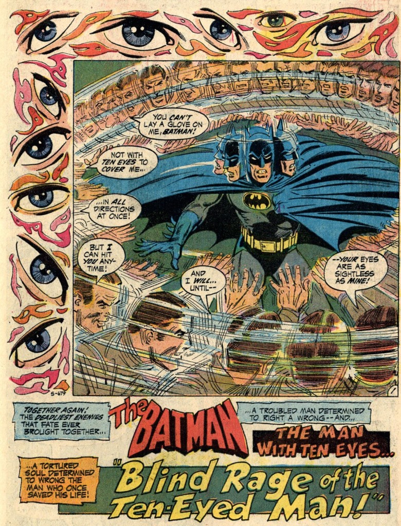 Batman #231

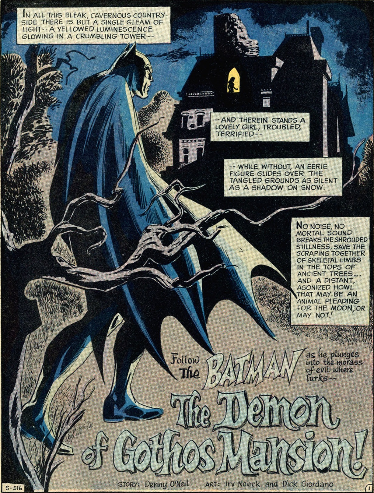
The example above (cover-dated May 1971) actually disregards the typical logo, replacing it with a headless design that seems more suited for this particular page. That was a relatively rare move in the early seventies, when most Batman title pages still displayed the standard logo, but it wasn’t an entirely isolated case, as editor Julie Schwartz clearly gave creators leeway to experiment every once in a while. The fact that they only did so occasionally made those specific stories feel more special from the outset.
Here are two original designs from issues lettered by Ben Oda:
 Batman #227
 Detective Comics #405

Notice how in both cases the series’ title (The Batman) isn’t just placed inside a sentence, but also redesigned to match the story title and genre: in the former with a gothic motif (it’s a horror tale), in the later tilted dynamically to the right (it’s more of an action yarn). Also in the latter, artist Bob Brown plays with the bat-signal, which projects the Dark Knight’s symbol (i.e. a version of the series’ typical logo) at the top of the page (where the logo used to be located, traditionally). In other words, following the footsteps of The Spirit, creators were increasingly molding the comic’s title and symbol into a more organic part of the opening pages.
I guess it was only a matter of time before some artists took things one step further and, much like Will Eisner often did, incorporated the series’ title into the diegetic image, as if the word ‘Batman’ (or sometimes the whole logo itself) had physically materialized inside the characters’ world, whether as a snow sculpture or as a billboard…
 Batman #244

 Batman #274
I’ve written before about how Archie Goodwin’s beloved run in Detective Comics in 1974 was full of these sorts of gimmicks. Indeed, the farther you delve into the Caped Crusader’s Bronze Age, the more Eisneresque examples you come across…
 Detective Comics #469
 Batman Family #6

(In these pages, the remaining credits are themselves discreetly integrated into the splashes, although that is a more common device.)
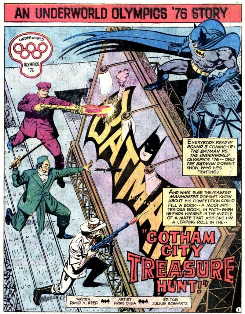
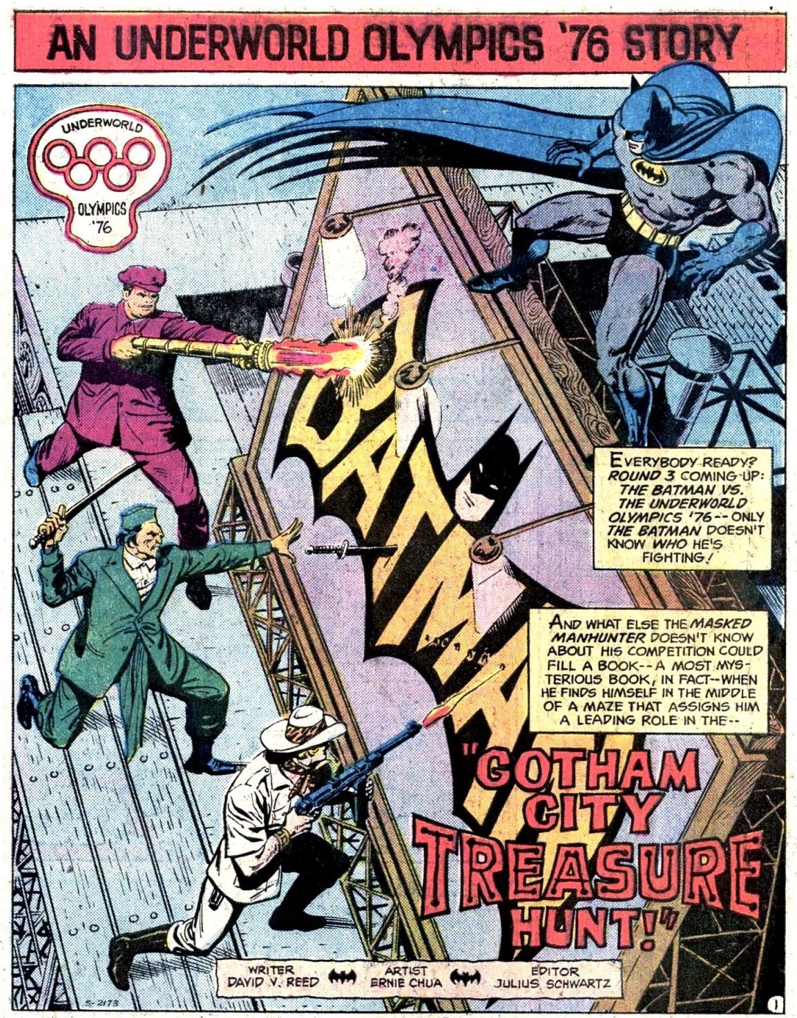
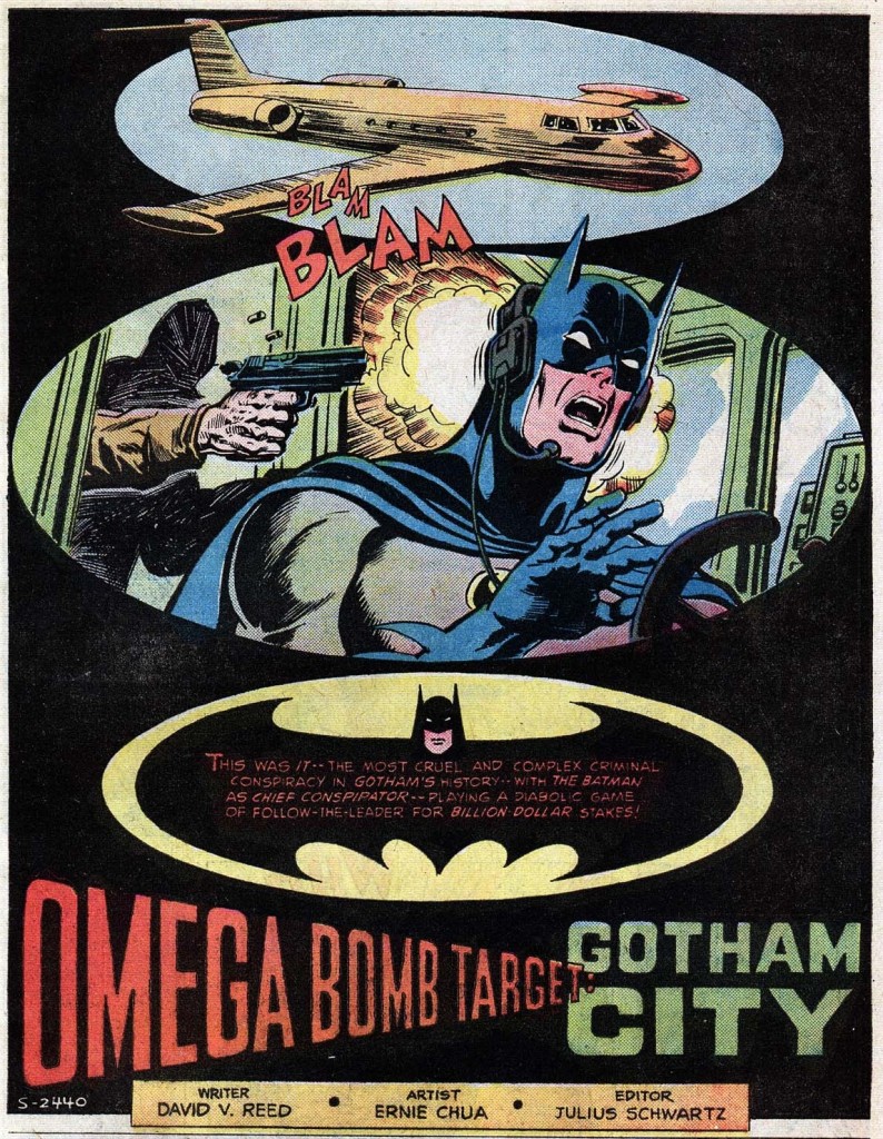
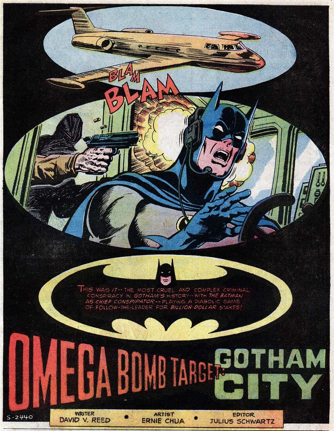
One artist who truly excelled at redesigning Batman’s logo in powerful, inventive ways was Ernie Chua (aka Ernie Chan), who was particularly active in both Batman and Detective Comics in the mid-to-late 1970s. Rather than inserting the logo into the story’s reality, Chua’s specialty was distorting it in striking ways, creating a string of splashes with a distinct pop art flavor…
 Detective Comics #461

 Batman #277
I’m not always the biggest fan of Ernie Chua’s work on Batman comics, whose overall style seems relatively mundane when compared to that of his energetic predecessors. When it comes to title pages, though, I think he was terrific!
Chua’s logo distortions, besides looking smashing, also did a swell job of suggestively conveying the mood and/or themes of the stories ahead:
 Batman #283
 Detective Comics #462
(Shame that Ben Oda couldn’t resist adding the standard logo to the caption at the bottom, since it takes some of the power away from the haunting logo at the top…)
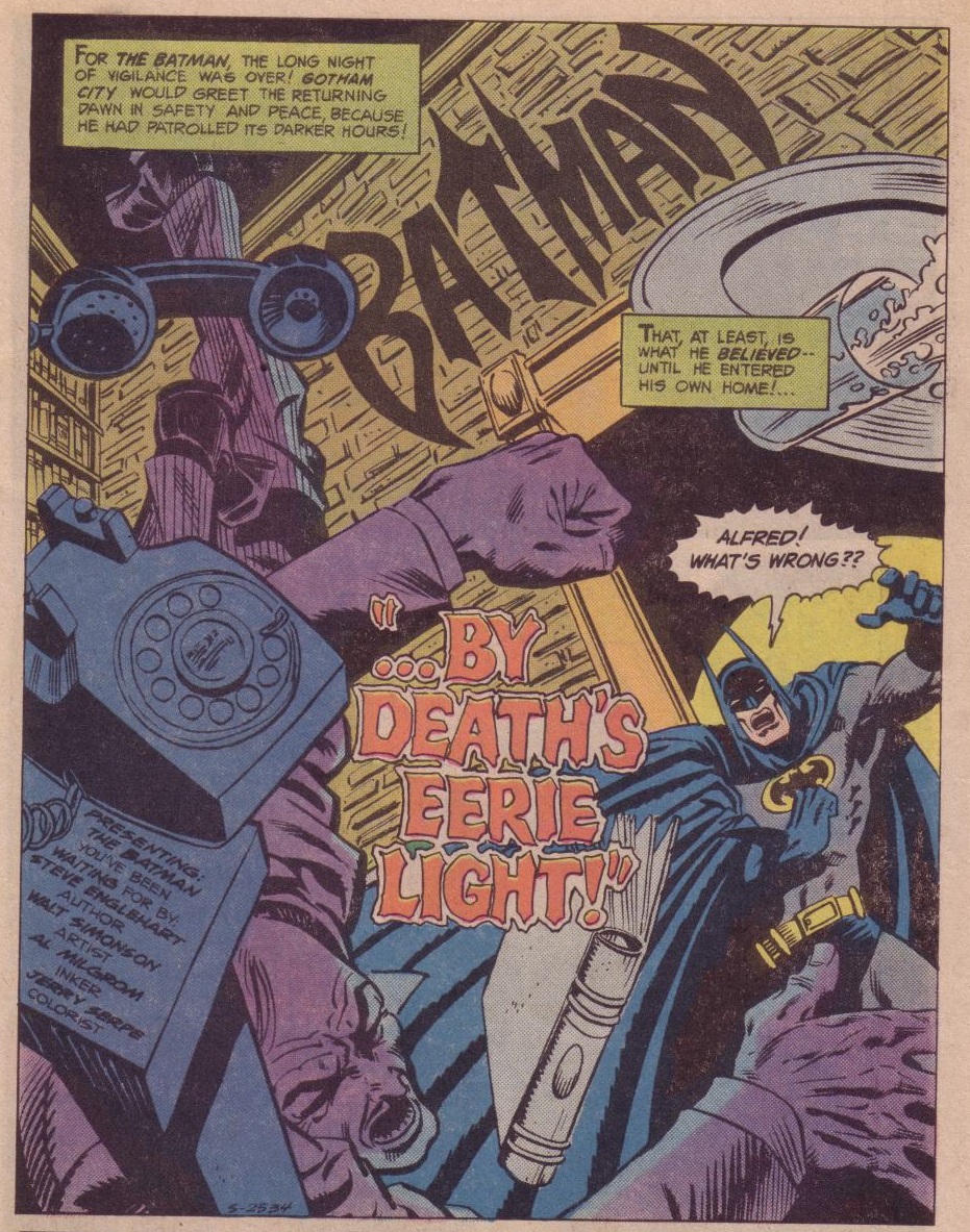
Speaking of creating a memorable atmosphere through distortion, I’m also a huge fan of this masterpiece by Walt Simonson:
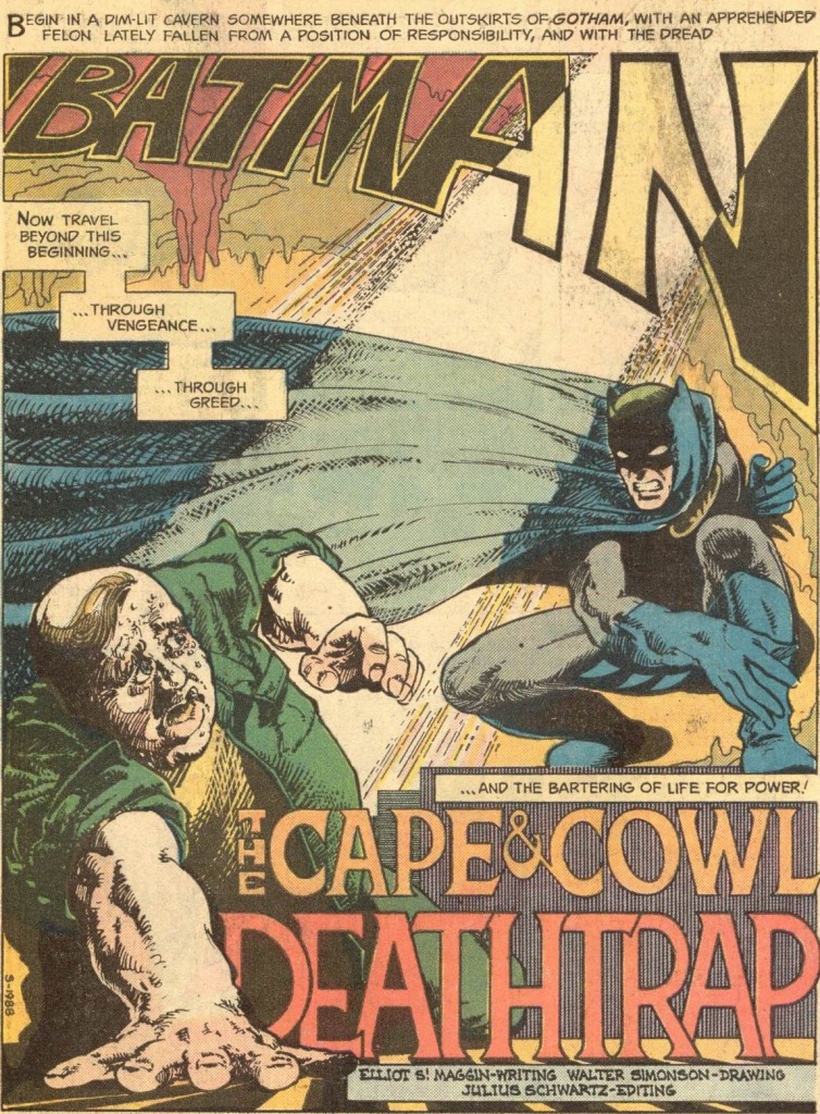 Detective Comics #450
It’s as if the word ‘Batman’ – like Batman himself – is encroaching upon the felon in an intimidating way… or perhaps reflecting what’s on his mind. Plus, I don’t know who the colorist was, but s/he deserves praise for that stylish effect with the sunlight! (I also appreciate the fact that the letters in ‘Deathtrap’ are casting shadows, enhancing this word’s ominous presence.)
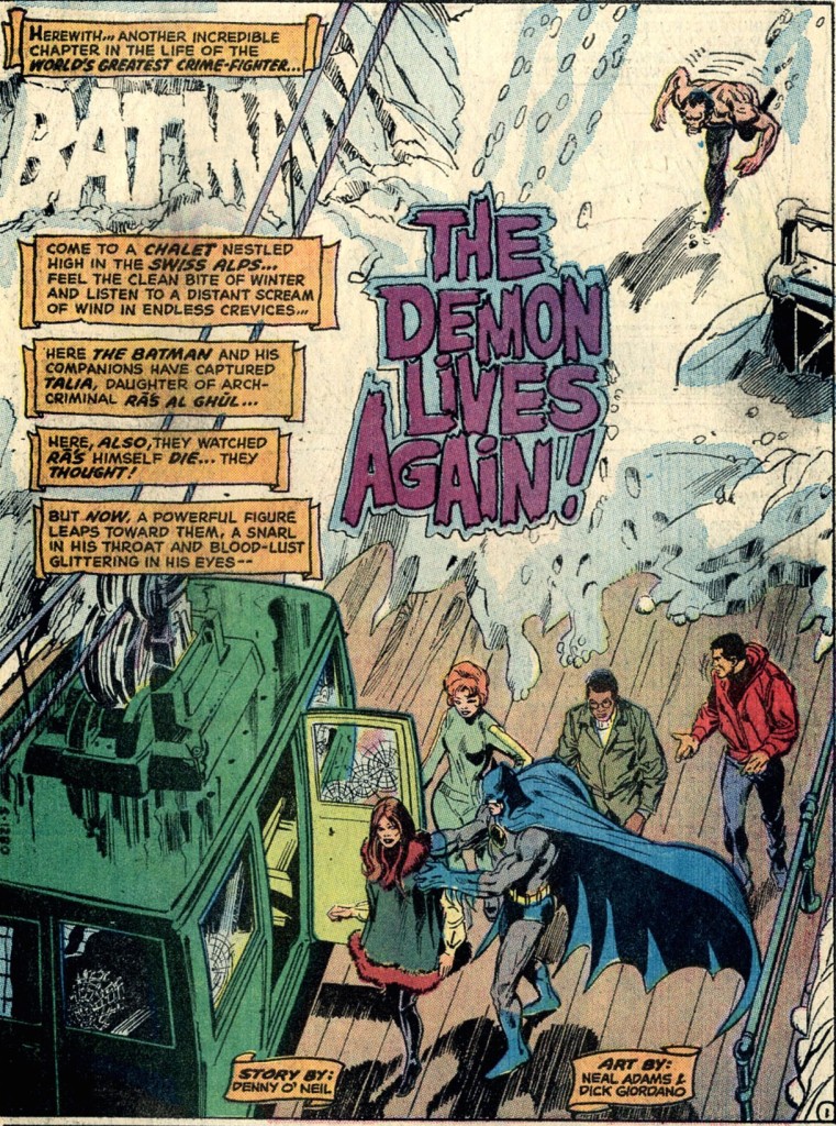
What a pity that this versatile approach to logo design never fully caught on in Batman comics, especially once you move beyond the 1970s. One of the few exceptions in the following decade occurred in Detective Comics #497, precisely in a story dedicated to Will Eisner (discussed here).
When you see the technique in later comics, it tends to be attached to the work of a limited set of artists. One of those artists is J.H. Williams III, the master of daring layouts:
 Batman #667
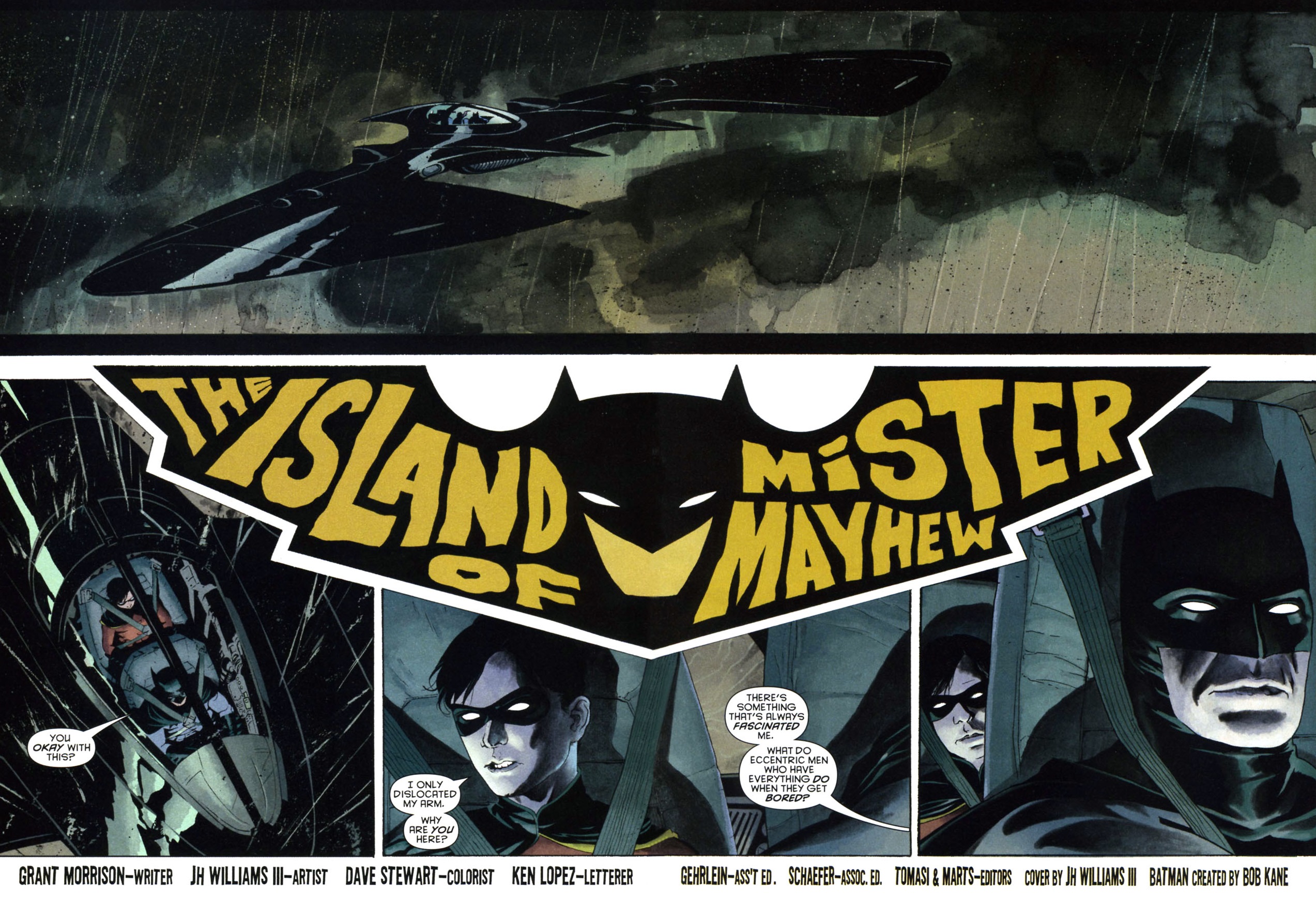
(Yep, either J.H. Williams III or letterer Ken Lopez actually shoved the story’s title into the logo!)
Likewise – and as I’ve mentioned before – Kelley Jones loves adorning his pages with all kinds of flourishes, so why wouldn’t he get into this game by adding his own eccentric takes on the comic’s title/logo…
 Gotham After Midnight #1
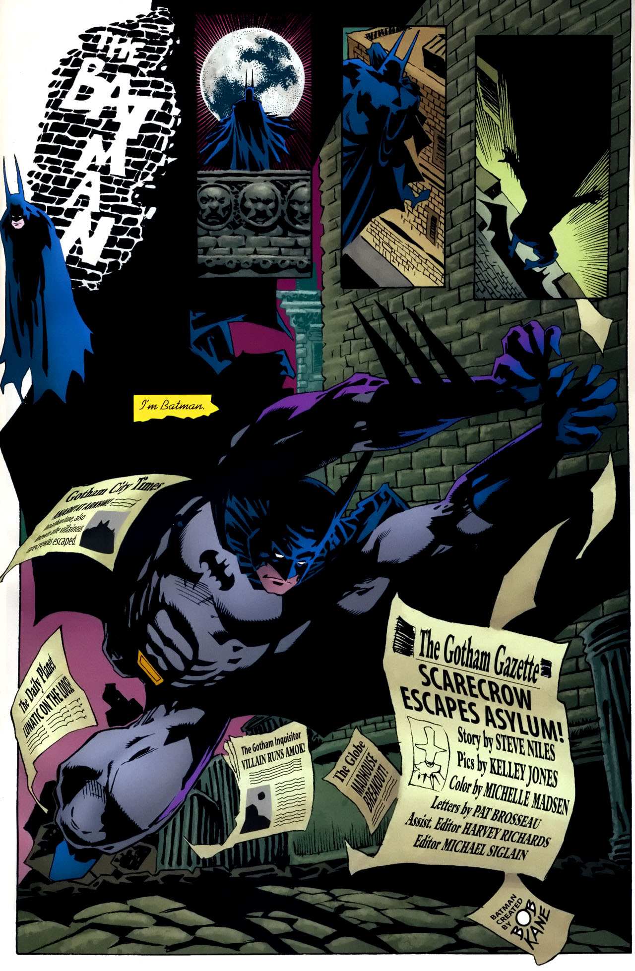
(Playing along, letterer Pat Brosseau also incorporated the credits into the main image…)
Another artist who made Batman’s title pages more Eisneresque was Norm Breyfogle, who drew loads of Dark Knight comics in the late ‘80s and ‘90s and remains one of my all-time favorites (yes, I’m a cliché).
And just in case in case you think I’m pushing the connection to The Spirit too far, I dare you to look at this damn splash and tell me if it would look out of place in an Eisner comic from the forties:
 Detective Comics #613
(Here, too, letterer Todd Klein had fun sleekly sneaking in the credits…)
Norm Breyfogle liked evoking the classic logo, but – like Ernie Chua – he kept finding new ways to distort it, whether by pushing it far into the background or by breaking down its components (Batman head, stylized symbol, the word ‘Batman’):
 Batman #456

 Detective Comics #627

(Writing the hero’s name through dark windows on a city skyline is such a Will Eisner move…)
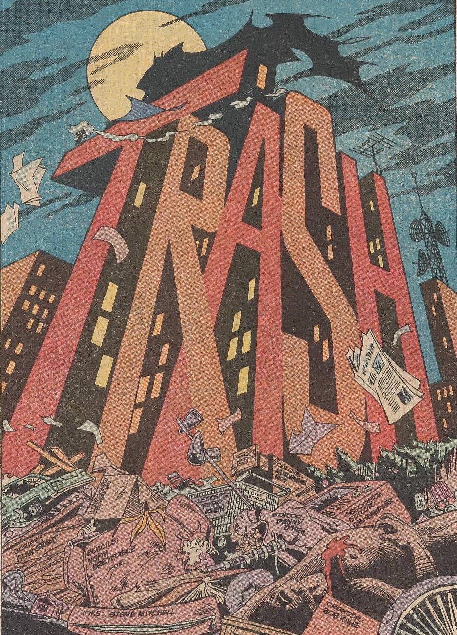
Practically all of Breyfogle’s title splashes feature a Batman shape, establishing the comic’s main star straight away (thus fulfilling the role of the former logos). Sometimes the shape is diegetic, belonging to the Dark Knight himself, other times it’s merely symbolic, like this menacing silhouette enveloping the issue’s villains:
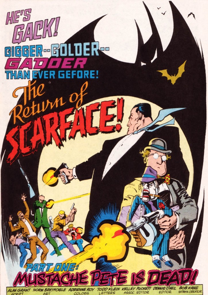 Batman #475

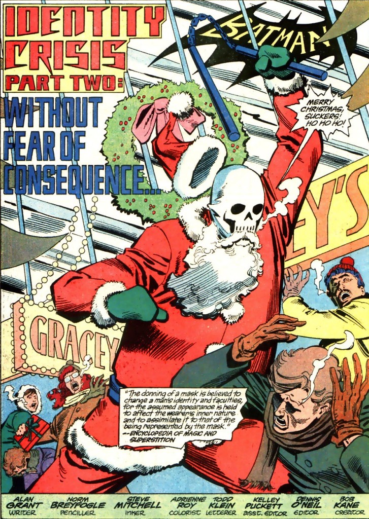
I’ll finish with the staggering splash below, in which Norm Breyfogle draws a Batman shape that is simultaneously a stand-in for a logo (it’s even above the story’s title), a part of the narrative (because the depicted Batman is indeed about to strike those punks), and a surreal exaggeration (what an outrageous cape…) that foreshadows the fact that this sequence will turn out to be a dream. Plus, if you look at the bottom, you’ll realize this Batman logo/figure/hallucination also delineates the very borders of the splash!
 Batman #458
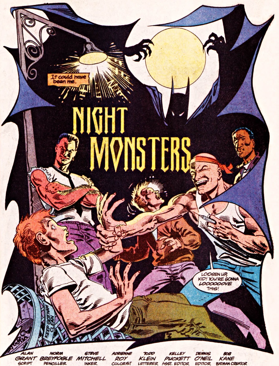
The logo finally took over almost every function in the page. Eisner would be proud.
A big thank you for this site. I have recently been getting back into comics – had years of picking up the odd graphic novel, but not bought floppies consistently. Your articles have given me some exciting-sounding issues to track down.
Keep it up!