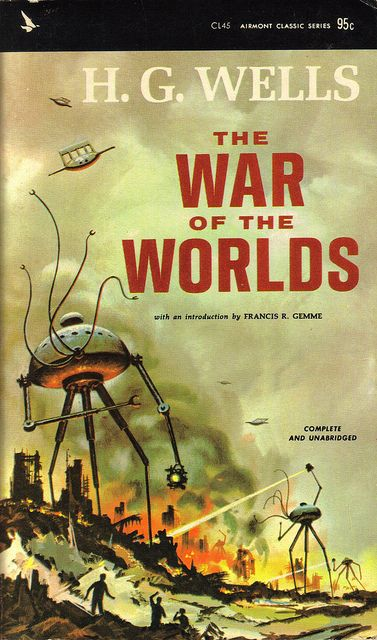
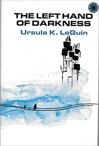
A couple of classic science fiction novels

We are living in sci-fi times – not in the sense that what we are living is fictional, but in the sense that lately reality has been enacting so many tropes of science fiction that it feels like we have seen a version of all this before, on the screen and on the page, making it simultaneously easier and more difficult to accept the current turn of events. If nothing else, the one thing this crisis might do is to make us reconsider our previous engagement with the apocalyptic imaginary, not to mention our engagement with sci-fi as a whole. With that in mind – and because I also like books without pictures – let’s do a bit of time traveling today and look at a couple of very cool classics of sci-fi literature:

THE WAR OF THE WORLDS

(H.G. Wells, 1898)
H.G. Wells

No one would have believed in the last years of the nineteenth century that this world was being watched keenly and closely by intelligences greater than man’s and yet as mortal as his own; that as men busied themselves about their various concerns they were scrutinised and studied, perhaps almost as narrowly as a man with a microscope might scrutinise the transient creatures that swarm and multiply in a drop of water. With infinite complacency men went to and fro over this globe about their little affairs, serene in their assurance of their empire over matter. It is possible that the infusoria under the microscope do the same. No one gave a thought to the older worlds of space as sources of human danger, or thought of them only to dismiss the idea of life upon them as impossible or improbable. It is curious to recall some of the mental habits of those departed days. At most terrestrial men fancied there might be other men upon Mars, perhaps inferior to themselves and ready to welcome a missionary enterprise. Yet across the gulf of space, minds that are to our minds as ours are to those of the beasts that perish, intellects vast and cool and unsympathetic, regarded this earth with envious eyes, and slowly and surely drew their plans against us. And early in the twentieth century came the great disillusionment.”

The granddaddy of alien invasion stories is quite a fun read. You’ve seen it all since then, but because H.G. Well’s novel is set at the beginning of the twentieth century (a few years after it was written), this tale about a Martian attack against Victorian England now retroactively oozes with a neat steampunk horror vibe. Between the locals’ quaintness and the elites’ smugness, nobody seems to have ever conceived of the possibility of such an attack (not even through previous science fiction, since this was quite a new concept) – convinced of their civilizational superiority yet utterly helpless and unprepared, these humans are the perfect cannon fodder, making the invasion come across as particularly vicious. Hell, if anything, the fact that, after over a century of Wells-inspired popular culture, we (unlike them) can imagine what they’re up against now makes The War of the Worlds a chilling reading experience from the get-go.

That said, while part of the sense of danger stems from the ways in which the spread of information is conditioned by the era’s relatively precarious communication networks, there are also interesting parallels with the current corona-shaped times: the Londoners’ amusing disregard for the events in the countryside brings to mind the West’s attitude earlier this year towards what was initially perceived as a Chinese issue.

It helps that Wells is quite a witty, compelling writer, his prose painting a set of vivid pictures while sadistically escalating the stakes in a nightmarish spiral. To a great degree, this is a war story (as the title suggests) and – before going into full adventure mode later on – the book’s narrator often sounds like a correspondent in the field, witnessing battles, reconstituting events from others’ accounts, editorializing about larger processes at play, and occasionally zooming into human interest pieces. I especially like his first disturbed description of the Martians:

Those who have never seen a living Martian can scarcely imagine the strange horror of its appearance. The peculiar V-shaped mouth with its pointed upper lip, the absence of brow ridges, the absence of a chin beneath the wedgelike lower lip, the incessant quivering of this mouth, the Gorgon groups of tentacles, the tumultuous breathing of the lungs in a strange atmosphere, the evident heaviness and painfulness of movement due to the greater gravitational energy of the earth—above all, the extraordinary intensity of the immense eyes—were at once vital, intense, inhuman, crippled and monstrous. There was something fungoid in the oily brown skin, something in the clumsy deliberation of the tedious movements unspeakably nasty. Even at this first encounter, this first glimpse, I was overcome with disgust and dread.”

This passage sounds somewhat like a European explorer’s racist accounts of the peoples he has subjected in other continents, but the twist is that the Martians are the conquerors and the British are now the natives about to be slaughtered.

In addition to the overall irony of having Mars (named after the God of War) create a battlefield in the heart of a nation that waged war around the world, many passages seem to mock the era’s militaristic spirit, with characters (including the narrator) at first feeling excited about the notion of a bellic venture, only to be shocked by the devastating impact of large-scale armed conflict.

You don’t have to see in it an allegory about imperialism, specifically. Government, society, religion, and science all seem to collapse in the face of what is ultimately a lesson in humility directed at human hubris, so that you can read The War of the Worlds as an entertaining deconstruction of the Anthropocene, emphasized by the final twist (which comes across as particularly resonant in 2020). Or you can even disregard the subtext and just let yourself be blown away by Wells’ brutal, prophetic depictions of warfare:

One has to imagine, as well as one may, the fate of those batteries towards Esher, waiting so tensely in the twilight. Survivors there were none. One may picture the orderly expectation, the officers alert and watchful, the gunners ready, the ammunition piled to hand, the limber gunners with their horses and wagons, the groups of civilian spectators standing as near as they were permitted, the evening stillness, the ambulances and hospital tents with the burned and wounded from Weybridge; then the dull resonance of the shots the Martians fired, and the clumsy projectile whirling over the trees and houses and smashing amid the neighbouring fields.

One may picture, too, the sudden shifting of the attention, the swiftly spreading coils and bellyings of that blackness advancing headlong, towering heavenward, turning the twilight to a palpable darkness, a strange and horrible antagonist of vapour striding upon its victims, men and horses near it seen dimly, running, shrieking, falling headlong, shouts of dismay, the guns suddenly abandoned, men choking and writhing on the ground, and the swift broadening-out of the opaque cone of smoke. And then night and extinction—nothing but a silent mass of impenetrable vapour hiding its dead.


THE LEFT HAND OF DARKNESS

(Ursula K. Le Guin, 1969)
ursula k le guin

“I’ll make my report as if I told a story, for I was taught as a child on my homeworld that Truth is a matter of the imagination. The soundest fact may fail or prevail in the style of its telling: like that singular organic jewel of our seas, which grows brighter as one woman wears it and, worn by another, dulls and goes to dust. Facts are no more solid, coherent, round, and real than pearls are. But both are sensitive.”

Ursula K. Le Guin’s acclaimed novel about Genly Ai, an envoy trying to convince the civilizations of the ultra-cold planet Gethen (also known as Winter) to join the Ekumen intergalactic alliance, remains an absolutely stunning masterpiece. While the voice shifts from chapter to chapter (including scientific reports, diplomatic transcripts, and mythological tales passed on by oral tradition), the bulk of the book follows Ai’s narration, his observations about Gethen’s bewildering politics, religion, biology, and overall social dynamics serving as a vehicle for Le Guin to muse on topics such as war, language, patriotism, and sex.

Like The War of the Worlds and, indeed, like all the best sci-fi fantasy – once you go deep into alien species and cultures, the border between the two genres becomes fuzzy – by conjuring up a whole other world, The Left Hand of Darkness denaturalizes ours. It imaginatively and provocatively exposes how limited many of our preconceptions are, whether regarding time (‘It is always the Year One here. Only the dating of every past and future year changes each New Year’s Day, as one counts backwards or forwards from the unitary Now.’), regarding spirituality (‘The Handdara is a religion without institution, without priests, without hierarchy, without vows, without creed; I am still unable to say whether it has a God or not.’), or, above all, regarding gender roles (‘The king was pregnant.’).

Gethen’s inhabitants are a specific type of hermaphrodites, which means they’ve developed highly distinct approaches to family values and reproduction (one of the most striking chapters is a treaty on alien sexuality). A running motif in the book is how Genly Ai, who has managed to mostly cope with the planet’s wild climate and possibly supernatural premonitory cults, feels constantly challenged by this one feature above all others…

“Though I had been nearly two years on Winter I was still far from being able to see the people of the planet through their own eyes. I tried to, but my efforts took the form of self-consciously seeing a Gethenian first as a man, then as a woman, forcing him into those categories so irrelevant to his nature and so essential to my own. Thus as I sipped my smoking sour beer I thought that at table Estraven’s performance had been womanly, all charm and tact and lack of substance, specious and adroit. Was it in fact perhaps this soft supple femininity that I disliked and distrusted in him? For it was impossible to think of him as a woman, that dark, ironic, powerful presence near me in the firelit darkness, and yet whenever I thought of him as a man I felt a sense of falseness, of imposture: in him, or in my own attitude towards him?”

As you can tell, the whole thing is extremely well-written. Ursula Le Guin conveys thoughtful, subtly playful insights under the guise of an anthropological gaze that reminds me of Jorge Luis Borges’ style in short stories like ‘Brodie’s Report’ and ‘The Theologians.’ Yet because the characters are so fully realized and because some chapters are narrated by native Gethenians, we are prompted not just to respond to their strangeness, but also to engage with their perspective from within, which makes The Left Hand of Darkness an especially rich reading experience. The beauty of it lies precisely in the mix of dry tone and surreal elements, i.e. of science and fiction. And while the amount of foreign names and terminology can be a bit daunting at first, at the heart of the novel is a truly engrossing political thriller.

The Left Hand of Darkness is arguably the most well-known of Le Guin’s Hainish Cycle, a series of loosely connected books related to the Ekumen league of planets. It is mainly remembered for its final third, which many see as a powerful kind of love story and/or a seminal – if dated, in some respects – feminist text touching on issues of queerness and transphobia. Readers of this blog, however, may be interested to know that, on top of those things, it is also one hell of an action adventure yarn, with breathtaking descriptions of the protagonists’ perilous journey through the harshest of landscapes and weather conditions…

“We seldom talked while on the march or at lunch, for our lips were sore, and when one’s own mouth was open the cold got inside, hurting teeth and throat and lungs; it was necessary to keep the mouth closed and breathe through the nose, at least when the air was forty or fifty degrees below freezing. When it went on lower than that, the whole breathing process was further complicated by the rapid freezing of one’s exhaled breath; if you didn’t look out your nostrils might freeze shut, and then to keep from suffocating you would gasp in a lungful of razors.

Under certain conditions our exhalations freezing instantly made a tiny cracking noise, like distant firecrackers, and a shower of crystals: each breath a snowstorm.”
Posted in FANTASTIC ADVENTURES | Tagged , , , , , , , | Leave a comment

COMICS CAN BE AWESOME (4 May 2020)

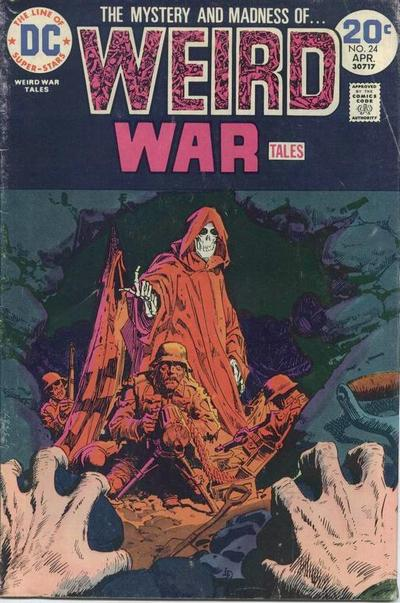
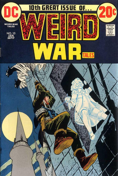
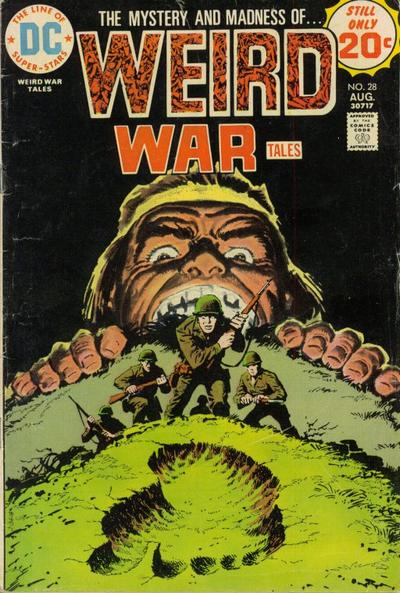
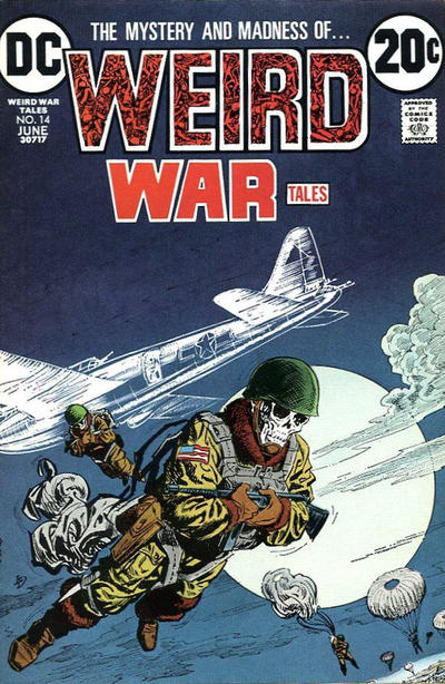
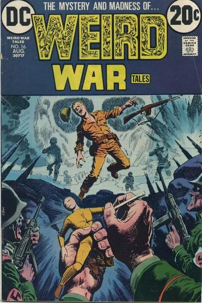
Your weekly reminder that comics can be awesome, Weird War Tales edition…

Weird War TalesWeird War Tales 16Weird War Tales 24Weird War Tales 10Weird War Tales 28

Posted in ART OF HORROR COMICS | Tagged , , , , , | Leave a comment

On Batman’s title (and logo) pages

For the past couple of weeks, I’ve been spotlighting one of the trademarks of The Spirit, namely the way Will Eisner and later creators kept adjusting that series’ logo to fit the title pages, ingeniously inserting new designs into each particular image. Since The Spirit – along with Zorro, Dick Tracy, and The Shadow – is one of the main influences on Batman comics, it shouldn’t come as much of a surprise that a number of artists have tried to pull off a similar trick in the Bat-books.

After all, artists love playing with the logos on the covers, so why wouldn’t they do the same in the interior work?

Batman     Superman/Batman     Legends of the Dark Knight: Choices

That said, this is still rarer than you might think. The vast majority of Batman comics’ title pages either feature a pretty standard logo or – as it is often the case with modern comics – actually do without the logo altogether (it’s already on the cover, after all).

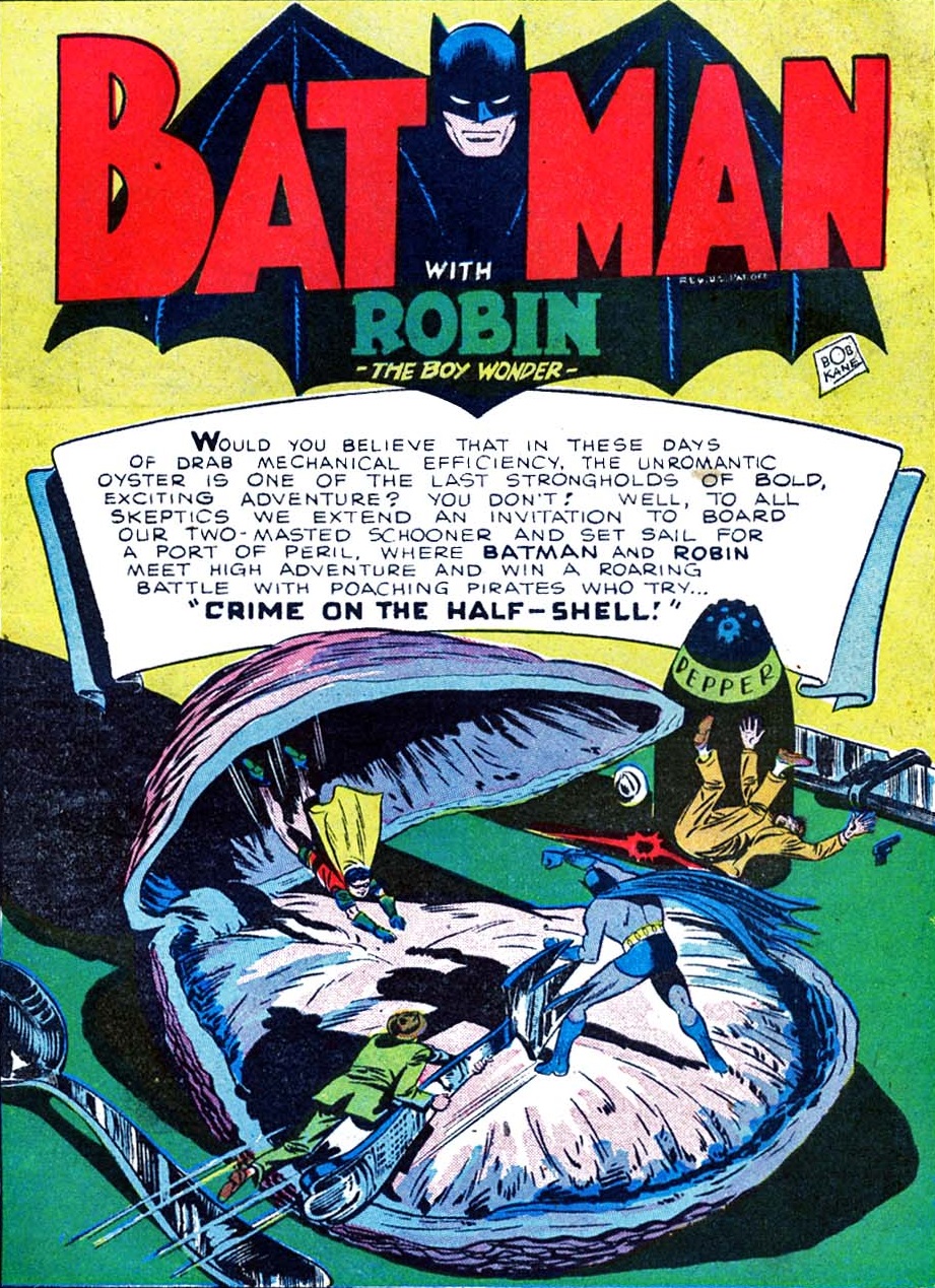
Bob Kane was no Will Eisner. If you go back to the franchise’s first decades, you’ll see that traditionally the series’ logo (which changed over time, but tended to consist of variations of a stylized bat shape with the Caped Crusader’s creepy face and the word ‘Batman’ in an art deco-ish font) hovered over each opening splash like a generic stamp or a fixed background with little relation to the rest of the image…

Detective Comics #113Detective Comics #113

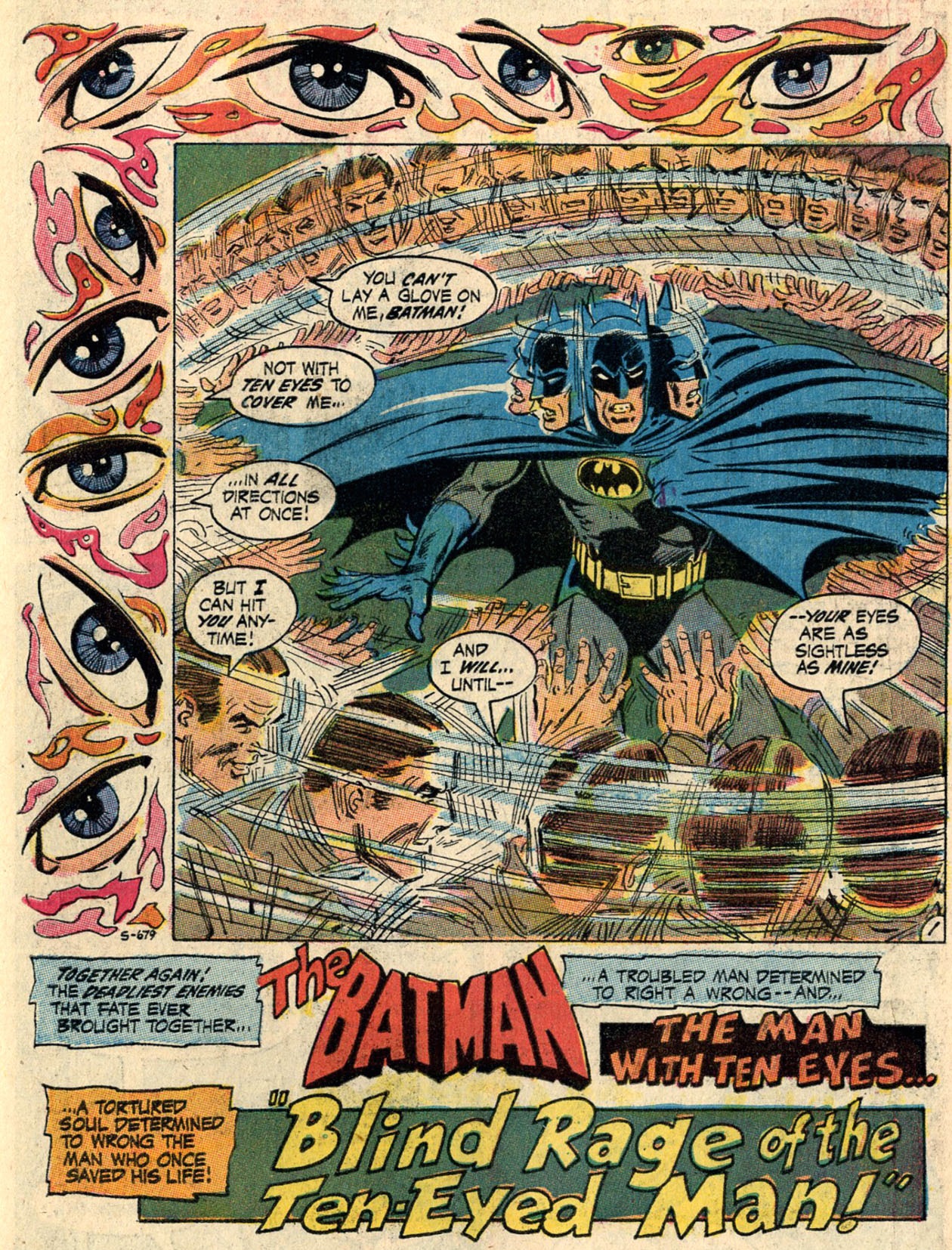
It was only in the 1970s that this rule became more flexible. Irv Novick’s opening pages were among the first to mess with the logo, although I’m not sure whether the credit for this should go to him or to letterer John Costanza.

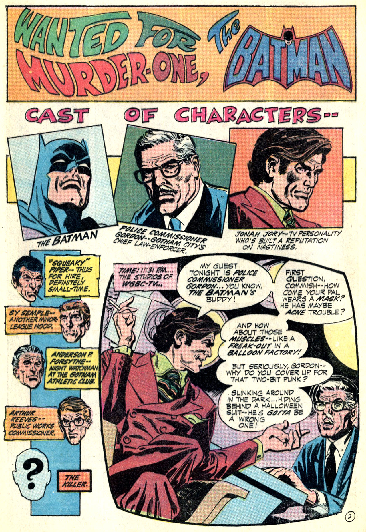
Here is one of the earliest attempts, which still preserves the logo’s shape, but places it in a smooth continuum with the story title’s psychedelic design (and colors):

Batman #225Batman #225

Notice that, while the logo remains stuck at the top, it doesn’t feel as isolated from the rest of the page because the whole layout is composed of separate boxes with similarly explicit information – except for the last box/panel, which transitions into the narrative by simulating a television screen!

One device that became increasingly common around this time was to move the series’ title away from the top, shifting it to different, specific areas of the page and thus allowing the words ‘The Batman’ to be incorporated into the initial narration while still standing out for readers at first glance. You can see an example of this device in the freaky beauty below (another Novick/Costanza collaboration):

Batman #231Batman #231

The example above (cover-dated May 1971) actually disregards the typical logo, replacing it with a headless design that seems more suited for this particular page. That was a relatively rare move in the early seventies, when most Batman title pages still displayed the standard logo, but it wasn’t an entirely isolated case, as editor Julie Schwartz clearly gave creators leeway to experiment every once in a while. The fact that they only did so occasionally made those specific stories feel more special from the outset.

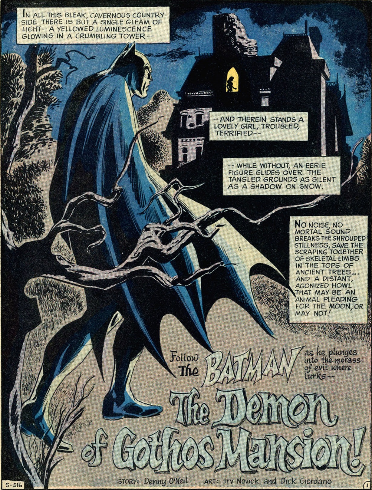
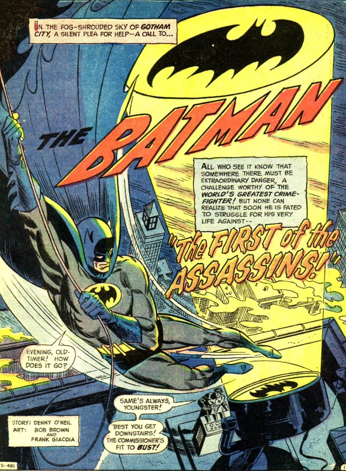
Here are two original designs from issues lettered by Ben Oda:

Batman #227Batman #227
Detective Comics #405Detective Comics #405

Notice how in both cases the series’ title (The Batman) isn’t just placed inside a sentence, but also redesigned to match the story title and genre: in the former with a gothic motif (it’s a horror tale), in the later tilted dynamically to the right (it’s more of an action yarn). Also in the latter, artist Bob Brown plays with the bat-signal, which projects the Dark Knight’s symbol (i.e. a version of the series’ typical logo) at the top of the page (where the logo used to be located, traditionally). In other words, following the footsteps of The Spirit, creators were increasingly molding the comic’s title and symbol into a more organic part of the opening pages.

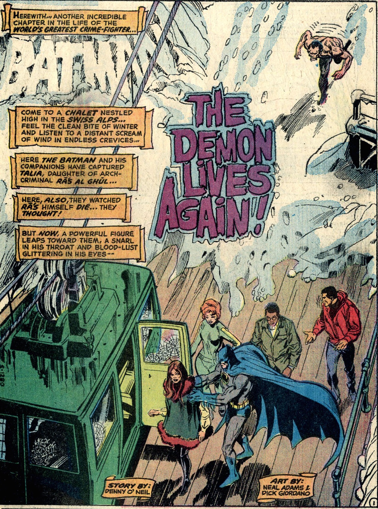
I guess it was only a matter of time before some artists took things one step further and, much like Will Eisner often did, incorporated the series’ title into the diegetic image, as if the word ‘Batman’ (or sometimes the whole logo itself) had physically materialized inside the characters’ world, whether as a snow sculpture or as a billboard…

Batman #244Batman #244
Batman #274Batman #274

I’ve written before about how Archie Goodwin’s beloved run in Detective Comics in 1974 was full of these sorts of gimmicks. Indeed, the farther you delve into the Caped Crusader’s Bronze Age, the more Eisneresque examples you come across…

Detective Comics #469Detective Comics #469
Batman Family #6Batman Family #6

(In these pages, the remaining credits are themselves discreetly integrated into the splashes, although that is a more common device.)

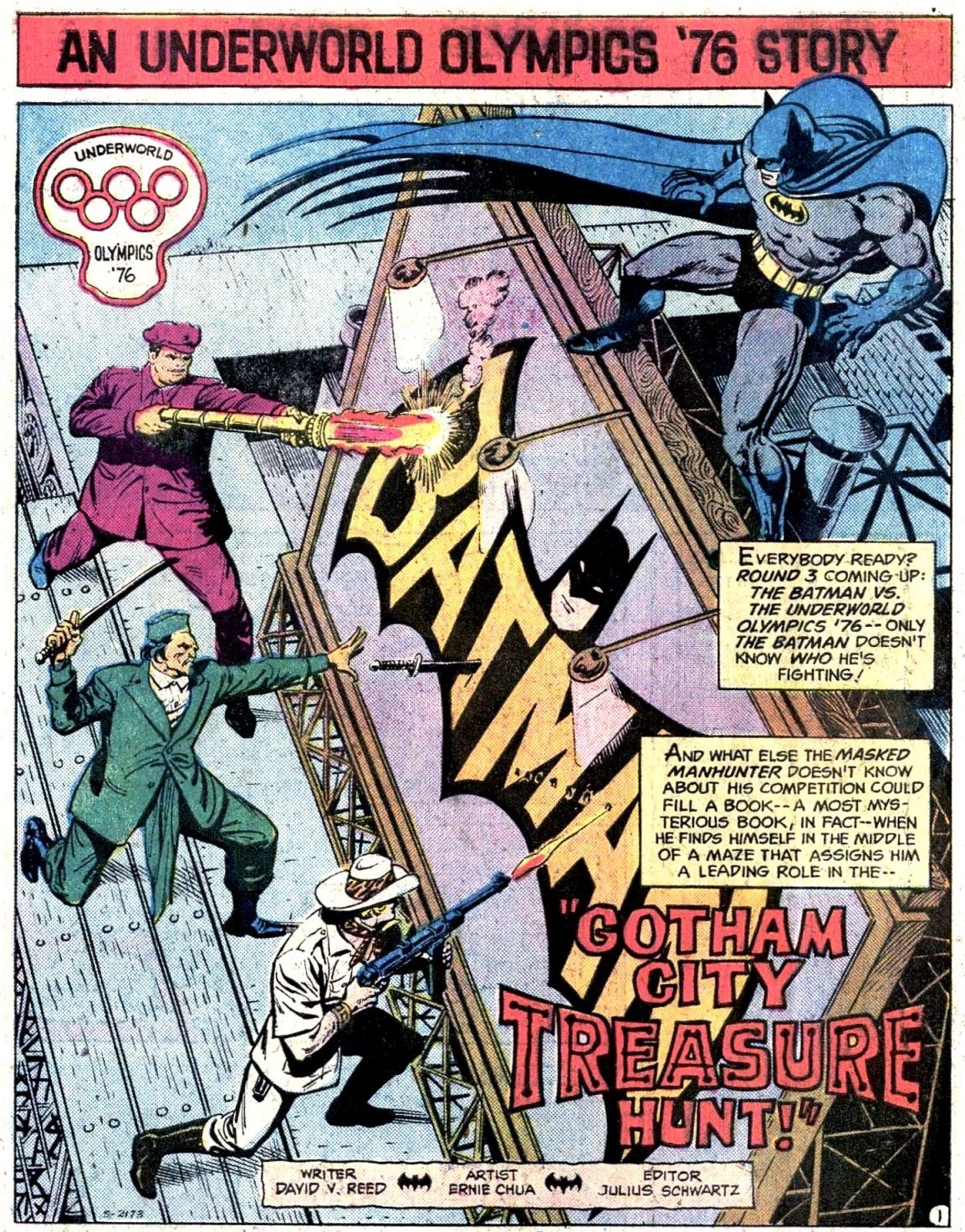
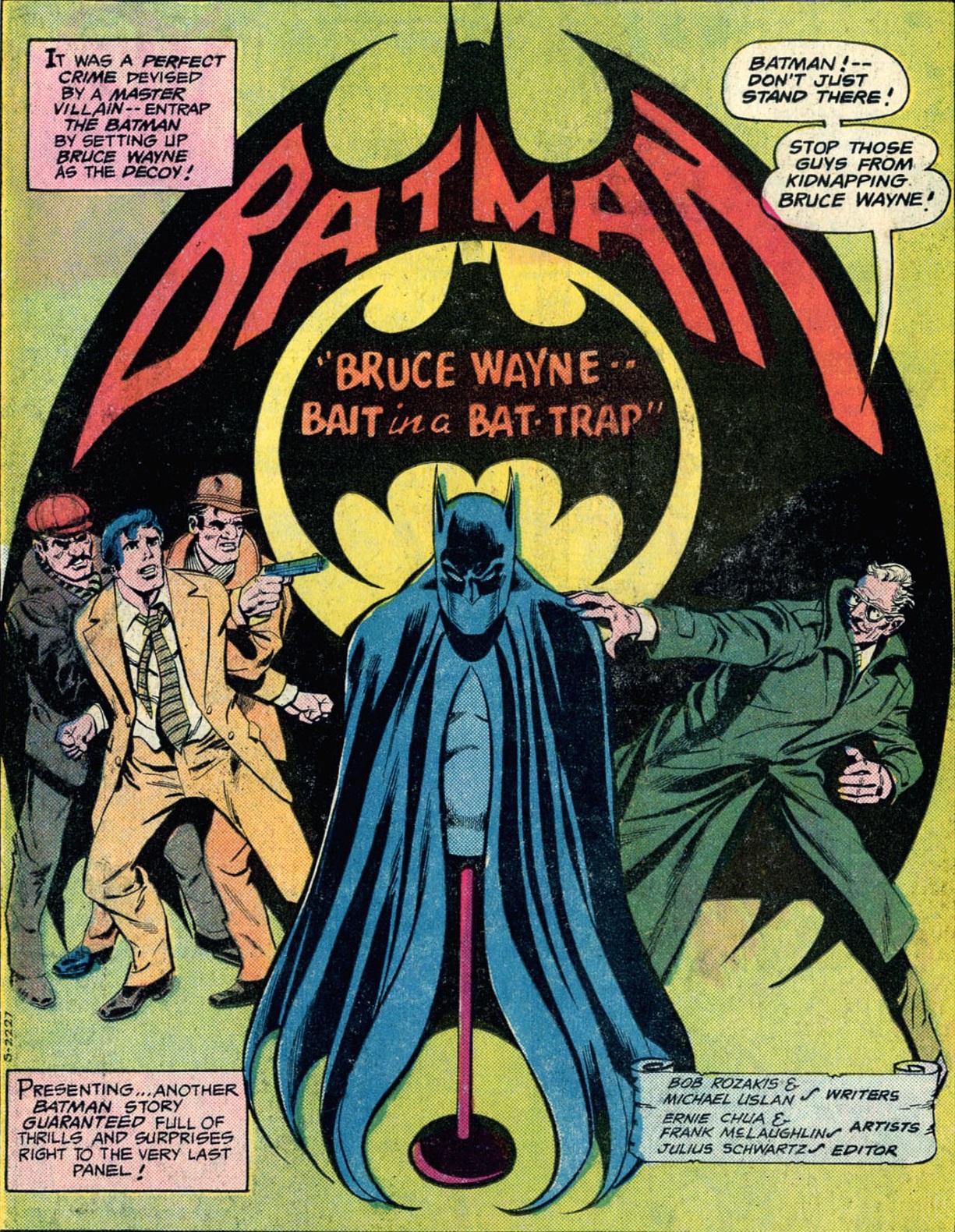
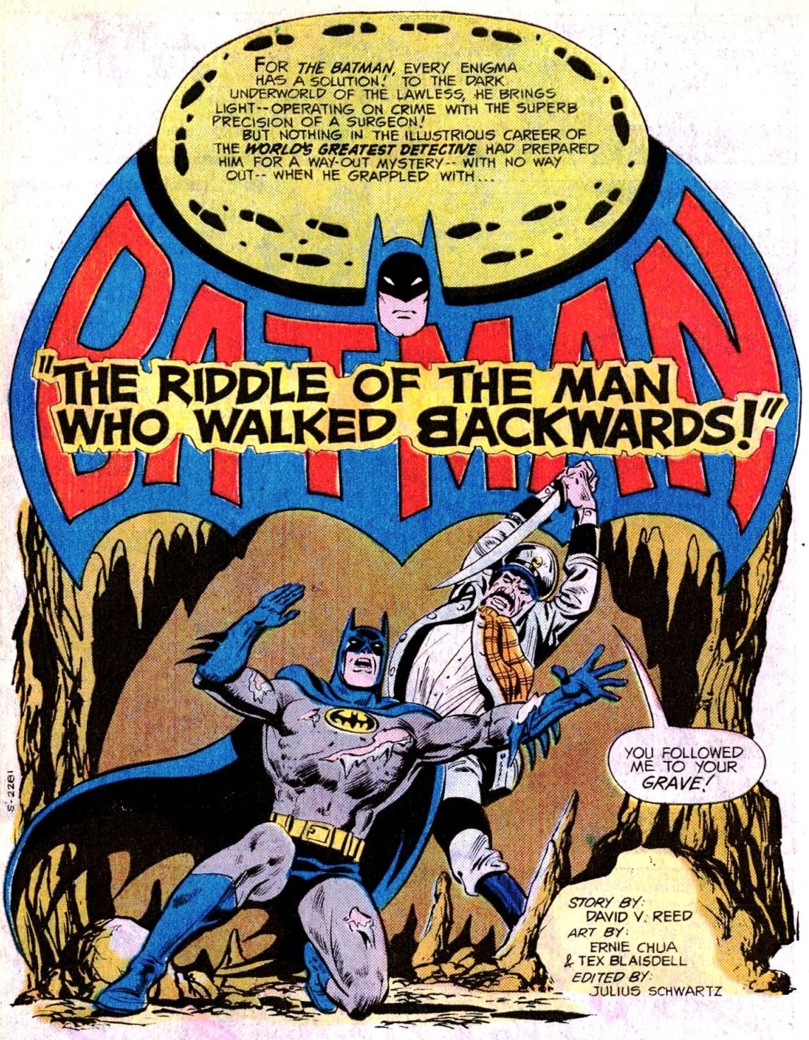
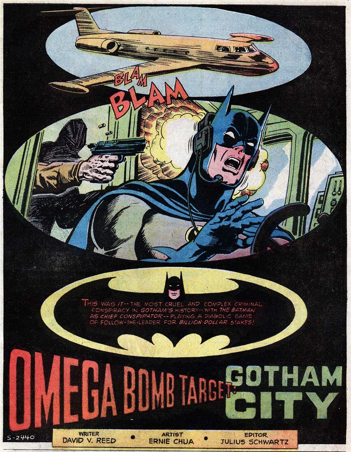
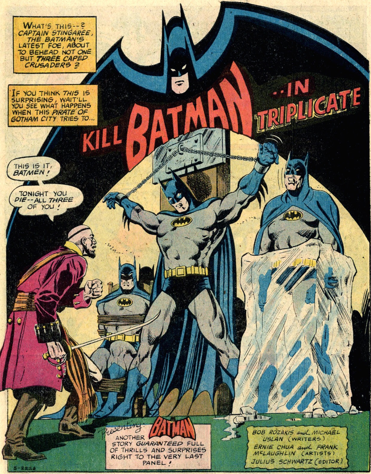
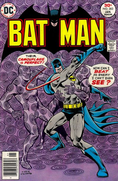
One artist who truly excelled at redesigning Batman’s logo in powerful, inventive ways was Ernie Chua (aka Ernie Chan), who was particularly active in both Batman and Detective Comics in the mid-to-late 1970s. Rather than inserting the logo into the story’s reality, Chua’s specialty was distorting it in striking ways, creating a string of splashes with a distinct pop art flavor…

Detective Comics #461Detective Comics #461
Batman #277Batman #277

I’m not always the biggest fan of Ernie Chua’s work on Batman comics, whose overall style seems relatively mundane when compared to that of his energetic predecessors. When it comes to title pages, though, I think he was terrific!

Chua’s logo distortions, besides looking smashing, also did a swell job of suggestively conveying the mood and/or themes of the stories ahead:

Batman #283Batman #283
Detective Comics #462Detective Comics #462

(Shame that Ben Oda couldn’t resist adding the standard logo to the caption at the bottom, since it takes some of the power away from the haunting logo at the top…)

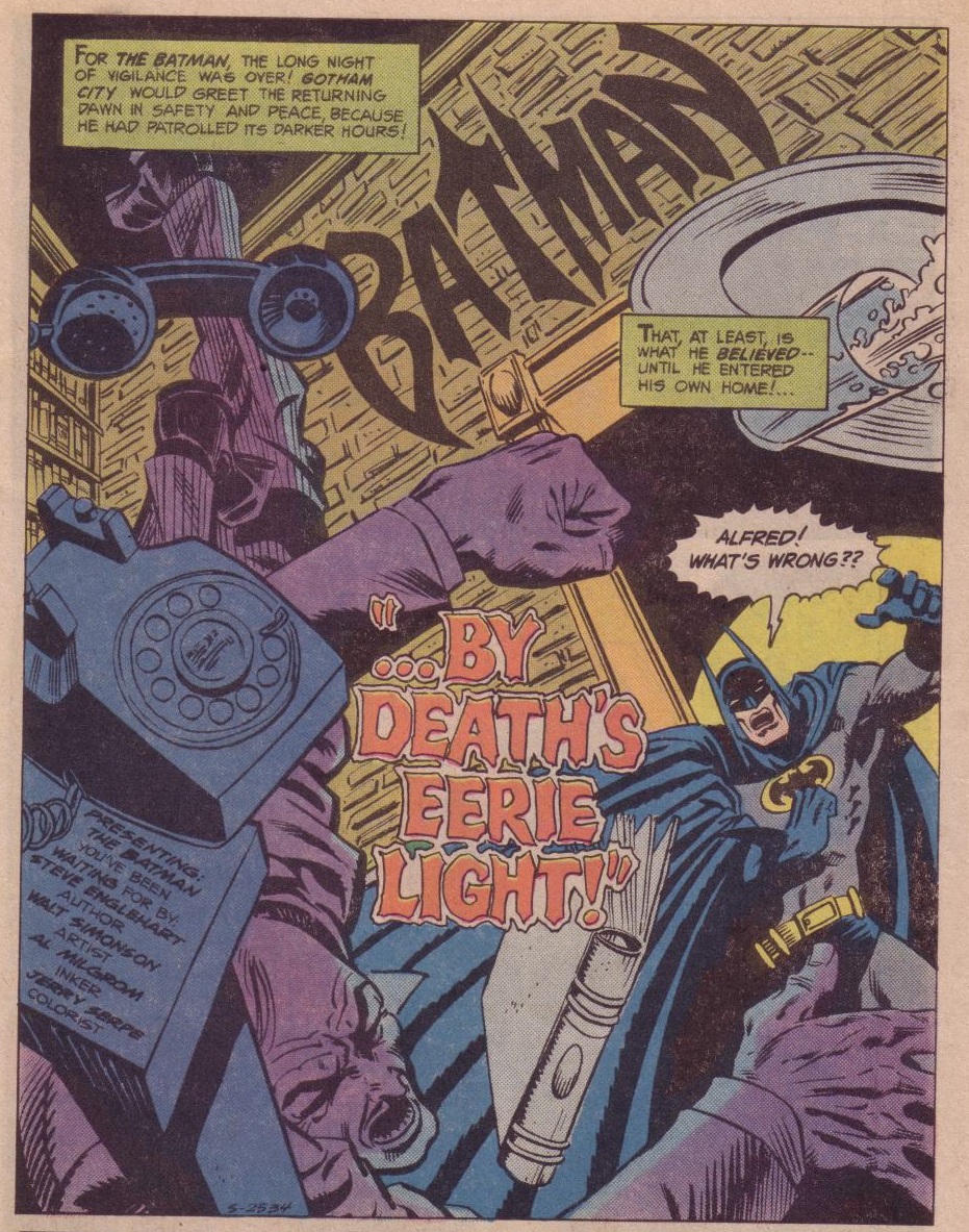
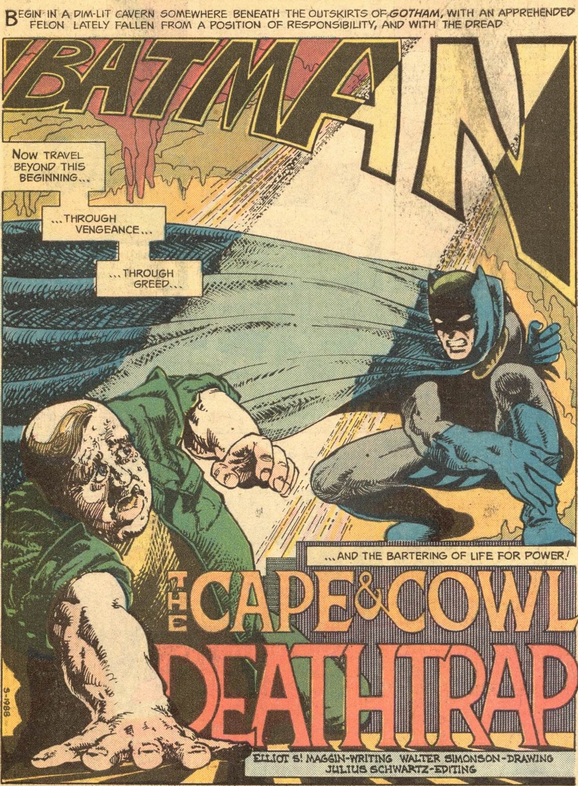
Speaking of creating a memorable atmosphere through distortion, I’m also a huge fan of this masterpiece by Walt Simonson:

Detective Comics #450Detective Comics #450

It’s as if the word ‘Batman’ – like Batman himself – is encroaching upon the felon in an intimidating way… or perhaps reflecting what’s on his mind. Plus, I don’t know who the colorist was, but s/he deserves praise for that stylish effect with the sunlight! (I also appreciate the fact that the letters in ‘Deathtrap’ are casting shadows, enhancing this word’s ominous presence.)

What a pity that this versatile approach to logo design never fully caught on in Batman comics, especially once you move beyond the 1970s. One of the few exceptions in the following decade occurred in Detective Comics #497, precisely in a story dedicated to Will Eisner (discussed here).

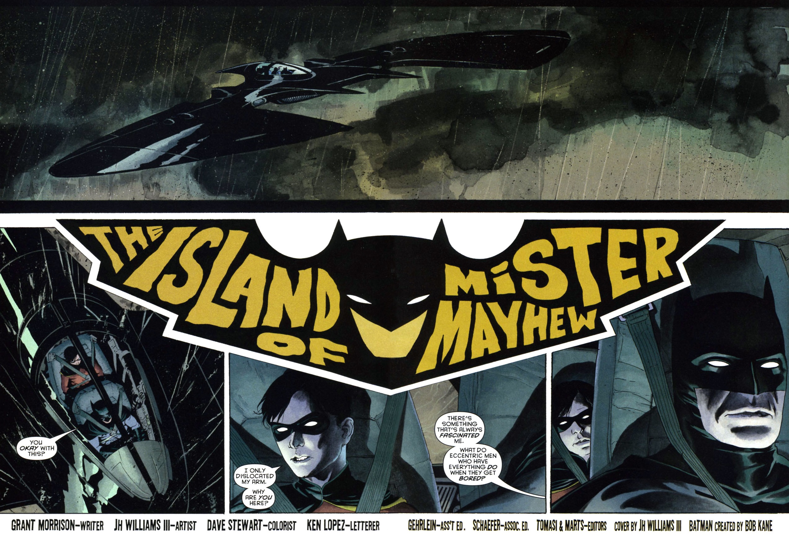
When you see the technique in later comics, it tends to be attached to the work of a limited set of artists. One of those artists is J.H. Williams III, the master of daring layouts:

Batman #667Batman #667

(Yep, either J.H. Williams III or letterer Ken Lopez actually shoved the story’s title into the logo!)

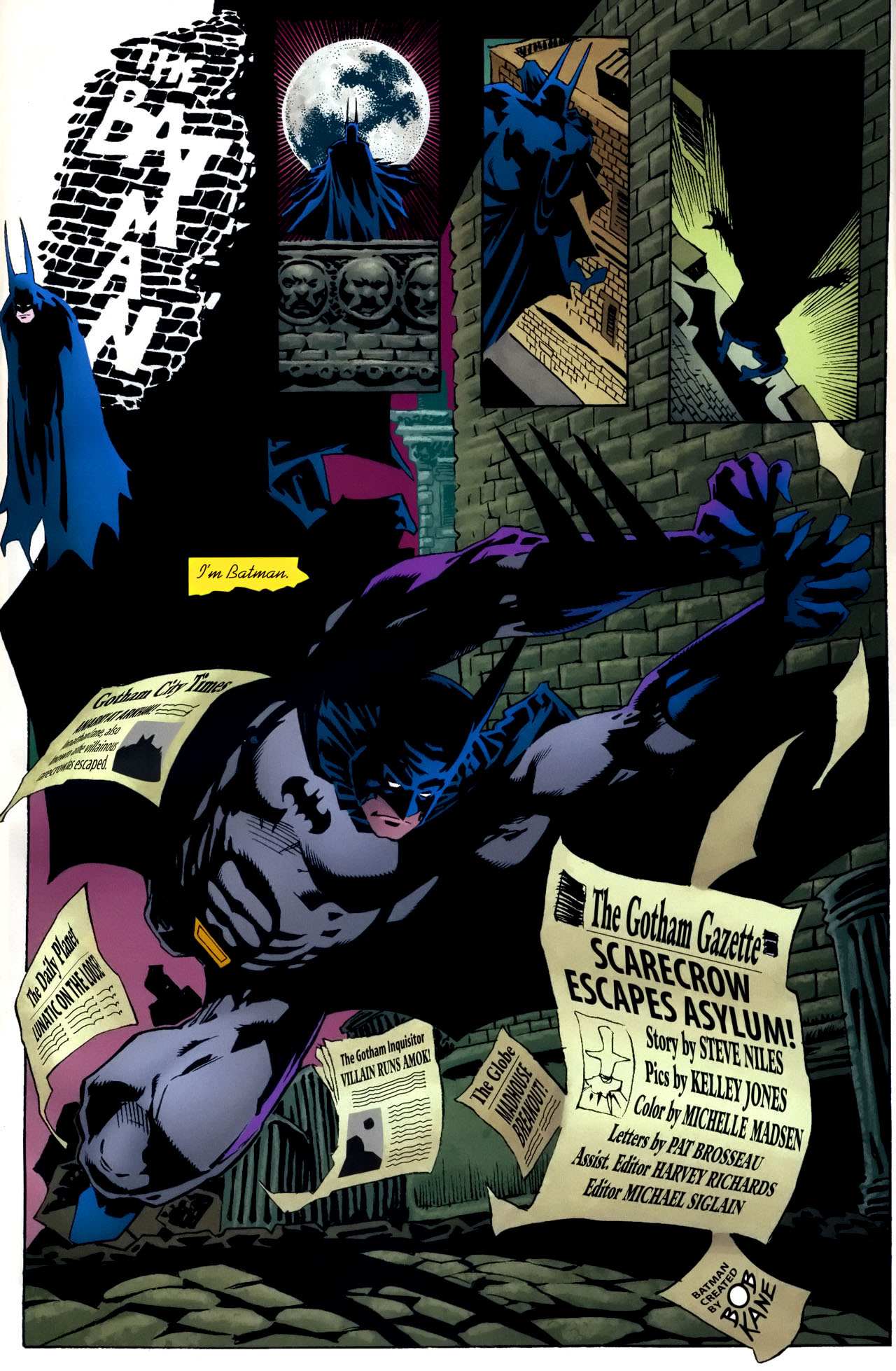
Likewise – and as I’ve mentioned before – Kelley Jones loves adorning his pages with all kinds of flourishes, so why wouldn’t he get into this game by adding his own eccentric takes on the comic’s title/logo…

Gotham After MidnightGotham After Midnight #1

(Playing along, letterer Pat Brosseau also incorporated the credits into the main image…)

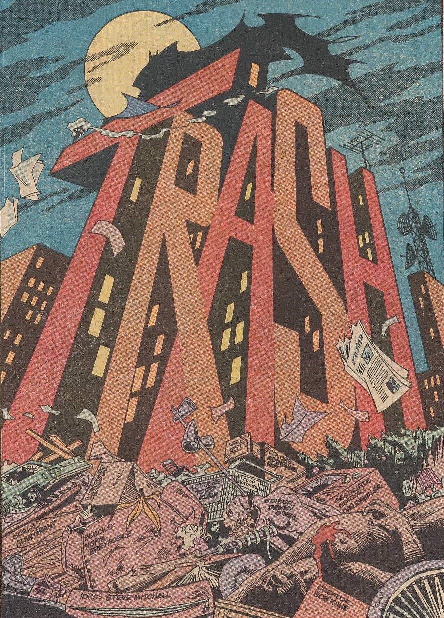
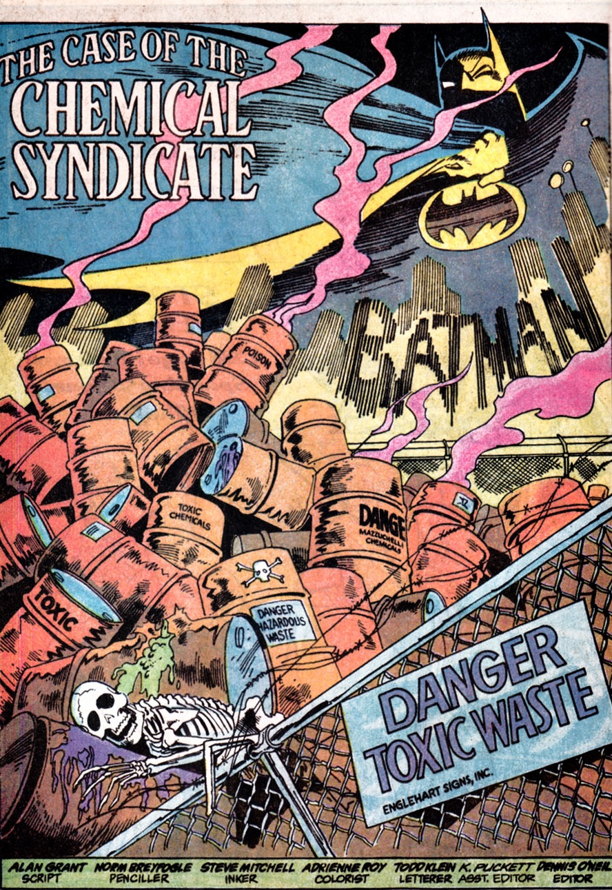
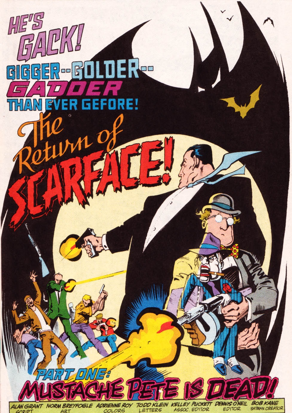
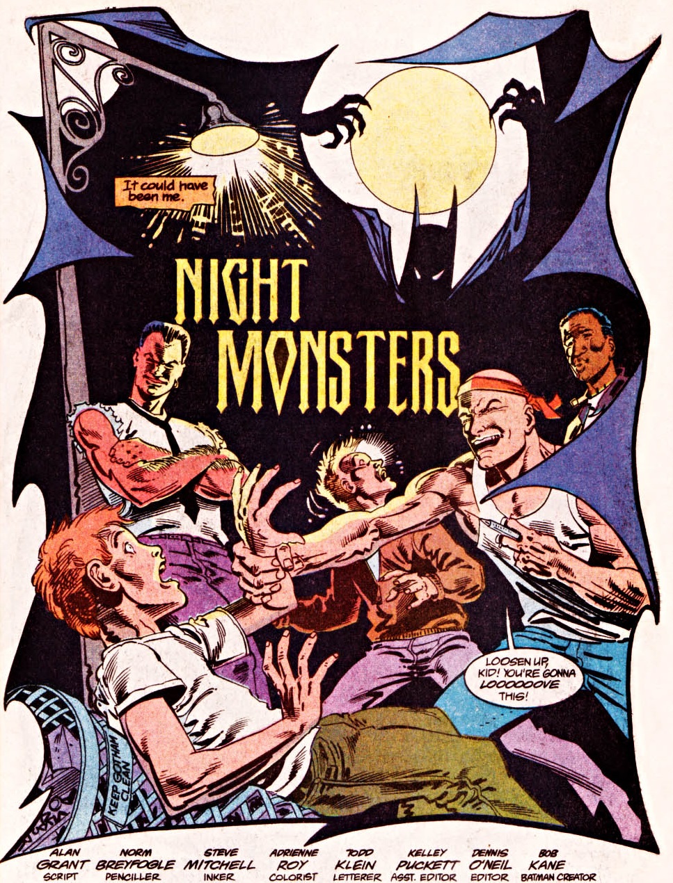
Another artist who made Batman’s title pages more Eisneresque was Norm Breyfogle, who drew loads of Dark Knight comics in the late ‘80s and ‘90s and remains one of my all-time favorites (yes, I’m a cliché).

And just in case in case you think I’m pushing the connection to The Spirit too far, I dare you to look at this damn splash and tell me if it would look out of place in an Eisner comic from the forties:

Detective Comics #613Detective Comics #613

(Here, too, letterer Todd Klein had fun sleekly sneaking in the credits…)

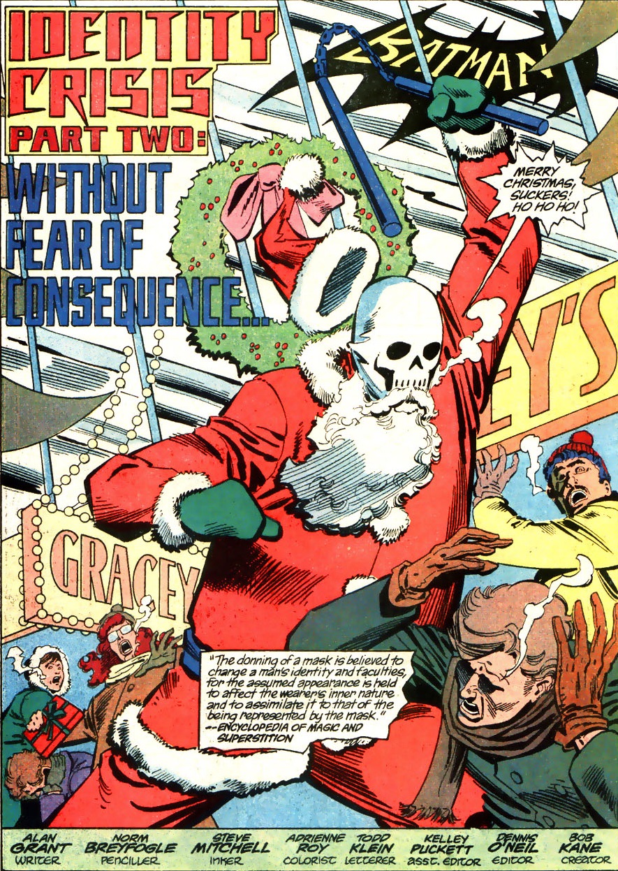
Norm Breyfogle liked evoking the classic logo, but – like Ernie Chua – he kept finding new ways to distort it, whether by pushing it far into the background or by breaking down its components (Batman head, stylized symbol, the word ‘Batman’):

Batman #456Batman #456
Detective Comics #627Detective Comics #627

(Writing the hero’s name through dark windows on a city skyline is such a Will Eisner move…)

Practically all of Breyfogle’s title splashes feature a Batman shape, establishing the comic’s main star straight away (thus fulfilling the role of the former logos). Sometimes the shape is diegetic, belonging to the Dark Knight himself, other times it’s merely symbolic, like this menacing silhouette enveloping the issue’s villains:

Batman #475Batman #475

I’ll finish with the staggering splash below, in which Norm Breyfogle draws a Batman shape that is simultaneously a stand-in for a logo (it’s even above the story’s title), a part of the narrative (because the depicted Batman is indeed about to strike those punks), and a surreal exaggeration (what an outrageous cape…) that foreshadows the fact that this sequence will turn out to be a dream. Plus, if you look at the bottom, you’ll realize this Batman logo/figure/hallucination also delineates the very borders of the splash!

Batman #458Batman #458

The logo finally took over almost every function in the page. Eisner would be proud.

Posted in ART OF BATMAN COMICS | Tagged , , , , , , , , , , , , , | 1 Comment

COMICS CAN BE AWESOME (27 April 2020)

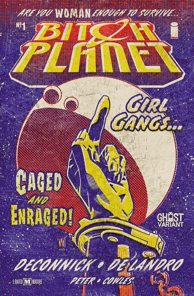
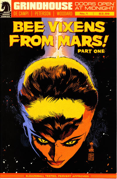
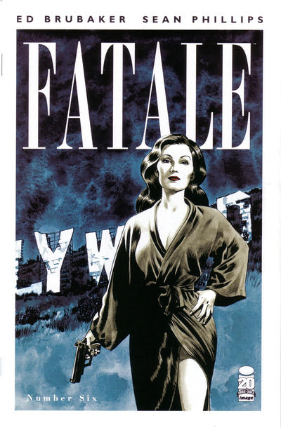
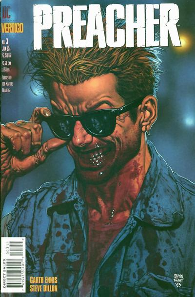
Your grindhouse reminder that comics can be awesome…

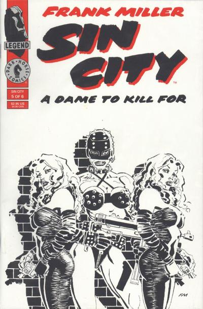
Sin CityBitch PlanetGrindhouseFatalePreacher

Posted in AWESOME COVERS | Tagged , , , , , , , , , , | Leave a comment

On The Spirit’s title pages – part 2

Darwyn CookeThe Spirit (v2) #3

I tend to be quite distrustful of attempts to update Will Eisner’s The Spirit. Because most creators cannot begin to match Eisner’s experimentalism, the appeal ends up being little more than the curious, nostalgic exercise of checking out all the modern variations of the original cast and concepts (which usually do little more than to tone down the original’s racism, if not its sexism).

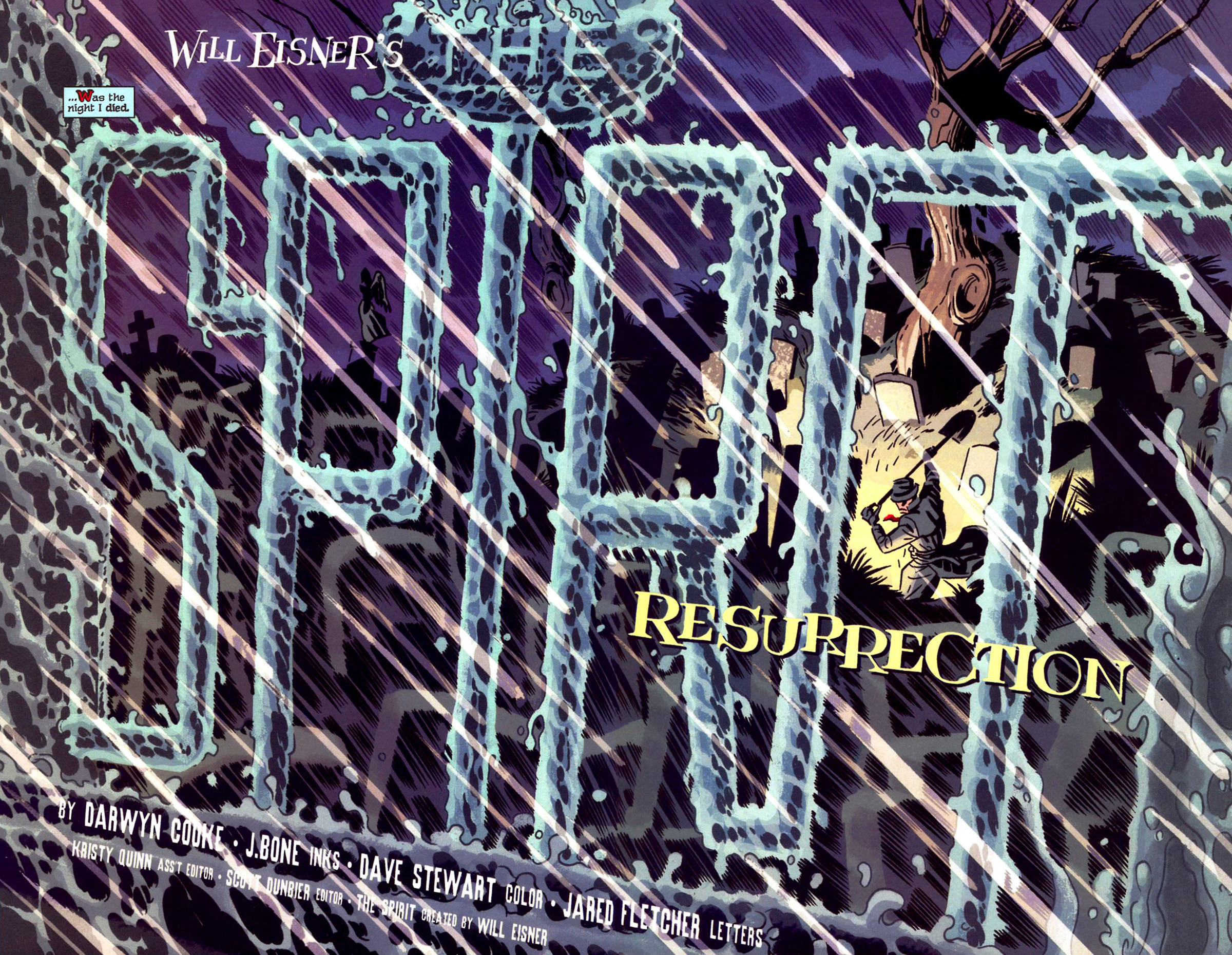
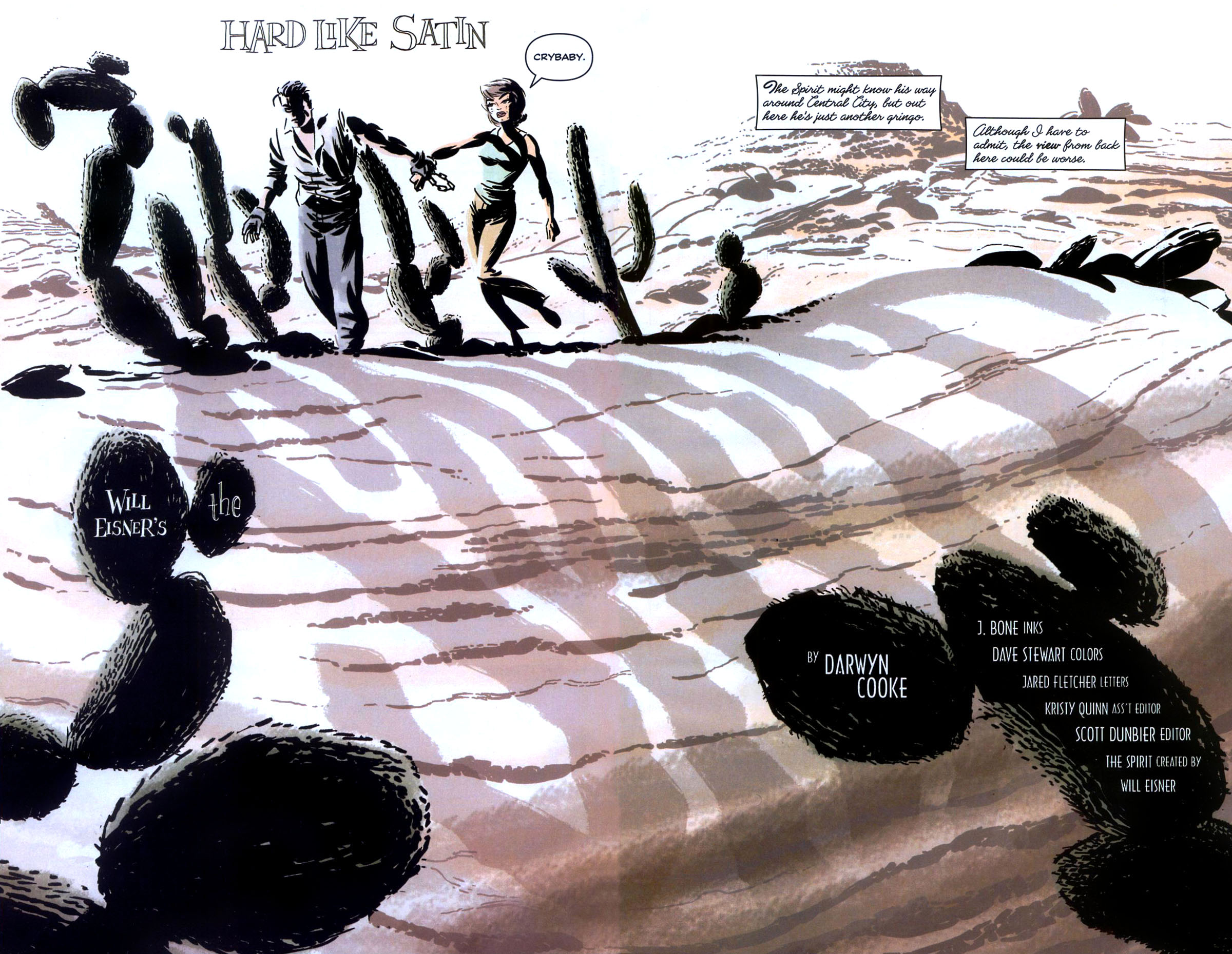
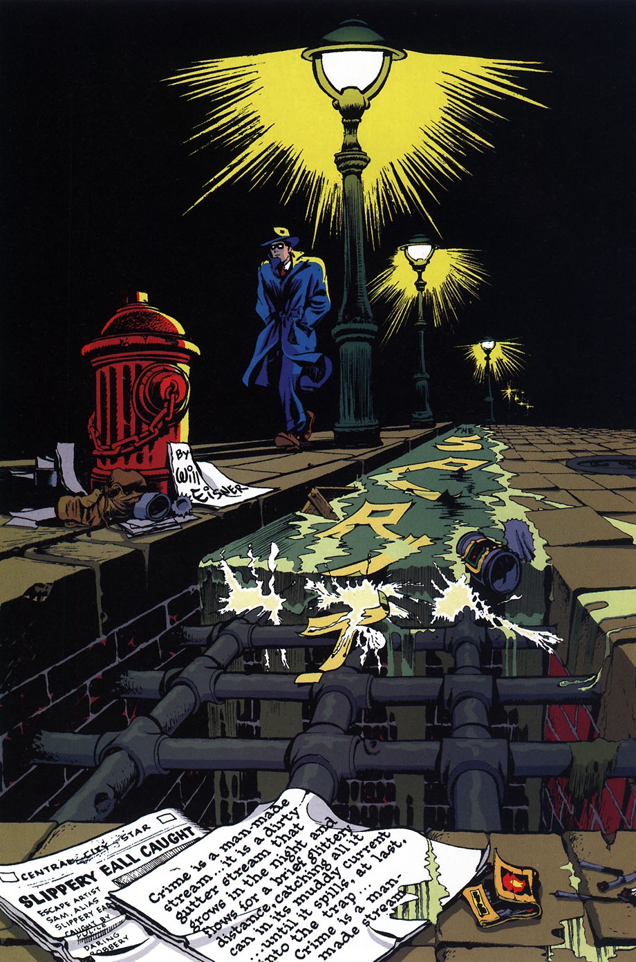
Not that we haven’t gotten some stylish comics out of this nostalgia, starting with Darwyn Cooke’s run at DC in 2006-2008. Although overrated in some circles, given that it was sadly plagued with pretty superficial stories, at least that series did look absolutely delightful. Cooke, who was above all an incredible artist, made sure to always introduce a different logo in each issue through breathtaking, gobsmackingly vibrant double spreads…

Darwyn CookeThe Spirit (v2) #4

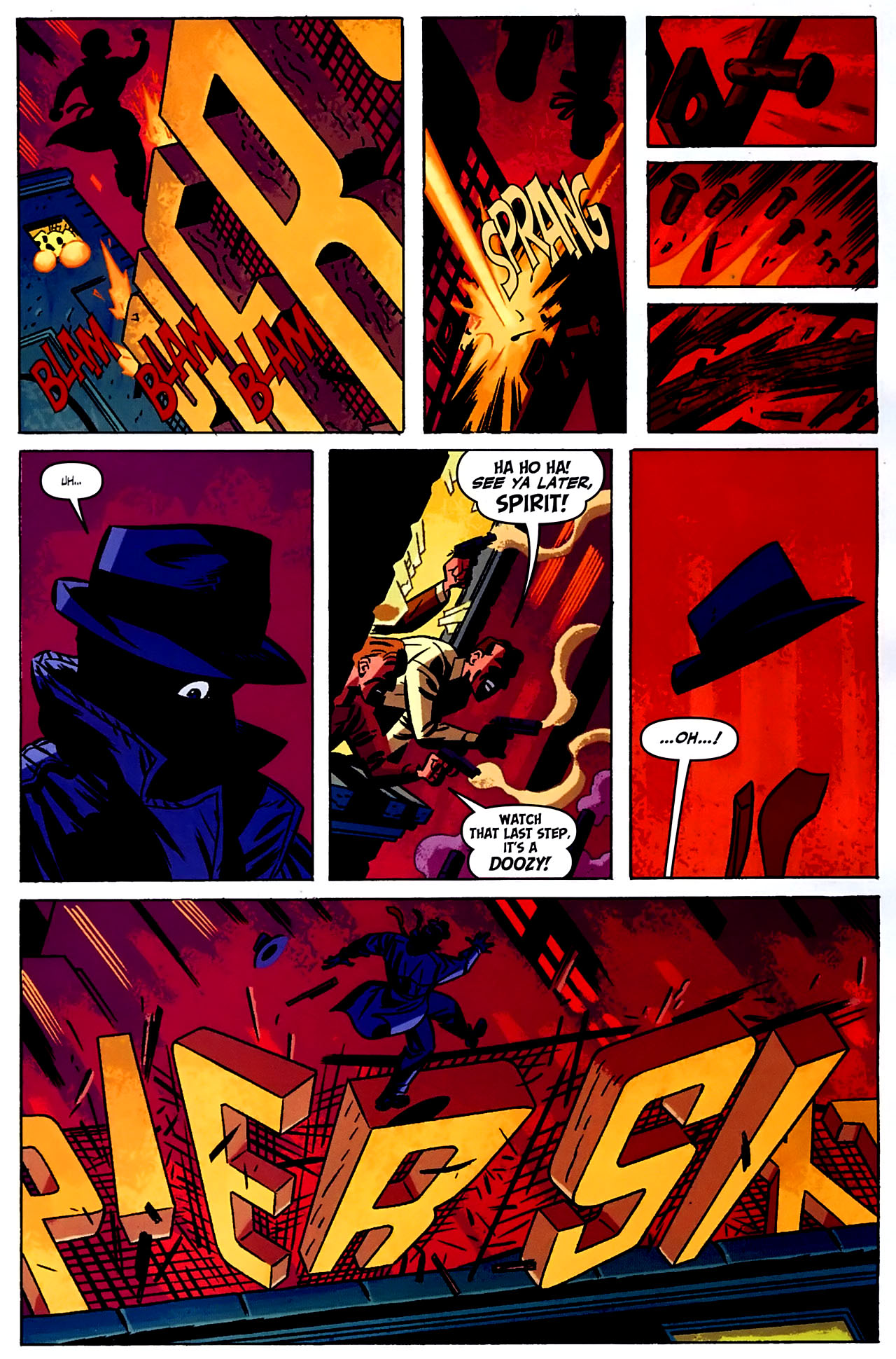
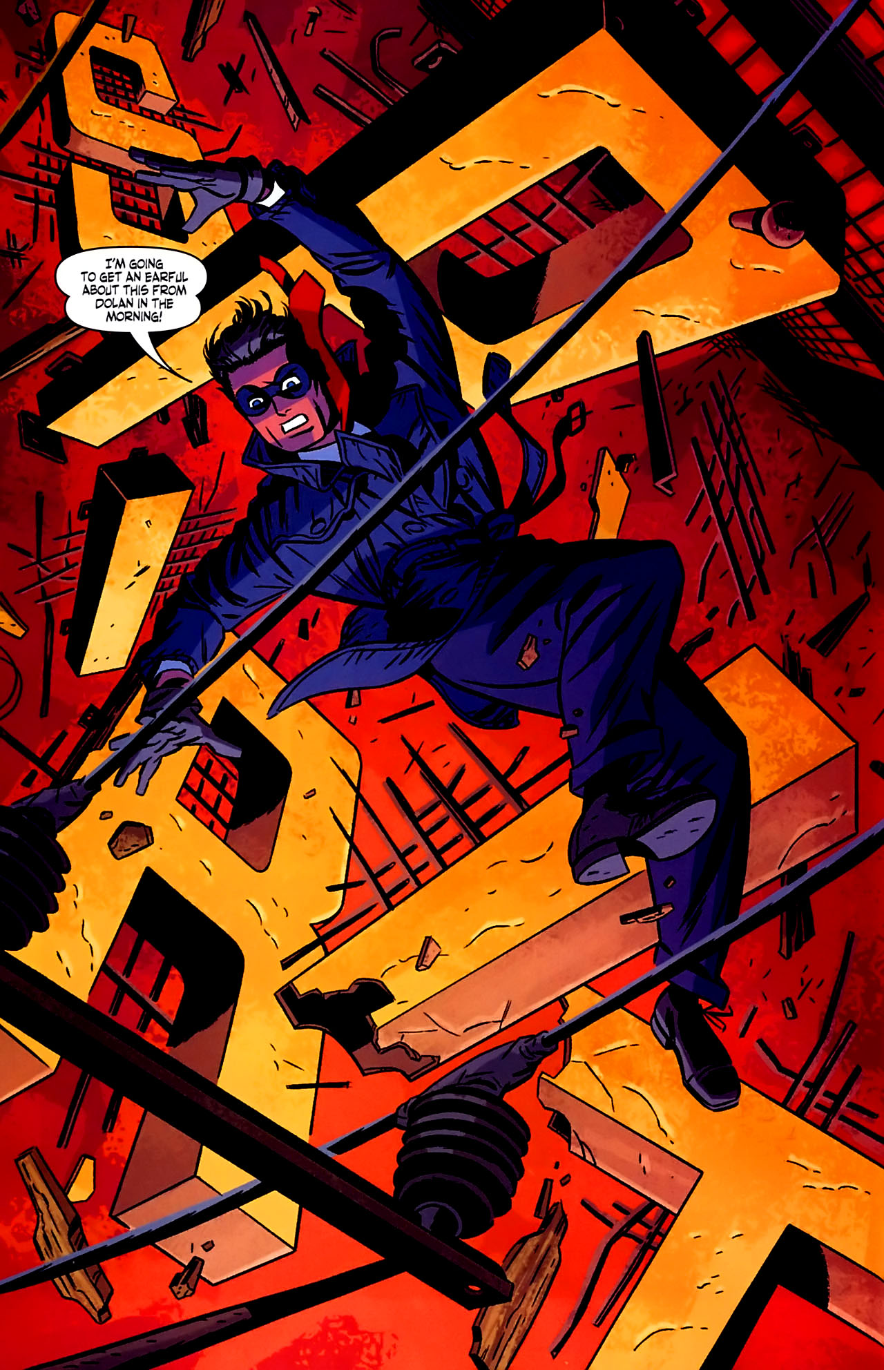
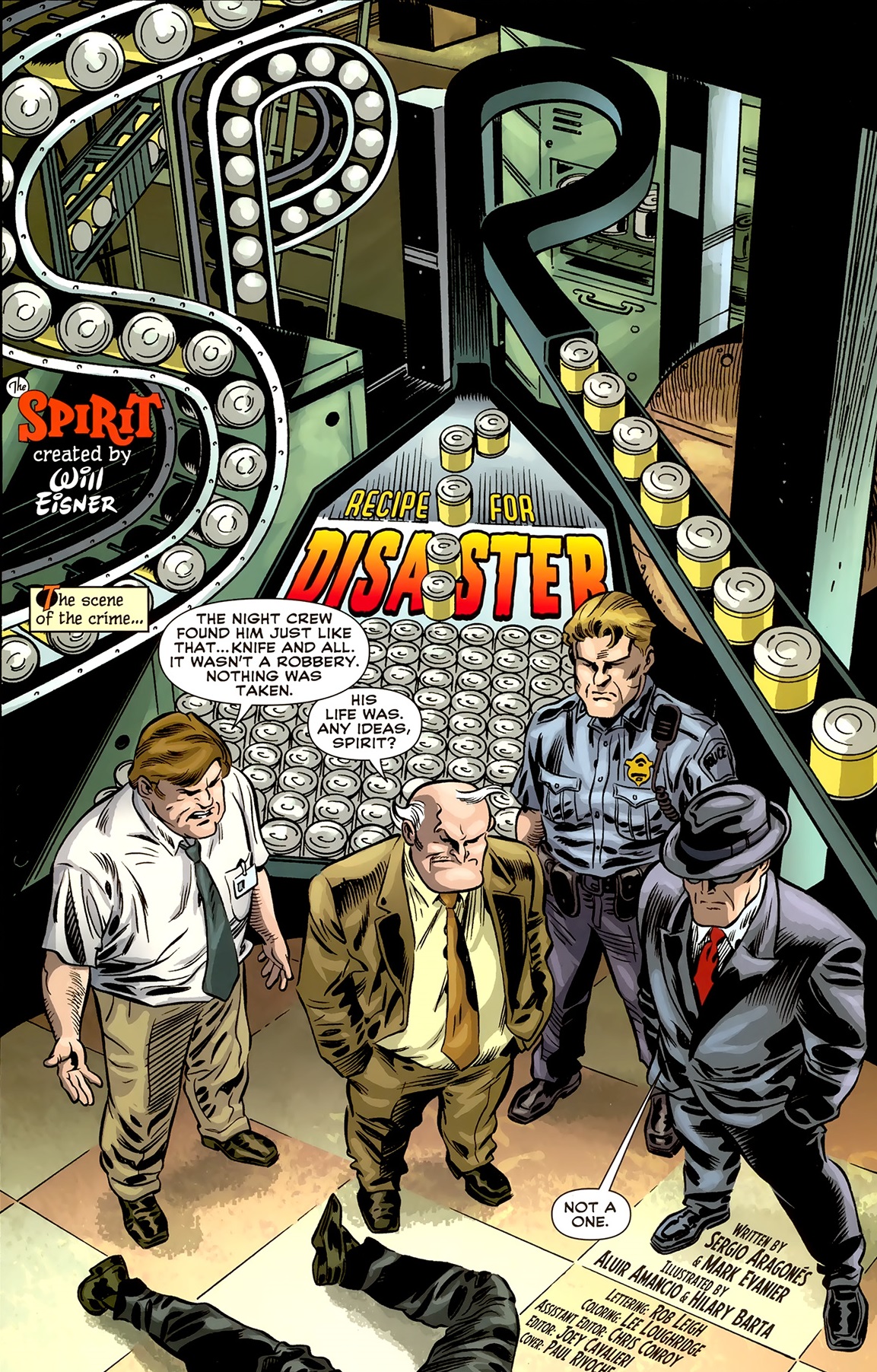
At the time, Darwyn Cooke also worked on a Batman / The Spirit one-shot, written by Jeph Loeb. There, Cooke and Loeb came up with a very neat wink to the series’ fanciful logos. This gag took place while the Spirit escaped from a gunfight by climbing a set of huge letters on top of a building signaling Pier Sixteen:

batman the spiritbatman the spiritBatman / The Spirit

Despite Cooke’s noirish style, his DC reboot of The Spirit sought, first and foremost, to emulate the lighter side of Will Eisner’s comic, including its goofy humor and rollicking adventure tone. After Cooke left the title, many of the creators that followed did the same, with scripts – especially those co-written by Sergio Aragonés and Mark Evanier – as well as artwork – especially when drawn by Paul Smith – going for laughs, albeit of a stale, old-school variety (resorting, for example, to outdated caricatures of the film industry, in ‘Stand In for Murder’). Mark Waid’s and J. Bone’s mini-series The Rocketeer / The Spirit: Pulp Friction and, more recently, Matt Wagner’s and Dan Schkade’s reboot of the franchise for Dynamite went with a similar corny direction.

To be fair, these issues do kind of evoke the comedic mysteries of the 1940s’ run, but they lack the panache of the series at its best – in other words, they feel like tales of The Spirit’s classic era, they just don’t feel like the good ones. (The same goes for most of Dark Horse’s anthology The Spirit: The New Adventures, despite contributions by many of the biggest names in the business).

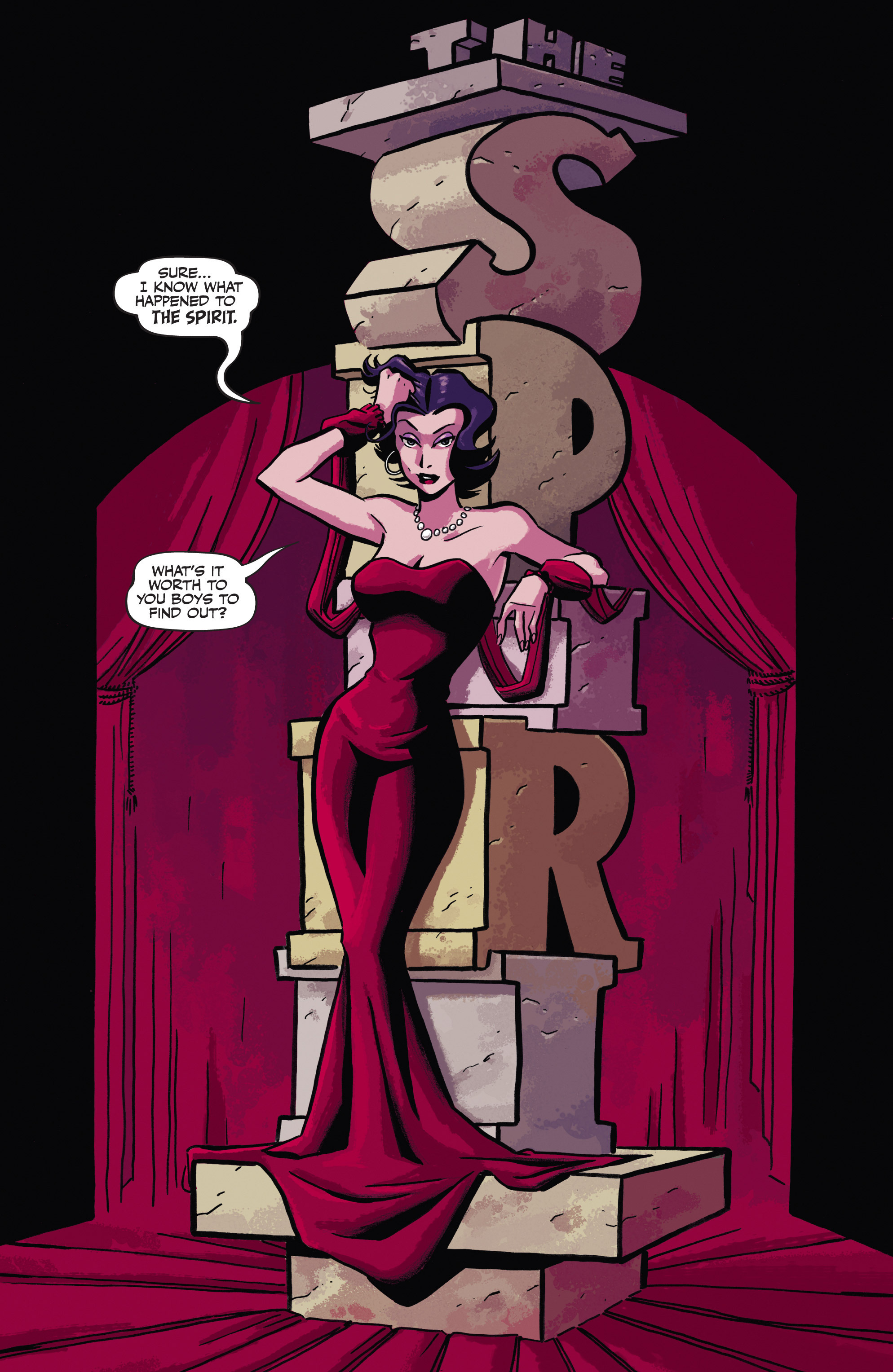
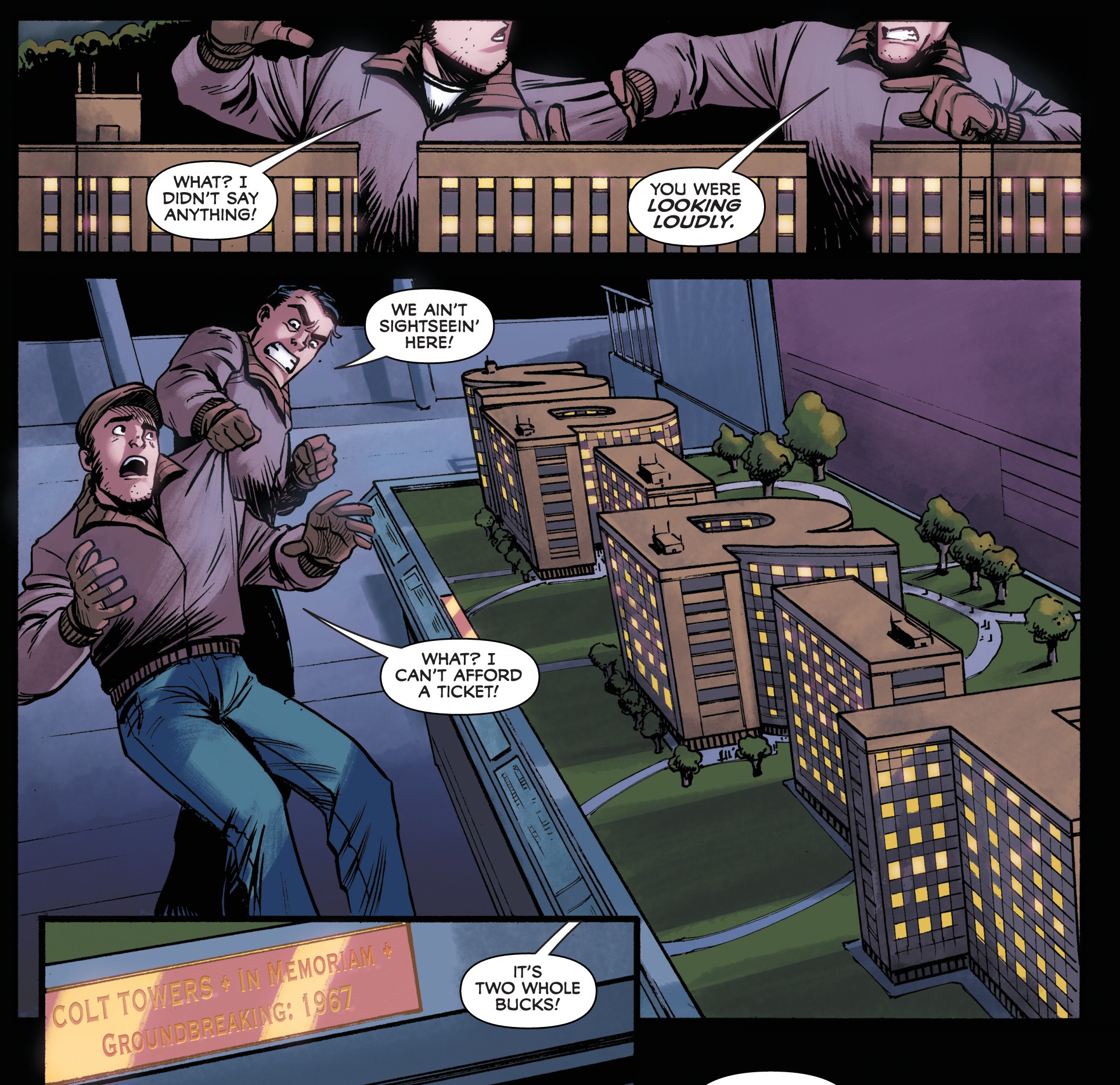
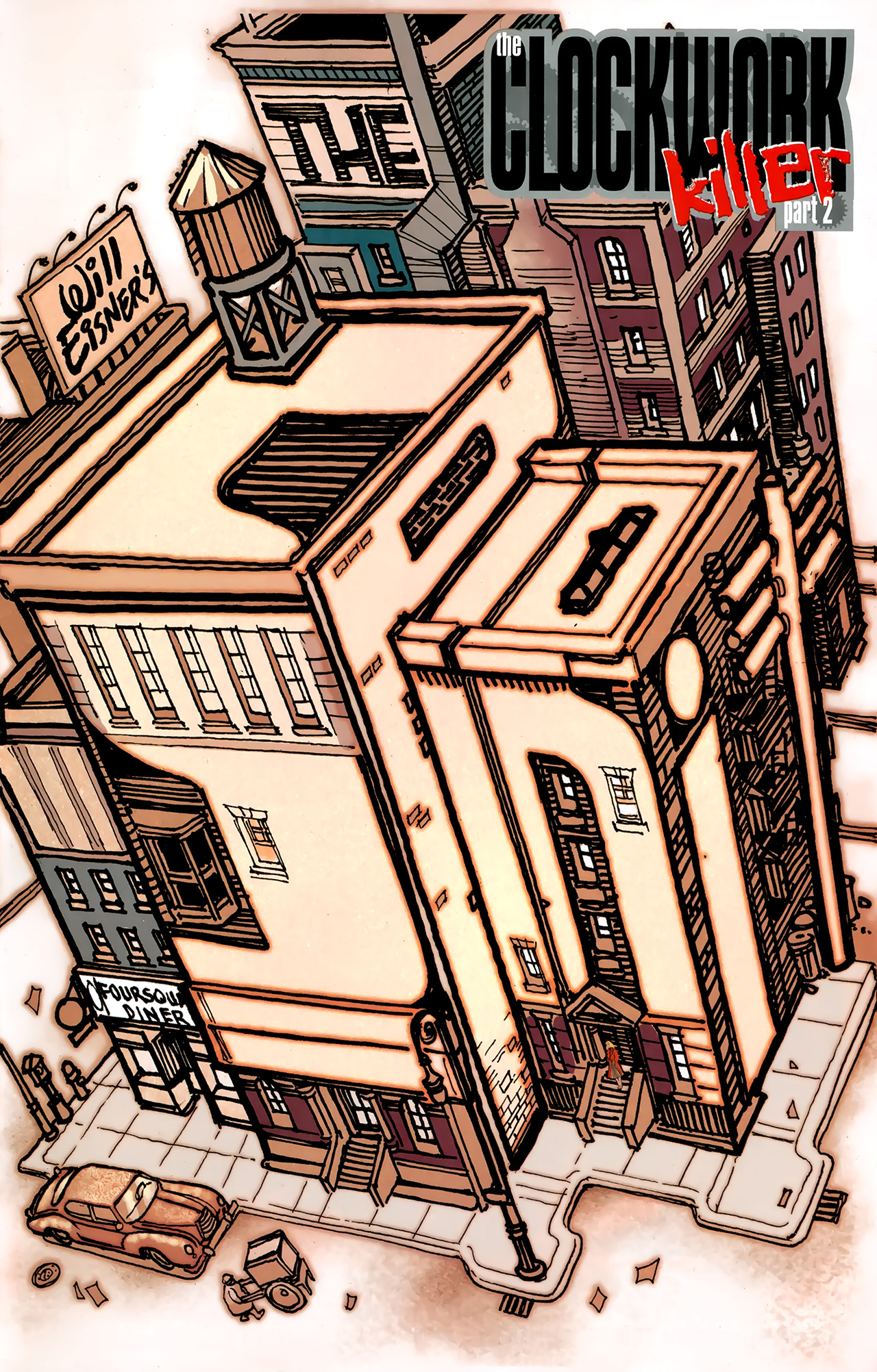
That said, while modern creators haven’t always lived up to Eisner’s drive to innovate and to uncover the untapped possibilities of comic book narratives, at least they’ve proven apt at imitating one of his work’s most distinctive features, namely the pages playing with the series’ logo. The results can therefore be considered either original in their unoriginality or vice-versa, but I admit I’m a sucker for this kind of device anyway…

spiritThe Spirit (v2) #25
The SpiritThe Spirit (v4) #4

As you can see, the words ‘The Spirit’ are often treated as a material presence, either by twisting the shape of surrounding objects or by presenting the logo as an (unexplained) object in itself, one with which the cast nonchalantly interacts.

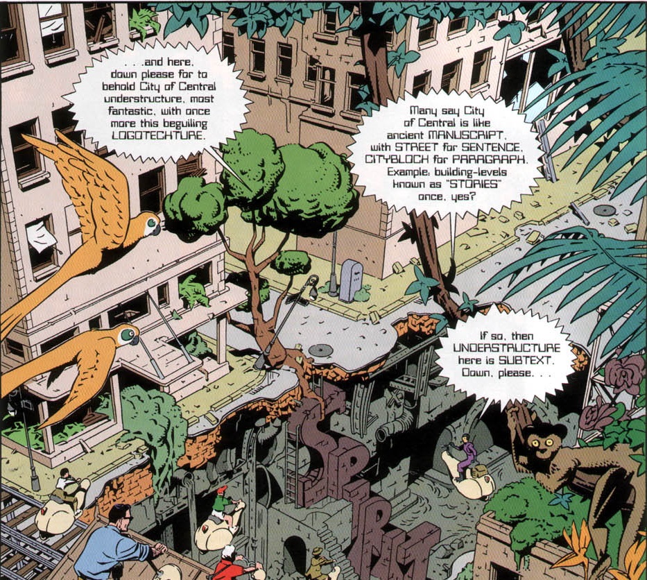
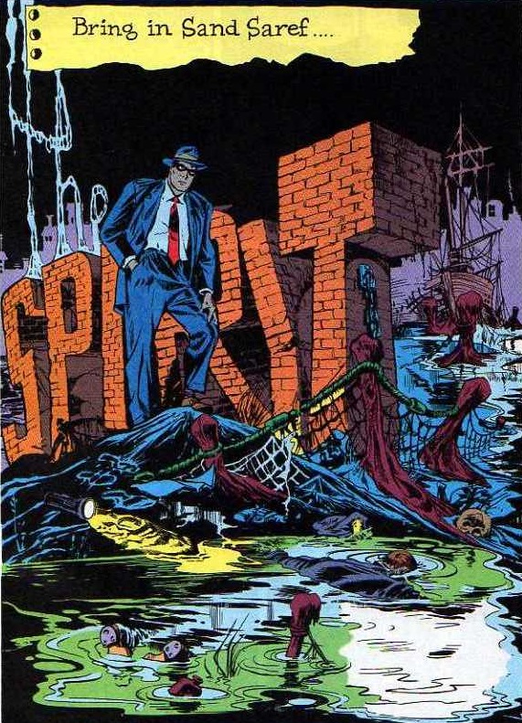
Back in 1998, Alan Moore and Daniel Torres had already done a playful take on this tradition of the series, in the memorable ten-page story ‘Last Night I Dreamed of Doctor Cobra.’ Set in the future, that comic followed a tour through Central City’s ruins, including what the guide called the city’s ‘logotechture’ (i.e. its buildings shaped like words, specifically ‘Spirit’), thus amusingly breaking the unspoken rule about the characters acknowledging the logo’s shape:

The SpiritThe Spirit: The New Adventures #3

If it’s comedy you want, I suggest feasting your eyes on Gail Simone’s and Phil Hester’s short story ‘The Cold Depths of the Icicle Heart’ (The Spirit (v2) #13, cover-dated February 2008), which conveys the kind of masterful ability to play with the language of comics that made Will Eisner’s work so great. Similarly, you could do much worse than to track down the spot-on pastiches in Big Bang Presents #1 and in the criminally short-lived Greyshirt.

Moreover, Fred Van Lente and Bob Q brought all kinds of fun to the pages of The Green Hornet ’66 Meets The Spirit, a truly madcap romp set at a 1966 World Expo in Central City. Like many of Van Lente’s comics, this mini-series has become one of those tales I’ll gladly reread whenever I need a chuckle. And while it doesn’t mimic Eisner’s classic title pages, it does include a brief homage early on:

The Green Hornet ’66 Meets The Spirit #1The Green Hornet ’66 Meets The Spirit #1

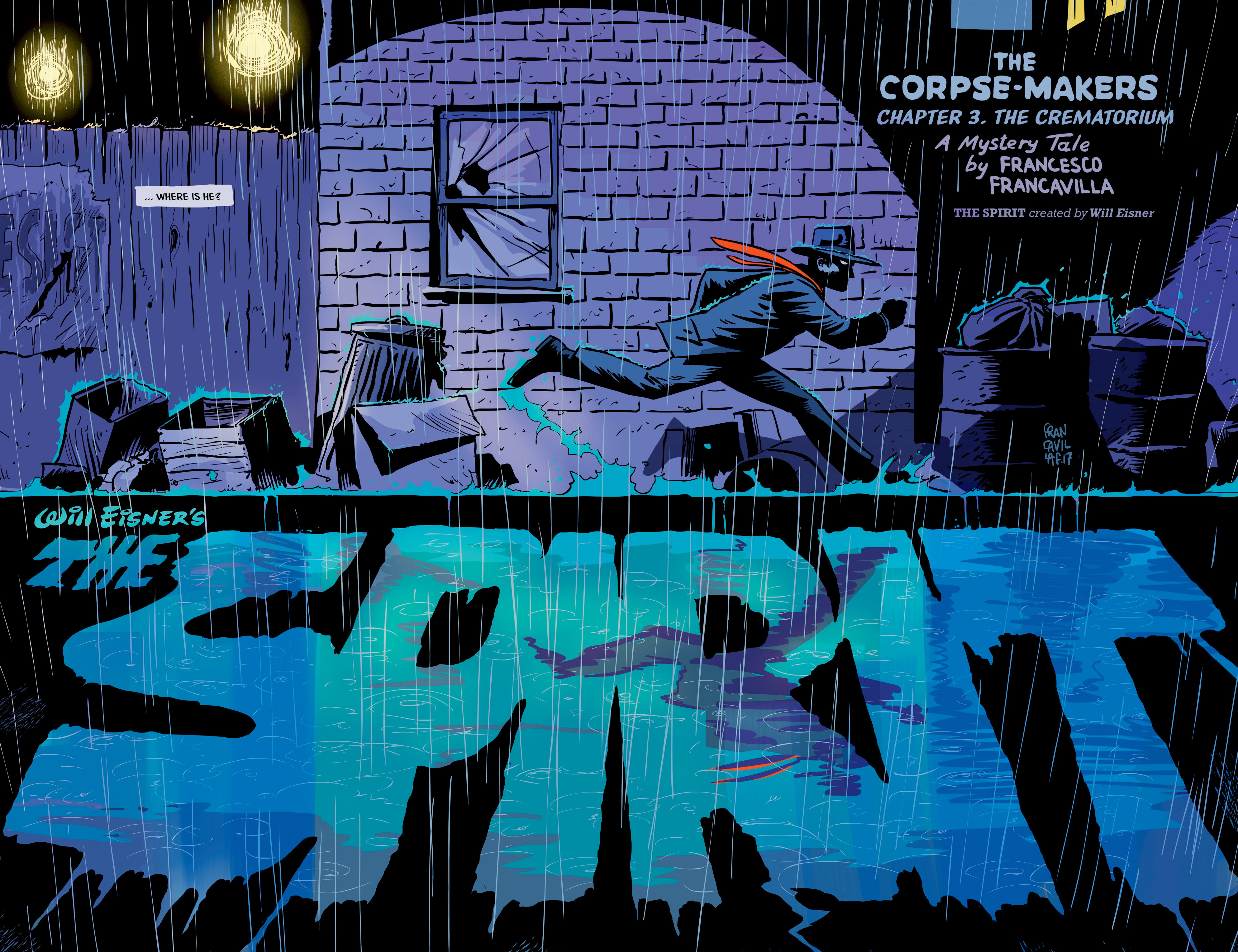
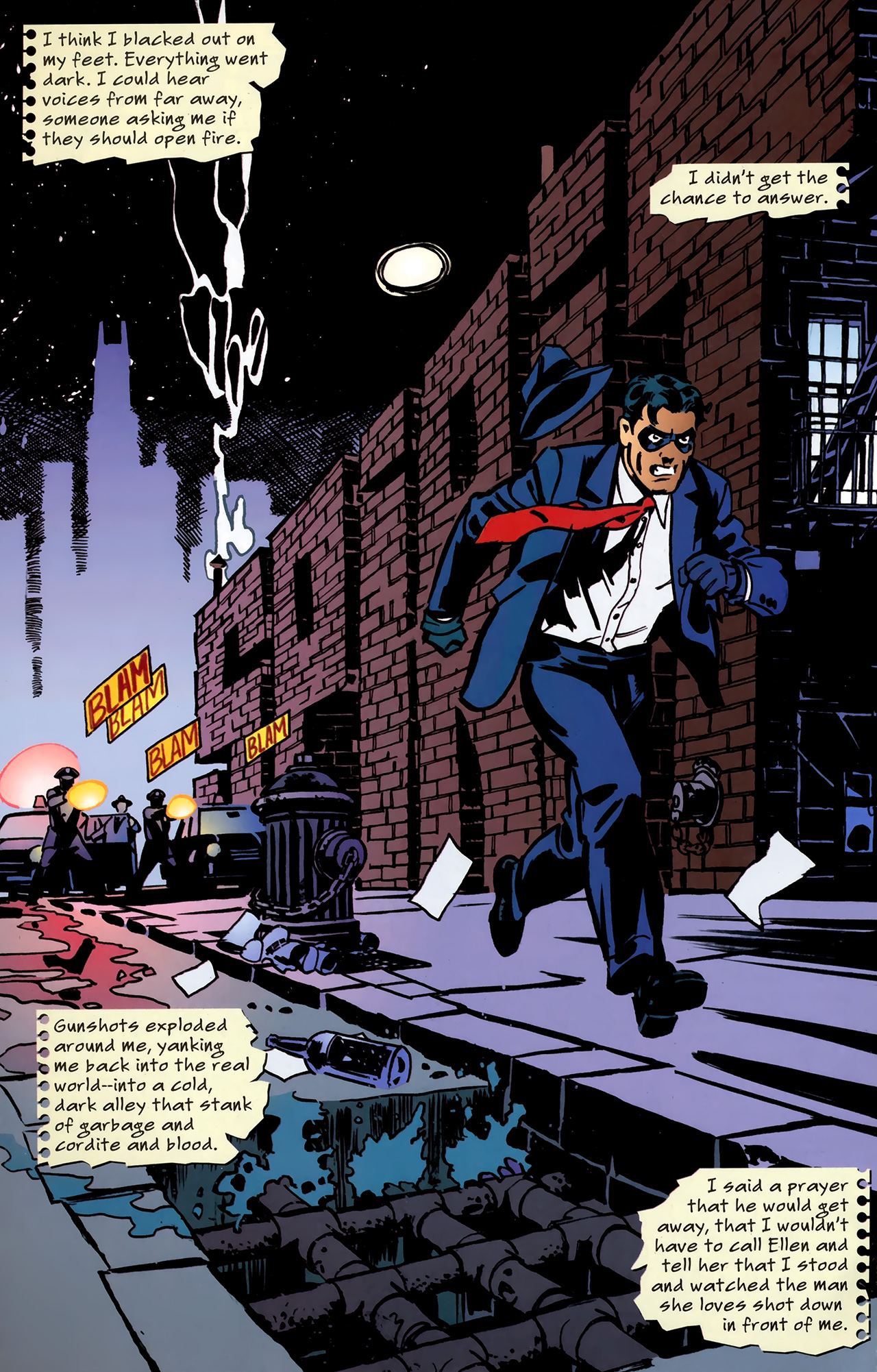
Not everyone has gone with the humorous route in adapting The Spirit, though. For instance, Francesco Francavilla’s mini-series The Corpse-Makers leaned hard on the noir vibe (mixed with a bit of horror), which was also a staple of the original. If you’re into rainy streets and an omnipresent sense of doom, this comic has them in spades, more than compensating for a weak plot through some ultra-atmospheric visuals, including eye-popping double page spreads near the start of each issue that bring to mind some of the greatest film noir posters of the classic era:

The SpiritThe Spirit: The Corpse-Makers #3

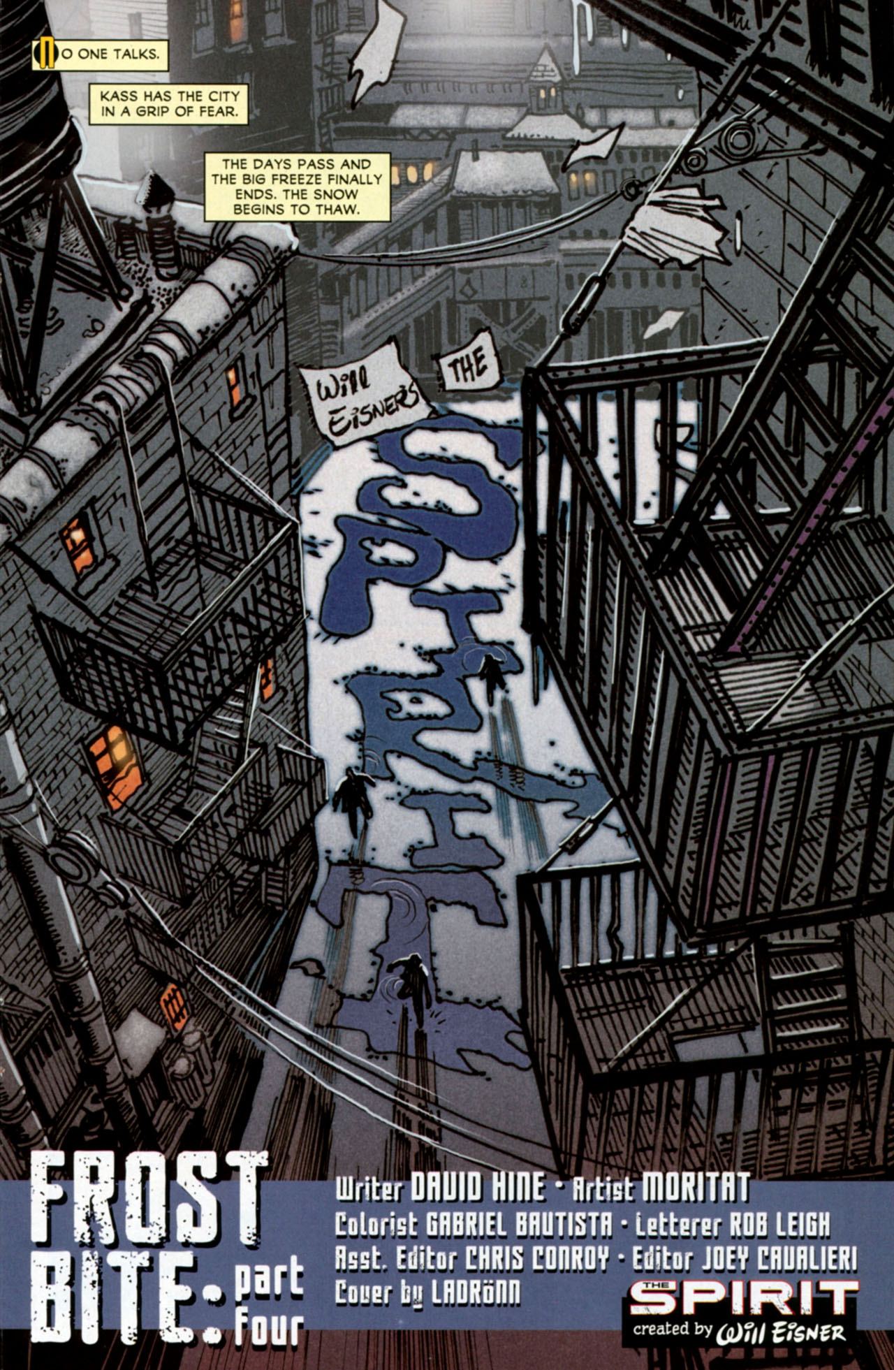
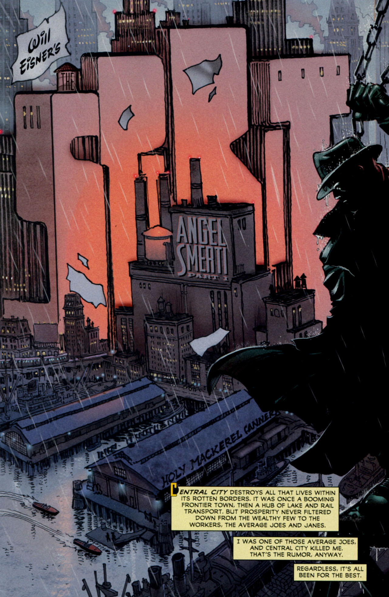
One of the grimmest takes on this property was actually published by DC back in 2010-2011, as part of their pulpy ‘First Wave’ line. Initially written by Mark Schultz and, since issue #4, by David Hine, with regular art by Moritat, that series loosely reimagined The Spirit’s world and characters while delivering a two-fisted crime saga with a trashy, surrealist edge that was not too far from Sin City (another comic that was no doubt inspired by Will Eisner’s early work). Mining the same type of material that must have influenced Eisner in the first place, this neo-noir version of The Spirit captured the nightmarish, hardboiled vibe of a Cornell Woolrich yarn and the gritty aesthetics of postwar movies like The Naked City, The Racket, and Force of Evil.

Moritat was more than up to the task of designing remarkable splashes that ingeniously integrated the comic’s name – at one point, he even got away with writing ‘The Spirit’ in cocaine lines! However, it annoyed me that, in most issues, letterer Rob Leigh (I assume it was him) made little effort to smoothly blend each story’s title into the images, bluntly superimposing his own titles and credits over Moritat’s carefully constructed logos in a whole different style…

The SpiritThe Spirit (v3) #7
the spiritThe Spirit (v3) #12

(You may have to squint to spot this last logo, written through the building’s shape, but it’s totally worth it…)

These awkward clashes stand out even more because, every once in a while, Leigh did manage to merge story title and artwork more organically, leaving us yearning for a more consistent effort to do so. Crucially, the series’ very first title page created expectations that weren’t matched by most subsequent issues:

The SpiritThe Spirit (v3) #1

(That said, the credits in issue #8 are pretty good as well.)

Likewise, although I understand the gesture (not least for legal reasons) of explicitly crediting Will Eisner for the series’ original creation, I don’t see why Rob Leigh – or perhaps somebody else at DC – decided this had to be done through the addition of such a glaring standard extra logo, diminishing the power of Moritat’s designs. After all, if you scroll up back to the splash pages by Darwyn Cooke and Francesco Francavilla, you can see their letterers (Jared Fletcher in the former, Francavilla himself in the latter) were both able to credit Eisner in unobtrusive ways.

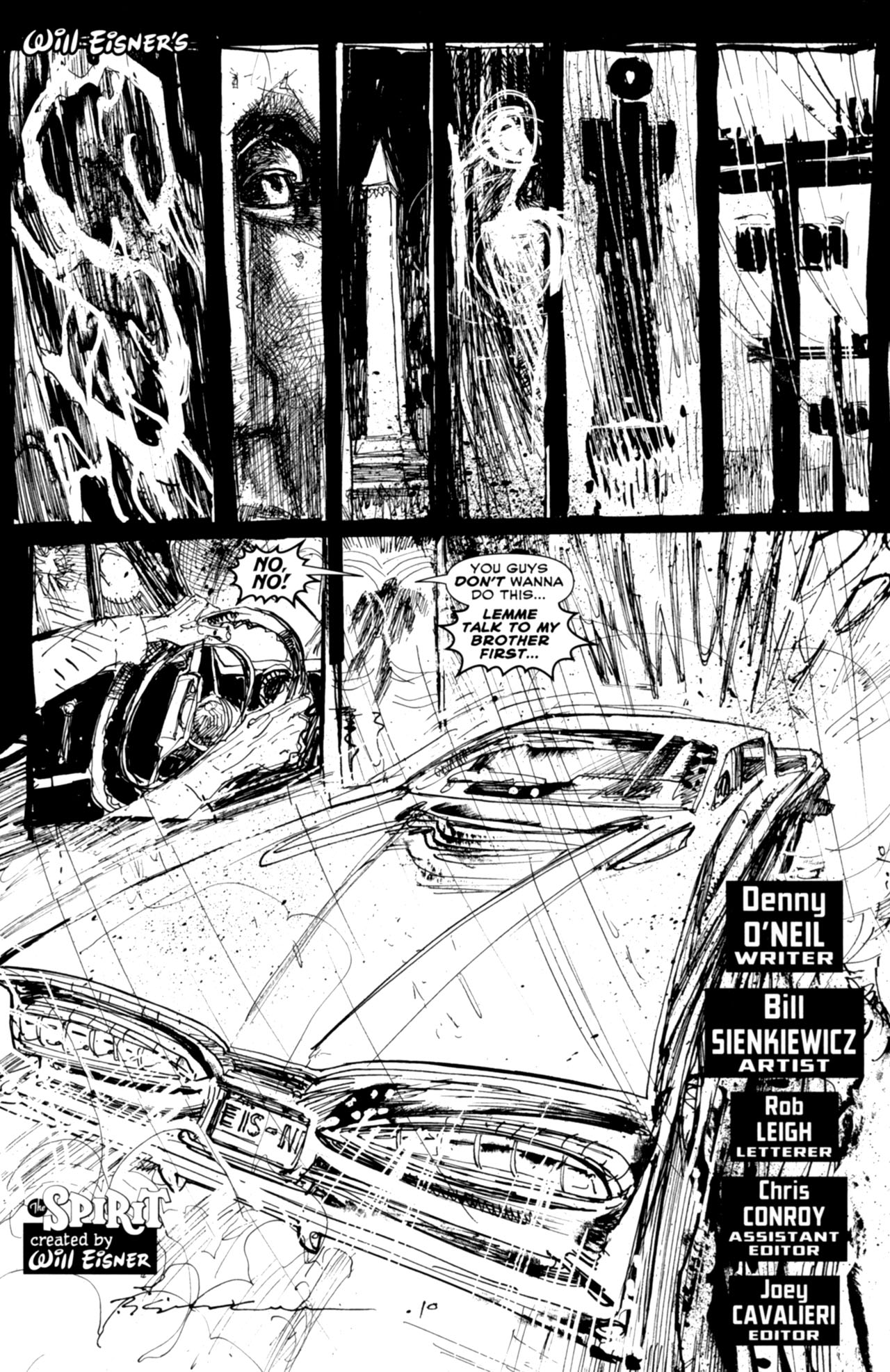
I have the same problem with Leigh’s work in the black & white backups. For example, the amazing Bill Sienkiewicz did such a splendid job with the title page below that it’s a damn shame the image was partially spoiled through the addition of a more conventional logo to the bottom left corner…

the spiritThe Spirit (v3) #1

(Did Will Eisner’s signature really have to show up twice in the same page? Did the logo at the bottom really have to be so close to the license plate, drowning the reference inside the picture itself? Shouldn’t the splash in the lower half of the page be given more room to breathe?)

As for the writing, while David Hine has repeatedly displayed a willingness to push the boundaries of comic books that is truly worthy of Eisner (as seen, most notably, in Strange Embrace and The Bulletproof Coffin), his work on The Spirit didn’t do much to break the mold. For the most part, the result were solid genre comics, wrapping Denny Colt in an intricate web of drugs, corruption, revenge, human traffic, organized crime, sexy dames, and relentless violence. Oh, and don’t forget the killer robots!

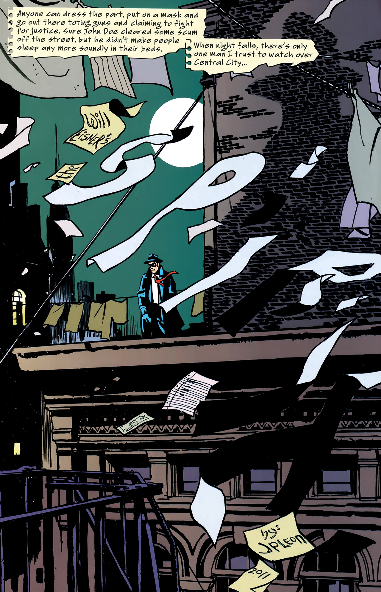
The major exception in terms of the series’ formal experimentation was ‘The Big Picture’ (#16, cover-dated September 2011), a bravura tribute both to Will Eisner’s daring narrative tricks and to The Spirit’s trademark openings… The whole story was told through splash pages and all of them incorporated variations of the series’ logo in one way or another:

the spiritThe Spirit (v3) #16

(The smoky ‘The’ is especially nifty!)

I was actually quite unfair in failing to include ‘The Big Picture’ in my top non-Eisner Spirit comics, when I did a post about them a while back. David Hine, Rob Leigh, colorist Daniel Vozzo, and guest-artist John Paul Léon all did an excellent job of creating splashes that are not only gorgeous on their own, but which also channel (without copying) Will Eisner’s specific designs.

For instance, the page above seems to combine elements from these two classics:

eisnerThe Spirit – November 20, 1947
will eisnerThe Spirit – January 15, 1950

The story itself was a bit meta, since it consisted of a mistaken identity thriller in which another vigilante – with a more vicious attitude – dressed up in the same costume as our hero, arguing that the Spirit was not a man, but an idea. While simple and ultimately clichéd, this premise nevertheless suggested a veiled acknowledgement of the fact that all these series appropriating Will Eisner’s creation could never fully replace the original, no matter how much they tried to simulate its appearance.

The final page of the issue – and of David Hine’s run – clinched this notion in the form of Commissioner Dolan’s closing words, which can be read as applying to the Spirit (within the story) and to Eisner himself (in the real world)…

spiritThe Spirit (v3) #16

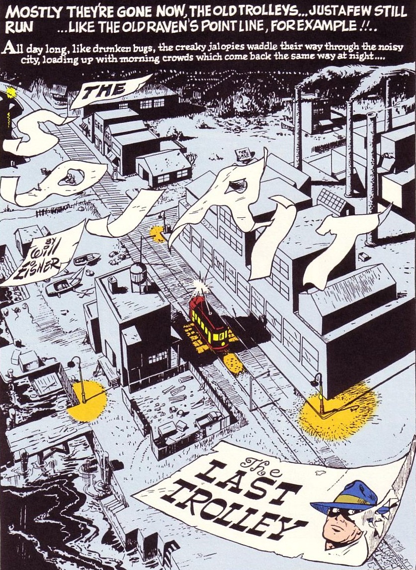
And if you think I’m forcing this reading, bear in mind that the paper strips flying in the wind have probably drifted here from one of Will Eisner’s most famous splashes:

The SpiritThe Spirit – March 24, 1946
Posted in HARDBOILED CRIME | Tagged , , , , , , , , , , , , , , , , , , , , , , , , , , , , , | Leave a comment

COMICS CAN BE AWESOME (20 April 2020)

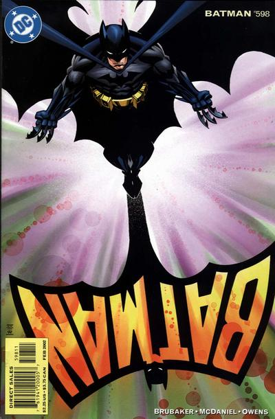
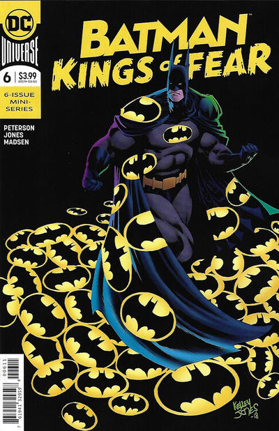
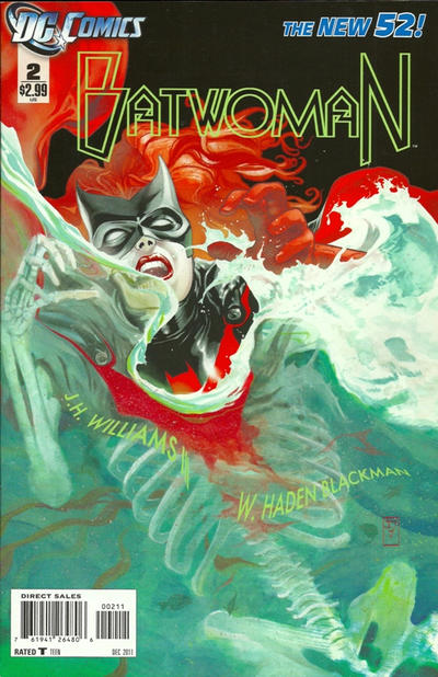
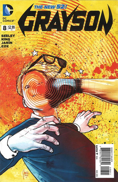
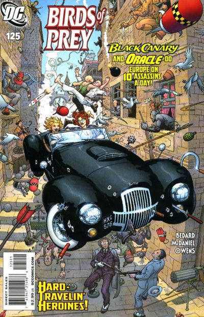
This week, a reminder that Batman comics (and their spin-offs) can look awesome…

BatmanBatman Kings of FearBatwomanGraysonBirds of Prey

Posted in COVERS OF BATMAN COMICS | Tagged , , , , , , , , , | Leave a comment

On The Spirit’s title pages – part 1

eisner

At its best, Will Eisner’s post-World War II work on the noir comedy series The Spirt gave us some of the greatest comics ever – not just groundbreaking stuff at the time, but a string of truly ingenious approaches to the medium that are still a joy to read today.

Although the protagonist, Denny Colt (a former detective widely believed to be dead who reinvented himself as the titular crimefighter), does look pretty cool in his blue domino mask and rumpled fedora, he is not the main reason for the comic’s success. Hell, he barely appears in many of the episodes! As I’ve argued before, the true stars of The Spirit are the storytelling techniques developed by Eisner and his team throughout the 1940s. And, among these, none has become more recognizable than their famous title pages…

The Spiritwill eisner

Check out the way the layout in the images above fluidly guides your eyes from top to bottom, from left to right, ushering you to turn the page… While the use of wide negative space and a relatively limited color palette concentrate your gaze, the forceful impact and dynamic sense of movement create a thrilling feeling even before you know much about the story ahead.

Yes, the occasional racist stereotypes can be hard to stomach (most infamously, the characterization of Ebony White), but, as a rule, the first page of each tale of The Spirit was a beautiful piece of art on its own, deserving of adorning your living room walls. You can tell there was plenty of care and creativity put into conceiving every single installment… For one thing, Will Eisner kept coming up with new designs for the series’ logo and integrating them in striking ways – more often than not in the form of a splash – which gave each adventure a slightly distinct mood.

The inventive logo design played such a big role in the comic’s identity that it often took over the whole page, which was clearly constructed around it. In many of those openers, the logo was even depicted as an actual object, somehow becoming part of the diegetic materiality…

will eisnereisner

I never get tired of this gimmick. It establishes straight away that we are entering an unreal world, unashamed of its artificiality. And, indeed, the main setting, Central City, is made up of mashed tropes of crime fiction and slapstick comedy – certainly gritty, yet also proudly cartoony.

In fact, the device of physically manifesting the series’ title is so perfectly suited to the tone of The Spirit that it started showing up early on, even before the strip’s golden years (after Eisner’s return from the war). For instance, here are a couple of examples from 1940 and 1942, respectively:

eisnerWill Eisner

You’ve probably also noticed how much of The Spirit’s style comes from the same place as film noir. The link is both visual and thematic: the comic is full of desperate losers, urban criminals, dilapidated tenements, smoked-filled rooms, and several femme fatales who seem to have transitioned to the paper straight from the big screen. Between the dirty alleys and  the subliminal postwar malaise, some stories feel aimed at the maddening pitch of expressionistic despair from that sequence in The Set-Up where Robert Ryan tries to escape from the sports arena.

The title pages reflected these links not only by being noirish as hell, but also by being incredibly cinematic… Will Eisner studied the language of Hollywood thrillers – from lighting choices to the tight mise en scène – and brilliantly translated it into the comic book medium. The result resembled, not merely the storyboards that precede film shooting, but finalized movies deaccelerated and broken down into expressive, individual images. By channeling familiar audiovisual motifs like the motion of a camera peeking into and entering a window or the phone ringing in the distance (instantly building up suspense), these still pictures captured some of the energy and timing of movies, albeit with all the intense exaggeration that drawing allows:

eisnerWill Eisner

I’m not saying The Spirit is pure noir literature. If you want a proper hardboiled read from this era, go grab yourself a copy of Raymond Chandler’s The High Window or The Little Sister. What Will Eisner – and the uncredited assistants at his studio – did was to take prototypical elements from this genre and cleverly figure out how to best put them in the service of a fun cartoon strip.

For example, few things scream NOIR more than neon signs, so, bellow, you’ll find a couple of pages that evocatively turned The Spirit’s logo into neon… This effect, combined with a simulation of black & white photography and a flexible approach to panel borders, effectively kickstarts their narratives with a film-like, dreamy atmosphere.

Eisner's SpiritWill Eisner

Another signature mark of The Spirit that was frequently on display in the title pages was the series’ flair for adopting unconventional perspectives for framing its stories. Some tales largely disregarded the Spirit and his regular cast, preferring to follow small-time crooks or peripheral players who found themselves entangled in an encroaching criminal web, Ozark-style. Other tales were told from the point of view of animals or even inanimate objects… This was no doubt an extension of the same will to experiment that ushered in the originality and virtuosity of the opening visuals.

Here is a particularly amusing composition that illustrates this tendency:

The Spirit

In 1950, Will Eisner left The Spirit in the hands of a host of talented ghost writers and artists, keeping a mostly supervisory role. Fortunately, though, his replacements kept the tradition alive, coming up with awesome openers that embedded the comic’s logo into the initial pages…

Here is a great one by Al Wenzel that is definitely worthy of Eisner:

Will Eisner

I especially like the title pages done by Jim Dixon, who had a grimier, more detailed touch… Seriously, you can practically hear the wood creak in this one:

Eisner

Actually, I’m not much of a fan of Dixon’s artwork in the rest of the stories, but he sure nailed most of his openers. Even when he failed to come up with an imaginative design for The Spirit’s logo (like in the examples below), he knew how to pull off disorienting POVs that pulled readers into the comic while conveying the sordid environment that characterized the material.

EisnerEisner

Next week, we’ll see if modern day creators have also done justice to this feature of The Spirit.


Posted in HARDBOILED CRIME | Tagged , , , , | Leave a comment

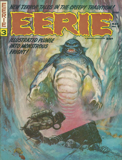
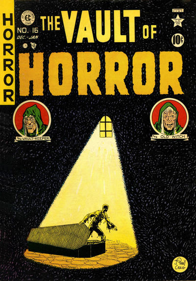
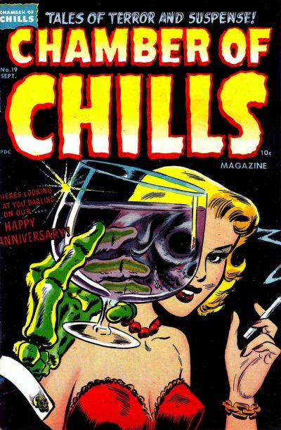
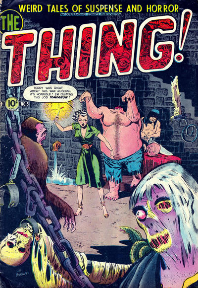
COMICS CAN BE AWESOME (13 April 2020)

As it often happens in scary times, the horror genre provides both a perversely comforting, vaccine-like sedative against overwhelming anxiety and useful metaphors to consider the wider processes at play.

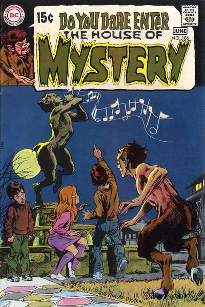
So here is your spooky reminder that comics can be awesome…

House of MysteryEerieVault of HorrorChamber of Chills MagazineThe Thing!

Posted in ART OF HORROR COMICS | Tagged , , , , , , , , , , , , , | Leave a comment

Spotlight on Injection

Between the dystopic aesthetics of armed forces sealing people in their homes while drones patrol the empty streets, the apocalyptic vibe of the world stopping over a contagious invisible menace (not to mention the sheer death toll), the process of social relations moving even more online, and all the self-organized networks making the most out of the vast possibilities of virtual technology, we are living in sci-fi times. It seems hard to imagine that, at the end of this, we will return to some sort of business as usual, but it is still unclear how radical the transformation of society, politics, and the economic system will be. The looming chance that we are entering a deaccelerated age, with less industrial production and less international connectivity (at least on a material level), inspired me to revisit one of the most entertaining sci-fi comics of the last few years…

Injection

The 2015 series Injection revolves around five eccentric geniuses who gathered in a think tank called Cultural Cross-Contamination Unit (CCCU). Frustrated over what they feared could be a much less interesting world after the current peak of novelty and innovation slows down, the group developed an alien-injected AI – or, as they called it, a ‘non-biological artificial consciousness emulator’ – with the ability to reshape the fabric of reality, including by physically conjuring up old myths. The result is mind-bending and often gruesome, so it is now up to them to put out the fire.

Many of you won’t be surprised to know Injection is written by Warren Ellis, since it shares all of his pet motifs, from the sardonic sense of humor to the unbridled fascination with technological progress (combined with a healthy dose of fear of its misuse), not to mention the haunted view of British history. The CCCU team are certainly not his first leads obsessed with exploring and experimenting, mirroring the desire for wonder and thrilling surprise that presumably also drives readers to pick up Ellis’ works in the first place.

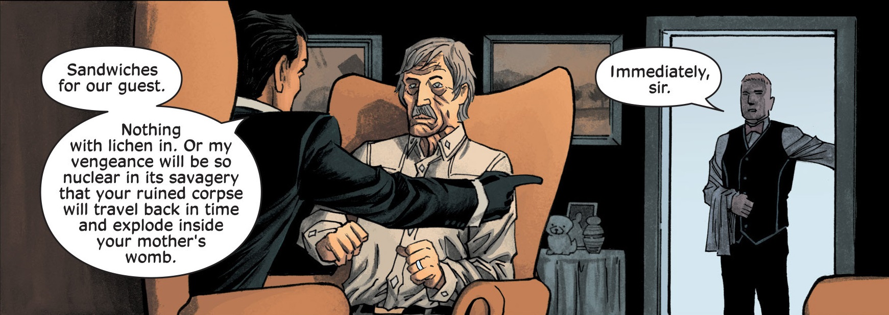
Also in typical Ellis fashion, each of the CCCU members always (reasonably) acts like they’re the most intelligent person in the room, showcasing the writer’s playful relationship with the proto-poetic language of scientific jargon as they nonchalantly mention stuff like ‘paramilitary cells in conversation with a half-alive machine intelligence containing a strategic processing engine.’ On top of this, they all talk in Ellis’ signature brand of aggressive hyperbole… especially when it comes to sandwiches, for some reason:

Injection #6Injection #6

You can see Injection as a less superhero-y variation on what Warren Ellis did in Planetary or perhaps argue that he has been building up towards this for the past decades, as if everything that came before – at least since his magnum opus, Transmetropolitan – were sketches and approximations that culminated here. In any case, what Injection lacks in overall originality (at least for Ellis’ standards), it more than makes up for in vivacity. This is Ellis in overdrive: there is a giddy, infectious sense of excitement about even throwaway notions like that of Merlin as a ‘political wizard’ or of financial capital as a form of alchemy. And although Ellis’ infatuation with science often flies in the face of my more critical impulses against self-righteous positivism, I’d say this is the right moment for some upbeat, enthusiastic sci-fi.

Moreover, while Ellis gets some flak for his tendency to fall back on the same tropes and stock character types, he is still a highly versatile creator, constantly crafting different environments and types of stories, ranging from the surrealist art horror of Shipwreck to the ultra-slick superhero action of Moon Knight: From the Dead (which shares an art team with Injection). Here, Ellis compellingly filters dark fantasy through heady, hardcore science fiction:

Injection #3Injection #3Injection #3

In addition to this, Injection also features strong elements of crime fiction and techno-thriller. (Plus, there is one story arc about ghost sex.) The mixed flavor of the ensuing genre hybrid is particularly effective because Warren Ellis takes his time before fully explaining the series’ odd setting and terms, so that for a while many readers may be unsure what kind of story they’re being told. The lack of solid ground is, of course, part of the fun, as we are initially bombarded with all sorts of strange concepts and often have to reread entire passages just to begin guessing what is going on. This could’ve been quite off-putting if there was nothing else to hold on to, but Ellis cleverly secures readers’ craving for more immediate gratification through a steady supply of amusing interactions as well as sudden bursts of gore.

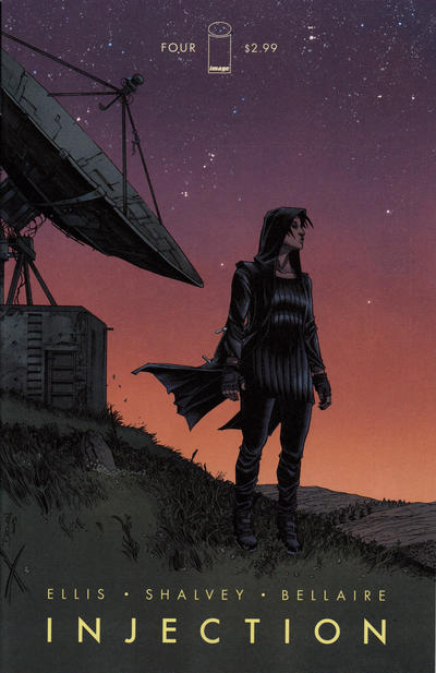
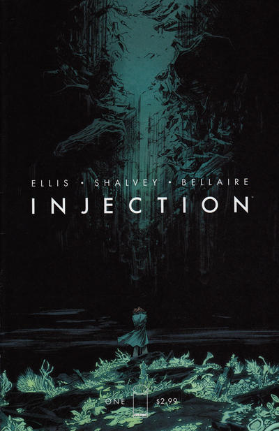
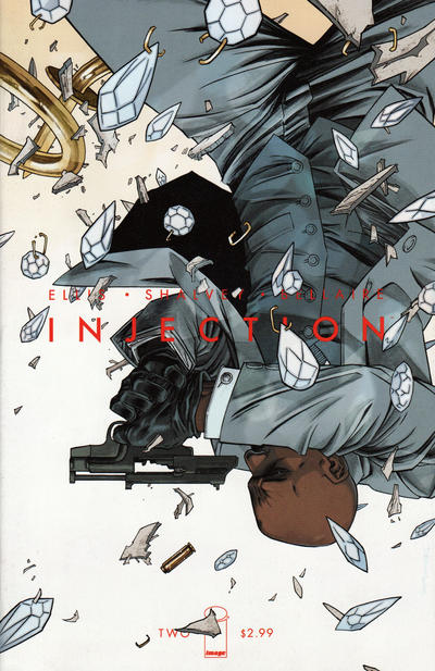
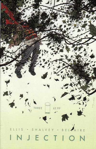
Injection’s storytelling variety is gracefully rendered by Declan Shalvey and Jordie Bellaire, starting with their stunning covers, each with its own distinctive mood:

Injection     Injection     Injection

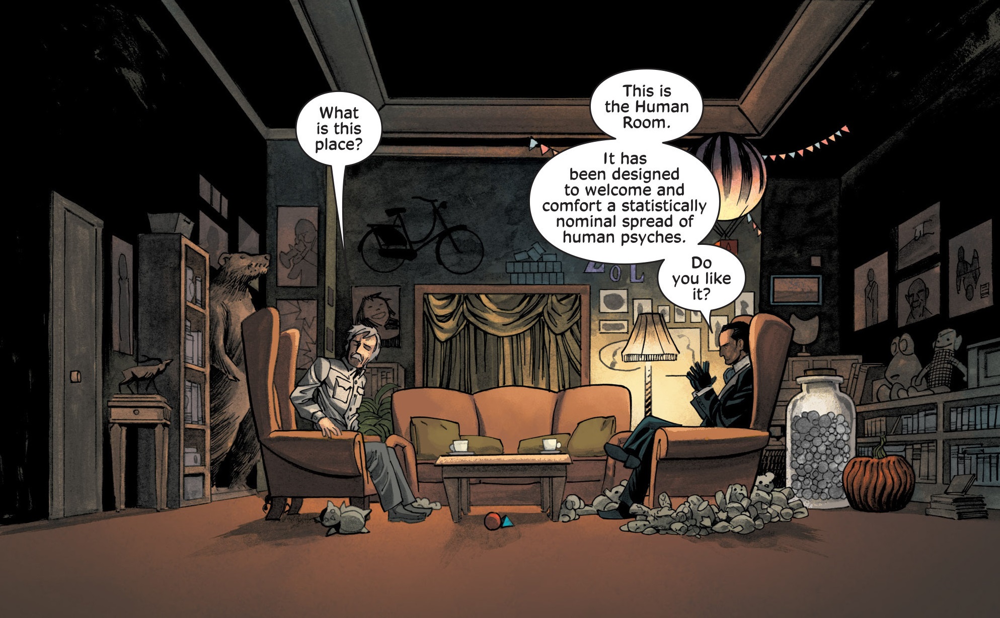
Indeed, as usual with Warren Ellis’ comics, the artists deserve much of the praise, since they carry the bulk of the characterization. As his latest novel, Normal, demonstrates, without visuals Ellis’ characters become largely indistinguishable, so instead of a dramatic pulse you’re essentially left with a string of (really cool) ideas and angry monologues. In Injection, Declan Shalvey’s artwork and Jordie Bellaire’s colors instill each person with neatly expressive facial ‘acting’ and body language.

Bellaire, in particular, proves to be one of the greatest colorists in the business. Working with a soothing, relatively minimalistic palette, she has specific tones dominate each sequence. This carefully anchors every scene in its own precise atmosphere, whether it’s one of the many lengthy conversation pieces or one of the occasional instances when the series springs into balls-to-the-wall action.

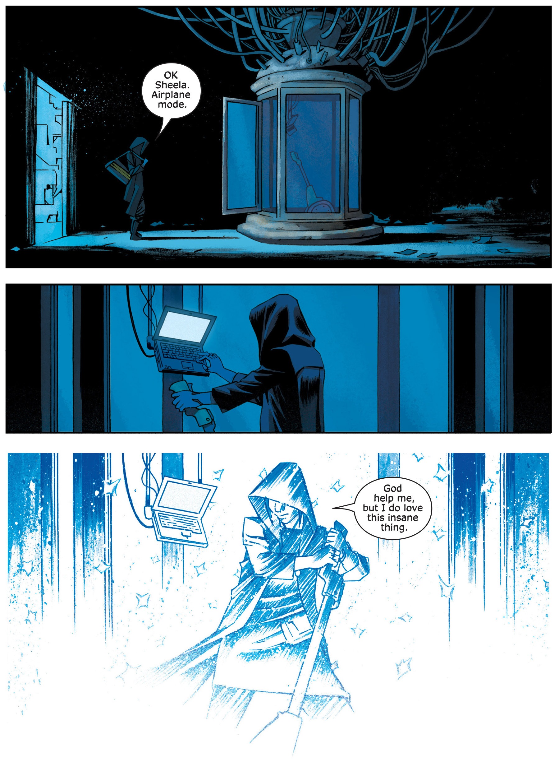
Notably, while never going into fully experimental mode, Shalvey and Bellaire keep coming up with new ways to visualize the fantastic processes at play, like this subtle depiction of teleportation:

Injection #11Injection #11

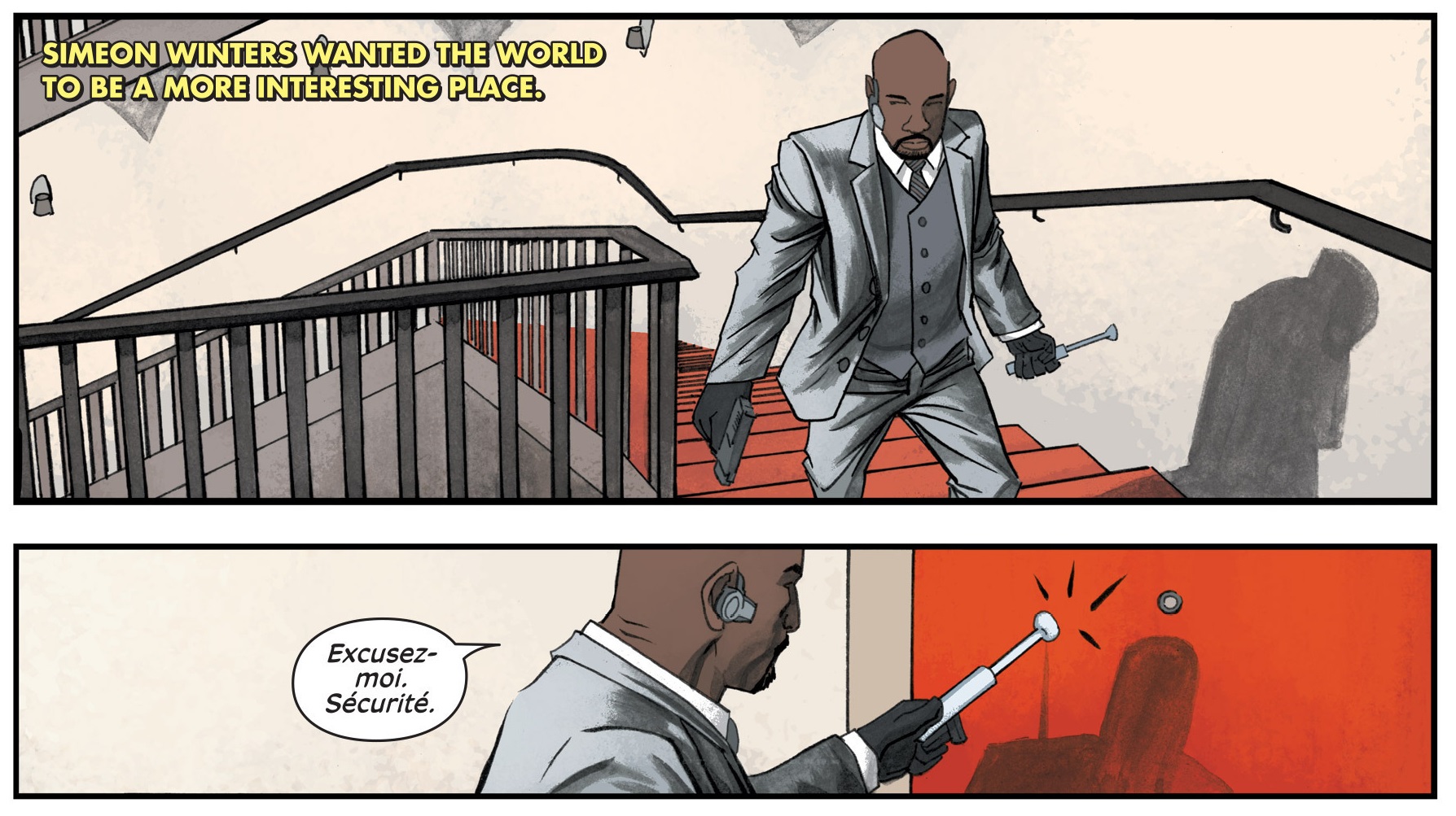
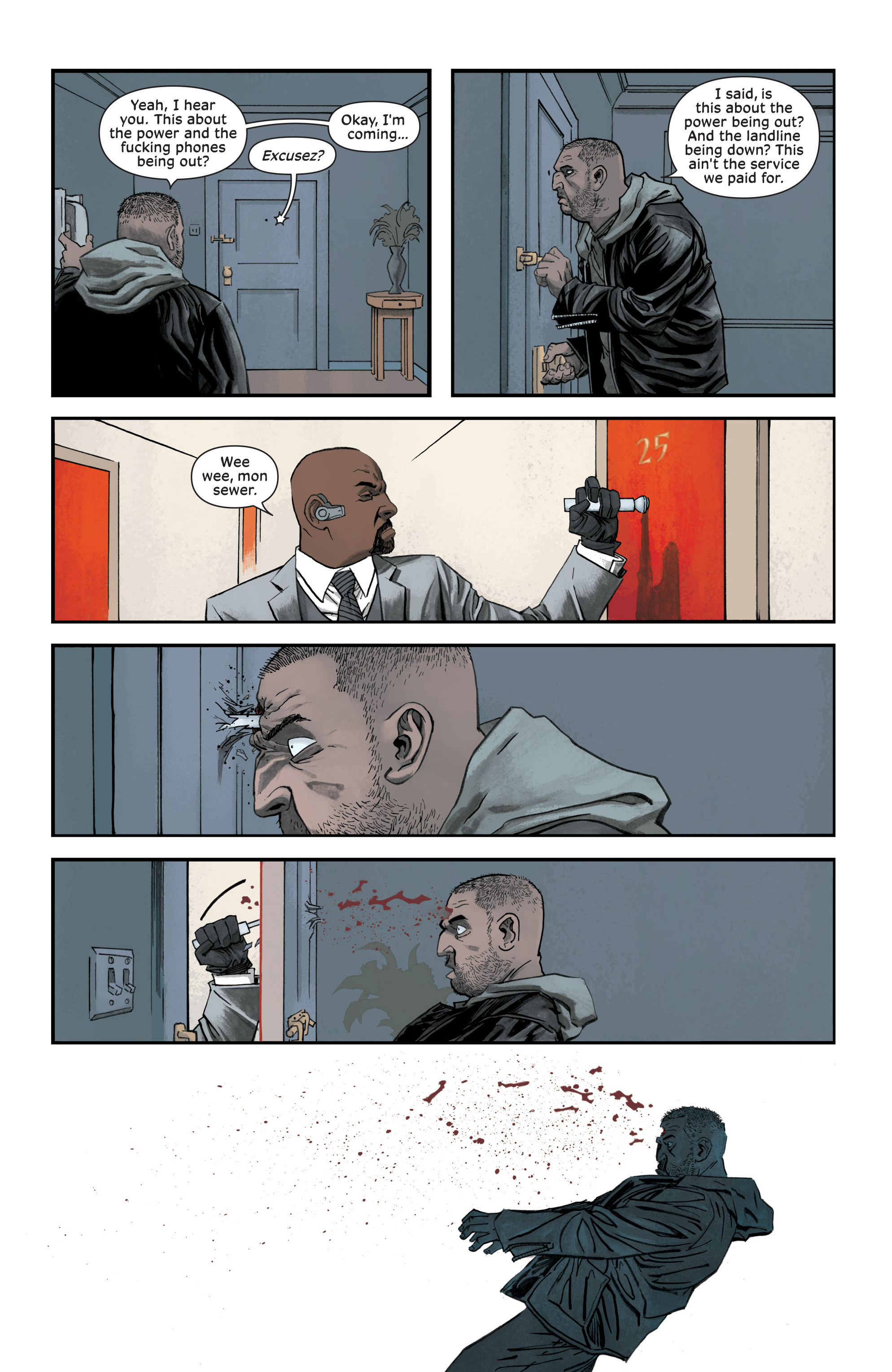
Besides the stylish art, characterization is helped by the fact that, in a typical postmodern move, the main cast – Maria Kilbride, Robin Morel, Brigid Roth, Vivek Headland, and Simeon Winters – is blatantly composed of spins on familiar archetypes from British popular culture, namely the brilliant scientist Bernard Quatermass, the occult detective Thomas Carnacki, the technologically savvy Doctor (from Doctor Who), the cerebral sleuth Sherlock Holmes, and the suave, strategic-minded spy James Bond.

Injection makes a point of updating these icons not only by equipping them with more cutting-edge, cybernetic knowledge, but also by swapping some of their genders, races, and sexual orientation, suitably channeling the concern with diversity that has become a staple of our times, thus reflecting the comic’s own forward-looking spirit. As a result, yes, we do finally get an Idris Elba-looking Bond:

Injection 2InjectionInjection #2

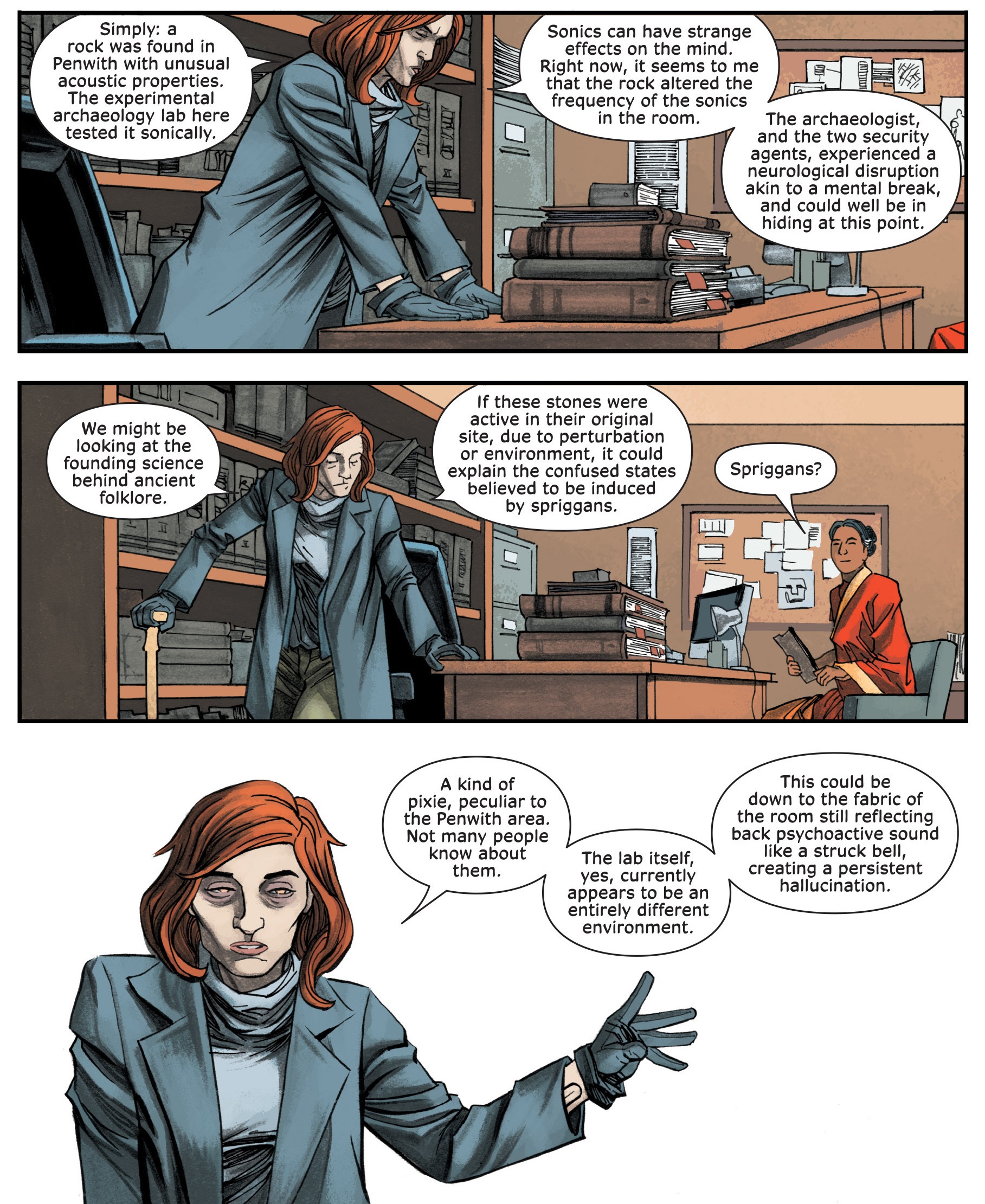
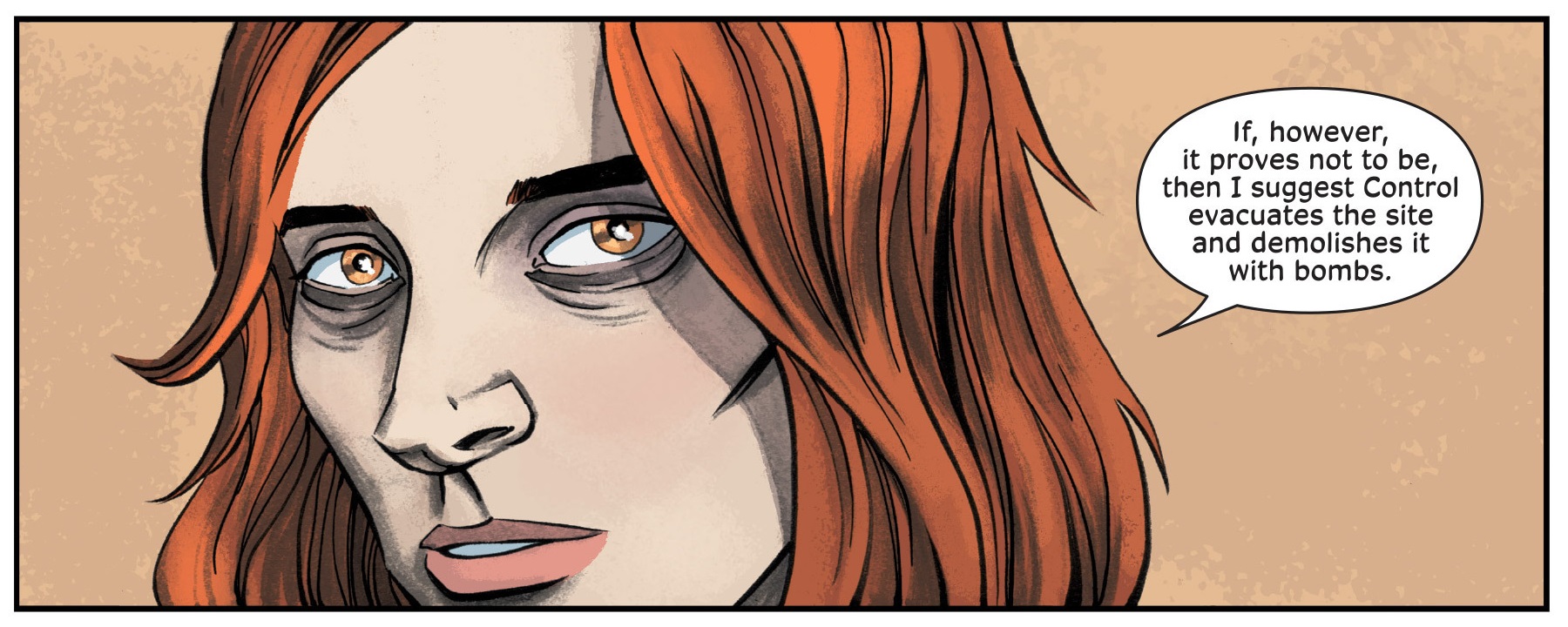
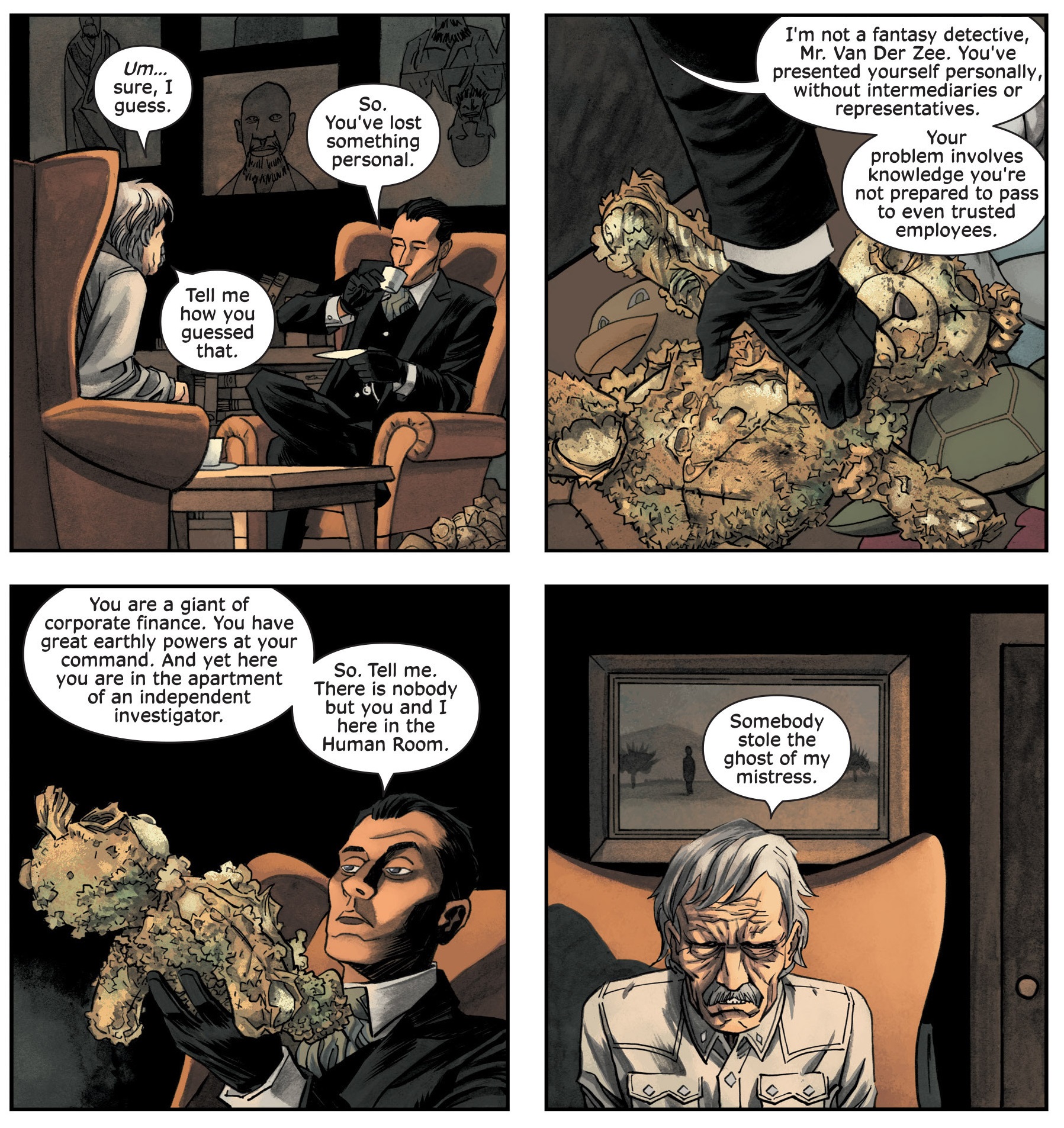
As much of a blast as Warren Ellis clearly has writing James Bond (as he did in his kickass run for Dynamite, which came out around the same time), his glee particularly shines through when reimagining Sherlock Holmes in the form of Vivek Headland. Ellis, who early in his career adapted the Holmes tale ‘The Adventure of the Sussex Vampire’ for Caliber and who later played with Holmesian types on the pages of Planetary, Global Frequency, and, most remarkably, the fabulous one-shot Aetheric Mechanics, here takes things one step further by basing a core character of an ongoing series on the Baker Street detective and devoting an entire arc to one of his investigations while hilariously exaggerating the original’s deductive abilities and idiosyncratic personality…

Awe at the sequence below, starting with what is probably my favorite panel in the whole series (not least because of Declan Shalvey’s lovingly detailed background):

Injection #6Injection #6Injection #6

On a metafictional level, it’s as if these classic characters have gotten together and deliberately created a mechanism to make their escapades livelier and more futuristic. Indeed, the storylines are themselves shaped around modern versions of each tradition of weird fiction – the first one a Quatermass-style yarn, the second one a Holmes mystery, the third one a Doctor Who adventure.

Injection doesn’t require you to pick up on this intertextual game to follow the narrative or even to appreciate the captivating cast. Yet it’s this dimension that makes the comic more than a fantasy about a powerful out-of-control sentient machine. Hell, the very fact that the CCCU’s invention chooses to bring ancient legends to life speaks to the notion that there is something enduringly relevant about old fictions, which makes Brigid Roth’s words sound like a thesis statement: ‘myth is how we used to transmit knowledge. Myths are facts embedded in stories worth retelling.’

The series has been on hiatus since late 2017, but hopefully it will return soon – at the very least, we need a Bond storyline and a Carnacki one! While times don’t appear to be growing any less interesting (especially in the Chinese curse sense), it would be nice to see Injection’s heroes once again rework themselves in line with the shifting visions of the future ahead.

Posted in FANTASTIC ADVENTURES | Tagged , , , , , , | Leave a comment

COMICS CAN BE AWESOME (6 April 2020)

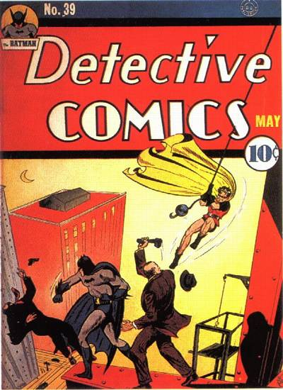
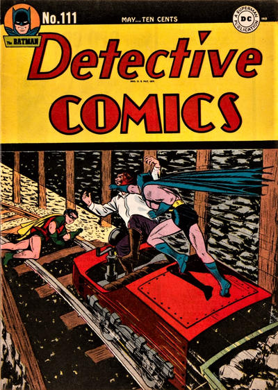
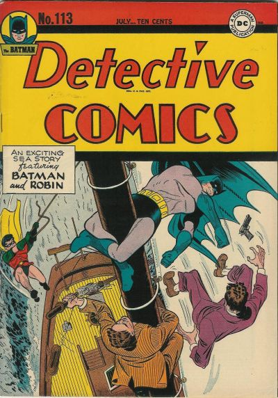
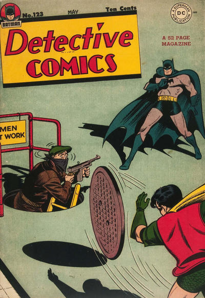
Things are looking grim out there. At times like these, when I need some distraction and cheering up, nothing beats the classics, by which I mean watching the Golden Age Dynamic Duo kick butts and take names…

With that in mind, here is here is this week’s reminder that comics can be awesome:

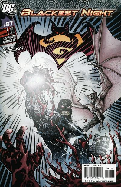
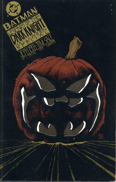
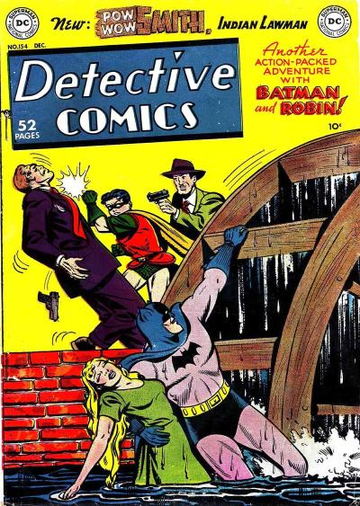
Detective ComicsDetective ComicsBatmanBatman & RobinBatman

Posted in COVERS OF BATMAN COMICS | Tagged , , , , , , , | Leave a comment